Zen Forms
Forms permit the user to enter data. A Zen control is a component that displays application data and allows the user to edit this data. A Zen form is a specialized group component designed to contain control components. Zen forms have the same style and layout attributes as any Zen group. Also, because they are groups, forms may contain any other type of Zen component.
Like all Zen components, a Zen form must be the child of a Zen page object. This means that if you want to provide a form for a Zen application, you must create a Zen page class that includes a form component inside the <page> container. Two components are available:
-
“<form>” — A Zen group that contains a specific list of control components. These controls may or may not take their values from a data controller, but their layout is entirely determined by the <form> definition in XData Contents.
-
“<dynaForm>” — An extension of <form> that dynamically injects control components into a group (or groups) on the Zen page. The list of controls may be determined by the properties of an associated data controller, or by a callback method that generates a list of controls. Layout is automatic, determined by code internal to the <dynaForm>.
There is a Studio tutorial that uses Zen wizards to create a form-based user interface for a simple application. See the chapter “Building a Simple Application with Studio” in the book Using Studio.
For information about data controllers, see the chapter “Model View Controller.”
Chapter topics incluide:
Forms and Controls
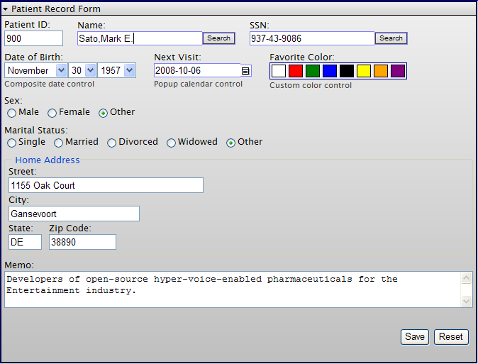
The Zen library includes a number of controls for use in forms. Many of these controls are wrappers for the standard HTML controls, while others offer additional functionality. The following figure displays a form that contains a number of controls, including text fields and radio buttons. This is the sample form generated by the class ZENDemo.FormDemoOpens in a new tab in the SAMPLES namespace.
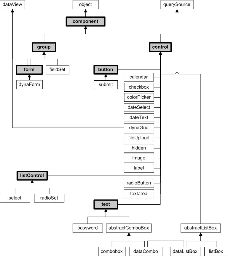
The following figure lists the form and control components that Zen provides. Most of the classes shown in the figure are controls. All of the classes shown in the diagram are in the package %ZEN.Component, for example %ZEN.Component.formOpens in a new tab and %ZEN.Component.controlOpens in a new tab. The diagram shows the inheritance relationships for these classes, and highlights the base classes most frequently discussed in this book.
For details about individual controls, see the chapter “Zen Controls.”
User Interactions
The basic interaction between a Zen application user and a Zen form is as follows:
-
A user interacts with controls on the form
-
Zen may validate the data as it is entered
-
A user action indicates that it is time to submit the form
-
Zen may validate the data prior to attempting the submit
-
Zen interacts with the user to handle any errors it finds
-
When all is well, Zen submits data from the form
-
Any of the following might happen next:
-
Data from the form may be written to the server
-
The same Zen page may redisplay
-
A different Zen page may display
-
The same Zen page may display, but with components added or changed
-
Defining a Form
The Zen components “<form>” and “<dynaForm>” each support the following attributes for defining the characteristics of a form.
| Attribute | Description |
|---|---|
| Zen group attributes | A form has the same style and layout attributes as any Zen group. For descriptions, see “Group Layout and Style Attributes” in the “Zen Layout” chapter of Using Zen. |
| action |
Specifies a HTML action for the form. Setting the action attribute overrides the default behavior of Zen forms so that Zen does not execute its normal submit logic. InterSystems recommends you do not use the action attribute except in special cases where direct control of the HTML action attribute is required. This could be the case for certain custom login forms. |
| autocomplete | Indicates whether controls in this form can have their values automatically completed by default by the browser. Elements belonging to the form can override this setting by setting an autocomplete attribute. |
| autoValidate |
If true (the default), automatically invoke this form’s validate method whenever this form is submitted. This attribute has the underlying data type %ZEN.Datatype.booleanOpens in a new tab. See “Zen Attribute Data Types.” |
| controllerId | If this form is associated with a data controller, the controllerId attribute identifies the controller that provides the data for this form. The controllerId value must match the id value provided for that <dataController>. See the chapter “Model View Controller.” |
| enctype | Specifies a HTML enctype for the form, such as "multipart/form-data" |
| invalidMessage |
Message text that the form validate method displays in an alert box when the contents of this form are invalid. The default is: This form contains invalid values. Please correct the following field(s) and try again. Although you can enter ordinary text for this attribute, it has the underlying data type %ZEN.Datatype.captionOpens in a new tab. See “Zen Attribute Data Types.” |
| key |
String that identifies a specific instance of the data model object that is associated with this form. This is the model ID. The format and possible values of the model ID are determined by the developer of the data model class. For details, see “Data Model Properties” in the chapter “Model View Controller.” If a <form> or <dynaForm> specifies a key, the OnLoadForm callback uses this model ID to load initial values into the form. However, if this form is connected to a <dataController>, the key value is ignored. The key can be a literal string, or it can contain a Zen #()# runtime expression. |
| method |
Specifies a HTML method for the form. Setting the method attribute overrides the default behavior of Zen forms so that Zen does not execute its normal submit logic. InterSystems recommends you do not use the method attribute except in special cases where direct control of the HTML method attribute is required. This could be the case for certain custom login forms. |
| nextPage | URI of the page to display after this form is successfully submitted. This URI may be overwritten by a specific <submit> button on the form. |
| onchange |
The onchange event handler for the form. Zen invokes this handler when the value of a control on this form is changed by the user or when the modified flags are cleared by a call to the form’s clearModified method. When fired for a control, the onchange expression can use an argument called control to reference the modified control. See “Zen Component Event Handlers.” |
| ondefault | Client-side JavaScript expression that Zen invokes when the user performs an action that triggers the default action for a form. Typically this is when the user presses the Enter key within a control within the form. |
| oninvalid | Client-side JavaScript expression that Zen invokes when this form’s validate method determines that the contents of this form are invalid. This provides the application with a chance to display a custom message. |
| OnLoadForm |
Name of a server-side callback method in the Zen page class. Find further information following this table. |
| onnotifyView |
The onnotifyView event handler for the form. Zen invokes this handler each time the data controller connected to this form raises an event. See “Zen Component Event Handlers.”This attribute applies if the form is associated with a data controller. See the chapter “Model View Controller.” |
| onreset | Client-side JavaScript expression that Zen invokes when this form is about to be reset. Generally this expression invokes a client-side JavaScript method. |
| OnSubmitForm |
Name of a server-side callback method in the Zen page class. This method takes a set of actions that is appropriate upon form submit. Use of OnSubmitForm is limited to providing an alternative to the built-in mechanisms that a form provides for detecting changes, validating values, and submitting the form. It should not be used to perform other types of general-purpose processing. The next several sections describe the build-in mechanisms provided by form submit. Zen invokes this method when the user submits the form, automatically passing it an input parameter of type %ZEN.Submit. If no OnSubmitForm value is specified for the form, Zen invokes the page’s %OnSubmit method instead. To follow this sequence, see the section “Processing a Form Submit.” The callback must return a %StatusOpens in a new tab data type. The following is a valid signature for this callback: ClassMethod SubmitForm(pSubmit As %ZEN.Submit) As %Status To use the above method as the callback, the developer would set OnSubmitForm="SubmitForm" for the <form> or <dynaForm>. |
| onsubmit | Client-side JavaScript expression that Zen invokes when this form is about to be submitted. Generally this expression invokes a client-side JavaScript method with a Boolean return value. Invoking this method gives Zen a chance to perform client-side validation of values within the form. If the method returns false, the pending submit operation does not occur. Note that unlike the HTML onsubmit event, the onsubmit callback is always called whenever the form is submitted. |
| onvalidate | Client-side JavaScript expression that Zen invokes when this form’s validate method is called. Generally this expression invokes a client-side JavaScript method that performs validation. |
| readOnlyMessage |
Message text that the form validate method displays in an alert box when the user makes an attempt to save a form bound to a read-only data model. The default readOnlyMessage text is: This data is read only. Although you can enter ordinary text for this attribute, it has the underlying data type %ZEN.Datatype.captionOpens in a new tab. See “Zen Attribute Data Types.” |
The OnLoadForm method retrieves the values that appear on the form when it first displays. It can get values from the object whose model ID is provided by the key attribute for the form, or it can assign literal values. The method must then place these values into the input array, subscripted by the name attribute for the corresponding control on the form. It is this name (and not the id) that associates a control with a value. Zen invokes this method when it first draws the form, automatically passing it the following parameters:
-
%StringOpens in a new tab — the key value for the form
-
An array of %StringOpens in a new tab passed by reference
The callback must return a %StatusOpens in a new tab data type. The following example shows a valid method signature and use of parameters:
Method LoadForm(pKey As %String,
                ByRef pValues As %String) As %Status
{
  Set emp = ##class(ZENDemo.Data.Employee).%OpenId(pKey)
  If ($IsObject(emp)) {
    Set pValues("ID") = emp.%Id()
    Set pValues("Name") = emp.Name
    Set pValues("SSN") = emp.SSN
  }
  Quit $$$OK
}
To use the above method as the callback, the developer would set OnLoadForm="LoadForm" for the <form> or <dynaForm>.
Providing Values for a Form
A form can initially display with blank fields, or you can provide data for some of the fields. Providing data for a field that the user sees means setting the value property for the associated Zen control component, before you ask Zen to display the form. There are several ways to do this:
-
Set the value attribute while adding each control to XData Contents.
<text value="hello"/>
-
Set the onLoadForm attribute while adding the form to XData Contents.
<form id="MyForm" OnLoadForm="LoadForm">
-
Set value properties from the page’s %OnAfterCreatePage method.
Do ..%SetValueById("Doctor",$G(^formTest("Doctor")))
-
On the client side, call the setValue method for each control.
Presumably, once the user begins editing the form, any initial values may change.
Detecting Modifications to the Form
A Zen form component tracks whether or not changes have occurred in any control on the form. %ZEN.Component.formOpens in a new tab and %ZEN.Component.controlOpens in a new tab each offers a client-side method called isModified that tests this programmatically.
A control’s isModified method returns true if the current logical value of the control (the value property) is different from its original logical value (the originalValue property). With each successive submit operation, the originalValue for each control acquires its previous value, so that this answer is always current with respect to the current state of the form.
When you call a form’s isModified method, it invokes isModified for each control on the form, and if any control returns true, isModified returns true for the form.
The <textarea> control returns an accurate isModified status when it contains fewer than 50 characters. When the <textarea> value contains 50 characters or more, the control does not compute an isModified status.
Validating a Form
Each Zen form has a validate method whose purpose is to validate the values of controls on the form. If the form’s autoValidate property is true, validate is called automatically each time the form is submitted. Otherwise, validate may be called explicitly by the application. validate does the following:
-
Calls a form-specific onvalidate event handler, if defined. If this event returns false, Zen declares the form invalid and no further testing occurs.
-
Resets the invalid property of all the form’s controls to false, then tests each control by calling the control’s validationHandler method. This method, in turn, does the following:
-
If the control’s readOnly or disabled properties are true, return true.
-
If the control’s required property is true and the control does not have a value (its value is ""), return false.
-
If the control defines an onvalidate event, execute it and returns its value. Otherwise, call the control’s isValid method. isValid can be overridden by subclasses that wish to provide built-in validation (such as the dateText control).
-
-
As the validate method tests each control, the form builds a local array of invalid controls.
-
After the validate method is finished testing the controls, it returns true if the form is valid.
-
If the form contains one or more controls with invalid values, it is invalid. validate performs one of the following additional steps to handle this case:
-
If the form defines an oninvalid event handler:
Execute the handler. This provides the form with a chance to handle the error conditions. The value returned by the oninvalid event is then returned by the form’s validate method. The oninvalid handler has an argument named invalidList that receives a JavaScript array containing the list of invalid controls. For example:
<form oninvalid="return zenPage.formInvalid(zenThis,invalidList);" />Where the formInvalid method looks like this:
ClientMethod formInvalid(form,list) [ Language = javascript ] { return false; } -
When the form has no oninvalid event handler:
validate sets the invalid property to true for each invalid control (which changes their style to zenInvalid); gives focus to the first invalid control; and displays an error message within an alert box. The message displayed in the alert box is built from a combination of the form’s invalidMessage property along with the value returned from each invalid control’s getInvalidReason method.
-
It is standard practice not to invoke validation logic for null values.
Errors and Invalid Values
Should an error occur while a form is being submitted, or should the form fail validation, Zen redisplays the page containing the form. The user has the opportunity to re-enter any incorrect values and submit the page again. All of this is extremely easy to set up when adding the <form> or <dynaForm> component to the Zen page.
The SAMPLES namespace class ZENTest.FormTestOpens in a new tab allows you to experience error handling with Zen forms as follows:
-
Start your browser.
-
Enter this URI:
http://localhost:57772/csp/samples/ZENTest.FormTest.clsOpens in a new tab
Where 57772 is the web server port number that you have assigned to Caché.
-
Ensure that the Name field is empty.
-
Clear the Status check box.
-
Click Submit.
-
The form’s validate method detects the invalid fields and highlights them with pink.
-
The following alert message displays in the browser.
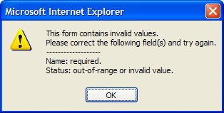
To generate this message, the form has assembled the following snippets of text. Zen offers default values for these items, so there is no need for you to do anything for the default message to appear. However, if you wish you can customize them to any extent:
-
The message begins with the form’s invalidMessage text.
-
For each control that has its required attribute set to true, but contains no entry, the message lists the control’s label followed by the control’s requiredMessage text.
-
For each control that contains an invalid value, the message lists the control’s label followed by the control’s invalidMessage text.
-
-
Click OK to dismiss the alert message box.
-
The invalid controls remain highlighted until the user edits them and resubmits the form.
Processing a Form Submit
The request to submit the contents of a form can be triggered in one of two ways:
-
The user clicks a “<submit>” button placed within the form.
-
The application calls the submit method of the form object in response to a user event:
%form.submit
When a form is submitted, the values of the controls in the form are sent to the server and the %OnSubmit callback method of the page containing the form is called. Note that the %OnSubmit callback method is that of the page that contains the form, not of the form itself or of any component on the form.
%OnSubmit receives an instance of a special %ZEN.SubmitOpens in a new tab object that contains all the submitted values. Note that there is no page object available during submit processing. Zen automatically handles the full details of the submit operation, including invoking server callbacks and error processing. All forms are submitted using the HTTP POST submission method.
Note that using the setting ENCODED=2 disables the <form> component, because ENCODED=2 removes all unencrypted parameters from the url.
If you are interested in details of how Zen executes a submit operation, the following table lists the internal events in sequence, organized by user viewpoint, browser-based execution, and server-side execution. Most of the communication details are handled by the CSP technology underlying Zen. For background information, see the “Zen Client and Server” chapter in Using Zen.
| User Viewpoint | In the Browser | On the Server | |
|---|---|---|---|
| 1 | User clicks a button to invoke form submit | ||
| 2 | Post control values to the server via the HTTP POST mechanism | ||
| 3 | Deserialize data from the client | ||
| 4 | Reconstruct DOM based on new control values | ||
| 5 | Run the server-side code for the page | ||
| 6 | Update server-side DOM | ||
| 7 | Generate new HTML page | ||
| 8 | Send new HTML page as response to HTTP POST | ||
| 9 | Render the HTML received in HTTP POST response | ||
| 10 | Update client-side DOM to reflect changes made on the server | ||
| 11 | User sees new page |
User Login Forms
An application login page presents a special case of a Zen form. To create application login and logout pages, see the section “Controlling Access to Applications” in the “Zen Security” chapter of Developing Zen Applications.
Dynamic Forms
A <dynaForm> is a specialized type of form that dynamically injects control components into a group (or groups) on the Zen page. Layout is determined automatically by code internal to the <dynaForm>. The list of controls may be determined by the properties of an associated data controller, or by a callback method that generates a list of controls.
<dynaForm> has the following attributes:
| Attribute | Description |
|---|---|
| Form component attributes | A <dynaForm> has the same general-purpose attributes as any Zen form. For descriptions, see the section “Defining a Form.” The general-purpose form attributes include the controllerId and onnotifyView attributes needed to work with a data controller. |
| controllerId |
If this form is associated with a data controller, the controllerId attribute identifies the <dataController> component that provides the data for this form. The controllerId value must match the id value for the <dataController>. For full details about creating a <dynaForm> that uses a data controller, see the chapter “Model View Controller.” |
| defaultGroupId | The id of a group in which to place the controls generated by this <dynaForm>. This provides a way to control layout. Somewhere inside the <dynaForm>, you must specify a group component (such as <vgroup> or <hgroup>) with an id that matches the defaultGroupId. If no defaultGroupId is provided, controls are added directly to the <dynaForm> without being contained in a group. |
| injectControls |
By default, Zen places any automatically inserted controls after (that is, below or to the right of) any manually inserted controls on the <dynaForm>. If you want automatically inserted controls to appear before (that is, above or to the left of) any manually inserted controls, set the injectControls attribute to "before" as in the following example. This code causes the controls provided by the data controller to appear "before" the manually inserted Save button: The possible values for injectControls are "before" and "after". The default is "after". |
| OnGetPropertyInfo |
Name of a server-side callback method in the Zen page class. This method prepares additional controls to inject onto the form when it is displayed. Zen invokes this method when it first draws the form. See the discussion following this table. |
| onnotifyView |
The onnotifyView event handler for the form. This attribute applies if the form is associated with a data controller. Zen invokes this handler each time the data controller connected to this form raises an event. See “Zen Component Event Handlers.” For full details about creating a <dynaForm> that uses a data controller, see the chapter “Model View Controller.” |
The callback method identified by the OnGetPropertyInfo attribute prepares additional controls to inject onto the form when it is displayed. If this method is defined in the page class, Zen invokes it when it first draws the form, automatically passing it the following parameters:
-
%IntegerOpens in a new tab — the next index number to apply to a control on the generated form. As the callback method injects additional controls on the form, it must increment this index value, as shown in the example below.
-
As array of %StringOpens in a new tab passed by reference.
-
%StringOpens in a new tab — the current data model ID, for cases where the contents of a dynamic form vary by instance of the data model object. The method can get values from this object, or it can assign literal values.
To define additional controls, the method must place values into the input array, using two-part subscripts as follows:
-
The first subscript is the value of the name attribute that was assigned to the corresponding control on the form. It is this name (and not the id) that identifies the control and associates it with a value. For example, the following array position stores the 1–based index of the control’s ordinal position on the form:
pInfo(name)
-
The second subscript is the name of a property on the control object. %type is a control property whose value identifies the type of the control. The names of other properties are listed in the “Zen Controls” chapter, either in the “Control Attributes” section or in topics about specific controls. For example, the following array position stores the value for the attr attribute of the name control:
pInfo(name,attr)
The callback must return a %StatusOpens in a new tab data type. The following example shows a valid method signature and use of parameters and array subscripts:
Method GetInfo(pIndex As %Integer,
               ByRef pInfo As %String,
               pModelId As %String) As %Status
{
  Set pInfo("Field1") = pIndex
  Set pInfo("Field1","%type") = "textarea"
  Set pInfo("Field2") = pIndex + 1
  Set pInfo("Field2","label") = "Field 2"
  Quit $$$OK
}
To use the above method as the callback, the developer would set OnGetPropertyInfo="GetInfo" for the <dynaForm>.
If the last control on the generated form comes from an embedded property with n fields, your callback must increment past these generated controls by adding n to the index number at the beginning of the method, before assigning the index to any controls. This convention is not necessary when the last generated control on the form comes from a simple data type, such as %StringOpens in a new tab, %BooleanOpens in a new tab, or %NumericOpens in a new tab. The previous example shows the simple case, in which the method uses and increments the index provided.