Popup Windows and Dialogs
This chapter describes Zen components that “pop up” to display their contents over the main application page. The tradeoff for the flexibility provided by these components is that you must provide more programming in the page class to make them effective. This chapter describes the following components:
-
“Modal Groups” — Make HTML content visible in response to a user event.
-
“Popup Windows” — Pop up a new window that displays a Zen page or any other content.
-
“Dialogs” — Pop up a dialog that prompts the user and accepts user input.
Modal Groups
A modal group is a specialized group component that normally does not display its contents. When the modal group is made visible, only its contents receive user events. Any event that occurs outside of the modal group (such as a mouse click) automatically hides the modal group. Zen uses this modal mechanism when it creates drop-down menus and drop-down combobox controls. You can also use this mechanism for popup items.
You can define the contents of a modal group either by placing a <modalGroup> component within the page class or by creating an instance of the %ZEN.Component.modalGroupOpens in a new tab class programmatically. There are three options:
-
“Static” — Place a <modalGroup> component in the page class XData Contents block. Its contents remain hidden until a client-side method on the page calls the modalGroup show method.
-
“Dynamic” — Have the page call its createComponent method to create a modalGroup component dynamically. Add components to the group. Display it by calling the modalGroup show method.
-
“Built-in” — Have the page call the modalGroup show method to display one of the built-in modal groups: "msgBox" or "calendar"
To close the current modal group, the page must invoke its endModal method. Generally endModal is triggered by an event handler for one of the buttons in the modal group (OK, Cancel, or similar). It is an error to call endModal if there is no modal group currently displayed.
While a modal group has the editing focus, keyboard controls are disabled. For example, it is not possible to use Tab to move from field to field within the modal group. This prevents the user from (inadvertently) pressing Tab to navigate through all the fields and then back to the page, while the modal group has focus. The modal group keeps the focus until the user either clicks away from it or clicks the button that has been set up to close the modal group.
For Internet Explorer (IE) only: When displaying a modal group, Zen hides the contents of any <embed> elements (that is, SVG content). This is because IE ignores zindex setting for <embed> elements.
You can customize the behavior of a component within a modal group by modifying its modal callback methods:
-
onStartModalHandler(zindex) — If present, fires upon notification that this component is about to become modal. That is, it is pushed to the front of the display. The caller supplies a zindex value large enough to ensure that this component is placed above all others currently visible in the browser.
-
onEndModalHandler(zindex) — If present, fires upon notification that this component is about to stop being modal. That is, it is no longer be pushed to the front of the display. The caller supplies a zindex value small enough to ensure that this component returns to its normal layer relative to other components in the browser.
Static Modal Groups
In static mode, the modal group is defined within a page class XData Contents block using XML statements. The contents of the group are hidden until the modal group component’s show method is called; then they are displayed in a popup window.
The following steps set this up in the page class:
-
Supply a <modalGroup> definition within the <page> in XData Contents. For example:
<modalGroup id="mgStatic" groupTitle="Popup"> <text id="mgText" label="Value:" /> <button id="mgButton" caption="OK" onclick="zenPage.mgBtnClick();"/> </modalGroup> -
Provide a client-side method to display the modal group. For example:
ClientMethod modalGroupStatic() [ Language = javascript ]
{
  var group = this.getComponentById('mgStatic');
  group.show();
}
This method:
-
Finds the <modalGroup> on the <page> by calling getComponentById with the <modalGroup> id value
-
Calls the client-side show method. No arguments are needed because the <modalGroup> definition provides all the necessary information to show.
-
-
Somewhere within the <page> you must give the user a mechanism to invoke the modalGroupStatic method to display the modal group. The following example provides a button:
<button caption="Enter a New Value" onclick="zenPage.modalGroupStatic();" title="Display a modal group using a static definition." /> -
For testing purposes, you may provide the <page> with a field in which to echo the data from the popup:
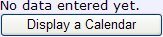
<html id="mgHtml">No data entered yet. </html>The page XData Contents block now looks like this.
<page xmlns="http://www.intersystems.com/zen" xmlns:demo="http://www.intersystems.com/zendemo" height="100%"> <html id="mgHtml">No data entered yet. </html> <button caption="Enter a New Value" onclick="zenPage.modalGroupStatic();" title="Display a modal group using a static definition." /> <modalGroup id="mgStatic" groupTitle="Popup"> <text id="mgText" label="Value:" /> <button id="mgButton" caption="OK" onclick="zenPage.mgBtnClick();"/> </modalGroup> </page> -
You must give the user a mechanism to close the popup. Additionally, if your popup invited the user to enter values, you want to retrieve and use these values. The following client-side method in the page class does this:
ClientMethod mgBtnClick() [ Language = javascript ]
{
  // get value from text field
  var ctrl = zen('mgText');

  // write user value into HTML component
  zenSetProp('mgHtml','content','User entered: ' + ctrl.getValue());

  // hide the modal group
  zenPage.endModal();
}
This method:
-
Executes when the user clicks OK in the popup. This works because step 1 identified this method as the onclick event handler for the <button> in the <modalGroup>.
-
Finds the <text> control from the <modalGroup> by calling the JavaScript function zen with the <text> id value
-
Gets the value entered into the <text> control by calling getValue
-
Finds the <html> component on the <page> and sets the content property of the <html> component, by calling the JavaScript utility function zenSetProp() with the <html> id value. The new <html> content value concatenates a literal string with the newly acquired <text> value.
-
Calls the page’s endModal method to close the popup.
-
The user may interact with this sample page as follows:
-
The user initially sees:
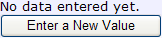
-
Clicking the button on this page invokes the modalGroupStatic method. This causes a window to pop up in front of the main page. The contents of the popup are the contents of the <modalGroup>. The popup title is the <modalGroup> groupTitle text.
In the illustration below, the user has typed a value in the <text> control within the popup:
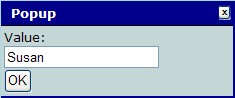
-
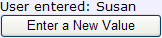
Clicking the OK button in this popup invokes the mgBtnClick method. This closes the popup and changes the contents of the <html> component on the <page> to echo the user input, as follows:
The above example is similar to one available in the class ZENDemo.MethodTestOpens in a new tab in the SAMPLES namespace. You can try this sample from the Zen Demo main page by choosing Home, Overview, Methods, then Modal Group: Static. To get started, see “The Zen Demo” as described in the “Introducing Zen” chapter of Using Zen.
Dynamic Modal Groups
In dynamic mode, the page creates a modal group component programmatically, by calling the client-side JavaScript methods createComponent, addChild, and setProperty. The sequence culminates in a call to the modalGroup show method with the appropriate arguments.
The following steps set this up in the page class:
-
Provide a client-side method to display the modal group. For example:
ClientMethod modalGroupDynamic() [ Language = javascript ]
{
  // create a modal group
  var group = this.createComponent('modalGroup');

  // add components dynamically
  var col = this.createComponent('colorPicker');
  group.addChild(col);
  col.setProperty('id','myCol');

  var radio = this.createComponent('radioSet');
  radio.setProperty('id','myRadio');
  group.addChild(radio);

  zenPage.addChild(group);
  zenPage.refreshContents(true);
  radio.setProperty('valueList','elm,maple,oak');

  var btn = this.createComponent('button');
  group.addChild(btn);
  btn.setProperty('caption','Save');
  btn.setProperty('onclick','zenPage.btnClick();');

  // Show the group in "dynamic" mode.
  zenPage.refreshContents(true);
  group.show();
}
This method:
-
Calls the page’s createComponent method to add a modalGroup component
-
Adds a colorPicker to the group
-
Calls the page’s createComponent method to create a colorPicker control
-
Calls the modal group’s addChild method to add the colorPicker to the group
-
Calls the color picker’s setProperty method to give the colorPicker an id value
-
-
Adds a radioSet to the group in the same way
-
Adds a button to the group in the same way
-
Calls the button’s setProperty method to set its onclick value to the name of a client-side method that executes when the user clicks this button
-
Calls the modal group’s show method with these arguments:
-
A title for the popup window
-
The keyword 'dynamic'
-
The keyword null in argument positions three, four, and five
-
An optional width value of '236'
For argument details, see “The show Method” in this chapter.
-
-
-
Somewhere within the <page> you must give the user a mechanism to invoke the modalGroupDynamic method to display the modal group. The following example provides a button:
<button caption="Choose Plantings" onclick="zenPage.modalGroupDynamic();" title="Display a modal group using a dynamic definition." /> -
For testing purposes, you may provide the <page> with a field in which to echo the data from the popup:
<html id="mgHtml">No data entered yet. </html>The page XData Contents block now looks like this.
<page xmlns="http://www.intersystems.com/zen" xmlns:demo="http://www.intersystems.com/zendemo" height="100%"> <html id="mgHtml">No data entered yet. </html> <button caption="Choose Plantings" onclick="zenPage.modalGroupDynamic();" title="Display a modal group using a dynamic definition." /> </page> -
You must give the user a mechanism to close the popup. Additionally, if your popup invited the user to enter values, you want to retrieve and use these values. The following client-side method in the page class does this:
ClientMethod btnClick() [ Language = javascript ]
{
  // get values from controls
  var col = zen('myCol');
  var radio = zen('myRadio');

  // write user values into HTML component
  zenSetProp('mgHtml','content','User entered: ' +
                    col.getValue() + ' ' + radio.getValue());

  // hide the modal group
  zenPage.endModal();
}
This method:
-
Executes when the user clicks Save in the popup. This works because step 1 identified this method as the onclick event handler for the Save button in the modal group.
-
Finds the color picker and radio set controls by calling the JavaScript utility function zen() with their id values.
-
Finds the <html> component on the <page> and sets the content property of the <html> component by calling the JavaScript utility function zenSetProp() with the <html> id value. The new <html> content concatenates a literal string with the color picker and radio set values, acquired using getValue().
-
Calls the page’s endModal() method to close the popup.
-
The user may interact with this sample page as follows:
-
The user initially sees:
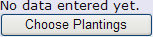
-
Clicking the button on this page invokes the modalGroupDynamic method. This causes a window to pop up in front of the main page. The contents of the popup are the child components that modalGroupDynamic added. The popup title is the first argument that modalGroupDynamic passed to the show method.
In the illustration below, the user has clicked on a color and a radio button:
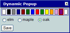
-
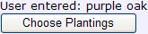
Clicking the Save button in this popup invokes the btnClick method. This closes the popup and changes the contents of the <html> component on the <page> as follows:
Built-in Modal Groups
In built-in mode, Zen dynamically creates and displays one of its built-in modal groups. This option is much simpler than the steps for a dynamic modal group. There are two options for built-in modal groups:
-
"calendar" — Display the built-in “calendar box.”
-
"msgBox" — Display the built-in “message box.”
Calendar
The following steps add a calendar popup to a Zen page class:
-
Provide a client-side method to display the modal group.
ClientMethod modalGroupCalendar() [ Language = javascript ]
{
  var group = zenPage.createComponent('modalGroup');
  group.setProperty('onaction','zenPage.calendarAction(group);');
  group.show('Select a date:','calendar','2005-12-12');
}
This method:
-
Calls the page’s createComponent method to add a modalGroup component
-
Calls the modal group’s setProperty method that sets its onaction value to the name of a client-side method. setProperty executes when the user performs any action on this popup, such as selecting a date value from the calendar. It accepts an argument, group, that represents the modalGroup instance.
-
Calls the modal group’s show method with three arguments:
-
A title for the popup window
-
The keyword 'calendar'
-
An optional pre-selected date for the calendar to display when it pops up
-
-
-
Somewhere within the <page> you must give the user a mechanism to invoke the method that displays the modal group. The following example provides a button:
<button caption="Display a Calendar" onclick="zenPage.modalGroupCalendar();" /> -
Finally, you must retrieve and use the date value acquired by the calendar control, and then close the popup. The following client-side method in the page class does this:
ClientMethod calendarAction(group) [ Language = javascript ]
{
  alert("You selected: " + group.getValue());

  // write user value into HTML component
  zenSetProp('mgHtml','content','User entered: ' + group.getValue());
}
This method:
-
Executes when the user clicks on a specific date value in the popup. This works because step 1 identified this method as the onaction event handler for the modal group.
-
Calls the modal group’s getValue method to retrieve the date value entered into the calendar.
-
Issues a JavaScript alert message that confirms the value.
-
Finds the <html> component on the <page> and sets the content property of the <html> component by calling the JavaScript utility function zenSetProp() with the <html> id value. The new <html> content value concatenates a literal string with the newly acquired date value.
-
Does not call the page’s endModal method. The built-in calendar modal group closes automatically when the user chooses a date.
-
The user may interact with this sample page as follows:
-
The user initially sees:
-
Clicking the button on this page invokes the modalGroupCalendar method. This causes a window to pop up in front of the main page. The popup title is the first argument that modalGroupCalendar passed to the show method. The currently selected date is the one specified by the third show argument.
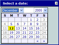
-
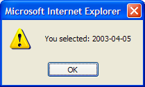
Selecting a different month, year, and date from the preselected value automatically invokes the calendarAction method. This closes the popup and displays a browser alert message that echoes the new date value:
-
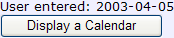
Dismissing the alert makes it easy to see that the contents of the <html> component on the <page> have now changed as follows:
The above example is similar to one available in the class ZENDemo.MethodTestOpens in a new tab in the SAMPLES namespace. You can try this sample from the Zen Demo main page by choosing Home, Overview, Methods, and Modal Group: Calendar. To get started, see “The Zen Demo” as described in the “Introducing Zen” chapter of Using Zen.
Message Box
The following steps add a message box popup to a Zen page class:
-
Provide a client-side method to display the modal group.
ClientMethod modalGroupMsg() [ Language = javascript ]
{
  var group = this.createComponent('modalGroup');
  group.show('My New Message','msgBox',
  'This<br>message<br>contains <span style="color: red">HTML</span>!');
}
This method:
-
Calls the page’s createComponent method to add a modalGroup component
-
Calls the modal group’s show method with three arguments:
-
A title for the popup window
-
The keyword 'msgBox'
-
HTML-formatted message content for the popup message
-
-
-
Somewhere within the <page> you must give the user a mechanism to invoke the method that displays the modal group. The following example provide a button:
<button caption="Display a Message" onclick="zenPage.modalGroupMsg();" /> -
When the user clicks this button, the popup displays:
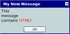
Clicking OK on the popup dismisses it.
The above example is similar to one available in the class ZENDemo.MethodTestOpens in a new tab in the SAMPLES namespace. You can try this sample from the Zen Demo main page Home, Overview, Methods, and Modal Group: MsgBox. To get started, see “The Zen Demo” as described in the “Introducing Zen” chapter of Using Zen.
The show Method
show is a client-side JavaScript method that displays a modal group. It has no return value, and up to eight optional arguments. Previous topics in the “Modal Groups” section have discussed some of these arguments. A complete list follows:
-
title — Title for the popup window. For static modal groups, this overrides the groupTitle value in the <modalGroup> definition.
-
type — One of the following keywords:
-
"calendar" — Display the built-in calendar box.
-
"dynamic" — Display a dynamically created modal group.
-
"msgBox" — Display the built-in message box.
-
"static" — Display a statically defined <modalGroup>.
If no type argument is supplied, the default is "static" if a <modalGroup> definition exists within the <page>. Otherwise the default is "dynamic".
-
-
value — Value to display when a built-in modal group is used. When the type is:
-
"calendar" — value is a date in YYYY-MM-DD format. When the window pops up, the calendar displays this month and year with value as a pre-selected date.
-
"msgBox" — value is the HTML-formatted message content for the popup message.
-
-
top — Vertical coordinate of the top left corner of the popup window (0 is the top of the screen)
-
left — Horizontal coordinate of the top left corner of the popup window (0 is the far left of the screen)
-
wid — Width of the popup window
-
hgt — Height of the popup window
-
parms — Object containing a set of additional characteristics passed on to the modalGroup as a set of name-value pairs. Typically this offers a way to pass additional parameters to the popup calendar.
<modalGroup> Attributes
The <modalGroup> component is the XML projection of the %ZEN.Component.modalGroupOpens in a new tab class. The following table lists the <modalGroup> attributes that are available when defining a <modalGroup> within a page class XData Contents definition.
| Attribute | Description |
|---|---|
| Zen group attributes | <modalGroup> has the same style and layout attributes as any Zen group. For descriptions, see “Group Layout and Style Attributes” in the “Zen Layout” chapter of Using Zen. |
| groupTitle |
Title to display at the top of the modal group. For static modal groups, you can set the groupTitle value in the <modalGroup> definition. Otherwise, this value is set dynamically by the first argument of the show method. Although you can enter ordinary text for this attribute, it has the underlying data type %ZEN.Datatype.captionOpens in a new tab. See “Zen Attribute Data Types.” |
| okCaption |
Caption displayed in OK button for a message box. The default is "OK". Although you can enter ordinary text for this attribute, it has the underlying data type %%ZEN.Datatype.captionOpens in a new tab. See “Zen Attribute Data Types.” |
| onaction |
The onaction event event handler for the <modalGroup>. Zen invokes this handler whenever the user takes action on a built-in modal group popup ("msgBox" or "calendar"). See “Zen Component Event Handlers.” If you provide a seed value for the <modalGroup>, it is automatically passed to the onaction event handler. |
| onhideGroup | Client-side JavaScript expression that runs when the modal group is hidden. |
| onshowGroup | Client-side JavaScript expression that runs when the modal group is made visible. |
| seed | Allows you to pass some arbitrary value to the onaction event handler. |
| value | (Read-only) value is set by the show method; applications should not set this. However, it is sometimes useful to retrieve this value, for example when working with the built-in calendar modal group. |
Popup Windows
A popup window is a new browser window that pops up over the currently active window in response to a user event. The popup window becomes the active window as soon as it is displayed, and remains dominant until the user closes it. The following table lists the client-side JavaScript methods that control popup windows. Except for onPopupAction, these Zen page methods are final and cannot be overridden. onPopupAction is a Zen component method that needs to be overridden to control popup behavior. Since Zen pages are also components, they support the onPopupAction client-side method.
By default, Zen renders popup windows as <div> elements drawn on the current Zen page. If you want popup dialogs to display in separate windows, you can set the global ^%ISC.ZEN.useSoftModals to 0 or override the method %OnUseSoftModals so that it returns 0.
Note that you should avoid using characters other than alphanumeric characters and the underscore in pop-up window names because doing so is incompatible with certain browsers
| Client-Side Method | Description |
|---|---|
| launchPopupWindow(...) | Launch a popup window. Either identify the parent component, or allow it to default to the current Zen page. |
| firePopupAction(...) | Notify the parent component for the current popup that a user action has occurred. Optionally close the popup as well. |
| onPopupAction(...) | The parent component invokes this method each time it is notified that a user action has occurred on the popup. |
| cancelPopup() | Close the current popup with no further action. |
To display a popup window from a Zen page, follow these steps:
-
Create a Zen page class to display as a popup window. In our examples, this is “the popup page” or:
MyApp.MyDialog.cls
When you design a popup page, add properties to it that correspond to URI parameters you expect to pass to it when invoking the popup; for example:
Property ABC As %String(ZENURL="ABC");
-
Open a Zen page class that you plan to use as the window that launches the popup. In our examples, this is “the parent page.”
-
Add a client-side method to the parent page and make this method call launchPopupWindow.
In the following example, the popup page class name appears as the first argument in the call to launchPopupWindow, correctly enclosed in zenLink syntax with single quotes. This call to launchPopupWindow passes a single URI parameter called ABC to the popup page with a value of 22:
ClientMethod showPopupWindow() [ Language = javascript ]
{
  var parms = new Object();
  parms.ABC = 22;
  zenPage.launchPopupWindow(
    zenLink('MyApp.MyDialog.cls'),
    'A True Dialogue',
    'status,scrollbars,resizable,width=400,height=300',
    parms);
}
For more detailed descriptions, see the list of arguments following these instructions.
-
Place a component on the parent page whose onclick attribute invokes the client-side method that invokes launchPopupWindow. For example:
<button caption="Initiate Conversation" onclick="zenPage.showPopupWindow();" title="A demonstration of launching a popup window" /> -
Examine the popup page class. Make sure it provides a component that invokes the firePopupAction method. firePopupAction notifies the parent of the popup window that a user action has occurred in the popup. firePopupAction has three arguments:
-
action — If an action parameter is not specified, the literal string ok is the action code.
-
value — Your code must provide a value; this value is automatically passed as an argument to the parent’s onPopupAction method.
-
close — close is true by default. If true, the popup window closes after notifying the parent window.
For example:
// tell our parent window that OK was pressed; do not close this window. this.firePopupAction('apply',this.getDialogValue(),false); -
-
In the parent component class, override the onPopupAction method to provide an appropriate response when the popup page fires a popup action. The general idea is to retrieve and use the value returned by the popup page. If you did not identify a parent component, the parent is the page that invoked the popup. If the parent is the page, you must override onPopupAction in the parent page class. In the onPopupAction method signature:
-
popupName is the name of the popup window sending the action.
-
action is the name of the action.
-
value is the value associated with the action.
All of these arguments are automatically passed to onPopupAction from the popup page’s firePopupAction method.
Within the onPopupAction method, you may use the returned value in any way you wish. The following example saves the value into the content property of an <html> component:
Important:When Internet Explorer is the browser, do not use a submit operation to save values from any popup window. Simply save the values.
ClientMethod onPopupAction(popupName, action, value) [ Language = javascript ] { zenSetProp('mgHtml','content','User entered: ' + value); } -
-
If you created a button or link on the parent page, such as the one shown in step 4 above, clicking that button now displays your popup page in a separate window, overlaying the parent page.
The client side method launchPopupWindow has the following arguments, in sequential order:
-
url – A string that identifies the content you wish to display, either:
-
The name of a Zen page class, including its package name and .cls extension
-
The URI of the desired content
The JavaScript function zenLink makes sure that any additional URI parameters, such as session tracking values, are included in the link. You may use zenLink with the class name or with any URI. In the following example, the client-side method uses JavaScript string concatenation to construct a URI from several disparate elements before making the call to the Zen page method launchPopupWindow. The example also uses the escape function to correctly format any variable values used in the string:
ClientMethod editCSSValue(context) [ Language = javascript ] { var ctrl = this.getComponentById('value'); var value = ctrl.getValue(); var url = zenLink('%ZEN.Dialog.cssDeclarationEditor.cls?context=' + escape(context) + '&declaration=' + escape(value) ); zenPage.launchPopupWindow(url, 'CSSDeclarationEditor', 'resizable,width=500,height=700' ); } -
-
pageName – A string that identifies the popup window.
-
features – A comma-separated list of window attributes expected by the JavaScript function window_open.
The results of these attributes are browser-dependent. Some developers prefer the Internet Explorer behavior, which is truly modal: the modal window stays on top and nothing can happen in the application until the user dismisses the modal window. Other developers prefer the non-modal behavior, which other browsers use regardless of how you set up this call: the modal window is just another window in the application and other windows can take priority over the modal window if the user clicks on them.
If you want to make the behavior in Internet Explorer consistent with the behavior in other browsers, include the string modal=no in the list of window attributes for launchPopupWindow. For example:
zenPage.launchPopupWindow(url, 'CSSDeclarationEditor', 'resizable,width=500,height=700,modal=no' ); -
parms – If provided, parms is an array of values to be used as parameters in the URI string that invokes the popup window. You can use the parms argument to supply parameters for the URI so that you do not have to worry about correctly formatting and concatenating URI parameters in the url argument.
The convention for populating the parms array with values is as follows:
var parms = new Object();
parms.Aaa = 10;
parms.Bbb = 20;
zenPage.launchPopupWindow(url,
          'CSSDeclarationEditor',
          'resizable,width=500,height=700,modal=no'
          parms);
Given the above sample code, launchPopupWindow uses Aaa and Bbb as URI parameters, and gives these parameters the values that you assigned to the corresponding members of the parms array (10 and 20). launchPopupWindow takes care of all the details of correctly escaping these parameter values and combining them with the url value in the URI string.
Each member of the parms array must correspond to a ZENURL property in the popup page class; for example:
Property Aaa As %String(ZENURL="Aaa"); Property Bbb As %String(ZENURL="Bbb"); -
parent – If provided, parent identifies the Zen component to be notified when the firePopupAction method fires. This can be any component on the page, or the page object itself. If no parent value is supplied, the parent defaults to the page. If provided, the parent value is the system-assigned index number used internally to identify this component. For components within repeating groups, parent includes a dot followed by a number indicating the (1–based) position of this component within the group. Applications can use but should not set the parent value.
Dialogs
Zen includes some built-in classes designed to work as popup dialog windows. A Zen dialog window can contain any of the usual Zen components. All dialog windows are subclasses of %ZEN.Dialog.standardDialogOpens in a new tab, which is a Zen page class. This base class provides classic dialog buttons such as OK, Apply, and Cancel, as well as conventions for retrieving the values entered into the dialog if the user clicks OK.
This topic describes the conventions for working with Zen dialog windows:
-
Displaying the built-in file select window
-
Displaying the built-in color select window
-
Displaying an search dialog window
-
Creating a new dialog window based on %ZEN.Dialog.standardDialogOpens in a new tab
-
Creating a new dialog window template, as an alternative to %ZEN.Dialog.standardDialogOpens in a new tab
File Selection Dialog Window
The %ZEN.Dialog.fileSelectOpens in a new tab window displays and lets the user choose from a list of directories and files on the server system. The resulting value is a full path and filename.
To use the fileSelect dialog to view the file system on the server, the current user must hold USE privileges on one of the following resources: %Admin_Manage, %Admin_Operate, %Admin_Security, or %Development.
To display the fileSelect dialog as a popup window, use the steps in the “Popup Windows” section of this chapter, but in the step that describes adding a client-side method, provide a method similar to the following:
ClientMethod showPopupFile() [ Language = javascript ]
{
var pathname = '\Temp';
var showdir = '0';
zenPage.launchPopupWindow(
  '%ZEN.Dialog.fileSelect.cls?Dir=' + escape(pathname) +
  '&showdirectoryonly=' + showdir,
  'FileSelectWindow',
  'status,scrollbars,resizable,width=660,height=700');
}
The method calls the Zen page method launchPopupWindow with these arguments:
-
URI string beginning with the filename of the %ZEN.Dialog.fileSelectOpens in a new tab class. The filename is all that is needed, but in this case, the URI continues with various parameters, including:
-
Pathname for the file search window. This is either a full pathname or a path relative to the Caché system management directory (\mgr under the Caché installation directory). If omitted, the default is the Caché system management directory.
-
A showdirectoryonly value of 0 so that files are visible in the display. You can omit this, as 0 is the default. Set showdirectoryonly to 1 if you want to show directories only.
-
-
Identifier for the popup window
-
Comma-separated list of popup window characteristics
For a more complete example using %ZEN.Dialog.fileSelectOpens in a new tab, see ZENTest.FormTest2Opens in a new tab in the SAMPLES namespace. For further details about the launchPopupWindow method, see the “Popup Windows” section, earlier in this chapter.
Color Selection Dialog Window
The %ZEN.Dialog.colorSelectOpens in a new tab window lets the user choose from a set of colored cells. The resulting value is an HTML color value, such as #F3FDDA. To display the fileSelect dialog as a popup window, use the steps in the “Popup Windows” section of this chapter, but in step 2, provide a client-side method similar to the following:
ClientMethod showPopupColor() [ Language = javascript ]
{
  zenPage.launchPopupWindow(
    '%ZEN.Dialog.colorSelect.cls',
    'ColorPicker',
    'status,scrollbars,resizable,width=500,height=700');}
This method calls the client-side function launchPopupWindow with arguments as follows:
-
Filename of the %ZEN.Dialog.colorSelectOpens in a new tab class
-
Identifier for the popup window
-
Comma-separated list of popup window characteristics
For further details about the launchPopupWindow method, see the “Popup Windows” section, earlier in this chapter.
Search Dialog Window
The %ZEN.Dialog.searchDialogOpens in a new tab window lets the user construct and execute an SQL query. This class has the following properties:
-
query — the SQL statement used to populate the search form. This value cannot be passed in as a ZENURL parameter. Instead, applications should subclass %ZEN.Dialog.searchDialogOpens in a new tab and provide the query value using server-side logic in the subclass.
-
paramNames — provides a comma-separated list of names to display for parameters in the search form.
Creating a Dialog Window
To create a new type of Zen dialog window based on %ZEN.Dialog.standardDialogOpens in a new tab:
-
Add a new XData block with:
-
The name dialogBody
-
A <pane> as the container
-
An id value for the component that you identify as the source of user input
For example:
XData dialogBody { <pane> <text label="I say: " value="What do you think?" /> <textarea label="And you say: " id="yourReply" /> </pane> } -
-
Override the server-side callback method %OnGetTitle, for example:
Method %OnGetTitle() As %String { Quit $$$TextHTML("This is My Dialog") } -
Override the server-side callback method %OnGetSubtitle, for example:
Method %OnGetSubtitle() As %String { Quit $$$TextHTML("by John Smith") } -
Override the client-side JavaScript method getDialogValue so that it returns a value, for example:
ClientMethod getDialogValue() [ Language = javascript ] { return this.getComponentById('yourReply').getValue() } -
To give the dialog an Apply button (in addition to the automatic OK and Cancel buttons) override the APPLYBUTTON parameter and set it to 1:
Parameter APPLYBUTTON = 1; -
To enable the $$$Text localization macros, give the DOMAIN parameter a meaningful value:
Parameter DOMAIN = "MyDomain"; -
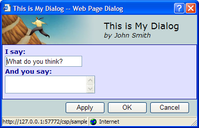
When displayed, this dialog appears as follows:
Creating a Dialog Window Template
Suppose you want to apply your own styling to the dialogs, rather than using the same layout and graphics as in the Zen standard dialog. The most straightforward way to accomplish this is to create a new dialog window template class and use it as an alternative to %ZEN.Dialog.standardDialogOpens in a new tab in the above instructions. The steps are:
-
In your subclass, apply the style differences you require.
-
When creating new dialogs using the instructions in the “Creating a Dialog Window” section in this chapter, extend the new subclass instead of extending %ZEN.Dialog.standardDialogOpens in a new tab
-
When you need a file selector class:
-
Copy the class %ZEN.Dialog.fileSelectOpens in a new tab
-
Edit the copy so that it extends your new dialog window template class instead of extending %ZEN.Dialog.standardDialogOpens in a new tab
-
-
When you need a color selector class:
-
Copy the class %ZEN.Dialog.colorSelectOpens in a new tab
-
Edit the copy so that it extends your new dialog window template class instead of extending %ZEN.Dialog.standardDialogOpens in a new tab
-