Introduction to Cube Elements
Before you create your own cube, it is useful to examine a sample cube and see how you can use it. This chapter discusses the following:
Accessing the Patients Cube
-
Access the Management Portal and go to the SAMPLES namespace, as described earlier.
-
Click Home,DeepSee,Analyzer.
-
Click the Change Subject Area button
 .
. -
Click Patients.
-
Click OK.
The Analyzer page includes three main areas:
-
The Model Contents area on the left lists the contents of the cube you selected. You can expand folders and drag and drop items into the Pivot Builder area.
-
The Pivot Builder area in the upper right provides options that you use to create pivot tables. This area consists of the Rows, Columns, Measures, and Filters boxes.
-
The Pivot Preview area in the bottom right displays the pivot table in almost the same way that it will be shown in dashboards.
Orientation to the Model Contents Area
The Model Contents area lists the contents of the cube that you are currently viewing. For this tutorial, select Dimensions from the drop-down list; this option displays the measures and dimensions in the given cube.
The top section shows named sets, but this tutorial does not use these. Below that, this area includes the following sections:
Measures
The Measures section lists all measures in the cube. For example:
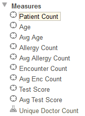
You can have two types of measures, indicated by different icons:
| Standard measures | |
| Calculated measures, which are defined in terms of other measures |
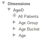
Dimensions
The Dimensions section lists the dimensions and the levels, members, and properties that they contain. (It also contains any non-measure calculated members, as well as any sets; this chapter does not discuss these items.)
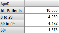
Click the triangle next to any dimension name to expand it. A dimension contains at least one level and may also include a special member known as the All member. In the following example, the AgeD dimension includes an All member named All Patients, as well as the levels Age Group, Age Bucket, and Age.
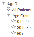
If you expand a level, the system displays the members of that level. For example:
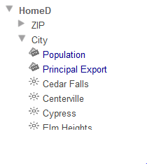
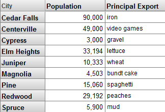
If a level also includes properties, the system shows those properties in blue font, at the start of the list, with a different icon. For example, the City level includes the Population and Principal Export properties:
Creating a Simple Pivot Table
In this section, you create a simple pivot table that uses levels and measures in a typical way. The goal of this section is to see how levels and measures work and to learn what a member is.
The numbers you see will be different from what is shown here.
-
Expand the DiagD dimension in the Model Contents pane.
-
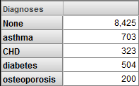
Drag and drop Diagnoses to Rows.
Or double-click Diagnoses.
The system displays the following:
-
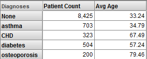
Drag and drop Patient Count to Measures.
Or double-click Patient Count.
-
Drag and drop Avg Age to Measures.
Or double-click Avg Age.
The system displays the following:
-
Click Save.
The system displays a dialog box where you specify the pivot table name.
Save the pivot table and give it a name. When you do so, you are saving the underlying query that retrieves the data, along with the information needed to display it the way you chose. You are not saving the data.
-
For Folder, type Test
-
For Pivot Name, type Patients by Diagnosis (Patients Cube)
-
Click OK.
It is worthwhile to develop a formal understanding of what we see. Note the following points:
-
The base table is Patients, which means that all measures summarize data about patients.
-
Apart from the header row, each row of this pivot table displays data for one member of the Diagnoses dimension.
In all cases, a member corresponds to a set of records in the fact table. (In most cases, each record in the fact table corresponds to one record in the base table.)
Therefore, each row in this pivot table displays data for a set of patients with a particular diagnosis.
Other layouts are possible (as shown later in this book), but in all cases, any data cell in a pivot table is associated with a set of records in the fact table.
-
In a typical pivot table, each data cell displays the aggregate value for a measure, aggregated across all records used by that data cell.
-
To understand the contents of a given data cell, use the information given by the corresponding labels. For example, consider the cell in the asthma row, in the Patient Count column. This cell displays the total number of patients who have asthma.
Similarly, consider the Avg Age column for this row. This cell displays the average age of patients who have asthma.
-
For different measures, the aggregation can be performed in different ways. For Patient Count, DeepSee sums the numbers. For Avg Age, DeepSee averages the numbers. Other aggregations are possible.
Measures and Levels
In this section, we take a closer look at measures and levels.
-
Click New.
-
Drag and drop Count and Avg Age, to the Measures area.
You now see something like this:
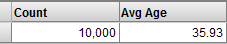
This simple pivot table shows us the aggregate value for each of these measures, across all the records in the base class. There are 10000 patients and their average age (in this example) is 35.93 years.
-
Compare these values to the values obtained directly from the source table. To do so:
-
In a separate browser tab or window, access the Management Portal and go to the SAMPLES namespace, as described earlier.
-
Click System Explorer > SQL.
-
Click the Execute Query tab.
-
Execute the following query:
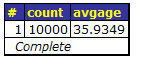
select count(*) as "count",avg(age) as avgage from deepsee_study.patient
You should see the same numbers. For example:
 Tip:
Tip:Leave this browser tab or window open for later use.
-
-
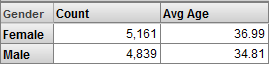
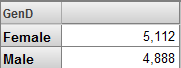
In the Analyzer, modify the previous pivot table as follows:
-
Expand GenD on the left.
-
Drag and drop Gender to the Row area. Now you see something like the following:
-
-
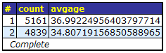
Compare these values to the aggregate values obtained from the source table. To do so:
-
Access the Management Portal and go to the SAMPLES namespace, as described earlier.
-
Click System Explorer > SQL.
-
Click the Execute Query tab.
-
Click Show History.
-
Click the query you ran previously.
-
Add the following to the end of the query and then rerun the query:
group by genderYou should see the same numbers as shown in the pivot table. For example:
-
-
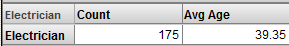
For a final example, make the following change in the Analyzer:
-
Click the X button in the Rows pane. This action clears the row definition.
-
Expand ProfD and Profession.
-
Drag and drop Electrician to Rows.
The system displays something like this:
-
-
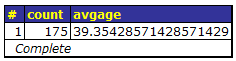
Compare these values to the values from the source table. To do so:
-
Access the Management Portal and go to the SAMPLES namespace, as described earlier.
-
Click System Explorer > SQL.
-
Click the Execute Query tab.
-
Execute the following query:
select count(*) as "count",avg(age) as avgage from deepsee_study.patient join deepsee_study.patientdetails
on deepsee_study.patient.patientid = deepsee_study.patientdetails.patientid
where deepsee_study.patientdetails.profession->profession='Electrician'
You should see the same numbers. For example:
-
Dimensions and Levels
In many scenarios, you can use dimensions and levels interchangeably. In this section, we compare them and see the differences.
-
In the Analyzer, click New.
-
Drag and drop the GenD definition to the Rows area. You should see something like this:
The measure shown is Count, which is a count of patients.
-
Click New.
-
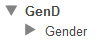
Expand the GenD dimension. You will see the following in the left area:
-
Drag and drop the Gender level to the Rows area. You should see something like this:
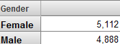
In this case, we see the same results except for the caption above the rows.
In the Patients sample, the names of dimensions are short and end with D, and the name of a level is never identical to the name of the dimension that contains it. This naming convention is not required, and you can use the same name for a level and for the dimension that contains it.
-
Click New.
-
Expand the AgeD dimension. You will see the following in the left area:
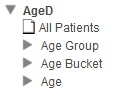
This dimension is defined differently from the GenD dimension in two ways:
-
AgeD defines a special member called All Patients, which is an All member. An All member refers to all records of the base class.
-
AgeD defines multiple levels: Age Group, Age Bucket, and Age.
-
-
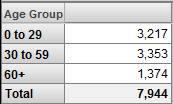
Drag and drop the AgeD dimension to the Rows area. You should see something like this:
When you drag and drop a dimension for use as rows (or columns), the system displays the All member for that dimension, if any, followed by all the members of the first level defined in that dimension. In this case, the first level is Age Group.
The All Members
An All member refers to all records of the base class. Each dimension can have an All member, but in the Patients cube, only one dimension has an All member.
This part of the tutorial demonstrates how you can use an All member:
-
Click New.
-
Expand the AgeD dimension.
-
Drag and drop Age Group to Rows.
-
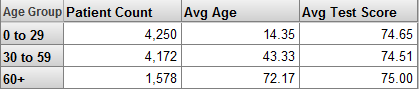
Drag and drop the measures Patient Count, Avg Age, and Avg Test Score to Measures. The system displays something like the following:
-
Click the Pivot Options button
 .
. -
In the Row Options area, click the Summary check box, leave Sum selected in the drop-down list, and then click OK.
The system then displays a Total line, as follows:
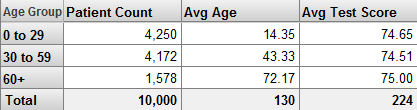
The Total value is appropriate for Patient Count but not for the other measures. For Avg Age and Avg Test Score, it would be more appropriate to display an average value rather than a sum.
-
Click the Pivot Options button
again. -
In the Row Options area, clear the Summary check box and then click OK.
-
Drag and drop All Patients to Rows, below Age Group. The system then displays the All Patients after the members of the Age Group level:
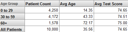
The All Patients row is a more useful summary line than the Total line. It shows the Patient Count, Avg Age, and Avg Test Score measures, each aggregated across all patients.
Note:For Avg Age and Avg Test Score, in some cases, you might prefer to have an average of the values shown in the pivot table. For example, for Avg Age, this summary line adds the ages of all patients and then divides by 10000. You might prefer to add the values of Avg Age for the three members shown here and then divide that by three. The All member does not help you do this; instead you would create a calculated member (discussed later in this tutorial).
-
Click the X button in the Rows pane. This action clears the row definition.
-
Expand the DiagD dimension.
-
Drag and drop Diagnoses to the Rows pane.
-
Drag and drop All Patients to Rows, below Diagnoses. You then see something like the following:
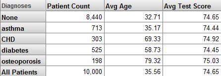
As you can see, you can use the generically named All Patient member with dimensions other than Age, the dimension in which it happens to be defined.
Hierarchies
A dimension contains one or more hierarchies, each of which can contain multiple levels. The Model Contents area lists the levels in the order specified by the hierarchy, but (to save space) does not display the hierarchy names for this cube.
Users can take advantage of hierarchies to drill to lower levels. This part of the tutorial demonstrates how this works.
-
Click New.
-
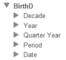
Expand the BirthD dimension in the Model Contents pane.
The system displays the following:
-
Drag and drop Decade to Rows.
Or double-click Decade.
The system displays something like the following:
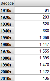
The measure shown is Count, which is a count of patients.
-
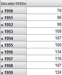
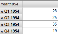
Double-click the 1950s row (or any other row with a comparatively large number of patients). Click anywhere to the right of the << symbols.
The system then displays the patients born in that decade, grouped by year (the next lowest level in the hierarchy), as follows:
This double-click behavior is available within pivot tables displayed on dashboards (not just within the Analyzer).
-
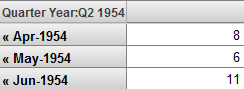
Double-click a row again. The system displays the patients born in that year, grouped by year and quarter:
-
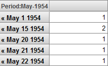
Double-click a row again. The system displays the patients born in that year and quarter, grouped by year and month:
-
Double-click a row again. The system displays the patients born in that year and month, grouped by actual date:
-
Click the << symbols repeatedly to return to the original state of the pivot table.
Properties
A level can have properties, which you can display in pivot tables.
-
Click New.
-
Expand the HomeD dimension in the Model Contents pane.
-
Expand the City level.
The system displays the following:
-
Drag and drop City to Rows.
The system displays something like the following:
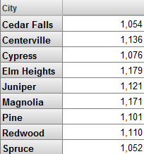
The measure shown is Count, which is a count of patients.
-
Drag and drop Population to Columns.
-
Drag and drop Principal Export to Columns.
The system displays the following:
-
Click the X button in the Rows pane.
-
Drag and drop ZIP to Rows.
The system displays something like the following:
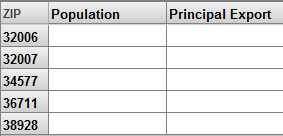
These properties do not have values for this level.
In pivot tables, properties are different from measures in several ways:
-
Properties can have string values.
-
Properties have values only for the level in which they are defined.
Depending on how a cube is defined, properties can also affect the sorting and the member names of the level to which they belong. There are examples later in this tutorial.
Listings
This part of the tutorial demonstrates listings, which display selected records from the lowest-level data for the selected cell or cells. To see how these work, we will first create a pivot table that uses a very small number of records. Then when we display the listing, we will be able to compare it easily to the aggregate value of the cell from which we started.
-
Click New.
-
Drag and drop Patient Count and Avg Test Score to Measures.
-
Expand the AgeD dimension in the Model Contents pane.
-
Expand the Age level.
-
Drag and drop the member 0 to Columns. This member refers to all patients who are less than 1 year old.
Note that you must click the member name rather than the icon to its left.
The system displays something like the following:
-
Drag and drop the member 1 to Columns, below the member 0.
The system displays something like the following:
-
Expand the BirthTD dimension.
-
Drag and drop the Birth Time level to Rows.
The system displays something like the following:
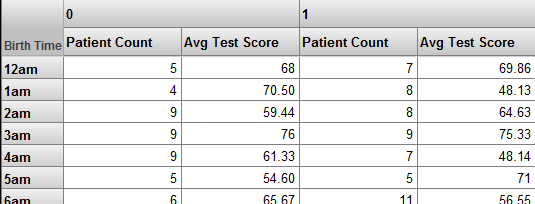
-
Click a cell. For example, click the Patient Count cell in the 12am row, below 0.
-
Click the Display Listing button
 .
.The system considers the selected context, which in this case is patients under 1 year old, who were born between midnight and 1 am. The system then executes an SQL query against the source data. This query includes selected fields for these patients, as follows:
-
Count the number of rows displayed. This equals the Patient Count value in the row you started from.
-
Click the Display Table button
 to redisplay the pivot table in its original state.
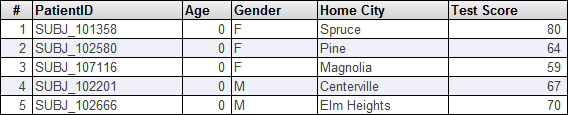
By default, the Patients cube uses a listing called Patient details, which includes the fields PatientID, Age, Gender, and others, as you just saw. You can display other listings as well.
-
Click the Pivot Options button
to display options for this pivot table.The system displays a dialog box.
-
For the Listing drop-down list, click Doctor details and then click OK.
The Doctor details listing displays information about the primary care physicians for the selected patients.
-
Click the same cell that you clicked earlier and then click the Display Listing button
. Now the system displays something like the following:
Filters and Members
In a typical pivot table, you use members as rows, as columns, or both, as seen earlier in this chapter. Another common use for members is to enable you to filter the data.
-
In the Analyzer, click New.
-
Expand ColorD and Favorite Color.
-
Drag and drop Favorite Color to Rows.
The system displays something like the following:
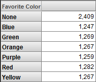
This pivot table displays the members of the Favorite Color as rows. The measure shown is Count, which is a count of patients.
-
Drag and drop Red to Filters.
The Analyzer now shows only one member of the Favorite Color level. You see something like this:
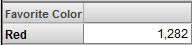
Make a note of the total number of patients.
-
Click the X button in the Rows box.
-
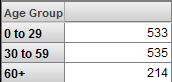
Expand AgeD.
-
Drag and drop Age Group to Rows.
The Analyzer now displays something like this:
-
Click the Pivot Options button
. -
In the Row Options area, click the Summary check box, leave Sum selected in the drop-down list, and then click OK.
The Analyzer now displays something like this:
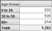
The Total line displays the sum of the numbers in the column. Notice that the total here is the same as shown earlier.
You can use any member as a filter for any pivot table, no matter what the pivot table uses for rows (or for columns). In all cases, the system retrieves only the records associated with the given member.
You can use multiple members as filters, and you can combine filters. For details, see Using the DeepSee Analyzer.
Filters and Searchable Measures
In DeepSee, you can define searchable measures. With such a measure, you can apply a filter that considers the values at the level of the source record itself.
-
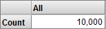
Click New.
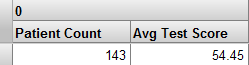
The system displays the count of all patients:
-
Click the Advanced Options button
 in the Filters box.
 -
Click Add Condition. Then you see this:
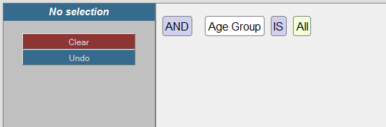
-
Click Age Group, which enables you to edit this part of the expression.
The dialog box now looks something like this:
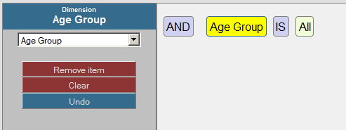
-
Click the drop-down list on the left, scroll down, and click Measures.Encounter Count. As soon as you do, the expression is updated. For example:
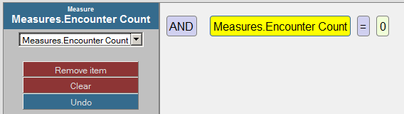
-
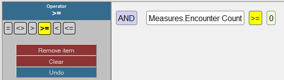
Click the = operator, which enables you to edit this part of the expression.
The dialog box now looks something like this:
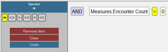
-
Click the >= operator. As soon as you do, the expression is updated. For example:
-
Click 0, which enables you to edit this part of the expression.
The dialog box now looks something like this:
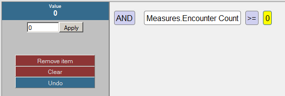
-
Type 10 into the field and click Apply.
-
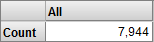
Click OK.
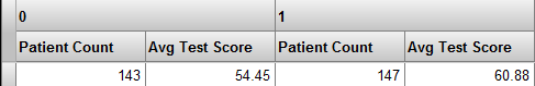
The system then displays the total count of all patients who have at least ten encounters:
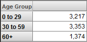
Now let us see the effect of adding a level to the pivot table.
-
Expand the AgeD dimension in the Model Contents pane.
-
Drag and drop Age Group to Rows.
The system displays something like the following:
-
Click the Pivot Options button
. -
In the Row Options area, click the Summary check box, leave Sum selected in the drop-down list, and then click OK.
-
Click OK.
The Analyzer now displays something like this:
The Total line displays the sum of the numbers in the column. Notice that the total here is the same as shown earlier.