<dateText>
<dateText>
The <dateText> control is essentially a combo box. It displays a text box as well as a button that, when pressed, displays a popup calendar. When the user enters a value into the text area of this control, Zen either converts this value into the closest matching date value, or it displays an invalid date message. As a comparison, see the <dateSelect> component.
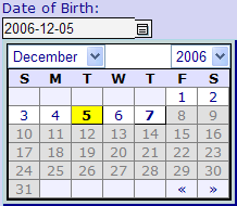
A Zen <dateText> component looks like this:
<dateText> has the following attributes:
| Attribute | Description |
|---|---|
| Control component attributes | <dateText> has the same general-purpose attributes as any Zen control. For descriptions, see the section “Control Attributes.” On the client, the <dateText> value is a string in the format YYYY-MM-DD. On the server, the <dateText> value has the %Timestamp datatype. However, you can change what the user sees in the <dateText> display; see the format and separator attributes. |
| dayList |
Comma-separated list of day abbreviations to show at the top of the calendar. If you do not provide a dayList value, the default is: $$$Text("S,M,T,W,T,F,S") The dayList attribute has its ZENLOCALIZE datatype parameter set to 1 (true). This makes it easy to localize its text into other languages, and permits use of the $$$Text macros when you assign values to this property from client-side or server-side code. Any localized dayList string must remain a comma-separated list. |
| defaultTime |
Provides a default value for the time portion of the <dateText> control value. The defaultTime is used as the initial time displayed in the popup calendar if the following conditions are met:
The calendar itself defaults to a time value of "01:00:00" when a time is not specified or when the date value passed is invalid. |
| firstDayOfWeek | Number (Sunday=0, Saturday=6) that specifies which day of the week is displayed as the starting day of the week. The default is 0 (Sunday). |
| format |
String that specifies the display format for this component. The internal value of this control is always YYYY-MM-DD, but you can change what the user sees. The default is "YMD". Possible values are:
The value supplied for format can be a literal string, or it can contain a Zen #()# runtime expression. |
| invalidDateMessage |
Message displayed by control when the date entered by the user fails validation. The default is: $$$Text("Invalid Date","%ZEN"); Although you can enter ordinary text for this attribute, it has the underlying data type %ZEN.Datatype.captionOpens in a new tab. See “Zen Attribute Data Types.” |
| maxDate |
String in the format YYYY-MM-DD (datatype %Timestamp on the server). If specified, this is the latest date the <dateText> accepts as its value. The maxDate value does not affect which years are displayed by the calendar unless endYear is omitted. The value supplied for maxDate can be a literal string, or it can contain a Zen #()# runtime expression. |
| minDate |
String in the format YYYY-MM-DD (datatype %Timestamp on the server). If specified, this is the earliest date the <dateText> accepts as its value. The minDate value does not affect which years are displayed by the calendar unless startYear is omitted. The value supplied for minDate can be a literal string, or it can contain a Zen #()# runtime expression. |
| monthList |
Comma-separated list of month names to display in the list of months that the user can choose from the calendar. If you do not provide a monthList value, the default is: $$$Text("January,February,March,April,May,June,July,August,September,October,November,December") monthList has its ZENLOCALIZE datatype parameter set to 1 (true). This makes it easy to localize its text into other languages, and permits use of the $$$Text macros when you assign values to this property from client-side or server-side code. Any localized monthList string must remain a comma-separated list. |
| separator |
Separator character to use between date segments. The default is the hyphen character (-). if the user enters the forward slash (/) instead of a hyphen, the <dateText> component accepts it, but the hyphen is the expected format. As an alternative to the default hyphen, you can use the separator attribute to specify some other character as the date separator. If time is also displayed, the time portion of the date is always separated from the data portion using the colon (:). |
| showTime |
If true, this component displays a text entry field below the main calendar. In the example above, showTime is true. The default is false. The user can enter a time of day in the showTime field using the 24–hour time format HH:MM:SS. When the form is submitted, the <calendar> value accepts both date and time values in the following ODBC/JDBC timestamp format: YYYY-MM-DD HH:MM:SS showTime has the underlying data type %ZEN.Datatype.booleanOpens in a new tab. See “Zen Attribute Data Types.” |
| size | HTML width of the text input area for this control. The default is 15. |
| timeCaption |
Caption text for the showTime field. If you do not provide a timeCaption value, the default is: $$$Text("Time:") Although you can enter ordinary text for this attribute, it has the underlying data type %ZEN.Datatype.captionOpens in a new tab. See “Zen Attribute Data Types.” |
| value |
You can access the value property of a dateText control programmatically. When you do this, it bypasses the date matching function that Zen provides when the user sets the date by typing text in the input field. |