Zen Style
The chapter “Zen Layout” explains how to place Zen components on the page. To do this, you provide an XData Contents block in the page class and fill it with XML elements that represent Zen components.
This chapter explains how to specify styles for Zen components. You can do this by:
-
Setting style attributes while placing XML elements in the XData Contents block.
-
Applying Cascading Style Sheet (CSS) style definitions in an XData Style block.
-
Referencing external CSS files in a variety of ways.
Component Style Attributes
All Zen components provide the XML attributes listed in the following table. These attributes control how a component appears within its enclosing group. For attributes that control component behavior, see the “Behavior” section in the chapter “Zen Component Concepts.”
| Attribute | Description |
|---|---|
| align | Possible values are "left", "right", or "center". This becomes the align value for the <td> element that contains the child component in the generated HTML. |
| condition | Server-side expression that, if true, allows this component to be added to the set of page components. This server-only attribute is not defined on the client side. |
| containerStyle |
Overrides the parent group’s cellStyle, to provide extra padding or alignment values for the <td> element that contains the child component in the generated HTML. containerStyle is a string containing a CSS style statement such as: "color:red; background: yellow;" |
| enclosingClass | Name of a CSS style class. When Zen lays out this group, it applies this style to the component’s enclosing <div> element. |
| enclosingStyle |
String containing a CSS style statement such as: "color:red; background: yellow;" When Zen lays out this group, it applies this style to the component’s enclosing <div> element. |
| height | CSS length value (integer or percentage). This becomes the height value for the <td> element that contains the child component in the generated HTML. |
| hidden |
If true, the component is hidden (placed on the page, but not displayed). If the status of a component is hidden, its label text (if any) is also hidden. The default is false. This attribute has the underlying data type %ZEN.Datatype.booleanOpens in a new tab. It has the value "true" or "false" in XData Contents, 1 or 0 in server-side code, true or false in client-side code. The hidden value can be a literal string, or it can contain a Zen #()# runtime expression. |
| hint |
The hint attribute supplies additional text that displays below the component. The hint text can be styled, using the hintClass and hintStyle attributes. Although you can enter ordinary text for this attribute, it has the underlying data type %ZEN.Datatype.captionOpens in a new tab. This makes it easy to localize its text into other languages, as long as a language DOMAIN parameter is defined in the Zen page class. The %ZEN.Datatype.captionOpens in a new tab data type also enables you to use $$$Text macros when you assign values to the label property from client-side or server-side code. |
| hintClass | CSS class to apply to the hint. |
| hintStyle | CSS style to apply to the hint. |
| id | This value can be used to select a CSS style definition for the component. It becomes the id value for the component’s enclosing <div> element. |
| import |
Comma-separated list of additional component classes that this component needs to have defined on the client side. Use import for cases in which the client needs classes that are not directly defined in the original object tree. When constructing the import string, use the full package and class name for each class in the list, and be sure that there are no space characters between any items in the list. The correct format is as follows: import="ZENDemo.Component.demoMenu,ZENTest.customComponent" This server-only attribute is not defined on the client side. |
| label |
A text label for the component. The component simply supplies the label text. Styles for laying out this label are the responsibility of the component’s parent group. For details about this, see the showLabel description in this section. Although you can enter ordinary text for this attribute, it has the underlying data type %ZEN.Datatype.captionOpens in a new tab. This makes it easy to localize its text into other languages, as long as a language DOMAIN parameter is defined in the Zen page class. The %ZEN.Datatype.captionOpens in a new tab data type also enables you to use $$$Text macros when you assign values to the label property from client-side or server-side code. |
| labelClass | Name of a CSS style class. When Zen lays out this group, it applies this style to the label displayed for the component. |
| labelStyle |
String containing a CSS style statement such as: "color:red; background: yellow;" When Zen lays out this group, it applies this style to the label displayed for the component. |
| name | Specifies the name of the component. Typically, this is used to identify a control within a form. See the “Zen Forms” chapter in Using Zen Components. |
| resource |
Server-side expression that determines if this component should be added to the set of page components. This server-only attribute is not defined on the client side. If a resource is specified, the current user must hold USE privileges on this resource or the component is not added to the set of page components. If you are not familiar with Caché resources, see the “Assets and Resources” chapter in the Caché Security Administration Guide. |
| showLabel |
If true, Zen displays the label for this component. If false, it does not. The default is true. The showLabel attribute has the underlying data type %ZEN.Datatype.booleanOpens in a new tab. It has the value "true" or "false" in XData Contents, 1 or 0 in server-side code, true or false in client-side code. For information of the interaction of showLabel with a containing group, see the discussion that follows this table. |
| slice | Used when this component’s parent group has a cellSize value of "stretch", slice is an integer value indicating the size of this component relative to other components within the group. Zen computes this size by dividing this component’s slice value by the sum of all slice values for all child components in the same group. The minimum value for slice is 0. |
| title |
Help text that displays as a tooltip when the user hovers the mouse over this component (or its label). Also see the hint attribute. Although you can enter ordinary text for this attribute, it has the underlying data type %ZEN.Datatype.captionOpens in a new tab. This makes it easy to localize its text into other languages, as long as a language DOMAIN parameter is defined in the Zen page class. The %ZEN.Datatype.captionOpens in a new tab data type also enables you to use $$$Text macros when you assign values to the title property from client-side or server-side code. |
| valign | Possible values are "top", "bottom", or "middle". This becomes the valign value for the <td> element that contains the child component in the generated HTML. |
| width | CSS length value (integer or percentage). It may be "*" to indicate that the element should take up the remaining space in the layout table. This becomes the width value for the <td> element that contains the child component in the generated HTML. |
If a component, such as a control, is displayed within a group, such as a form, the component’s label and showLabel attributes interact with the group’s layout, labelPosition, and cellStyle attributes.
Suppose the group has:
-
layout set to "vertical" (the default)
-
labelPosition set to "left"
-
cellStyle with some CSS style definitions
<form labelPosition="left" cellStyle="padding: 4px;">
  <text label="Name" hint="Last Name, First"/>
    Enter your city using the field below:
  <text label="City"/>
  <button caption="Save"/>
</form>
Then while laying out the page, the Zen layout manager adds the space allocated for the child component’s label to the total width allowed for the component within the group. Any style information in the cellStyle for the group also applies to the table cell that has been reserved for laying out the component label.
This is the case even when showLabel is false for that component (that is, if no label actually appears in the space allowed for it). You can use this to your advantage in laying out different areas within a group.
For more about layout, labelPosition, and cellStyle, see “Group Layout and Style Attributes” in the chapter “Zen Layout.”
You can apply component style attributes while placing the component in the XData Contents block. The following example applies the style attributes valign, height, and width to the Zen components <vgroup> and <spacer>:
XData Contents [XMLNamespace="http://www.intersystems.com/zen"]
  {
    <page xmlns="http://www.intersystems.com/zen" title="HelpDesk">
      <html id="title">My Title</html>
      <hgroup>
        <vgroup valign="top">
          <pane paneName="menuPane"/>
        </vgroup>
        <spacer width="20"/>
        <vgroup width="100%" valign="top">
          <pane paneName="tablePane"/>
          <spacer height="20"/>
          <pane paneName="detailPane"/>
        </vgroup>
      </hgroup>
    </page>
  }
Enclosing <div> Element
To facilitate use of CSS styles as well as dynamic HTML, every Zen component that you place on a Zen page is enclosed within an <div> element on the generated HTML page. This is the enclosing <div> for the component.
If you have assigned a specific value to the component’s id attribute, this becomes the HTML id of the enclosing <div>. This convention makes it possible to directly select the enclosing element from a CSS style sheet. For example, suppose you define a button as follows:
<button id="myButton" caption="Press Me" onclick="zenPage.btnClick();"/>
You could then use the following CSS definition in your page’s XData Style block, to set the color of this button:
XData Style
{
<style type="text/css">
#myButton input {
    color: red;
}
</style>
}
When a component is within a composite component, the conventions for creating an HTML id are a bit different. Zen prepends the composite’s id string to the name used for the component. If the composite does not have an id, Zen manufactures one by prepending the letters id to the index number of the component on the page.
It is also possible to work with a component’s enclosing <div> programmatically. Every component has a client-side getEnclosingDiv method that returns the HTML <div> element that Zen is using as the component’s enclosing <div>. The following example retrieves the value of div by first invoking the client-side function zen with the id specified in the component definition, and then invoking the client-side component method getEnclosingDiv:
ClientMethod GiveMyButtonStyleToAbc() [ Language = javascript ]
{
  var comp = zen('abc');
  var div = comp.getEnclosingDiv();

  // div is an HTML div element
  div.className = 'myButton';
}
XData Style
Any Zen component class, page class, or application class can provide an XData Style block to define CSS styles. The “Zen Tutorial” chapter introduced XData Style when it displayed the skeleton class generated by the New Zen Application wizard, as follows:
Class MyApp.MyNewApp Extends %ZEN.application
{

  /// This is the name of this application.
  Parameter APPLICATIONNAME = "My New Zen Application";

  /// This is the URL of the main starting page of this application.
  Parameter HOMEPAGE = "";

  /// This Style block contains application-wide CSS style definitions.
  XData Style
  {
    <style type="text/css">
    </style>
  }
}
To define styles for the application class shown above, you would add CSS statements between the <style type="text/css"> tag and the closing </style> tag.
The following example shows an XData Style block in a page class. This class defines styles in the XData Style block and then references them from XData Contents by using the id attribute with components. The following example defines and then references the styles title, vg1, and vg2.
Class MyApp.MyNewPage Extends %ZEN.Component.page
{

  /// Class name of application this page belongs to.
  Parameter APPLICATION = "MyApp.MyNewApp";

  /// Displayed name of this page.
  Parameter PAGENAME = "My Home Page";

  /// Domain used for localization.
  Parameter DOMAIN = "";

  /// This Style block contains page-specific CSS style definitions.
  XData Style
  {
    <style type="text/css">
    /* style for title bar */
    #title {
      background: #C5D6D6;
      color: black;
      font-family: Verdana;
      font-size: 1.5em;
      font-weight: bold;
      padding: 5px;
      border-bottom: 1px solid black;
      text-align: center;
    }

    #vg1 {
      border-right: 1px solid black;
       background: #E0E0FF;
      height: 600px;
    }

    #vg2 {
    }
    </style>
  }

  /// This XML block defines the contents of this page.
  XData Contents [XMLNamespace="http://www.intersystems.com/zen"]
  {
    <page xmlns="http://www.intersystems.com/zen" title="My Page">
      <html id="title">Title</html>
      <hgroup width="100%">
        <vgroup id="vg1" width="200px">
        </vgroup>
        <vgroup id="vg2" width="*">
        </vgroup>
      </hgroup>
    </page>
  }
}
Inheritance of Styles
The following table explains the effect of class inheritance on XData Style.
| Parent Defines XData Style | Child Defines XData Style | Result |
|---|---|---|
| Yes | No | Child inherits XData Style from the parent. |
| Yes | Yes | Child inherits all of the styles defined in the XData Style block of the parent class. If any of these styles are redefined in the child class, the style definition in the child class takes precedence. |
| No | Yes | Child uses its own XData Style definition. |
| No | No | Some parent of both classes probably defines XData Style. If not, the browser applies its own style defaults. |
Style inheritance does not cross over the boundaries of class inheritance. A <page> is a component, but no component actually inherits from <page>. So a component that appears on a page within an application does not override any of the style definitions in the XData Style block in either the page class or the application class. The XData Style blocks provided by the component class, page class, and application class all coexist, subject to the rules described in the section “Cascade of Styles.”
Cascade of Styles
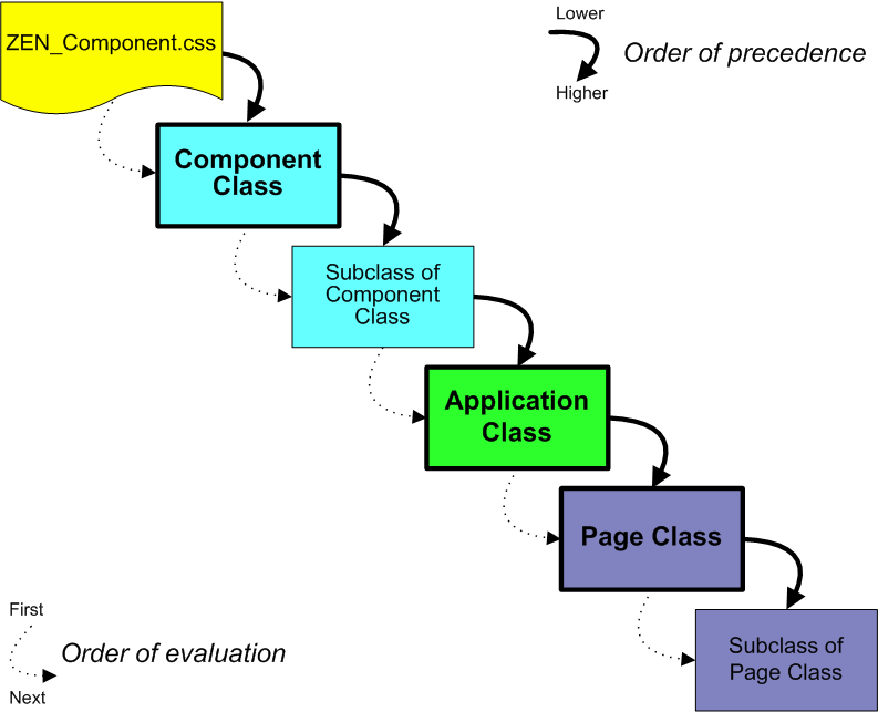
When a Zen page constructs itself, it collects all the CSS style information that you have provided for each component on the page, and applies it to the component. There may be many sources for this information: page classes, application classes, and component classes. Zen applies the information in these sources in the following order. Note that when conflicts exist, the styles that are defined last take precedence:
-
Styles defined by the CSS files for the Zen component library. The filenames have the form:ZEN_Component_*.css.
-
Styles defined by base component classes.
The default styles for the built-in Zen components are provided via an XData Style block in the corresponding %ZEN.Component class (or one of its parents). However, if you want to change the style of a built-in Zen component, do not edit the class directly. Either subclass the component to create a custom component, or override the corresponding style definitions in the page or application class.
-
Styles defined by subclasses of base component classes (that is, custom components).
Any subclass of %ZEN.Component.componentOpens in a new tab can provide an XData Style block. If the child has an XData Style block, this replaces the XData Style from the parent class. If not, the child inherits XData Style from the parent.
-
Styles defined within the application class for the current application. These may come from any of the following sources. Styles from each source are evaluated in the sequential order as shown:
-
An XData Style block containing CSS statements
-
A reference to an external CSS file using the CSSINCLUDES parameter.
-
-
Styles defined within the template page class (if there is one for the current page). These may come from any of the following sources. Styles from each source are evaluated in the sequential order as shown:
-
A reference to an external CSS file using the CSSINCLUDES parameter
-
An XData Style block containing CSS statements
-
Style attributes in XData Contents. For an individual component, these may provide:
-
Simple values for HTML attributes, such as "300" for height
-
Literal CSS statements, such as "color:red; background: yellow;")
-
The name of a CSS style that is defined somewhere in the cascade of styles
-
-
-
Styles defined within the page class. For example:
-
A reference to an external CSS file using the CSSINCLUDES parameter
-
An XData Style block containing CSS statements
-
Style attributes in XData Contents. For an individual component, these may provide:
-
Simple values for HTML attributes, such as "300" for height
-
Literal CSS statements, such as "color:red; background: yellow;")
-
The name of a CSS style that is defined somewhere in the cascade of styles
-
-
The following diagram gives a general idea of where styles originate. For details, see the previous list.
This order of precedence makes it easier to ensure a consistent “look and feel” for your application. You can override the style definition within the application class (for an application-wide style override), within a template page class (to override a value for a suite of pages) or within an ordinary page class (to override a value for a specific page).
However, it is important to note that this order of precedence does not exactly match the hierarchy of these objects when ZEN constructs the page for display. Compare this discussion and diagram with the “Zen Applications” section in the chapter “Zen Application Concepts.”
Overriding Built-in Styles
Suppose you want to override the style of a built-in Zen component such as <tablePane>. There is no requirement to do this, but once you get your table onto the page, you might discover that you want to change its appearance. If so, you must override the CSS styles for <tablePane>. To accomplish this, you need to know:
-
The name of the CSS style definition that you want to change
-
Where, in the cascade of styles, you want to interject changes to this style
-
Which technique you want to use to apply changes to the style:
-
Referencing an external CSS file from a Zen class
-
Providing an XData Style block in a Zen class
-
The following XData Style block changes the background color, border style, and font family choices for a CSS rule called table.tpTable. How did the developer choose this rule to change? How does this XData Style block fit into the cascade of styles? And why did the developer choose to provide an XData Style block rather than an external CSS file? The next several sections provide answers.
XData Style
{
<style type="text/css">
       table.tpTable {
         background: green;
         border: 1px solid red;
         font-family: courier new;
       }
</style>
}
Finding the CSS Style Name
You can determine which CSS rules to override for a specific Zen component as follows:
-
Somewhere in the inheritance tree for each Zen component, there is an XData Style block that defines the CSS rules for this component. To find the correct one, usually you must know something about the inheritance of the component class. For example, %ZEN.Component.tablePaneOpens in a new tab inherits from %ZEN.Component.simpleTablePaneOpens in a new tab. It is the simpleTablePane class that contains the relevant XData Style block. There is no XData Style block in the tablePane class.
You can use the online class documentation to trace inheritance. Start the documentation in one of the following ways:
-
From Studio, choose Tools > Class Browser. Under the %ZEN.Component package, find the class you are interested in. Right-click on the class name and choose Documentation.
-
Start the InterSystems online documentation. Choose Class Reference from the navigation bar near the top of the page. Choose the %SYS namespace and %ZEN.Component package. Click on the class name.
Once you have found the documentation page for the class of interest, see if it inherits from another Zen component class. If so, the XData Style block is probably in the parent class. You can click on the parent class name to navigate to its documentation page.
-
-
When you know the class name of the component you want to research, you need to view its CSS style definitions. You can do this in one of the following ways:
-
In Studio, run the Zen Style Wizard to see if the component or its parent are listed. The Zen Style Wizard is the easiest way to modify styles. It does not include every style, but lists the most popular styles for modification. simpleTablePane is there, with the entry:
table.tpTable
Described as:
Main table for tablePane
-
In Studio, in the %SYS namespace and %ZEN.Component package, open the component class for viewing. Find its XData Style block or that of its parent, and see what CSS rules it contains.
-
Examine the CSS files for the Zen component library. The files are located in the following directory, where C:\MyCache is the name of your installation directory:
C:\MyCache\CSP\broker\. The filenames have the form: ZEN_Component_*.css. The text following the underscore helps you determine which file to examine.
Search for the component name in the code comments. The styles that follow (until the next component name) are those for the component. For example:
/* %ZEN.Component.simpleTablePane */

/* table */
table.tpTable {
  background: white;;
  border: 1px solid black;
  font-family: arial;
  width: 100%;
  table-layout: fixed;
  empty-cells: show;
  }
-
Overriding a CSS Style Rule
Once you have found the CSS rule that applies to the component whose appearance you want to modify, you can override the CSS rule in one of two ways:
-
Referencing an external CSS file from a Zen application or page class
-
Providing an XData Style block in a Zen application, page, or custom component class
To effectively predict the results of your changes, keep in mind the order of precedence rules described in the “Cascade of Styles” section. The following table restates these rules in terms of the results that you are trying to accomplish.
| What to Accomplish | Where to Interject Style Changes |
|---|---|
| Application-wide styling rules. You can override these styles in template pages or in individual page classes. | Place the revised CSS rule in an external CSS file and reference from the application class using the CSSINCLUDES class parameter. |
| Place an XData Style block in the application class and place the revised CSS rule definition within it. You can either type rule syntax into XData Style or use the Zen Style Wizard for convenient style editing. If there are style conflicts between XData Style and CSSINCLUDES for the application, XData Style takes precedence. | |
| Styles that apply to a group of pages within an application. You can override these styles in individual page classes. | Create a template page class. Ensure that all the pages you want to have consistent style are subclasses of this template page. |
| Place the revised CSS rule in an external CSS file and reference from the template page class using the CSSINCLUDES class parameter. | |
| Place an XData Style block in the template page class and place the revised CSS rule definition within it. You can either type rule syntax into XData Style or use the Zen Style Wizard for convenient style editing. If there are style conflicts between XData Style and CSSINCLUDES for the template page class, XData Style takes precedence. | |
| Styles that apply to only one page within an application. | Place the revised CSS rule in an external CSS file and reference from the page class using the CSSINCLUDES class parameter. |
| Place an XData Style block in the page class and place the revised CSS rule definition within it. You can either type rule syntax into XData Style or use the Zen Style Wizard for convenient style editing. If there are style conflicts between XData Style and CSSINCLUDES for the page class, XData Style takes precedence. | |
| Styles that apply to all instances of a particular component. | Any styles defined in application or page classes automatically override styles defined in component classes, so for stylistic consistency and control you should make changes near the end of the cascade, in the application or page class, rather than in the component class. |
| However, if you wish, you may create a custom component that is a subclass of the built-in Zen component whose styles you wish to change. Place an XData Style block in the custom component class and place the revised CSS rule definition within this XData Style. You can either type rule syntax into XData Style or use the Zen Style Wizard for convenient style editing. | |
| In any case, do not edit the XData Style block in a built-in Zen component class or its parent. Do not edit the built-in stylesheet files. These files have names in the form: ZEN_Component_*.css. Changes of this kind are lost next time you upgrade the Caché server version. |
Applying New Styles
The above topics explain how to modify styles that are already in use by a built-in Zen component. If you want to define an entirely new CSS style (with a new name) and apply that style to a component, there are additional steps to perform. In that case you must not only subclass the component and define the CSS style, but also reference that CSS style from the portion of the subclass that renders the component on the page as HTML. For details about these steps, see the “Custom Components” chapter in the book Developing Zen Applications.