Editing the Report Layout
The Line Item Report Builder provides a graphical editor that lets you modify the default report format to improve the report output. The following section provides a brief introductory tutorial. The subsequent section describes the main elements of the Report Builder user interface.
Tutorial
In the following exercise, you create and modify the report layout for the data structure you defined in MyApp.MyReportDC.
-
Click DeepSee, Visual Reporting, Report Builder and then Line Item Report Builder.
-
Click New. The system displays a dialog box where you can enter the following values:
-
Package Name — MyApp
-
Class Name — MyReport
-
-
Click OK.
-
At the top of the Fields column, click Set source. The system displays a dialog box. Select the Data Collector you created previously, by clicking MyApp, then MyReportDC. At the top of the Fields column, click Auto-fill to create a default report.
-
Click Preview to view the default report.
-
In this step, you modify the report by removing the sysID data field.
-
In the Report Body section, select either the sysID data field, or field label.
-
Click Edit to open the editing toolbar, and click Cut.
-
The sysID data field disappears from the report. If you want to add a data field to the report, drag it from the Fields column.
-
-
Edit table properties.
Select a component in the Report Body section. A collection of tools for formatting tables in reports appears in the Properties column.
-
In the section labeled Borders and Dividers, select Toggle table border. It is the first selection in this section, and draws a border around the table.
-
In the section labeled Borders and Dividers, select Toggle zebra striping in body. It is the last selection in this section, and applies zebra stripe coloration to rows in the table.
-
-
Add an element to the report layout.
Drag $pageNum from the Fields column and drop it in the Page Footer section. You can position this element by dragging it, or by editing values in the Size and Position section of the Properties column.
-
Click Save.
-
Click Preview to see the effect of your modifications.
Line Item Report Builder UI
The Line Item Report Builder provides a single view, which shows the report layout. It provides the following buttons:
-
Open – Open an existing report
-
New – Create a new report
-
Save – Save the current report
-
Setup – Opens the Page Set-up Dialog, which you can use to set characteristics for the printed page.
-
Preview – Creates a preview of PDF output of the current report
The Page Set-up Dialog lets you set the following parameters of the physical page the report is printed on:
-
The Page size – Select a page size from the dropdown list. The list of available paper sizes can be configured for your system. See Customizing Paper Options.
-
The Orientation – Select “Portrait” or “Landscape”
-
The Margins – You can set all four margins with the spinner control or by typing in the text field. Units used for margins reflect the units used to specify the paper size.
-
The Running Headers – You can choose to omit running headers on the first page, last page, or both.
When a report is open in the editor, the page is organized into the following columns:
-
Fields – lets you select a data source, and displays the available data fields. The Auto-fill button creates a default report layout.
-
Layout – the area where you edit the report layout. The column is divided into sections that correspond to the layout sections of the report. Buttons at the top of the column provide access to graphical editing tools.
-
Properties – lets you edit graphical properties of the report component selected in the Layout column.
The next sections discuss the content and function of these columns.
Fields Column
The fields column is empty until you select a data collector for the report with the Set source button. Once you have selected a data source, the Fields column lists the data fields you defined when you created the data collector, along with the additional fields runTime, RunBy, and $pageNum. You can drag and drop fields from the Fields column into the report layout column. When you begin to drag a field, report sections where you cannot drop it turn gray.
The Auto-fill button populates the layout section with a default report layout based on the selected data source.
Layout Column
The layout column is where much of the report layout editing takes place. The Auto-fill button in the Fields column, creates a default report layout in the layout column, which you can use as a starting point. The layout column is divided into a number of sections, and provides a variety of tools and controls.
Toolbar Buttons
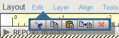
Buttons at the top of the column provide access to graphical editing tools. Click on the button to open a toolbar, click again to close it. Once the toolbar is open, you can drag it to another part of the page. The following image shows the edit toolbar open and docked with the Edit button:
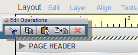
This image shows the edit toolbar after it has been dragged away from the Edit button:
The toolbars invoked by the editing buttons, and the tools they contain, are as follows:
-
Edit – tools for basic editing functions such as cut and paste:
-
 cut selection.
 -
 copy selection.
 -
 paste selection previously copied or cut.
 -
 duplicate selection.
 -
 delete selection.
-
-
Layer – tools to control z-order of objects in the report; for example, to put text in front of a filled rectangle.
-
 move to the back
 -
 move backward one level
 -
 move forward one level
 -
 move to the front
-
-
Align – tools to align, distribute, and size objects with respect to other objects. The object selected first in the selection group is the standard for alignment, centering, or adjusting height or width. Objects are spaced evenly between the right- and left-most (or top- and bottom-most) objects in the selection group.
-
 align left edges.
 -
 align top edges.
 -
 align right edges.
 -
 align bottom edges.
 -
 center horizontally.
 -
 center vertically.
 -
 apply equal horizontal spacing.
 -
 apply equal vertical spacing.
 -
 apply uniform height.
 -
 apply uniform width.
-
-
Tools – tools to perform graphical editing functions like moving report elements and adding text and graphics.
-
 select an object. shift-click to select multiple objects.
 -
 add text.
 -
 add an orthogonal line.
 -
 add a rectangle.
 -
 add a chart.
 -
 add a barcode.
 -
 add an image.
-
Configuring Charts, Barcodes and Images
When you add a chart, barcode, or image, the editor puts a placeholder object into the report. Right-click on the placeholder to open a dialog box that enables you to supply additional information about the object. The following sections describe how to configure these objects:
Chart
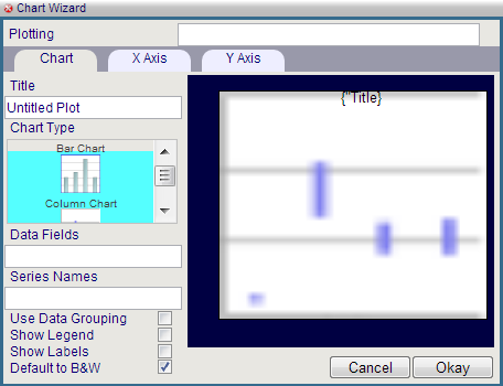
This image shows the chart configuration dialog.
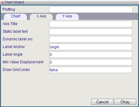
This image shows the dialog with the X-Axis tab active.
Barcode
This image shows the barcode configuration dialog.
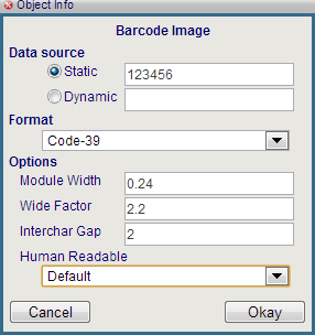
It is divided into the following sections:
-
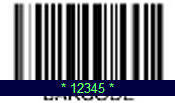
Data source – This section lets you specify whether the barcode displays static information, or a value from the database. To display a static value, select the Static radio button, and type the value into the text field. The barcode placeholder displays the value:
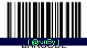
To display a value from the database, drag and drop a field name from the fields column. The upper-left corner of the field bounding box must be inside the bounding box of the placeholder. The placeholder then displays the XPATH expression the report uses to get data from that field:
You can also type the XPATH expression directly into the text field next to the Dynamic radio button.
-
Format – Select either Code-39 or Code-128.
-
Options – Specify options for the barcode, including whether it renders the value in human-readable text.
Image
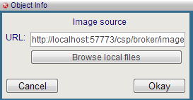
This image shows the image configuration dialog. You can specify an image by typing the URL into the text field, or by browsing for a local file.
Report Sections
The main area of the Layout column is divided into areas that correspond to the sections that make up a report. These sections are as follows:
-
Report Header
-
Page Header
-
Report Body
-
Report Footer
-
Page Footer
Each report section has a gray bar across the top of the section that contains a variety of controls. Not all sections contain all available controls. The following list describes these controls:
-
 add a section.
  /
/ expand/hide the section.
  Graphic banner layout. This is the only available layout for some report sections. It has the following characteristics:
-
Projects as an SVG graphic
-
Height is Fixed
-
Supports absolute positioning of elements
-
Supports layering of elements
-
Supports graphical elements such as bar codes, images, charts, and lines.
-
Rendering styles are static.
-
Text in long fields does not wrap.
-
Only available when processing XSL nodes, not node sets. When used to replace the rendering of a group body, the tool automatically renders one banner layout section per record in the data stream. In essence, it renders a banner layout for what would have been a row in a table.
-
-
 paragraph style layout. This layout has the following characteristics:
-
Projects as in ZSL-FO Block paragraph
-
Height is variable
-
Margins can be adjusted separately for each item
-
Text wraps automatically
-
Supports limited embedded style markers in data-driven elements
-
Does not support graphical elements
-
Inherently single column flow. No side by side, layering, or multi-column absolute positioning
-
Only available when processing XSL nodes, not node sets. When used to replace the rendering of a group body the tool automatically renders one paragraph layout section per record in the data stream. In essence, it renders a paragraph layout for what would have been a row in a table.
-
-
 name/value pair layout. This layout has the following characteristics:
-
Projects as an XSL-FO table
-
Height is variable
-
Text wraps automatically in table cells
-
Columns are Automatically aligned
-
Supports header repeat on multi-page tables
-
Rendering styles are static
-
No Graphical elements other than the table's own grid lines/backgrounds
-
Only available when processing XSL nodes, not node sets. When used to replace the rendering of a group body, the tool automatically renders one name-value pair layout per record. In essence, it renders a name-value pair layout for what would have been a row in a table.
-
-
 table layout. This layout has the following characteristics:
-
Projects as an XSL-FO table
-
Height is variable
-
Text wraps automatically in table cells
-
Columns are Automatically aligned
-
Supports zebra striping
-
Supports header repeat on multi-page tables
-
Rendering styles are static
-
No Graphical elements are allowed other than the table's own grid lines and backgrounds
-
Only available when processing XSL node sets (group bodies)
-
-
 Add or remove a page break at the end of the section. A line that looks like this:
  indicates a page break.
 -
 Add a conditional sub-section or running header.
 -
 Delete the section and its contents. You can restore the section by clicking on the gray bar, but the restored section is empty.
Properties Column
The properties column lets you specify the style attributes of objects in the layout column. The possible options are grouped according to the relevant style properties for various types of objects. The selection you make in the layout column determines what options are available in the properties column. The available options are as follows:
-
Fill Style: Lets you specify fill color and opacity. These options are also available for Line Style and Text Style.
-
 Opens a color picker from which you can select the fill color. The same icon is used to select color for lines and text.
 -
 Move the slider to select the opacity, from 100% (far right) to 0% (far left). The same icon is used to select opacity for lines and text.
-
-
Line Style: In addition to color and opacity, the Line Style group also lets you set the following properties.
-
 Lets you select the line width.
 -
 Lets you select the line style.
-
-
Text Style: In addition to color and opacity, the Text Style group also lets you set set the following properties.
-
 Lets you select bold, italic, or underlined text. Each button in this control toggles, and you can select more than one.
 -
 Lets you select the font size by either typing into the field, or using the spinner control.
 -
 Lets you select the paragraph justification.
 -
 Lets you select the font family by using the spinner control.
-
-
Borders and Dividers
-
 Toggles the border surrounding the table.
 -
 Toggles the border surrounding the table header.
 -
 Toggles the divider between table header and the table body.
 -
 Toggles the dividers between header columns.
 -
 Toggles the dividers between body columns.
 -
 Toggles the dividers between body rows.
 -
 Toggles zebra striping in the table body.
 -
 Opens a color picker that lets you select the alternate color for zebra striping.
-
-
Size and Position
-
 Lets you select the font size by either typing into the field, or using the spinner control.
-