Using XPath Charts in Zen Reports
Zen reports XPath charts is an older charting system which does not support the full functionality now available through Zen page charts. Zen reports continues to support it for backward compatibility. Callback charts provide a charting mechanism that fully duplicates the functionality of charts in Zen pages. See the section “Zen Reports Callback Charts”. The syntax for placing XPath charts in Zen reports is similar to the syntax for placing charts on Zen pages. See the “Zen Charts” chapter of Using Zen Components. Zen reports XPath charts differ from both Zen pages charts and Zen reports callback charts in the way they provide data to the chart. The section Providing Data for Zen Report XPath Charts describes how XPath charts acquire data. Note that XPath charts do not support the chartStacked attribute, and are not interactive.
If you combine xpath charts and call back charts in the same ZEN Report you can get unexpected results when using default colors because of CSS precedence.
Topics include:
XPath Chart Attributes in Zen Reports
When used in Zen reports, XPath chart elements support the following attributes.
| Attribute | Description |
|---|---|
| General display attributes | For descriptions of style, width, class, and other attributes, see the “Report Display Attributes” section in the chapter “Displaying Zen Report Data.” |
| Shared display attributes |
Zen charts and Zen report XPath charts use nearly identical syntax. Therefore, you can find most of the information you need about chart display attributes in the “Chart Layout, Style, and Behavior” section of the “Zen Charts” chapter of Using Zen Components. When you refer to Using Zen Components to verify the correct syntax for charts for Zen reports, ignore any documentation links to other sections for descriptions of SVG attributes or data gathering attributes. These do not apply to Zen report charts. Use only the attributes described in the section “Chart Layout, Style, and Behavior.” Zen report XPath charts do not support all the attributes supported by Zen charts. |
| Data source attributes | The topic, “Providing Data for Zen Report XPath Charts,” describes the chart attributes that identify the data to be displayed in a Zen report chart. These attributes work by identifying fields in the XML source data for the report. |
| Chart type attributes |
In addition to attributes described in “Chart Layout, Style, and Behavior” and “Providing Data for Zen Report XPath Charts,” some attributes apply only to charts of a specific type. For Zen report charts, these attributes are as follows:
|
| height |
HTML length value that specifies how much vertical space to allow to display this chart in the report. "2in", "5cm", "12px", "14pt", "3em", or "75%" are all valid formats for HTML length values. A percentage is relative to the parent element for the chart. Note that for pie charts, the height and width of the chart must be the same for the chart to be round. |
Providing Data for Zen Report XPath Charts
This section describes the attributes that identify the data displayed by a Zen report chart. You can apply these attributes to the chart elements in the XData ReportDisplay block of a Zen report class. If the attribute value begins with an exclamation mark (!), it provides an XPath expression that identifies a value in the XML data source. Values that do not begin with ! supply literal values.
The following code example shows dataFields and seriesNames specified as XPath expressions:
 <barChart
  dataFields="!@AdultPrice,!@ChildPrice"
  seriesGroup="Theater"
  seriesNames="!@TheaterName" />
For details on how to gather XML source data, see the chapter “Gathering Zen Report Data”. For examples that show XData ReportDefinition and XData ReportDisplay working together to provide data for a Zen report chart, see the “Examples of Zen Report XPath Charts” section, later in this chapter.
Charts in Zen pages do not support the attributes described in this section. The attributes in this section apply only to charts in Zen reports. For the corresponding information that applies to Zen charts, see “Providing Data for Zen Page Charts” in the “Zen Charts” chapter of Using Zen Components.
Within a Zen report XData ReportDisplay block, the chart elements support the following attributes for specifying a data source for a Zen report chart.
| Attribute | Description |
|---|---|
| dataFields |
All charts: Comma-separated list of one or more XPath expressions. These expressions identify nodes in the XML data source which are used to create the chart. Each XPath expression must be preceded by a ! character. Pie charts: A pie chart uses only the first data field in the dataFields list. It totals the values in this field, then makes the size of the pie slice for each value proportional to its percentage of the total. |
| dataGroup |
Line chart and bar chart: Specifies an XPath expression that identifies a node in the XML data source that contains the nodes identified by dataFields. The value cannot be preceded by a ! character. dataGroup and seriesGroup are mutually exclusive. For an explanation of the differences between dataGroup and seriesGroup, see the section “dataGroup and seriesGroup” in this chapter. Pie charts, difference charts, high/low charts, scatter charts: Not a valid option, seriesGroup is required. |
| seriesColors |
seriesColors provides a comma-separated list of one or more CSS color values to use when plotting the chart. The colors can be literal color names, or they can be provided as an XPath expression. XPath expressions must be preceded by a ! character. If you do not supply a seriesColors value, the default is: "blue,red,green,yellow,orange,plum,purple" If a chart needs more colors than seriesColors provides, the list of colors automatically repeats. |
| seriesCount | Number of data series to display on this chart. The number can be a literal value, or an XPath expression beginning with a ! character. If seriesCount is not provided or is set to a blank string (""), the count is computed automatically from the chart’s data source. |
| seriesGroup |
All charts: Specifies an XPath expression that identifies a node in the XML data source that contains the nodes identified by dataFields. The value cannot be preceded by a ! character. Bar charts and line charts: can use seriesGroup or dataGroup. dataGroup and seriesGroup are mutually exclusive. Pie charts, difference charts, high/low charts, scatter charts: seriesGroup is required. For an explanation of the differences between dataGroup and seriesGroup, see the section “dataGroup and seriesGroup” in this chapter. |
| seriesNames |
All charts: Provides names used to label each data series in the legend box. If you specify a seriesGroup, you can use either an XPath expression beginning with a ! character, or a comma-separated list of literal values. Do not mix XPath expressions and literal values. If you specify a dataGroup, use literal values for seriesNames. Pie charts: If you do not set labelValues, seriesNames provides labels for the pie slices and the legend box. |
| seriesSize | Number of items within each data series to display on this chart. The number can be a literal value, or an XPath expression beginning with a ! character. If seriesSize is not provided or is set to a blank string (""), the chart computes this number automatically from its data source. |
Chart Axes in Zen Reports
Charts in a Zen report may contain <xaxis> and <yaxis> elements. The syntax for these elements is nearly identical to that used on Zen pages. The majority of Zen reports charts are plotted using two axes as follows:
-
<xaxis> is the category axis; it names the categories in which data is being displayed.
-
<yaxis> is the value axis; it displays the value of the data in each category.
These relationships are reversed in the case of a pivoted chart. The <xyChart>, also called a scatter chart, uses value axis for both the <xaxis> and <yaxis> elements. A <pieChart> does not have axes.
Capitalization is important. On Zen pages the elements are <xAxis> and <yAxis>, but in Zen reports the elements are <xaxis> and <yaxis>. Studio catches typographical differences like these as you type and compile your classes.
When used in Zen reports, <xaxis> and <yaxis> support the following attributes:
| Attribute | Description |
|---|---|
| Shared axis attributes |
General-purpose attributes for chart axes. For descriptions, see the section “Chart Axes” in the “Zen Charts” chapter of Using Zen Components. The exception is that when chartPivot is true, it is not possible to rotate label text for Zen report axis labels, so in this case labelAngle has no effect. |
| labelDisplacement |
Decimal value that specifies the amount of extra space to allow between the row of text labels and the axis itself. A labelDisplacement value is useful to make extra vertical space for text labels between the <xaxis> and the plot area. This space becomes important when a labelAngle is set to rotate the text labels. When chartPivot is true, you can create extra horizontal space for text labels between the <yaxis> and the plot area by increasing the marginLeft value for the chart. In this case, labelDisplacement does not apply. If labelDisplacement is missing or blank (""), no extra space is allowed. |
| labelGroup |
Specifies an XPath expression that identifies a node in the XML data source that contains the nodes identified by labelValue. Use with labelValue. For an example, see the section “Line Chart with Multiple Data Points.” If you supply a value for labelValues, labelGroup and labelValue are ignored. If you supply no value for labelGroup, labelValue, or labelValues, a sequential number labels each item on the category axis: 1, 2, 3, etc. Specifying a labelGroup and labelValue on a value axis suppresses normal numeric labeling of the axis. |
| labelValue |
An XPath expression that identifies a node in the XML data source that provides label values for the category axis (this is the x-axis, unless the chart is pivoted). The node specified provides a set of label values that are applied one to each item on the category axis. If labelValue does not identify as many values as there are points on the category axis, then the remaining items are not labeled. Use with labelGroup. For an example, see the section “Line Chart with Multiple Data Points.” If you supply a value for labelValues, labelGroup and labelValue are ignored. If you supply no value for labelGroup, labelValue, or labelValues, a sequential number labels each item on the category axis: 1, 2, 3, etc. Specifying a labelGroup and labelValue on a value axis suppresses normal numeric labeling of the axis. |
| labelValues |
Comma-separated list of one or more label values for the category axis. Should not contain an XPath expression that begins with !. Provides literal values for slice names in a pieChart. For examples using labelValues, see the sections “Bar Chart with One Data Series” and “Pivoted Bar Chart with Multiple Data Points.” If you supply a value for labelValues, labelGroup and labelValue are ignored. If you supply no value for labelGroup, labelValue, or labelValues, a sequential number labels each item on the category axis: 1, 2, 3, etc. |
| maxValueDisplacement |
Positive or negative floating point number that permits fine adjustments to the maximum value represented on this axis. The number provided for maxValueDisplacement may or may not end with a percentage symbol (%). When the maxValue for this axis:
When using the maxValueDisplacement value, Zen calculates the maximum value represented on this axis as follows
|
| minValueDisplacement |
Positive or negative floating point number that permits fine adjustments to the minimum value represented on this axis. The number provided for minValueDisplacement may or may not end with a percentage symbol (%). When the minValue for this axis:
When using the minValueDisplacement value, Zen calculates the minimum value represented on this axis as follows
|
| textAnchor |
When you supply a value for labelAngle, the textAnchor value determines the rotation point for the text string that forms each axis label. If you set no textAnchor value, the default is "middle" which rotates the labels around the center of each text string. You can also set textAnchor to "start" which rotates the labels around the start of each text string, or to "end" which rotates the labels around the end of each text string. For information about labelAngle and other axis settings shared by Zen and Zen reports, see “Chart Axes” in the “Zen Charts” chapter of Using Zen Components. |
dataGroup and seriesGroup
Both <barChart> and <lineChart> allow you to use either a dataGroup or a seriesGroup attribute to provide an XPath expression that identifies the node in the XML data source that supplies values to the chart. All other chart types require seriesGroup. A chart using dataGroup organizes and displays the data differently from a chart that uses seriesGroup. The following examples illustrate these differences.
<lineChart> using dataGroup
The following XData ReportDisplay block:
XData ReportDisplay [ XMLNamespace = "http://www.intersystems.com/zen/report/display" ]
{
<report xmlns="http://www.intersystems.com/zen/report/display"
name="test">
<body>
<lineChart
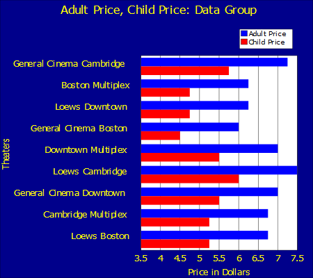
title="Adult Price, Child Price: Data Group"
dataGroup ="Theater"
dataFields="!@AdultPrice,!@ChildPrice"
seriesNames ="Adult Price, Child Price"
width ="450px"
height="500px"
marginTop="20"
marginBottom="45"
marginLeft="15"
marginRight="10"
legendVisible="true"
legendWidth="18"
legendX="70"
legendY="10"
>
<xaxis
labelGroup="Theater" labelValue="@TheaterName"
labelAngle="90" textAnchor="begin"
title="Theaters" />
<yaxis title="Price in Dollars" />
</lineChart>
</body>
</report>
}
Defines the following line chart:
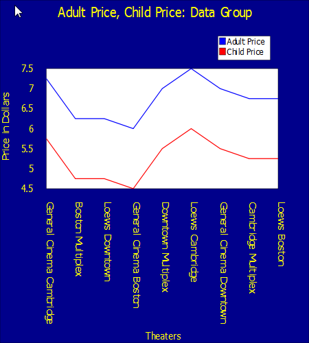
The primary difference between dataGroup and seriesGroup is in how the data is grouped for presentation. You can see that this chart presents the values specified by !@AdultPrice in the dataFields attribute as one line, and the values specified by !@ChildPrice as a second line. If additional data is available in the data set, you can use it to label the category (x) axis. In this example, the values from the !@TheaterName attribute label the x axis.
The following illustration shows how a chart usingdataGroup groups values in the XML data source.
<lineChart> using seriesGroup
The following XData ReportDisplay block:
XData ReportDisplay [ XMLNamespace = "http://www.intersystems.com/zen/report/display" ]
{
<report xmlns="http://www.intersystems.com/zen/report/display"
name="test">
<body>
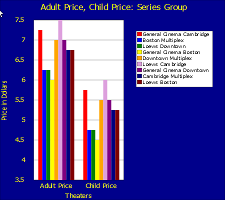
<lineChart title="Adult Price, Child Price: Series Group"
seriesGroup="Theater"
dataFields="!@AdultPrice,!@ChildPrice"
seriesNames="!@TheaterName"
seriesColors ="red,blue,green,yellow,orange,plum,purple,navy,maroon"
width ="450px"
height="400px"
marginTop="10"
marginLeft="10"
marginRight="45"
legendVisible="true"
legendWidth="35"
legendX="60"
legendY="14"
>
<xaxis
labelValues="Adult Price, Child Price"
textAnchor="begin" />
</lineChart>
</body>
</report>
}
Defines the following line chart:
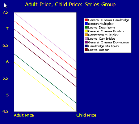
You can see that this chart draws a line for each of the !@AdultPrice / !@ChildPrice pairs in the data set. In this example, you cannot see all of the lines, because some of them have duplicate values. If additional data is available in the data set, you can use it to identify the lines by color in the chart legend. In this example, the values from the !@TheaterName attribute identify the lines.
The following illustration shows how a chart usingseriesGroup groups values in the XML data source.
<barChart> using dataGroup
The following XData ReportDisplay block:
XData ReportDisplay [ XMLNamespace = "http://www.intersystems.com/zen/report/display" ]
{
<report xmlns="http://www.intersystems.com/zen/report/display"
        name="test">
  <body>
    <barChart title="Adult Price, Child Price: Data Group"
      dataGroup="Theater"
      dataFields="!@AdultPrice, !@ChildPrice"
      seriesNames="Adult Price, Child Price"
      width ="450px"
      height="400px"
      marginTop="20"
      marginBottom="10"
      marginLeft="45"
      marginRight="5"
      chartPivot="true"
      legendVisible="true"
      legendWidth="18"
      legendX="76"
      legendY="10"
      >
      <yaxis
        labelGroup="Theater"
        labelValue="@TheaterName"
        title="Theaters"
        textAnchor="end"
      />
      <xaxis title="Price in Dollars" minValueDisplacement="-25%" majorGridLines="true"/>
    </barChart>
  </body>
</report>
}
Defines the following line chart:
You can see that this chart presents the values specified by !@AdultPrice in the dataFields attribute as one set of bars, and the values specified by !@ChildPrice as a second set. The pairs of bars are grouped by data node, as the points are grouped in the corresponding <lineChart>. If additional data is available in the data set, you can use it to label the category axis, which is the y axis in this example because the chart is pivoted. In this example, the values from the !@TheaterName attribute label the category axis.
<barChart> using seriesGroup
The following XData ReportDisplay block:
XData ReportDisplay [ XMLNamespace = "http://www.intersystems.com/zen/report/display" ]
{
<report xmlns="http://www.intersystems.com/zen/report/display"
        name="test">
  <body>
    <barChart title="Adult Price, Child Price: Series Group"
      seriesGroup="Theater"
      dataFields="!@AdultPrice, !@ChildPrice"
      seriesNames="!@TheaterName"
      seriesColors ="red,blue,green,yellow,orange,plum,purple,navy,maroon"
      width ="450px"
      height="400px"
      marginTop="10"
      marginBottom="10"
      marginLeft="15"
      marginRight="45"
      legendVisible="true"
      legendWidth="35"
      legendX="60"
      legendY="15"
      >
      <yaxis
       title="Price in Dollars"
        minValueDisplacement="-25%" majorGridLines="true"/>
      <xaxis
       labelValues="Adult Price, Child Price"
       title="Theaters"
      />
    </barChart>
  </body>
</report>
}
Defines the following line chart:
You can see that this chart draws a bar for each of the !@AdultPrice / !@ChildPrice pairs in the data set. The bars representing !@AdultPrice values are grouped together, as are the bars representing !@ChildPrice values. If additional data is available in the data set, you can use it to identify the bars by color in the chart legend. In this example, the values from the !@TheaterName attribute identify the bars.
Examples of Zen Report XPath Charts
This section provides several examples of line charts and bar charts. Each chart presents information from the same source in a different way. The information comes from the Cinema application in the SAMPLES database. If you want to use this code, place it in a Zen report class that resides in the SAMPLES namespace. You can also adjust the example so that it matches the data in your own Caché application.
The following XData ReportDefinition block provides data for all of the example charts:
XData ReportDefinition
[ XMLNamespace = "http://www.intersystems.com/zen/report/definition" ]
{
<report
 xmlns="http://www.intersystems.com/zen/report/definition"
 name="test"
 sql="Select Top 10 TheaterName, AdultPrice, ChildPrice from Cinema.Theater"
 >
  <group name="Theater">
    <attribute name="TheaterName" field="TheaterName" />
    <attribute name="AdultPrice" field="AdultPrice" />
    <attribute name="ChildPrice" field="ChildPrice" />
  </group>
</report>
}
It produces the following XML output:
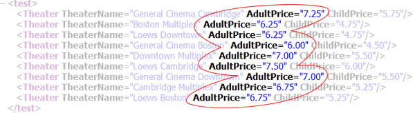
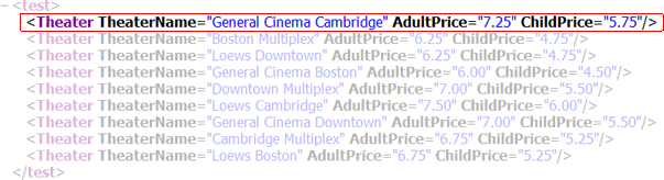
<test>
  <Theater TheaterName="General Cinema Cambridge"
   AdultPrice="7.25" ChildPrice="5.75"/>
  <Theater TheaterName="Boston Multiplex"
   AdultPrice="7.75" ChildPrice="6.25"/>
  <Theater TheaterName="Loews Downtown"
   AdultPrice="7.00" ChildPrice="5.50"/>
  <Theater TheaterName="General Cinema Boston"
   AdultPrice="7.00" ChildPrice="5.50"/>
  <Theater TheaterName="Downtown Multiplex"
   AdultPrice="7.00" ChildPrice="5.50"/>
  <Theater TheaterName="Loews Cambridge"
   AdultPrice="6.25" ChildPrice="4.75"/>
  <Theater TheaterName="General Cinema Downtown"
   AdultPrice="6.25" ChildPrice="4.75"/>
  <Theater TheaterName="Cambridge Multiplex"
   AdultPrice="6.75" ChildPrice="5.75"/>
  <Theater TheaterName="Loews Boston"
   AdultPrice="6.75" ChildPrice="5.75"/>
</test>
This XData ReportDefinition block supports the XData ReportDisplay syntax shown in the following examples.
Bar Chart with One Data Series
The following XData ReportDisplay block:
XData ReportDisplay
[ XMLNamespace = "http://www.intersystems.com/zen/report/display" ]
{
<report xmlns="http://www.intersystems.com/zen/report/display"
name="test">
<body>
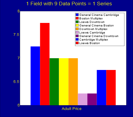
<barChart title="1 Field with 9 Data Points = 1 Series"
dataFields="!@AdultPrice"
seriesGroup="Theater"
seriesNames="!@TheaterName"
width ="450px"
height="400px"
marginTop="10"
marginLeft="15"
marginRight="5"
legendVisible="true"
legendWidth="38"
legendX="56"
legendY="11"
>
<xaxis labelValues="Adult Price" />
</barChart>
</body>
</report>
}
Defines the following bar chart:
For the XData ReportDefinition block that supplies the data, see the Examples of Zen Report XPath Charts. To learn more about specific <barChart> attributes, see the section “XPath Chart Attributes in Zen Reports.”
The data series for this chart comes from the values of the AdultPrice attribute in the XData ReportDefinition block. There are 9 theaters that have AdultPrice values, so there are 9 data points to display in the series. The reason that this is considered a series, rather than a set of data points, is that the <barChart> identifies its data source using the seriesGroup attribute in combination with the dataFields attribute.
The seriesNames attribute gives a text label to each legend entry in this chart. As the legend shows, these labels apply to the individual data points in the series. There is one series in this chart, so the <xaxis> labelValues attribute provides one label for the entire data series. A later example, Bar Chart with Two Data Series, shows two series, one for AdultPrice and one for ChildPrice.
Because this chart is based on a series, varying colors for the bars are assigned automatically using a set of 7 default colors. Since there are more than 7 bars, the colors repeat for the eighth and ninth bars. You can use the seriesColors attribute to specify a different set of colors.
See Legends for information on the legendX and legendY attributes.
Line Chart with Multiple Data Points
The following XData ReportDisplay block:
XData ReportDisplay
[ XMLNamespace = "http://www.intersystems.com/zen/report/display" ]
{
<report xmlns="http://www.intersystems.com/zen/report/display"
name="test">
<body>
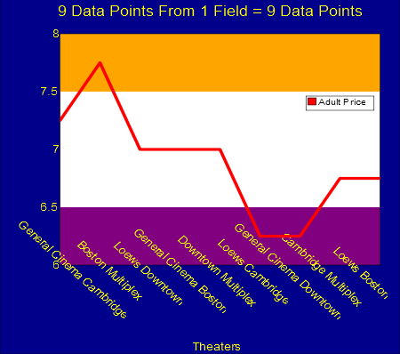
<lineChart title="9 Data Points From 1 Field = 9 Data Points"
dataGroup="Theater"
dataFields="!@AdultPrice"
seriesNames="Adult Price"
seriesColors="red"
plotStyle="stroke-width:0.8"
plotToEdge="false"
width ="450px"
height="400px"
marginTop="10"
marginBottom="25"
marginLeft="15"
marginRight="5"
bandUpper="7.5"
bandUpperStyle="fill:orange"
bandLower="6.5"
bandLowerStyle="fill:purple"
legendVisible="true"
legendWidth="18"
legendX="76"
legendY="27"
>
<xaxis
labelAngle="45"
labelGroup="Theater" labelValue="@TheaterName"
title="Theaters"/>
</lineChart>
</body>
</report>
}
Defines the following bar chart:
For the XData ReportDefinition block that supplies the data, see the Examples of Zen Report XPath Charts. To learn more about specific <lineChart> attributes, see the section “XPath Chart Attributes in Zen Reports.”
The 9 individual data points for this chart come from the values of the AdultPrice attribute in the XData ReportDefinition block. There are 9 theaters that have AdultPrice values, so there are 9 data points to display. The reason this is not considered a series is that the <lineChart> does not use the seriesGroup attribute to identify its data source. Instead, it identifies a dataGroup and dataFields.
A single seriesColors value specifies which color to use when charting the 9 data points in this chart. plotStyle specifies more styling details such as the line width. Setting plotToEdge to false tells the chart to keep all values inside the plot area, rather than plotting the last value at the outside edge. For added visual interest, bandUpper and bandLower define solid bands of background color above and below the typical range of values in this chart.
The seriesNames attribute is required to give a text label to the legend in this chart. This label applies to the full set of individual data points, so its color matches the single seriesColors value for the chart. The x-axis provides one label for each data point in the set. The report generates labels for each entry along the x-axis by using the <xaxis> labelGroup and labelValue attributes to get the appropriate text strings from the data source.
The <xaxis> title attribute provides the title shown at the bottom of the display. The marginBottom value for this chart is larger than usual to create the extra space needed at the bottom of the plot area above the x-axis title; this makes room for the rotated text strings that label the x-axis. The labelAngle specifies the clockwise angle of rotation for text labels, which in this case is 45 degrees. The rotation occurs around the center of the text string. If you wish to create more vertical space for these strings, you can add a labelDisplacement value, but this example does not do so.
See Legends for information on the legendX and legendY attributes.
Pivoted Bar Chart with Multiple Data Points
The following XData ReportDisplay block:
XData ReportDisplay
[ XMLNamespace = "http://www.intersystems.com/zen/report/display" ]
{
<report xmlns="http://www.intersystems.com/zen/report/display"
        name="test">
  <body>
    <barChart title="9 Data Points From 1 Field = 9 Data Points"

      dataGroup="Theater"
      dataFields="!@AdultPrice"
      seriesNames="Adult Price"

      width ="450px"
      height="400px"

      marginTop="10"
      marginLeft="25"
      marginRight="5"

      chartPivot="true"

      legendVisible="true"
      legendWidth="18"
      legendX="76"
      legendY="84"
      >
      <yaxis
        labelValues="GenCinCam,BosMulti,LoewsDown,GenCinBos,
          DownMulti,LoewsCam,GenCinDown,CamMulti,LoewsBos,"
        title="Theaters"
      />
    </barChart>
  </body>
</report>
}
Defines the following bar chart:
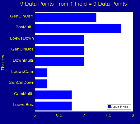
For the XData ReportDefinition block that supplies the data, see Examples of Zen Report XPath Charts. To learn more about specific <barChart> attributes, see the section “XPath Chart Attributes in Zen Reports.”
The 9 individual data points for this chart come from the values of the AdultPrice attribute in the XData ReportDefinition block. There are 9 theaters that have AdultPrice values, so there are 9 data points to display. The reason this is not considered a series is that the <barChart> does not use the seriesGroup attribute to identify its data source. Instead, it identifies a dataGroup and dataFields.
A single seriesColors value would be required to specify which color to use when charting the 9 data points in this chart. Since no seriesColors value is supplied, the chart uses the first color in its list of default charting colors, which is blue. The seriesNames attribute is required to give a text label to the legend in this chart. This label applies to the full set of individual data points, so its color matches the single seriesColors value for the chart.
Because chartPivot is set to true, the chart is pivoted so the x-axis, rather than the y-axis, displays the AdultPrice values. This design decision gives the y-axis the responsibility of providing one label for each data point in the set. This chart assigns literal labels to each entry along the y-axis by using the <yaxis> labelValues attribute with a comma-separated list of names. The <yaxis> title attribute provides the axis title shown at farthest left in the display.
See Legends for information on the legendX and legendY attributes.
Pie Chart with One Data Series
The following XData ReportDisplay block:
XData ReportDisplay [ XMLNamespace = "http://www.intersystems.com/zen/report/display" ]
{
<report xmlns="http://www.intersystems.com/zen/report/display"
        name="test">
  <body>
    <pieChart title="Adult Price"
      dataFields="!@AdultPrice"
      seriesGroup ="Theater"
      seriesNames ="!@TheaterName"
      seriesColors ="blue,red,green,yellow,orange,plum,purple,brown,navy"
      width ="400px"
      height="400px"
      marginTop="10"
      marginBottom="10"
      marginLeft="10"
      marginRight="10"
      legendVisible="false"
      labelStyle="font-family:arial"
    >
    </pieChart>
  </body>
</report>
}
Defines the following bar chart:
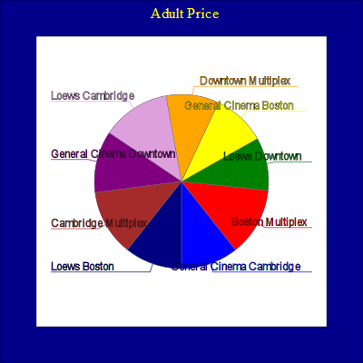
For the XData ReportDefinition block that supplies the data, see the Examples of Zen Report XPath Charts. To learn more about specific <pieChart> attributes, see the section “XPath Chart Attributes in Zen Reports.”
The data series for this chart comes from the values of the AdultPrice attribute in the XData ReportDefinition block. There are 9 theaters that have AdultPrice values, so there are 9 data points to display in the series. The <pieChart> identifies its data source using the seriesGroup attribute in combination with the dataFields attribute.
The seriesNames attribute gives a text label to each of the pie slices in this chart. The labeling of objects in the chart is a unique feature of <pieChart> that is not available for other charts. You should not use literal values for seriesNames. However, as for all types of chart, the seriesNames attribute also provides the same set of text labels for the chart legend.
The legend is not visible by default. If you set the labelValues attribute for the <pieChart> to a comma-separated list of labels, the chart uses labelValues to label the pie slices, and seriesNames to fill in the legend box. In this case, you can use legendVisible to display both the legend and the pie slice labels.
Providing values for the seriesColors attribute for this <pieChart> makes the chart easier to read. The default color set for series provides only 7 values, after which the colors repeat. In a <pieChart>, the repetition of colors 1 and 2 for slices 8 and 9 can be confusing when the circle wraps around to slices 1 and 2.
Bar Chart with Two Data Series
The following XData ReportDisplay block:
XData ReportDisplay
[ XMLNamespace = "http://www.intersystems.com/zen/report/display" ]
{
<report xmlns="http://www.intersystems.com/zen/report/display"
        name="test">
  <body>
    <barChart title="2 Fields with 9 Data Points Each = 2 Series"

      dataFields="!@AdultPrice,!@ChildPrice"
      seriesGroup ="Theater"
      seriesNames ="!@TheaterName"
      seriesColors ="blue,red,green,yellow,orange,plum,purple,brown,navy"

      width ="450px"
      height="400px"
      marginTop="10"
      marginLeft="15"
      marginRight="5"

      legendVisible="true"
      legendWidth="38"
      legendX="56"
      legendY="11"
      >
      <xaxis labelValues="Adult Price,Child Price" title="Theaters"/>
    </barChart>
  </body>
</report>
}
Defines the following bar chart:
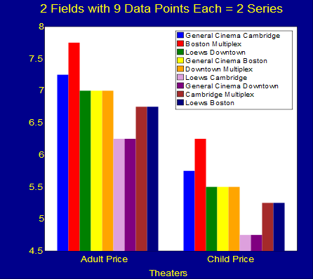
For the XData ReportDefinition block that supplies the data, see the Examples of Zen Report XPath Charts. To learn more about specific <barChart> attributes, see the section “XPath Chart Attributes in Zen Reports.”
The data series for this chart comes from the values of the AdultPrice and ChildPrice attributes in the XData ReportDefinition block. There are 9 theaters, so there are 9 data points to display in each series. The <barChart> identifies its data source using the seriesGroup attribute in combination with the dataFields attribute.
The seriesNames attribute gives a text label to each legend entry in this chart. As the legend shows, these labels apply to the individual data points in each series. As a counterpoint to the legend, the x-axis provides one label for each series, rather than for each data point. There are two series in this chart, so the <xaxis> labelValues attribute provides one label for each series in a comma-separated list.
It is useful to provide a seriesColors attribute for this <barChart> because the default color set for series provides only 7 values, after which the colors repeat. Defining an eighth and ninth color makes the chart easier to read because every color in the chart is unique. It is also possible to simply let the 7 default colors repeat, as shown in the example of a bar chart with only one series.
See Legends for information on the legendX and legendY attributes.