Zen Charts
This chapter explains how to place a chart on a Zen page. Every chart is an SVG component as described in the chapter “Zen and SVG” and is derived from the class %ZEN.SVGComponent.svgComponentOpens in a new tab. Charts follow the layout and style conventions for SVG components, but add specific behaviors of their own.
Zen reports callback charts use the same syntax as Zen pages to display charts. Callback charts are defined in the package %ZEN.Report.Display.COSChart, and all of the chart element names begin with the letter “c”, for example, <cbarChart>. See “Using Callback Charts in Zen Reports”. Syntax described in sections “Types of Chart,” “Chart Layout, Style, and Behavior” and “Chart Axes” applies equally well to charts in Zen pages and callback charts in Zen reports. XPath charts is an older implementation of charting in Zen reports which uses syntax different from Zen pages. See “Using XPath Charts in Zen Reports”.
Techniques for providing data for charts in Zen pages are different from both callback charts and XPath charts in Zen reports. See “Providing Data for Zen Page Charts” in this book and “Providing Data for Zen Report Charts” in the book Using Zen Reports.
The base chart class %ZEN.SVGComponent.chartOpens in a new tab defines the data, grid (axes and scales), styles, and legend used by charts. You can think of charts as occupying a virtual coordinate space that measures 100 units by 100 units. Internally, charts are plotted in terms of pixels, which allows you to specify size and positioning parameters in pixels as well as in terms of the virtual coordinate space. See “Specifying Size and Position.” Within the total space occupied by the chart, there is a smaller plot area where the chart plots the data. Margins define the space around the plot area. Generally you use these margins as space in which to display the labels and legend for the chart.
This chapter begins by introducing the various types of chart, so that you can look at some visual examples and think about the items you want to display on the Zen page, before reading the exact details of how to use a specific type of chart. Chapter topics appear in this order:
Types of Chart
This topic describes and illustrates the types of chart that you can place on the Zen page. Each description includes the unique attributes that define that type of chart. For attributes that all charts share in common, see the sections “Providing Data for Zen Page Charts” and “Chart Layout, Style, and Behavior.”
Zen offers the following built-in chart types:
Bar Charts
A <barChart> displays one or more data series as a set of vertical or horizontal bars. The following figure shows a Zen bar chart displaying data from three data series.
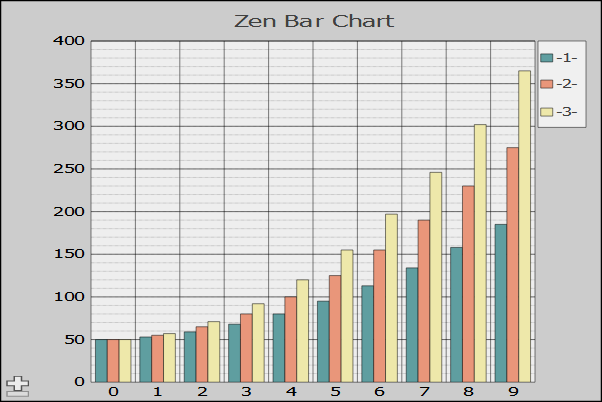
<barChart> has the following attributes:
| Attribute | Description |
|---|---|
| Chart attributes |
<barChart> has the same general-purpose attributes as any chart. For descriptions, see the sections “Providing Data for Zen Page Charts” and “Chart Layout, Style, and Behavior.” The plotToEdge attribute is always false for <barChart>. The <yAxis> baseValue attribute is used to plot the bottom of the bars. For details, see the section “Chart Axes.” |
| chartStacked |
If true, the bars at each position along the category axis are stacked atop one another (values are additive). See “chartStacked.” |
| endTime |
The end time for a timeBased x-axis. |
| showMultiples |
If true, display the chart as a number of small charts, one per data series. See “showMultiples”. |
| startTime |
The start time for a timeBased x-axis. |
| timeBased |
Specifies that the x-axis is a time line. See “timeBased.” |
Bubble Charts
A <bubbleChart> displays data as circles or “bubbles” positioned at x and y coordinates. It requires a minimum of two data series. The first series supplies x values and the second supplies y values. When used to chart only two data series, <bubbleChart> is effectively an <xyChart>. <bubbleChart> does not support chartPivot
If you supply a third series, the chart uses that data to draw the radius of each bubble. Values in the radius series are scaled and multiplied by the value of the radius property.
The following figure shows a chart with x, y and radius data series. Note how the default partial transparency of the bubbles lets you see the shapes even when they overlap. The property opacity controls this characteristic. Note also that in this example, the value of showQuadrant is true, so the chart area is divided into quadrants.
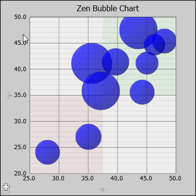
You can supply up to two additional data series. The fourth series determines how colors are applied to the data bubbles, and the fifth controls opacity of bubbles.
Values in the fourth, or color data series can be any arbitrary data. The chart establishes color categories for each new value encountered in the series, and assigns the colors to corresponding bubbles on the chart. The chart uses the colors that are currently in effect, see seriesColors and seriesColorScheme.
The following code fragment shows the part of an ongetData handler that sets up a color data series.
/// Callback to provide data for bubble chart.
ClientMethod getBubbleChartData(series) [ Language = javascript ]
{
  var chart = zenPage.getComponentById('chart');
  var data = new Array(chart.seriesSize);

  // ...code omitted...

  if (series == 3) // color
  {
    for (var i = 0; i < chart.seriesSize; i++)
    {
      data[i] = (i%3)?"group 1":"group 2"
    }
  }
  return data;
}
The following figure shows the resulting chart, with colors applied to randomly generated data. Note that in this chart, the value of showRegression is true, so the chart contains a computed linear regression line, and showQuadrant is false, so the chart does not show quadrants. The property lineStyle provides a style specification for the regression line.
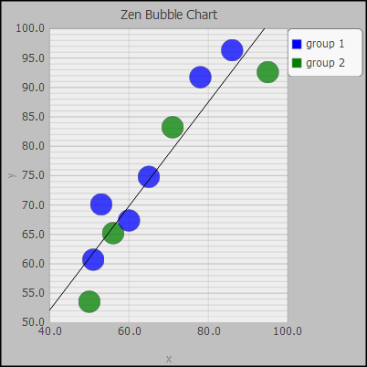
Values in the fifth, or opacity data series can be any arbitrary data. Values in the opacity series are scaled and multiplied by the value of the opacity property. Values are not normalized, so a large range in values can result in the smallest values being driven to 0 and becoming invisible.
/// Callback to provide data for bubble chart.
ClientMethod getBubbleChartData(series) [ Language = javascript ]
{
  var chart = zenPage.getComponentById('chart');
  var data = new Array(chart.seriesSize);

  // ...code omitted...

  if (series == 4) // opacity
   {
     data[1] = 1;
     data[2] = 4;
     data[3] = 1;
     data[4] = 1;
     data[5] = 4;
     data[6] = 1;
     data[7] = 4;
     data[8] = 4;
     data[9] = 4;
   }
   return data;
}
The following figure shows the resulting chart, with opacity applied to random generated data. Note also that the quadrants have been modified by setting the property xCenterValue, and the properties upperRightStyle and lowerLeftStyle have been used to modify the quadrant colors.
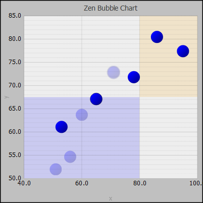
<bubbleChart> has the following attributes:
| Attribute | Description |
|---|---|
| Chart attributes |
<bubbleChart> has the same general-purpose attributes as any chart. For descriptions, see the sections “Providing Data for Zen Page Charts” and “Chart Layout, Style, and Behavior.” |
| lineStyle |
SVG CSS style definition applied to the regression line. |
| lowerLeftStyle |
CSS style value to be applied to the lower left quadrant background. |
| opacity |
Default opacity (from 0 to 1) for bubbles. If you have provided an opacity series, its values are scaled and multiplied by this value. Values in the opacity series are not normalized. |
| radius |
Default radius (in logical units) for bubbles. If you have provided a radius series, its values are scaled and multiplied by this value. |
| showQuadrant |
If true, then divide the plot area into quadrants, and apply color to the upper right and lower left quadrants. The default value is true, and the default colors are red in the upper right quadrant, and green in the lower left.. |
| showRegression |
If true, then draw a computed linear regression line. |
| xCenterValue |
The x-axis value to use when drawing background quadrants. The default value is the center of the x-axis. |
| yCenterValue |
The y-axis value to use when drawing background quadrants. The default value is the center of the y-axis. |
| upperRightStyle |
CSS style value to be applied to the upper right quadrant background. |
Bullseye Charts
A <bullseyeChart> displays data items as concentric circles.
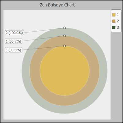
Bullseye charts are often used in situations where the largest circle shows the entire data set, the next circle shows data items that meet some relevant set of criteria, and the next circle shows data items that meet additional criteria. For example, if the largest circle shows the total number of patients in a study, the next circle might show patients with diabetes, and the smallest diabetic patients undergoing a specific treatment.
Combo Charts
A <comboChart> displays multiple data series in a single chart, using area, bar and line charts. The following figure illustrates all three chart types.
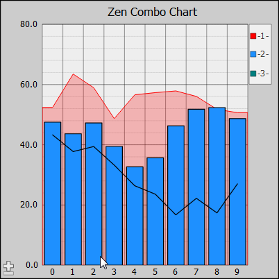
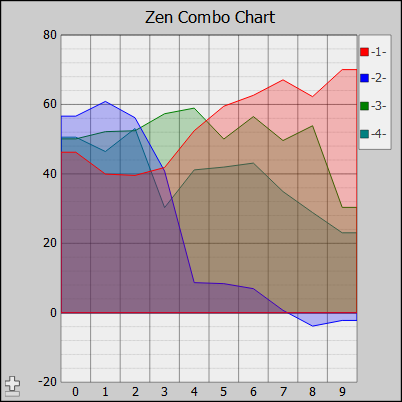
You can use other chart elements to plot multiple data series using a single type of chart, but <comboChart> sometimes offers advantages. For example, you can chart multiple filled line charts using <lineChart>, but <comboChart> may be a better choice, because it renders area charts with partial transparency, so all of the chart areas are visible, even when they overlap.
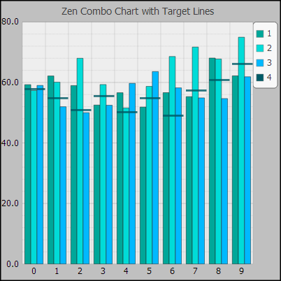
You can also use the attribute seriesTypes to display one of the data series as target lines. The following figure shows a chart where the fourth data series supplies target lines.
<comboChart> supports the following attributes:
| Attribute | Description |
|---|---|
| Chart attributes |
<comboChart> has the same general-purpose attributes as any chart. For descriptions, see the sections “Providing Data for Zen Page Charts” and “Chart Layout, Style, and Behavior.” |
| chartPivot |
If true, pivot the chart (display categories vertically and values horizontally). See “chartPivot.” |
| endTime |
The end time for a timeBased x-axis. |
| lineStyle |
SVG CSS style definition applied to lines in the chart. |
| seriesTypes |
Comma-delimited list of types that indicates how the corresponding series in the chart should be displayed. Possible types are: “line”, “area”, “bar”, and “target”. The default type is bar. If the type is “target”, the corresponding data series is used to put target lines on the chart. Area charts are rendered with partial transparency and placed behind all other chart types. Line charts are rendered in front of bar charts. |
| startTime |
The start time for a timeBased x-axis. |
| timeBased |
Specifies that the x-axis is a time line. See “timeBased.” |
Difference Charts
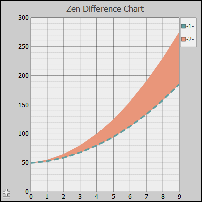
A <diffChart> is a specialized type of line chart that highlights the difference between two data series:
-
The first series provides a set of reference data values.
-
The second data series provides values that you want to compare to the reference data set.
The <diffChart> shades the area between the two series using the color of the second data series. To further distinguish between the series, the chart draws a line representing the reference series across the shaded area of the chart. This line uses the color of the first, or reference data series, and can take additional styling from the refLineStyle attribute. <diffChart> does not support chartPivot.
The following figure shows a difference chart:
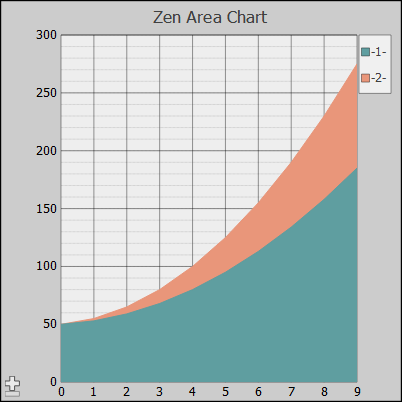
For comparison, the following figure shows the same data plotted as a filled line (area) chart:
<diffChart> has the following attributes:
| Attribute | Description |
|---|---|
| Chart attributes | <diffChart> has the same general-purpose attributes as any chart. For descriptions, see the sections “Providing Data for Zen Page Charts” and “Chart Layout, Style, and Behavior.” |
| refLineStyle |
SVG CSS style definition for the reference line. By default, this line uses the color assigned to the reference (first) data series, but typically it also assigns some patterning using refLineStyle. The default is: stroke-dasharray: 1,1; The difference chart in the previous figure shows: stroke-dasharray: 2,2; stroke-width: 1%; |
High/Low Charts
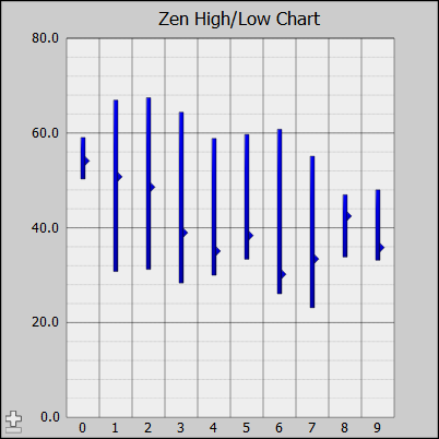
A <hilowChart> can be used to show stock market high-low-close values, or to trace a measured value along with its high and low ranges to indicate possible error margins. The chart displays a set of bars as established by three data series:
-
A series of high values sets the top (right) limit of each bar.
-
A series of low values sets the bottom (left) limit of each bar.
-
(Optional) The “closing” values. The chart places a marker on each bar at these values.
Each low value is assumed to be smaller than its corresponding high value. Each closing value is assumed to be between its corresponding high and low values. The chart uses its first seriesColors value to plot all bars and marker. It ignores the colors provided for the other series.
<hilowChart> has the following attributes:
| Attribute | Description |
|---|---|
| Chart attributes | <hilowChart> has the same general-purpose attributes as any Zen chart. For descriptions, see the sections “Providing Data for Zen Page Charts” and “Chart Layout, Style, and Behavior.” The plotToEdge attribute is always false for <hilowChart>. |
| chartPivot |
If true, pivot the chart (display categories vertically and values horizontally). See “chartPivot.” |
| invertedBarStyle |
SVG CSS style definition. Specifies the style used for bars where the high value is less than the low value. |
Line Charts
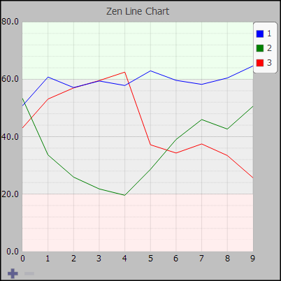
A <lineChart> displays one or more data series as a set of lines. The following figure shows a simple line chart.
<lineChart> has the following attributes:
| Attribute | Description |
|---|---|
| Chart attributes | <lineChart> has the same general-purpose attributes as any chart. For descriptions, see the sections “Providing Data for Zen Page Charts” and “Chart Layout, Style, and Behavior.” |
| chartFilled |
If true, the area under each line is filled (as in an area chart). If false, it is not filled (as in a line chart). This attribute has the underlying data type %ZEN.Datatype.booleanOpens in a new tab. See “Zen Attribute Data Types.” |
| chartPivot |
If true, pivot the chart (display categories vertically and values horizontally). See “chartPivot.” |
| chartStacked |
If true, the bars at each position along the category axis are stacked atop one another (values are additive). See “chartStacked.” |
| endTime |
The end time for a timeBased x-axis. |
| lineStyle |
SVG CSS style definition applied to lines in the chart. A color specified in this attribute takes precedence over colors specified in seriesColors. |
| showMultiples |
If true, display the chart as a number of small charts, one per data series. See “showMultiples.” |
| startTime |
The start time for a timeBased x-axis. |
| timeBased |
Specifies that the x-axis is a time line. See “timeBased.” |
Percent Bar Charts
A <percentbarChart> displays each data series as a bar in the chart. All the bars are the same height, and represent 100% of the values in the series. Bands in the bar represent items in the series, and are sized proportional to that items contribution to the total. This method of handling data series is similar to a <pieChart> when plotBy="both", except that the pie chart also shows the relative contribution of each series. See “Pie Charts by Items.”
You can use ongetLabelX to provide labels for the bars, and seriesNames to provide labels for the legend, matching names to colors by order in the series.
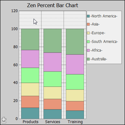
<percentbarChart> has the following attributes:
| Attribute | Description |
|---|---|
| Chart attributes |
<percentbarChart> has the same general-purpose attributes as any chart. For descriptions, see the sections “Providing Data for Zen Page Charts” and “Chart Layout, Style, and Behavior.” |
| chartPivot |
If true, pivot the chart (display categories vertically and values horizontally). See “chartPivot.” |
Pie Charts
Pie charts can plot single or multiple data series, and can show the series, the items in the series, or both. <pieChart> does not support axes or grids in the plot area, as do line charts or bar charts.
A <pieChart> that plots the items in a single data series displays a circle with radial slices representing items in the series. The chart adjusts the size of each slice to be proportional to the contribution of that item to the total. Note that the end user can rotate the pie chart with click and drag gestures in the browser.
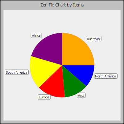
<pieChart> has the following attributes:
| Attribute | Description |
|---|---|
| Chart attributes | <pieChart> has the same general-purpose attributes as any Zen chart. For descriptions, see the sections “Providing Data for Zen Page Charts” and “Chart Layout, Style, and Behavior.” |
| holeSize |
Controls whether a hole is displayed in the center of the pie chart, and if so, how big the hole is. The value of this property is a percentage of the chart's radius along the x-axis. If the size of the chart changes, the size of the center hole maintains its proportional size. The value can range from 0 to 0.9. Values larger than 0.9 have no additional effect. The default value is 0. |
| pieHeight | Controls the apparent height of 3D pie charts. The value of this property is a percentage of the chart's radius along the x-axis. If the size of the chart changes, its depth maintains its proportional size. The value can range from 0 to 1. The default value is 0.33. |
| pieScale | Decimal value that specifies the scaling factor for the size of the pie within the chart. The default scaling value is 1.0. A value larger than 1.0 makes the pie bigger relative to the plot area; a value smaller than 1.0 makes the pie smaller. |
| plotBy | Specifies how the pie chart plots its data. Possible values are "items", "series", “both”, or "auto". The default is "auto". See “plotBy.” |
| rotateBy | If specified, rotate the pie chart by this amount (in degrees). |
| showMultiples |
If true, display the chart as a number of small charts, one per data series. See “showMultiples.” |
| showPercentage |
If true, percentage values (rounded to nearest integer) are displayed as part of the label for each slice. The default is false. This attribute has the underlying data type %ZEN.Datatype.booleanOpens in a new tab. See “Zen Attribute Data Types.” |
plotBy
The <pieChart> plotBy attribute controls how Zen generates a pie chart from the data provided. You may actually provide multiple series to the <pieChart>. The chart processes all the data series to create one series, and then displays that series as slices in the chart. plotBy options are as follows.
-
"items" – plot a slice for every item in this chart's data.
-
"series" – plot a slice for every data series in this chart's data.
-
"both" – plot a slice for each item within each data series, which means that the chart contains seriesCount * seriesSize slices.
-
"auto" – automatically select the appropriate way to display data based on how many data series and items are present.
Pie Charts by Items
When the value of plotBy is "items", a <pieChart> plots one slice for every item within the data series. If you provide multiple data series to an "items" pie chart, each slice of the pie represents the total of a particular item, summed across all of the data series in the chart.
The following conceptual figure shows how three data series, each containing six items, would generate an six-slice pie chart. Each slice represents the sum of the values for that item provided by the three series.
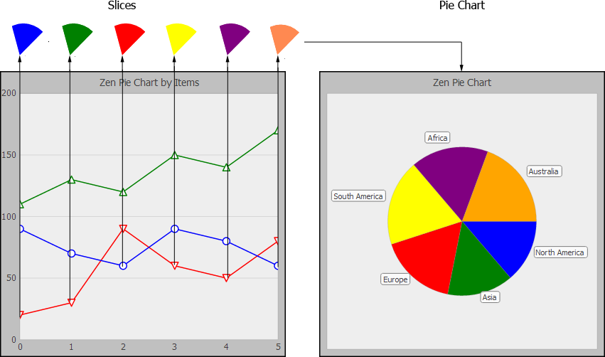
When the value of plotBy is "items", labels for the slices are treated as <yAxis> labels. This means you cannot specify them directly using a chart attribute such as seriesNames. Labels are provided by a %ZEN.Auxiliary.dataControllerOpens in a new tab, if present, or you can provide an onGetLabelY event handler to get the label values.
Pie Charts by Series
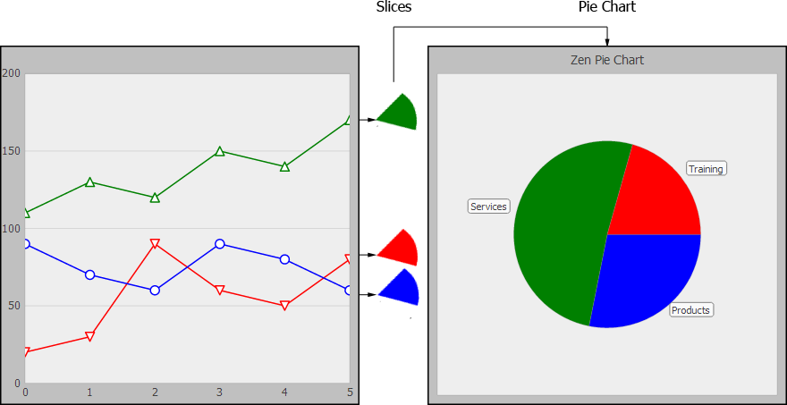
When the value of plotBy is "series", multiple series are in use. The <pieChart> plots one slice for every data series, so the number of slices in the pie chart is seriesCount. Each slice represents the sum of all the items within one of the series. The seriesNames attribute provides the labels for the slices, and for the legend.
The following conceptual figure shows how three data series, each containing six items, generate a three-slice pie chart. Each slice represents the sum of the eight items in that series.
Pie Charts by Both Items and Series
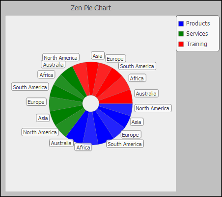
When the value of plotBy is "both", multiple series are in use. The <pieChart> plots one slice for every item in every data series, so there are seriesCount times seriesSize slices. The base color for each slice is the associated series color. Alternating slices use dark and normal shades of this color. The chart legend displays series names; the seriesNames attribute provides these labels. The slices display item names; the labels are provided by an onGetLabelY event handler, or a data controller.
The following pie chart example compares three series (Products, Services, and Training), each of which has data items in four categories (America, Asia, Europe, and Africa). The chart has twelve slices.
Scatter Diagrams
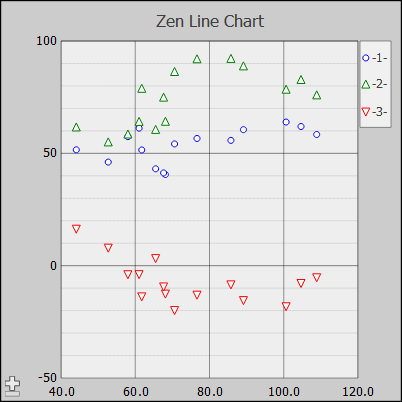
An <xyChart> plots two or more data series as (x,y) points. This type of chart is sometimes called a scatter diagram; it is intended to show the raw data distribution for the series. The <xyChart> represents its data series as follows:
-
The first data series provides the x values
-
The second data series provides correlated y values
-
Any additional data series are plotted as y values correlated to the x values provided by the first series.
The result is that an <xyChart> always displays one less plot than its number of data series.
<xyChart> has no unique attributes. <xyChart> has the same general-purpose attributes as any Zen chart. For descriptions, see the sections “Providing Data for Zen Page Charts” and “Chart Layout, Style, and Behavior.” An <xyChart> always has markersVisible and plotToEdge set to true. Generally you need to manipulate some of the other chart attributes to produce the desired results. For example:
-
The seriesCount value must always be one more than the number of plots you want to display. This leaves room for the first, x-value series.
-
The first data series is not plotted, so the <xyChart> applies series settings beginning with the second series, not the first. For example:
-
The seriesColors list applies to the second, third, and successive series.
-
The seriesNames list applies to the second, third, and successive series.
-
The markerShapes list applies to the second, third, and successive series.
-
-
A scatter diagram does not appear “scattered” unless you hide the lines between the markers. To do this, set the plotStyle for an <xyChart> as follows:
plotStyle="stroke:none;". This is a better approach than setting plotStyle="stroke-width: 0;", because some SVG implementations render a very thin line, even when stroke-width is set to 0.
<xyChart> has the following attributes:
| Attribute | Description |
|---|---|
| Chart attributes |
<xyChart> has the same general-purpose attributes as any chart. For descriptions, see the sections “Providing Data for Zen Page Charts” and “Chart Layout, Style, and Behavior.” |
| chartPivot |
If true, pivot the chart (display categories vertically and values horizontally). See “chartPivot.” |
| independentXSeries |
If false, the first data series is used to supply x values for the chart and all other data series provide y values. If true, then the chart displays multiple x series. In this case, the first data series provides the first set of x values, the second data provides the first set of y values, the third data series provides the second set of x values, and so on. This property is optional, and the default value is false. This attribute has the underlying data type %ZEN.Datatype.booleanOpens in a new tab. See “Zen Attribute Data Types.” |
Tree Map Charts
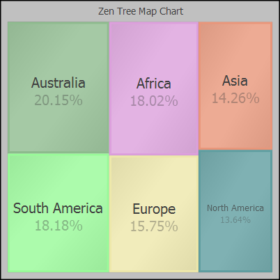
A <treeMapChart> plots the items in a single data series and displays each item in the series as a rectangle and arranges them in a larger rectangle. The chart adjusts the size of each smaller rectangle to be proportional to the contribution of that item to the total. You can display more than one data series by setting the attribute showMultiples to true. Each of the multiple charts displays a different data series.
| Attribute | Description |
|---|---|
| Chart attributes |
<xyChart> has the same general-purpose attributes as any chart. For descriptions, see the sections “Providing Data for Zen Page Charts” and “Chart Layout, Style, and Behavior.” |
| showMultiples |
If true, display the chart as a number of small charts, one per data series. See “showMultiples.” |
Providing Data for Zen Page Charts
The data for a chart consists of one or more data series. Each data series that you use for a chart is a simple array of numeric values. You can provide the data for a Zen page chart in one of two ways:
-
“Using a JavaScript Method” in the page class, by setting the chart’s ongetData attribute.
-
“Using a Data Controller”, by setting the chart’s controllerId attribute.
Regardless of which technique your chart uses to retrieve data, you can limit the data returned by either technique to the desired number and size of series.
Zen reports callback charts and Zen pages use identical syntax to display charts. Callback charts are defined in the package %ZEN.Report.Display.COSChart
When it comes to displaying charts, Zen pages and Zen reports use identical syntax. Syntax described in the previous section, “Types of Chart,” and in the later sections “Chart Layout, Style, and Behavior” and “Chart Axes” applies equally well to Zen pages and Zen reports. However, the techniques for providing data for charts in Zen reports are different from the techniques for Zen pages. For details, see the section “Providing Data for a Zen Report Chart” in the book Using Zen Reports.
To provide data for charts on Zen pages, use the topics in this section.
Using a JavaScript Method
All charts support the ongetData attribute for generating chart data.
| Attribute | Description |
|---|---|
| ongetData |
Client-side JavaScript expression that Zen invokes whenever:
For example: ongetData="return zenPage.getChartData(series);" In Zen reports, ongetData is a server-side method written in Object Script or other appropriate language. |
The ongetData expression invokes a client-side JavaScript method defined in the page class. This method becomes the ongetData event handler for the chart. The chart calls the ongetData event handler once for each of the data series specified by seriesCount. The event handler accepts a single argument, series, which specifies the data series currently being processed. The value of series is the 0-based ordinal number of the current data series; possible values range from 0 to seriesCount - 1.
The event handler also needs to know how many values to supply for the data series. This value is provided by the seriesSize attribute of the chart. In the example code that follows this explanation, this line gets the value of seriesSize from the chart:
var data = new Array(chart.seriesSize);
The method puts seriesSize - 1 items into an array and returns that array. It can use whatever approach is appropriate to provide data for the chart. For instance, it may use a switch statement based on the value of the series input argument.
The following is a sample ongetData event handler that provides random values as a test. You can see this event handler in the SAMPLES namespace in the template page class ZENTest.SVGChartTestOpens in a new tab. It provides the data for charts drawn by page classes that extend the ZENTest.SVGChartTestOpens in a new tab template, such as SVGLineChartTest and SVGBarChartTest:
ClientMethod getChartData(series) [ Language = javascript ]
{
  var chart = zen('chart');
  var data = new Array(chart.seriesSize);
  var value = 50;

  for (var i = 0; i < chart.seriesSize; i++) {
    if (Math.random() > 0.9) {
      value += (Math.random() * 50) - 35;
    }
    else {
      value += (Math.random() * 20) - 9;
    }
    data[i] = value;
  }
  return data;
}
The previous example creates a chart with random data.
Normally, you want to create charts using real data from the server. In the typical case, your server-side method returns a list. On the client side, this list is consumed by the chart component that displays the data. One way to make this work is shown in the following example:
-
When our example page is first displayed, its %OnAfterCreatePage method calls a server-side method PopulateData() to place values into a page property called Population for later use by client-side code. In our example, this happens only once, when %OnAfterCreatePage is called. Later user actions may change how this data is viewed, but in this example, we only get data from the server once.
Method %OnAfterCreatePage() As %Status { // Get the data while we're on the server Set sc = ..PopulateData() // Set the initial series size programmatically Set chart = %page.%GetComponentById("chartPop") Set chart.seriesSize = $Length(..States,",") Quit sc } -
The Population property is defined in our page class as follows:
Property Population As %ZEN.Datatype.list(DELIMITER = ",");And our server-side method PopulateData() places values and comma delimiters into the Population list as follows. Step 3 describes the Internals of the GetCountByState() class query referenced here:
Method PopulateData() As %Status { Try { Set sc = $System.Status.OK() // Get a resultset containing population by state Set sc = ##class(SimpleZenChart.Person).GetCountByState(.rs) Quit:$System.Status.IsError(sc) // Populate the page properties with comma delimited values While (rs.%Next()) { Set ..Population = ..Population _ rs.%Get("PersonCount") _ "," Set ..States = ..States _ rs.%Get("HomeState") _ "," } // Remove trailing delimiter Set ..Population = $Extract(..Population,1,*-1) Set ..States = $Extract(..States,1,*-1) } Catch(ex) { Set sc = ex.AsStatus() } Quit sc } -
As seen in the above excerpt, PopulateData() invokes a class query defined in SimpleZenChart.Person to retrieve the results that it uses in constructing the Population list. The GetCountByState() method looks like this:
ClassMethod GetCountByState(Output Results As %SQL.StatementResult) As %Status { Try { Set sc = $System.Status.OK() // Make a new SQL statement // Use an array to create the query text (this is not required) // Pass in schema search list into statement constructor Set statement = ##class(%SQL.Statement).%New(,"SimpleZenChart") Set query = 4 Set query(1) = "SELECT HomeState, COUNT(ID) As PersonCount" Set query(2) = "FROM Person" Set query(3) = "GROUP BY HomeState" Set query(4) = "ORDER BY HomeState" // Prepare query Set sc = statement.%Prepare(.query) Quit:$System.Status.IsError(sc) // Execute query Set Results = statement.%Execute() // Check %SQLCODE for an error If (Results.%SQLCODE < 0) { Set sc = $System.Status.Error($$$GeneralError, "Error in %Execute. %SQLCODE = " _Results.%SQLCODE_" Error message = "_Results.%Message) Quit } } Catch (ex) { Set sc = ex.AsStatus() } Quit sc } -
Each time a chart on our example page is refreshed, including the first time the page is displayed, the chart consults its ongetData expression to see which client-side method it should invoke to populate itself with data. In the following excerpt, the chart is a <barChart> and the client-side method is called getData():
<barChart id="chartPop" width="100%" height="100%" selectedItemStyle="fill:rgb(255,0,255);" seriesCount="1" appearance="2D" title="Population By State" ongetData="return zenPage.getData(series);" ongetLabelX="return zenPage.getXLabels(value);" onelementClick="zenPage.onSelectElement(zenThis);"> <xAxis title="States"/> </barChart> -
Our sample client-side method getData() consults the Population property of the client-side page object to get the list of values stored in that property. Because Population was defined as type %ZEN.Datatype.listOpens in a new tab in the page class, getData() automatically understands Population as a JavaScript array; no conversion is necessary. getData() returns this array as its return value.
ClientMethod getData(series) [ Language = javascript ] { try { var data = zenPage.Population; return data; } catch (ex) { zenExceptionHandler(ex,arguments); } } -
The <barChart> updates its display using the values in the JavaScript array returned by getData().
-
This example offers other interesting features. For example, when you click on a bar in the bar chart, Zen fires the client-side method identified by the <barChart> onelementClick attribute. In our example, this client-side method is called onSelectElement(). It uses the JavaScript utility function zenSetProp() to find some of the other components on the page then change their contents using data acquired from client-side methods, including getData().
ClientMethod onSelectElement(chart) [ Language = javascript ] { try { var selected = chart.getProperty('selectedItem') // Set the population and count for the item zenSetProp('htmlState','content',this.getXLabels(selected)); zenSetProp('htmlCount','content',(this.getData())[selected]); } catch (ex) { zenExceptionHandler(ex,arguments); } } -
In the excerpt above, the client-side method onSelectElement() uses the number of the currently selected bar in the bar chart as an index into the array returned by getData(). getXLabels() also uses an index into a JavaScript array, but in this case the array is the page property States, which contains a list of states whose population statistics are being stored in the example. Because the States property was defined as type %ZEN.Datatype.listOpens in a new tab in the page class, getXLabels() automatically understands States as a JavaScript array; no conversion is necessary.
ClientMethod getXLabels(value) [ Language = javascript ] { try { var data = zenPage.States return data[value]; } catch (ex) { zenExceptionHandler(ex,arguments); } } -
A final item of note in this example is one that changes the series size for the chart without modifying or resending any data. The client-side method changeSeriesSize() is invoked when the user selects one of the choices in a list box on the same page with the bar chart. The list box is defined as follows:
<listBox id="lbSeriesSize" label="Select Series Size" value="5" onchange="zenPage.changeSeriesSize(zenThis);"> <option text="10"/> <option text="20"/> <option text="30"/> <option text="40"/> <option text="50"/> </listBox> -
The client-side method changeSeriesSize() uses the text value from the selected <option> and uses it to reset the seriesSize value for the <barChart> whose id is chartPop. This is our example <barChart> as shown in step 4. When the seriesSize is reset, the chart redisplays.
ClientMethod changeSeriesSize(listbox) [ Language = javascript ]
{
  try {
    // Get selected index and compute value
    var selected = listbox.getProperty('selectedIndex');
    var value = listbox.getOptionText(selected);

    // Set the series size in the chart
    zenSetProp('chartPop','seriesSize',value);
  }
  catch (ex) {
    zenExceptionHandler(ex,arguments);
  }
}
Using a Data Controller
All charts support the following attributes, which associate the chart with a view on a data controller as described in the chapter “Model View Controller. ”
| Attribute | Description |
|---|---|
| controllerId | Identifies the data controller that provides the data for this chart. The controllerId value must match the id value provided for that <dataController>. |
| onnotifyView |
The onnotifyView event handler for the <chart>. This attribute applies if the chart is associated with a data controller. Zen invokes this handler each time the data controller connected to this chart raises an event. See “Zen Component Event Handlers.” |
If your XData Contents block contains a <dataController> reference that looks like this:
<dataController id="source" modelClass="myPackage.MyModel" modelId="1"/>Then your XData Contents block may also contain a chart definition that looks like this:
<pieChart id="myChart" controllerId="source"
          height="300" width="300"
          title="Pie Chart" titleStyle="fill: black;"
          backgroundStyle="fill: #c5d6d6;"
          plotAreaStyle="fill: white;"
          labelStyle="fill: black;"
          legendVisible="true" legendX="83" legendY="8"
          legendHeight="" legendWidth="15" >
</pieChart>
The chart’s controllerId value must match the <dataController> id value. The chart takes its seriesSize from the number of properties in the <dataController> modelClass.
Limiting the Data Set
The following attributes from the base class %ZEN.SVGComponent.chartOpens in a new tab tell the chart how many series to use, and how many of the items in each data series to use, when constructing the chart. All types of chart support these attributes. If you do not use a dataController to provide the data set, you must specify both seriesCount and seriesSize. If you use a dataController, Zen determines the number of series and items from the data.
| Attribute | Description |
|---|---|
| seriesCount | Positive integer specifying the number of series in the chart. If you do not use a dataController and your data source provides a larger number of series than you want to use, you can trim the number of displayed series by setting seriesCount to a smaller number. The following figures illustrate the action of seriesCount. |
| seriesSize | Positive integer specifying the number of items within each data series to display on this chart. If you do not use a dataController and your data source provides a larger number of items in the series than you want to use, you can trim the number of displayed items by setting seriesSize to a smaller number. The following figures illustrate the action of seriesSize. |
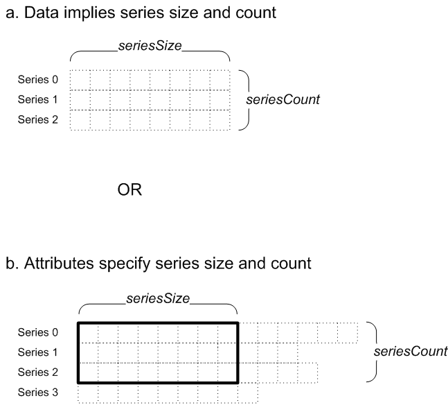
Chart Layout, Style, and Behavior
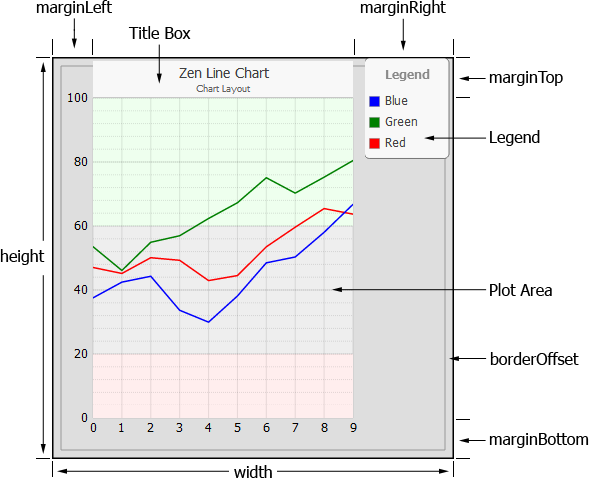
The following diagram shows the major components of a Zen chart. The chart properties described in the following sections control the positioning, style, and behavior of these components.
Chart properties include those from the SVG component class %ZEN.SVGComponent.svgComponentOpens in a new tab, such as width andheight, and those from the base chart class %ZEN.SVGComponent.chartOpens in a new tab, such as marginTop and borderOffset.
The base class %ZEN.SVGComponent.chartOpens in a new tab offers a large number of attributes that you can apply to a Zen chart to control details such as:
-
“Layout and style” — The relative size and characteristics of the background
-
“Plot area” — The part of the chart that displays the data
-
“Markers” — Shapes that highlight the exact data points on a continuous plot
-
“Legends” — A key to the meaning of each plot on the chart
-
“Titles” — Text that labels the chart, and the items on the chart
-
“User Selections” — How the chart should respond to user actions, such as mouse clicks
-
“Chart Axes” — Characteristics of the two axes that define most charts
Specifying Size and Position
Unless the specific description of a property states otherwise, you can give values for properties that specify sizes and positions in one of the following ways:
-
Do not specify a value, and let Zen calculate the value automatically.
-
Use a value from 0 to 100 that is interpreted as a percentage of the current chart size.
-
Specify a length value with units, such as "10px", to indicate that you want a margin of 10 pixels, independent of chart size
Layout and Style
The following attributes from the base class %ZEN.SVGComponent.chartOpens in a new tab determine the background style and the position of the plot area within the chart.
| Attribute | Description |
|---|---|
| SVG component attributes | A chart has the same attributes as any SVG component. For descriptions, see the “SVG Component Attributes” section in the chapter “Zen and SVG.” |
| backgroundStyle | SVG CSS style definition. Specifies the style for the background panel. This is the area outside the plot area but inside the chart component’s height and width. |
| borderOffset |
SVG CSS style definition. Specifies the distance in pixels between the background rectangle and the border. The default value is 8. |
| borderRadius |
Specifies the radius in pixels used to round the corners of the chart's background rectangle and border. |
| borderStyle |
SVG CSS style definition. Specifies the style used for the border line which is inset from outer edge of chart. |
| hasZoom |
If true, display zoom in/out buttons (for certain chart types). The default value is false. The property scrollButtonStyle controls the appearance of the buttons. |
| marginBottom |
Margin to allow from the bottom edge of the background to the bottom edge of the plot area. Axis labels or the chart legend usually appear in this space. You can provide a value as specified in “Specifying Size and Position.” |
| marginLeft | See marginBottom in this table. |
| marginRight | See marginBottom in this table. |
| marginTop | See marginBottom in this table. |
Plot Area
The following attributes from the base class %ZEN.SVGComponent.chartOpens in a new tab determine display conventions for graphs within the plot area and for the coordinate axes that border the plot area. Also see the section “Chart Axes.”
| Attribute | Description |
|---|---|
| appearance |
Controls the appearance of this chart. A value of "2D" provides standard two-dimensional chart appearance. A value of "3D" gives the chart a three-dimensional appearance so that the plot area appears to be recessed. Certain chart types, such as bar charts, display items with a 3D look. For pie charts, setting this property to "3D" displays a pie chart with a 3D appearance, but does not affect the plot area. The default value is "2D" for some charts and “3D” for others. |
| autoScaleText |
Specifies how the chart handles text elements when it is resized. If true, the text scales in proportion to the chart and all requested labels are rendered regardless of legibility. If false, the size of the text elements is fixed with respect to the page and some labels may be omitted to avoid visual overlap if there is not enough space on the chart to render the all values. This attribute has the underlying data type %ZEN.Datatype.booleanOpens in a new tab. See “Zen Attribute Data Types.” |
| axisLineStyle | An optional SVG CSS style definition applied to line drawn for x- and y-axes. |
| axisTitleStyle | An optional SVG CSS style definition applied to the title specified by the title property of the axis. |
| bandLower | Decimal value. If defined, the chart displays a colored band on the plot area covering the range lower than this value. bandLowerStyle defines the style of this band. |
| bandLowerStyle | SVG CSS style definition for the band defined by bandLower. |
| bandUpper | Decimal value. If defined, the chart displays a colored band on the plot area covering the range higher than this value. bandUpperStyle defines the style of this band. |
| bandUpperStyle | SVG CSS style definition for the band defined by bandUpper. |
| baseLineStyle | SVG CSS style definition for the base line. |
| currYAxis | When a chart has multiple y axes, currYAxis specifies which yAxis to display on the chart. The chart legend highlights all items that use the current axis. If the user clicks on a legend item that is not highlighted, the chart makes the corresponding axis the active one. See “Chart Axes”. Because reports are not interactive, currYAxis in a Zen report simply determines the axis that is displayed |
| gridStyle | SVG CSS style definition. Default style applied to all grid line elements within the plot area for this chart. If defined, gridStyle overrides any styles define in the CSS style definition for the page, but gridStyle is in turn overridden by any styles defined by a specific axis element in the chart. |
| labelStyle | SVG CSS style definition. Default style applied to all label elements for this chart. If defined, labelStyle overrides any styles define in the CSS style definition for the page, but labelStyle is in turn overridden by any styles defined by a specific axis element in the chart. |
| labelsVisible |
If true, display axis labels for this chart (or slice labels for a pie chart). If false, hide labels. The default is true. This attribute has the underlying data type %ZEN.Datatype.booleanOpens in a new tab. See “Zen Attribute Data Types.” |
| maxLabelLen |
The maximum number of characters to display for an axis label. The default value is 20. |
| ongetLabelX |
The ongetLabelX event handler for the <chart>. Zen invokes this handler to provide the text for labels on the x-axis. See “Zen Component Event Handlers.” It must accept an argument, value, that contains the 0-based ordinal number of the data point whose text label is to be returned. It may consist of a switch statement based on the value of the input argument. It must return a text string. For example: ongetLabelX="return zenPage.getXLabels(value);" |
| ongetLabelY |
Client-side JavaScript expression, as for ongetLabelX. For pie charts, ongetLabelY is the attribute to use to set slice labels. |
| ongetSeriesColor | The ongetSeriesColor event handler. The chart calls this event handler to get the color for a given data series. The event handler is passed an argument ,series, that contains the 0-based ordinal number of the series. If the event handler does not return a color for series, the chart uses whatever color is specified by seriesColors, seriesColorScheme, or seriesColorsOverride. |
| onrenderData |
Specifies an optional event handler. If an event handler is defined, it is called by the chart just after it has finished displaying grid lines and data. The event handler is passed an argument chart that is the current chart object. It is also passed a group, which is the SVG group to which any new SVG content should be added. |
| onrenderPlotArea | Client-side JavaScript expression. If the chart provides an onrenderPlotArea value, then the onrenderPlotArea expression is called by the chart just after it displays its underlying plot area (and bands) but before it display grid lines and data.
Not supported by Zen reports. |
| plotAreaStyle | SVG CSS style definition for the plot area panel for this chart. |
| plotEdgeStyle |
SVG CSS style definition applied to the left and bottom edges of the plot area panel for charts that have a 3D appearance. |
| plotStyle | Default SVG CSS style definition applied to the SVG elements that are used to plot data for this chart. These elements include the line in a line chart, or the bar in a bar chart. |
| plotToEdge |
Specifies how values should be plotted along a category axis:
This attribute has the underlying data type %ZEN.Datatype.booleanOpens in a new tab. See “Zen Attribute Data Types.” |
| scrollButtonStyle |
An optional SVG CSS style definition applied to the zoom and scroll buttons. Use the hasZoom property to make the zoom and scroll buttons visible. |
| seriesColors |
Comma-separated list of CSS color values to use for data series. The chart applies these colors to each data series in ordinal order (series 0 gets the first color, series 1 the second color, and so on). If you omit seriesColors, the chart uses the colors defined by seriesColorScheme. |
| seriesColorScheme |
This is the name of a built-in color scheme used to plot data series for the chart. Possible values are: “urban”, “tuscan”, “caribbean”, “rustbelt”, “bright”, “glow”, “gray”, “pastel”, and “solid”. The default value is "tuscan".seriesColors overrides this property. |
| seriesColorsOverride |
Additional comma-delimited list of CSS color values used for data series. If supplied, this is merged with the colors in the seriesColorScheme or seriesColors list. |
| seriesNames |
Comma-separated list of names to use for data series. The chart applies these names to each data series in ordinal order (series 0 gets the first name, series 1 the second name, and so on). These names can appear as labels for the series in the legend chart. The seriesNames attribute has its ZENLOCALIZE datatype parameter set to 1 (true). This makes it easy to localize its text into other languages, and permits use of the $$$Text macros when you assign values to this property from client-side or server-side code. Any localized seriesNames string must remain a comma-separated list. |
| seriesYAxes |
Comma-separated list of numbers. These numbers correspond to multiple y axes defined by the chart. The chart uses the axis identified by the number to plot the corresponding data series. The numbers are 0–based. By default, the every data series uses y-axis 0. For example, if seriesYAxes="1,2,0", the chart plots the first data series on second axis, the second data series on the third axis, and the third data series on the first axis. Note that <xyChart>, <diffChart> and <bubbleChart> do not support alternate yAxes. See “Chart Axes”. |
| stripeStyle |
An optional SVG CSS style definition applied to grid stripes when stripes have been enabled with the property stripesVisible. |
| stripesVisible |
If true, draw stripes over value axis grid lines. The default value is false. This attribute has the underlying data type %ZEN.Datatype.booleanOpens in a new tab. See “Zen Attribute Data Types.” |
| textSize |
Adjusts the size of text used in the chart title and axis labels. Possible values are: ”small”, “medium”, and “large”. If the value is "medium", the chart uses the default font sizes specified by the CSS. if "small" or "large" adjust the size of any text in the chart that does not have an explicit style set by a property. |
| unselectedItemStyle |
An optional SVG CSS style used to indicate unselected chart elements. Used when there is a selected element. |
| valueBoxStyle |
An optional SVG CSS style definition applied to the box that contains the value labels. Use the property valueLabelsVisible to make the labels visible. |
| valueLabelFormat |
Specifies a format applied to the numeric values in value labels and tooltips. For a description for this format string, see the section “Format String Field” in the book “Defining DeepSee Models.” Use the property valueLabelsVisible to make the labels visible. |
| valueLabelStyle |
An optional SVG CSS style definition applied to value labels. This only applies to charts that display element values, such as bar charts. Use the property valueLabelsVisible to make the labels visible. |
| valueLabelsVisible |
Specifies whether values should be displayed for elements within the chart. This only applies to charts that display element values, such as bar charts. This attribute has the underlying data type %ZEN.Datatype.booleanOpens in a new tab. See “Zen Attribute Data Types.” |
A number of attributes are supported by several chart types. These attributes are listed in the table of attributes for the relevant charts, and described in more detail in the following sections.
chartPivot
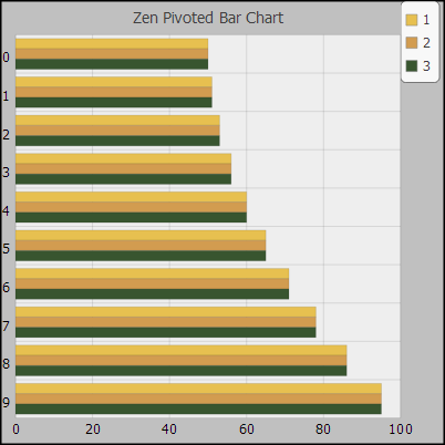
If the attribute chartPivot is true, rotate the chart so that the x-axis is vertical and the y-axis horizontal. If false, display the chart in typical fashion, with x-axis horizontal and the y-axis vertical.
This attribute has the underlying data type %ZEN.Datatype.booleanOpens in a new tab. See “Zen Attribute Data Types.”
The following figure shows a pivoted bar chart.
chartStacked
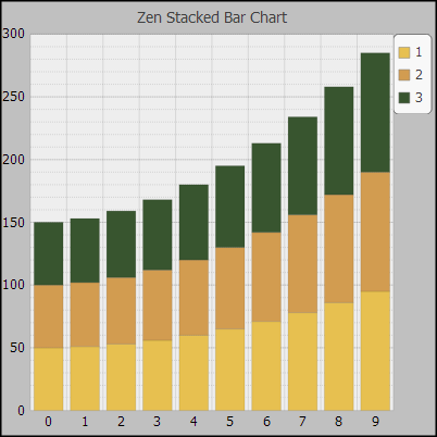
The attribute chartStacked comes into play if there are multiple data series. If true, the data series are drawn stacked on top of one another (values are additive). If false, the bars appear side by side (the values are independent).
This attribute has the underlying data type %ZEN.Datatype.booleanOpens in a new tab. See “Zen Attribute Data Types.”
If you set the property chartStacked to true, the result is a chart with values at each data point from all the data series in the chart stacked into a single bar. The following figure illustrates a stacked bar chart:
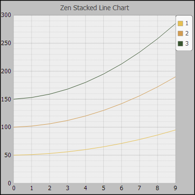
And the next figure shows the same data presented as a stacked line chart:
showMultiples
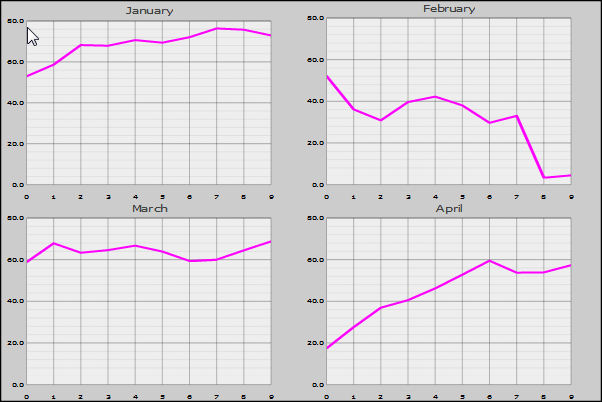
If the attribute showMultiples is true, charts that support small multiples display the data as a set of small charts, one for each data series. The chart method hasMultiples lets you determine whether the chart supports multiples.
This attribute has the underlying data type %ZEN.Datatype.booleanOpens in a new tab. See “Zen Attribute Data Types.”
The following figure shows a line chart with four data series and showMultiples="true".
timeBased
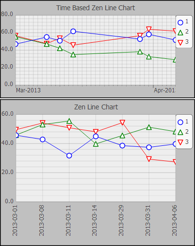
The attribute timeBased specifies that the x-axis is a time line. It is valid only for line and combo chart types. In order to plot a time based chart, you must use the ongetLabelX callback method to provide time values in the format YYYY-MM-DD or YYYY-MM-DD HH:MM:SS. These values are placed in their proper position on the x-axis timeline. Because the logic that positions values on the timeline depends on the returned date values, you cannot set the property maxLabelLen to a value less than ten.
The chart properties startTime and endTime set the start and end dates for the time line. If you do not supply values for startTime and endTime, the chart uses the earliest and latest values returned by the ongetLabelX callback method.
The following figure illustrates the effect of a timeBased x-axis. The top chart uses a time based x-axis, while the lower chart plots the same x values on a category axis.
Markers
Markers are shapes that are placed at each data point along the chart. If the chart has multiple series, each series in the chart can use a different shape for its marker. Marker attributes apply only to types of chart that support markers (that is, line charts). The base class %ZEN.SVGComponent.chartOpens in a new tab offers the following marker attributes.
| Attribute | Description |
|---|---|
| markerScale | Decimal value that specifies the scaling for markers. A value of 1.0 (or "") displays markers with the default size. Use a larger value for larger markers, smaller for smaller markers. |
| markerShapes |
Comma-separated list of shapes to use for each series. It can be convenient to use a different shape for each series in the chart. This adds further distinction besides the color of each plot in the chart. The list can contain any of the following keywords in any order or combination:
The default value for markerShapes is "circle,up,down,square" |
| markerStyle | SVG CSS style definition. Style applied to all marker elements for this chart. The default is to outline the shape in the same color as the series plot, and fill the shape with white. |
| markersVisible |
If true, and this chart supports markers, markers are displayed for the data points within the chart. If false, no markers are displayed, even if they are defined. The default is false. This attribute has the underlying data type %ZEN.Datatype.booleanOpens in a new tab. See “Zen Attribute Data Types.” |
Legends
The following attributes from the base class %ZEN.SVGComponent.chartOpens in a new tab determine the style of the chart legend and whether or not it should display.
| Attribute | Description |
|---|---|
| legendHeight | If this chart has a legend, this is the height of the legend box (within the chart coordinate space). You can provide a value as specified in “Specifying Size and Position.” The default height is based on the number of data series. |
| legendLabelStyle | SVG CSS style definition for label text in the legend box. |
| legendRectStyle | An optional SVG CSS style applied to the rectangle that indicates the current legend in the legend box. Used when the chart has more than one y-axis. |
| legendStyle | SVG CSS style definition for the background of the legend box. |
| legendTitle | Title to display in the legend box. |
| legendVisible |
If true, display a legend for this chart. The default is false. This attribute has the underlying data type %ZEN.Datatype.booleanOpens in a new tab. See “Zen Attribute Data Types.” |
| legendWidth | If this chart has a legend, this is the width of the legend box. You can provide a value as specified in “Specifying Size and Position.” If no legendWidth is specified, the chart assigns a default width of 15. |
| legendX | If this chart has a legend, legendX provides the x-position of the top left corner of the legend box within the chart coordinate space. You can provide a value as specified in “Specifying Size and Position.” If you provide a value relative to the coordinate space, the top left corner of the chart is (0,0) and the bottom right corner is (100,100). The default position for the legend is in the top-right corner of the chart. |
| legendY | If this chart has a legend, legendY provides the y-position of the top left corner of the legend box within the chart coordinate space. Provide values as for legendX. The default position for the legend is in the top-right corner of the chart. |
Titles
The following attributes from the base class %ZEN.SVGComponent.chartOpens in a new tab determine the style and contents of the chart title.
| Attribute | Description |
|---|---|
| multipleTitleStyle |
An optional SVG CSS style definition used for the title text in each of the small charts created when a data series is displayed as multiple charts. Used when showMultiplesOpens in a new tab is enabled. |
| subtitle |
Subtitle text for the chart. Although you can enter ordinary text for this attribute, it has the underlying data type %ZEN.Datatype.captionOpens in a new tab. See “Zen Attribute Data Types.” |
| subtitleStyle |
SVG CSS style definition. Specifies the style for the subtitle text. |
| title |
Title text for the chart. By default, it is centered at the top of the chart area. You can use titleX, titleY, and titleAlign. Although you can enter ordinary text for this attribute, it has the underlying data type %ZEN.Datatype.captionOpens in a new tab. See “Zen Attribute Data Types.” |
| titleAlign |
Alignment for title and subtitle. Possible values are, “center”, “left”, and “right”. The default value is “center”. |
| titleBoxStyle | SVG CSS style definition. Specifies the style for the box that contains the title and subtitle text. |
| titleStyle | SVG CSS style definition. Specifies the style for the title text. |
| titleX | If this chart has a title, this is the x-position of the title. This value is applied as specified by titleAlign. For example, if titleAlign is “center”, titleX positions the center of the title. You can provide a value as specified in “Specifying Size and Position.” The default is “center”. |
| titleY | If this chart has a title, this is the y-position of the bottom line for the title text. Descenders (for letters such as 'p' and 'q') fall below this line. You can provide a value as specified in “Specifying Size and Position.” The default position is just below the top of the chart, within the default marginTop. |
User Selections
The following attributes control user interactions with the chart. Zen reports does not support any of the properties in this section, because reports are not interactive.
| Attribute | Description |
|---|---|
| onelementClick |
The “onelementClick event handler” for the chart. Zen invokes this handler whenever the user clicks on a chart element (such as a marker in a line chart, or bar in a bar chart). See “Zen Component Event Handlers.” It must accept an argument, chart, that represents this chart object. It then calls a method on this object to determine the identity of the currently selected data point (getSelectedItem) or data series (getSelectedSeries). Either method returns the 0–based ordinal number of the item that was selected, or -1 if nothing is currently selected. For example: onelementClick="zenPage.chartElementClick(chart);" If no onelementClick expression is provided, Zen uses its own handler to provide values for selectedItem and selectedSeries. Not supported by Zen reports. |
| selectedItem | 0–based ordinal number of the currently selected chart element (such as a marker in a line chart, or bar in a bar chart). This value is -1 if nothing is currently selected.
Not supported by Zen reports. |
| selectedItemStyle | SVG CSS style definition for the currently selected item in the chart.
Not supported by Zen reports. |
| selectedSeries | 0–based ordinal number of the currently selected series in the chart, or -1 if no series is currently selected.
Not supported by Zen reports. |
Chart Axes
Zen displays all charts except pie charts with x and y axes. Axes determine how chart data is displayed. You can use <xAxis> or <yAxis> elements to specify the range of axis values (minValue to maxValue), or Zen can determine these values automatically based on the range of data values.
-
<xAxis> can be a category axis or a value axis, depending in the type of chart. A category axis names the data categories. A value axis indicates the values of plotted data.
-
<yAxis> is a value axis.
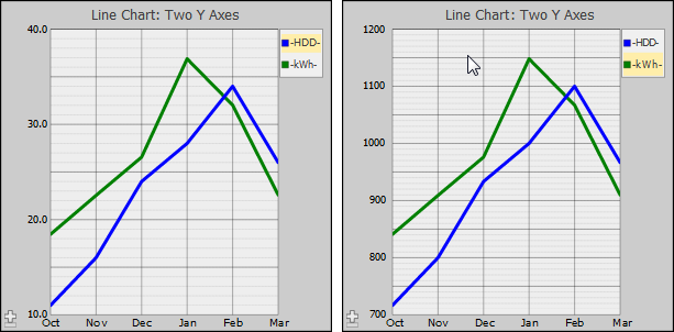
You can supply more than one y-axis to a chart, which enables you to plot data series with different ranges of values on the same chart in a meaningful way. The following example plots six months of data on heating degree days (HDD), and electricity use in kilowatt hours (kWh) for a residential building in the Boston MA area. A heating degree day is a measure of the energy demand for heating buildings. In this example, data values for HDD range from 11 to 34, and data values for kWh range from 841 to 1148. The following code fragment creates a line chart that plots these two data series using two different axes, one for values from 10 to 40, the other for values from 700 to 1200:
<lineChart id="chart"
  ongetData="return zenPage.getLineChartData(series);"
  onelementClick="zenPage.chartElementClick(chart);"
  ongetLabelX="return zenPage.getXLabels(value);"
  seriesNames="HDD,kWh"
  backgroundStyle="fill: #cccccc;"
  plotAreaStyle="fill: #eeeeee;"
  title="Line Chart: Two Y Axes"
  currYAxis="1"
  seriesCount="2"
  seriesSize="6"
  seriesColorScheme="solid"
  plotStyle="stroke-width: 1px;"
  labelsVisible="true"
  seriesYAxes="1,0"
  width="300"
  height="300">
  <xAxis id="xAxis" />
  <yAxis minorGridLines="true" minValue="700" maxValue="1200" labelUnits="100"
    minorUnits="10" majorUnits="50" majorGridLines="true" />
  <yAxis minorGridLines="true" minValue="10" maxValue="40" labelUnits="10" baseValue="0"/>
</lineChart>
The property seriesYAxes associates data series with axes. The property currYAxis specifies the axis that is active when you first display the chart. See “Plot Area”. The following figure shows the resulting chart. The first image shows the chart as it is initially displayed, with the HDD axis visible. The HDD item in the legend is highlighted to show that it is the relevant data series for the axis currently in use. If you click on kWh in legend, the chart displays the appropriate y-axis. All data series associated with an axis are all highlighted when that axis is active.
Compare these charts with the following chart, which attempts to plot both HDD and kWh on a single axis.
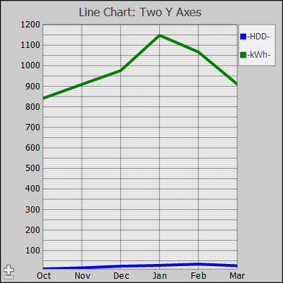
Note that <xyChart>, <diffChart> and <bubbleChart> do not support alternate yAxes.
The following attributes from the class %ZEN.Auxiliary.axisOpens in a new tab are available as attributes of either <xAxis> or <yAxis> within a chart definition. All of these attributes are optional; Zen provides reasonable defaults for each of them based on the data supplied to the chart.
| Attribute | Description |
|---|---|
| axisType | Provides additional control over the display of labels for this axis. If the value is a null string ("") the axis shows a value or category label. If the value is "percent" the axis shows a value label as a percentage. axisType also affects the format of the tooltip for values plotted on this axis. If valueLabelFormat is also set, that format takes precedence for tooltips. |
| baseValue | For charts with filled regions (bar charts), baseValue is a decimal value that specifies where the base of the filled region should be plotted. If missing or blank (""), the base is the bottom of the plot area. |
| labelPosition |
Specifies the side of the chart where the labels for this axis appear. Possible values for a y-axis are "left" and "right", and for an x-axis are "top" and "bottom". The default value is “left” for a y-axis and “bottom” for an x-axis. |
| labelStyle | SVG CSS style definition for the text labels along this axis. |
| labelUnits | Decimal value that specifies the amount of space between labels along a value axis. Ignored by category axes. If labelUnits is missing or blank (""), Zen automatically calculates a value based on the data series. |
| majorGridLines |
If true, grid lines are displayed for each major unit on this axis. If false, major grid lines are not displayed. The default is true. This attribute has the underlying data type %ZEN.Datatype.booleanOpens in a new tab. See “Zen Attribute Data Types.” |
| majorGridStyle | SVG CSS style definition for the major grid lines along this axis. |
| majorUnits | Decimal value that specifies the amount of space between major grid lines along this axis. If majorUnits is missing or blank (""), Zen automatically calculates a value based on the data series. |
| maxValue | Decimal value that specifies the maximum data value along this axis. If maxValue is missing or blank (""), Zen automatically calculates a value based on the data series. |
| minValue | Decimal value that specifies the minimum value along this axis. If minValue is missing or blank (""), Zen automatically calculates a value based on the data series. |
| minorGridLines |
If true, grid lines are displayed for each minor unit on this axis. If false, minor grid lines are not displayed. The default is true. This attribute has the underlying data type %ZEN.Datatype.booleanOpens in a new tab. See “Zen Attribute Data Types.” |
| minorGridStyle | SVG CSS style definition for the minor grid lines along this axis. |
| minorUnits | Decimal value that specifies the amount of space between minor grid lines along this axis. If minorUnits is missing or blank (""), Zen automatically calculates a value based on the data series. |
| title |
Title text for the axis. Although you can enter ordinary text for this attribute, it has the underlying data type %ZEN.Datatype.captionOpens in a new tab. See “Zen Attribute Data Types.” |
When you work with %ZEN.SVGComponent.chartOpens in a new tab subclasses programmatically, you work with axes as the xAxis and yAxis properties of the chart object. Each of these properties is a %ZEN.Auxiliary.axisOpens in a new tab object with properties corresponding to the attributes listed above.