Specifying Common Widget Options
For reference, this chapter describes options that are used in multiple places when you configure widgets. It discusses the following topics:
Customizing Print Settings for a Widget
You can print most kinds of widgets, as noted in “Comparison of Widget Types,” earlier in this book. To customize how DeepSee prints a widget, access the Dashboard Editor, select the widget as described in “Reconfiguring a Widget,” and click Print Setup and then click Page Setup. You can modify the following options:
-
Reset — Click this to restore the default print settings for this widget.
-
Page Size — Specify the size of the pages. Choose a page size.
-
Units — (Read only) This field displays the units associated with the page size you selected.
-
Orientation — Specify the orientation of the pages.
-
Title — Specify an optional title to include in the PDF. See the first subsection for special options.
-
Subtitle — Specify an optional subtitle to include in the PDF. See the first subsection for special options.
-
Show Subtitle — Click On to include the subtitle in the PDF. Or click Off not to include the subtitle.
-
Listing Settings — Select this to access additional options that apply when the output is a detail listing. Then specify options as described in the subsection “Listing Settings.”
-
Filter Settings — Select this to access options that control the appearance of information about any filters applied to this pivot table. Then specify options as described in the first subsection.
-
Show Date — Click On to include the current date in the PDF, at the top of the first page. Or click Off to omit this information.
-
Show User — Click On to include the current user in the PDF, at the top of the first page. Or click Off to omit this information.
-
Page Margins options: Top, Bottom, Left, and Right — Specify the size of the top, bottom, left, and right margins, respectively.
For a pivot table widget (including any chart widget), the pivot table definition specifies the default print settings; see “Customizing Pivot Tables” in Using the DeepSee Analyzer.
Requirements for Printing
When a user invokes the Print option, Caché uses Java to call out to a third-party PDF rendering tool. This means that Java (or specifically JRE, Java Runtime Environment) is required on the server accessed by the user’s local machine. For information on the requirements, which also apply to Zen Reports, see “Configuring Zen Reports for PDF Output” in Using Zen Reports.
Special Options for the Title and Subtitle
Within the Title and Subtitle fields, you can include a combination of static text and the following tokens:
-
{@filter.filterName} where filterName is the name of a filter defined for the given widget. Use the same name as provided in the Filter dropdown menu in the Dashboard Designer.
In the PDF, this token is replaced with the current value of that filter.
-
{@date.dateFormat} where dateFormat is an integer date format, with the same meaning as the dformat argument of $ZDATETIME.
In the PDF, this token is replaced with the date in the given format, followed by the time in 24–hour format.
-
{@variable.variableName} where variableName is the name of a runtime variable.
In the PDF, this token is replaced with the current value of that variable.
Listing Settings
For Listing Settings, specify some or all of the following options, which take effect when the output is a detail listing:
-
Show Listing Filters — Click On to include information on the context used for the detail listing (that is, which member or members were selected before the listing was requested, as well as any filters that were in use). Or click Off to omit this information.
-
Show Zebra Stripes — Click On to use different colors for alternating rows. Or click Off to use the same color for all rows.
-
Font Size — Specify the font size, including units, for example: 6pt
Filter Settings
For Filter Settings, specify some or all of the following options, which control the presentation of the filter information:
-
Show Filters — Specify the presentation of the filter information. Select By Table (to display this information as a table on the top of the first page), By Title (to display this information as the subtitle or appended to the subtitle), or Off (to not display this information).
By default, the filter information is appended to the subtitle area to the right of any specified subtitle.
When you display filter information as a table, the table has two columns with level names (that is, the filter names) on the left and member names (that is, filter item names) on the right.
-
Table Style — Specify options to control the appearance of the table that is used to display the filter information.
These options affect both the caption column (the left column) and the item column (the right column).
-
Row Header Style — Specify options to control the appearance of the row headers. These options override the Table Style options.
-
Item Style — Specify options to control the appearance of the item column. These options override the Table Style options.
-
Display Format for NOW — Specify how to display the NOW member of any time level, if that member is used in the filter and if the filter information is shown. Specify any of the dformat options of the $ZDATE function. For example, specify 3 for ODBC format (for example, 2015-03-27).
If you leave this option blank, the PDF shows the NOW member as NOW.
Adding Widget Properties
Some kinds of widgets require properties, each of which typically corresponds to a value in the configured data source. (For example, if the data source is a pivot table, each property of the widget can be a measure in that pivot table.)
For a meter widget, each property is displayed in a separate meter within the widget. Similarly, for pivot table widgets, each property is displayed as a separate column. Scorecards have columns, which are similar to properties and can be configured in a similar way.
To add a property to a widget:
-
Access the Dashboard Editor and select the widget as described in “Reconfiguring a Widget,” earlier in this book.
-
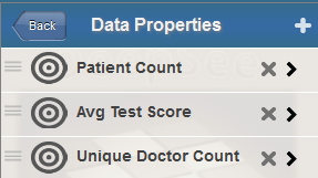
Click Data Properties.
The system displays the Data Properties submenu, which lists any properties defined for this widget. For example:
-
Click the plus sign + button.
The system displays a dialog box where you specify the property.
-
For Value, select the property of the data source to display.
For a meter widget or a scorecard, you can instead type a numeric constant.
If you manually edit Value, note that if Value has a numeric value, DeepSee assumes it is a numeric constant and displays that. If Value has the form =[propertyname], DeepSee assumes it is a property of the data source and thus displays the value of that property. When you select a property, DeepSee automatically wraps the property with =[].
For a scorecard, you can instead type a formula (see “Specifying a Scorecard Formula” in the chapter “Adding Scorecard Widgets”).
-
Optionally specify the following additional items:
-
Label — Type a label or optionally click the check box to the right of Label. If you click the check box, DeepSee uses the localized name of this property as the label; this option applies only when Value is a data source property.
If you type a label, note that you can include \n to force a line break in the label.
-
Hidden — Select this option to hide this value.
-
Value Column — Select this option to configure the value in this column as the value of the row. This value is passed to any custom actions; see “Specifying the Value of a Row,” later in this book.
Select this option for only one data property of the widget.
-
Format — Type a format string. See “Specifying a Numeric Format String,” later in this chapter.
Or specify these options later if you modify the property as described in the next section.
-
-
Click OK.
Managing Widget Properties
For any widget that defines properties, the Data Properties submenu lists the properties defined for this widget. For example:
In addition to the specific property options documented elsewhere, you can perform the following general activities:
-
Change the order of the properties. To do so, first click the icon to the left of the property name, so that this icon is highlighted:

Then drag the property up or down in the list.
-
Delete a property. To do so, click the X button in the row for that property.
-
Reconfigure a property. To do so, click the property name. DeepSee then displays a submenu with options. For details on the options, see the previous section. You can also specify Name. Make changes as needed.
Specifying Numeric Format Strings
In some meters and other places that display numeric values, you can use the Format option to control the display of numbers. In some cases, you can select an option or type a numeric format string. In other cases, you must type a numeric format string.
Selecting a Format String
In some cases, the Dashboard Editor provides the following set of choices for Format:
| Option | Example |
|---|---|
| ### | 6609 |
| ###.# | 6609.1 |
| ###.## | 6609.12 |
| ###.### | 6609.123 |
| #,## | 6,609 |
| #,##.# | 6,609.1 |
| #,##.## | 6,609.12 |
| #,##.### | 6,609.123 |
| ##.##% | 660912.3% |
Typing a Numeric Format String
In all applicable places, you can instead type a numeric format string, which provides more options. You can specify a string that consists of one to four pieces as follows:
positive_piece;negative_piece;zero_piece;missing_piece
Where positive_piece controls how a positive value is displayed, negative_piece controls how a negative value is displayed, zero_piece controls how zero is displayed, and missing_piece controls how a missing value is displayed.
Each piece is a string that includes one of the following base units:
| Base Unit | Meaning | Example |
|---|---|---|
| # | Display the value without the thousands separator and without decimal places. | 12345 |
| #,# | Display the value with the thousands separator. Do not include any decimal places. This is the default display format for positive numbers. | 12,345 |
| #.## | Display the value without the thousands separator. Include two decimal places (or one decimal place for each pound sign after the period). Specify as many pound signs after the period as you need. | 12345.67 |
| #,#.## | Display the value with the thousands separator. Include two decimal places (or one decimal place for each pound sign after the period). Specify as many pound signs after the period as you need. | 12,345.67 |
You can include additional characters before or after the base unit.
-
If you include a percent sign (%), the system displays the value as a percentage. That is, it multiplies the value by 100 and it displays the percent sign (%) in the position you specify.
-
Any other characters are displayed as given, in the position you specify.
The following table shows some examples:
| Example | Logical Value | Display Value |
|---|---|---|
| #,#;(#,#)
This corresponds to the default display of numbers. |
6608.9431 | 6,609 |
| –1,234 | (1,234) | |
| #,#.### | 6608.9431 | 6,608.943 |
| #%; | 6 | 600% |
| $#,#;($#,#) | 2195765 | $2,195,765 |
| –3407228 | ($3,407,228) |
Specifying Table Text Styles
In tables and chart legends, you can specify options that control the display of text. The options are as follows:
-
Color — Specify the color of the text. The following shows an example of the user interface:
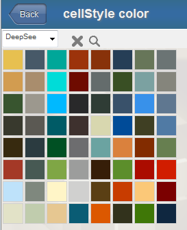
To specify a color, optionally choose the name of a color palette from the drop-down list. (For example, the list option DeepSee corresponds to the color palette shown in the preceding example.) Then click a color in the grid to choose that color.
Or click the magnifying glass icon, which displays a full-range color chooser. Click a color here or use the sliders to specify the red, green, and blue components of your color selection.
To clear the color selection, click the X.
Tip:An authorized user can add custom color palettes. See “Creating Custom Color Palettes” in the DeepSee Implementation Guide.
-
Background — Specify the color of the background, in the same way as described in the previous item.
-
Opacity — Use this option to specify the opacity of the background. The value 1 means 100%.
-
Font — Specify the typeface of the text. Select a typeface. To clear the typeface selection, click Default, at the top of the list.
-
Font Size — Use the slider to specify the size of the text or type a value into the input box.

To clear the size selection, click the check box.
-
Text Style — Specify the style of the text.

Select one or more options. The first three options make the text bold, italic, and underlined, respectively. The Cc option changes the text to capital letters as in the following example:
The S option adds shadows to the text as follows:

-
Align — Specify the alignment of the text.
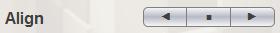
These options make the text left-aligned, centered, and right-aligned, respectively.
Specifying Chart Text Styles
In charts and other graphical elements, you can specify options that control the display of text. The options are as follows:
-
Color — Specify the color of the text. For information on specifying this option and other color options, see the Color option in the previous section.
-
Stroke — Specify the color of the outline of the characters in the text. The following figure shows an example where Color is blue and Stroke is black:

By default, DeepSee uses the same color for the outline as for the text itself.
-
Stroke Width — Use this option to specify the width of the outline. The following shows an example of a medium-width outline:

To clear the setting, click the check box.
-
Opacity — Use this option to specify the opacity of the text (which is 100% by default).
-
Font, Text Size, Text Style — See Font, Font Size, Text Style in the previous section.
Specifying Line Styles
In numerous places, you can specify options that control the display of lines and other graphical elements. The options are as follows:
-
Fill — Specify the color to use within the graphical element. This option applies to line markers and to parts of speedometers, for example. For information on specifying this option and other color options, see the Color option in “Specifying Table Text Styles,” earlier in this chapter.
-
Opacity — Use this option to specify the opacity of graphical element (which is 100% by default).
-
Line — Specify the color of the line that outlines the graphical element.
-
Line Width — Use this option to specify the width of the line.
-
Line Style — Specify the style of the line. Click Solid, Dashed, or Dotted.