Adding Widget Controls
This chapter describes how to add controls to widgets in a dashboard. It discusses the following topics:
For examples of controls and information on where they can be used, see the chapter “Orientation to Dashboards” in the DeepSee End User Guide.
The following buttons are not controls and are not discussed in this chapter:
| Button | Discussion |
|---|---|
 |
Opens the pivot table in the Mini Analyzer. |
 |
Displays the widget in table format. |
 |
Displays the widget in chart format. |
 |
Exports the currently viewed data to Microsoft Excel. |
 |
Displays the dimension list. |
 |
Drills down to a lower level in a hierarchy. |
These buttons are specified as settings of the widget, as discussed in “Specifying Widget Settings,” earlier in this book.
The print button  can be a control or can be specified as a widget setting.
Adding a Control
To add a control to a widget:
-
Access the Dashboard Editor and select the widget as described in “Reconfiguring a Widget,” earlier in this book.
-
Click Controls.
-
Click the plus sign + button.
The system displays a dialog box where you specify the control.
-
Specify the options as appropriate for the type of control you need, as described in the rest of this chapter.
-
Click OK to add the control.
-
Optionally save the dashboard.
For reference, this section lists the control options and describes their purposes.
-
Location — Specifies where the control is shown:
-
Widget (the default) displays the control on the widget toolbar.
Note:If you add a control to the widget, be sure the toolbar is visible (its display is controlled via the Toolbar option). See “Reconfiguring a Widget,” earlier in this book.
-
Dashboard displays the control in the Filters worklist.
Do not use Dashboard if you have configured this as a zero-worklist dashboard, because the control would not be visible to users.
-
Onclick Event configures the control as an onclick control. No visible indication of the control is given.
-
-
Target — Specifies which widgets this control affects. Specify one of the following:
-
If this option is blank, the control affects only the widget that owns it.
-
If this option is *, the control affects all widgets.
-
If this option is the name of the widget, the control affects that widget. In this case, use the value given in the Widget Name option for that widget.
-
-
Action — Specifies the action. Custom actions are shown at the end of the list.
-
Filter — (if Action is Filter) Specifies the filter for this control to use.
-
Type — Specifies the visual form of the control:
-
auto — The system chooses the suitable form based on your other selections.
-
dropdown — The control is shown as a drop-down list.
-
searchBox — The control is shown as a searchable drop-down list. The user can type a value and then search for values that match the input.
-
radio — The control is shown as a set of radio buttons.
Note that the radio option is available only when you reconfigure a control.
-
button — The control is shown as a button.
-
hidden — The control is not shown.
-
custom — The control is based on a custom portlet.
-
-
Custom control — (if Type is custom) — Specifies the portlet to use.
-
Control Label or Icon — Specifies either the text to display above the control or an icon to display next to the control. For information on adding icons that can be used here, see “Creating Icons” in the DeepSee Implementation Guide.
-
Active When — Specifies when this control is active. Choose one of the following values:
-
Always — This control is always active.
-
Item Selected — This control is active when the user selects one or more cells in a pivot table. The control is inactive otherwise.
-
1 Listing Item Selected — This control is active when the user selects a single row of a listing. The control is inactive otherwise.
-
Listing Item Selected — This control is active when the user selects one or more rows of a listing. The control is inactive otherwise.
-
-
Control Tooltip — Specifies a tooltip to display when the user hovers the cursor over the control.
-
Control Size — Specifies the width of the control.
-
Read Only — If selected, this option prevents a user from changing the value in this control.
In this case, the purpose of the control is to indicate the state of the control. Either provide a default value (if applicable) or pass a value via the dashboard URL. See “Accessing Dashboards from Your Application” in the DeepSee Implementation Guide.
-
Default Value (applies only to filter controls) — Specifies the default filter value. See “Adding an Explicit Filter Control,” later in this chapter.
-
Required (applies only to filter controls) — If this option is enabled, the user must specify a value for the filter. See “Adding an Explicit Filter Control,” later in this chapter.
Note that you must also specify Default Value so that the dashboard always has a value for this filter.
Not all combinations of these options are suitable. Later sections of this chapter provide recommended configurations for specific kinds of controls.
Reconfiguring a Control
To reconfigure a control on a widget:
-
Access the Dashboard Editor and select the widget as described in “Reconfiguring a Widget,” earlier in this book.
-
Click Controls.
-
Click the control name.
-
Make changes as needed. See the previous section for details.
-
Optionally save the dashboard.
Adding an Explicit Filter Control
To add a control to filter one or more widgets, add a control as described earlier in this chapter and configure it as follows:
-
Location — Select either Widget (the default) or Dashboard.
-
Target — If this control is going to automatically refresh the display, do one of the following:
-
Leave this option blank, if you want to refresh only this widget. This is the default.
-
Specify * to refresh all widgets.
-
Specify the name of the widget to refresh (use the value given in the Widget Name option for that widget).
-
-
Action — Select one of the following:
-
Apply Filter sets the filter and automatically refreshes the display.
-
Set Filter sets the filter but does not refresh the display.
-
-
Filter — Select the filter for this control to use:
-
For a pivot table created in the Analyzer, the system lists all levels available in the same subject area.
If there are any named filters in the subject area, the list include the item Named Filters. If you select this option, the user will be able to select any one of those named filters.
-
For a KPI, the system lists all filters defined in the KPI.
-
For an Ensemble business metric, the list includes Instance (the instance to display), MaxHistory (the number of historical points to display for the properties that specify AUTOHISTORY), and Properties (the metric property to display).
-
-
Type — Select auto, dropdown, or searchBox.
-
Control Label or Icon — Optionally type the text that you want to display above the control. Or select an icon to display next to the control.
-
Read Only — Optionally select this to prevent the users from changing the filter. In this case, the purpose of the filter is to indicate how the data is filtered. Either provide a default value or pass a filter value via the dashboard URL. See “Accessing Dashboards from Your Application” in the DeepSee Implementation Guide.
-
Value Required — If the user must specify a value for this filter, enable the Required option. Also specify a value for Default Value so that the dashboard always has a value for this filter.
-
Control Tooltip — Optionally type a tooltip to display when the user hovers the cursor over the control.
Specifying a Default Value
You may optionally type a value into Default Value.
Alternatively, click the magnifying glass. The system displays the following dialog box:
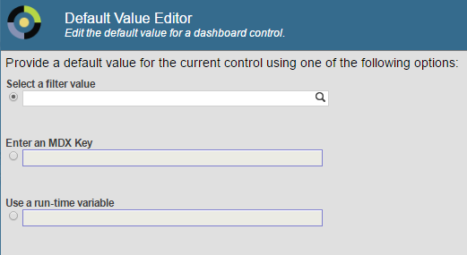
Here do one of the following:
-
Click the magnifying glass under Select a filter value and select a value in the resulting dialog.
-
Type a value in the Enter an MDX Key field. See the table after this list.
-
Select a value from the Use a run-time variable drop-down list, which lists all available runtime variables. (For details on creating these, see the DeepSee Implementation Guide.)
Then click OK.
If you select a runtime variable, it is shown in the Default Value field with an at sign (@) at the beginning. For example: @DefaultZipCode
DeepSee assumes that the filter value is a member key rather than a member name. In most cases, the member key and member name are the same. For information on seeing the member key, see “Finding the Key for a Member” in the chapter “Filtering Pivot Tables” in Using the DeepSee Analyzer.
Also, if a user accesses the dashboard via a URL, any filter values in the URL take precedence over the default value specified in this control.
If you type a value into the Enter an MDX Key field, use one of the following forms:
| Scenario | Expression That Returns This Value |
|---|---|
| A single member | "&[keyval]" where keyval is the key for the member. See “Key Values” in the DeepSee MDX Reference. |
| A range of members | "&[keyval1]:&[keyval2]" |
| A set of members | "{&[keyval1],&[keyval2],&[keyval3]}" |
| All members of the level except for a specified single member | "%NOT &[keyval]" |
| All members of the level except for a specified subset | "%NOT{&[keyval1],&[keyval2],&[keyval3]}" |
Adding an OnClick Filter Control
An onclick filter control is supported only in a widget that uses a pivot table as its data source.
To add an onclick filter control, add a control as described earlier in this chapter and configure it as follows:
-
Location — Click Onclick Event.
-
Target — Do one of the following:
-
Specify * to refresh all widgets.
-
Specify the name of the widget to refresh (use the value given in the Widget Name option for that widget).
-
-
Action — Select Apply Filter.
Note:You do not need to select the filter to apply. DeepSee automatically filters based on the complete context in which the user selects; that is, DeepSee considers the row and column context as well as any currently active filters applied to the widget. Furthermore, if you do specify a filter within the widget configuration, that filter is ignored.
Example: Listing with OnClick Filter
As an example, see the dashboard Listing with OnClick Filter, in SAMPLES. This dashboard is defined as follows:
-
In the dashboard definition, the upper widget has an onclick filter whose target is the lower widget.
-
The pivot table shown in the top widget — Use in Dashboards/Product Info — displays product categories as rows.
-
The pivot table shown in the bottom widget — Use in Dashboards/HoleFoods Sales Listing — is defined as an unfiltered detail listing that does not auto-execute. To define a pivot table in this way, do the following in the Analyzer:
-
Create a pivot table that uses the desired cube and that has no column or row definition and that also has no filter, like this:
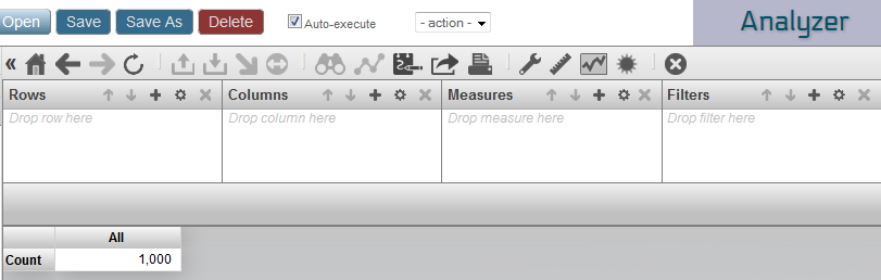
-
Clear the Auto-execute button.
-
Click the listing button
 .
.You can perform steps 2 and 3 in either order.
-
Save this pivot table.
-
Adding a Refresh Control
To add a control to refresh the dashboard (which is necessary if you have controls that set filters but that do not apply them automatically), add a control as described earlier in this chapter and configure it as follows:
-
Location — Select either Widget (the default) or Dashboard.
-
Target — Do one of the following:
-
Leave this option blank, if you want to refresh only this widget. This is the default.
-
Specify * to refresh all widgets.
-
Specify the name of the widget to refresh (use the value given in the Widget Name option for that widget).
-
-
Action — Select Refresh.
-
Type — Select auto or timer.
-
If you select auto, the control appears as follows:

-
If you select timer, type a value into Time (in seconds). In this case, the refresh control will automatically run at the specified interval.
-
-
Control Tooltip — Optionally type a tooltip to display when the user hovers the cursor over the button.
To use a custom button instead of the standard icon, specify the Type as button and specify a value for Control Label or Icon.
Adding a Control to Print the Dashboard
You can add controls with which users can print parts or all of the dashboard. The output is a PDF file (opened in a browser window) with one page for each widget.
To add such a control, add a control as described earlier in this chapter and configure it as follows:
-
Location — Select either Widget (the default) or Dashboard.
-
Target — Specify a list of the names of the widgets to print. The first widget in the list determines the print settings.
Or, if you want to print all the widgets and do not need to control the print settings, type *.
If you leave Target, only the current widget is printed. If you need only to print a single widget, however, it is simpler to just enable the print setting for that widget; see “Customizing Print Settings for a Widget,” earlier in this book.
-
Action — Select Print Widget.
-
Type — Select auto, dropdown, or button, as applicable for the chosen action.
The default type is a small button with a picture on it.
-
Control Label or Icon — Optionally type the text that you want to display on the control. Or select an icon to display next to the control.
-
Control Tooltip — Optionally type a tooltip to display when the user hovers the cursor over the control.
Then save the dashboard.
For further details and requirements, see the section “Customizing Print Settings for a Widget.”
Adding a Control to Reload the Dashboard
To add a control to reload the dashboard, add a control as described earlier in this chapter and configure it as follows:
-
Location — Select either Widget (the default) or Dashboard.
-
Target — Ignore this option. All widgets are refreshed.
-
Action — Select Reload Dashboard.
-
Type — Select auto or timer.
-
If you select auto, the control appears as follows:

-
If you select timer, type a value into Time (in seconds). In this case, the reload control will automatically run at the specified interval.
-
-
Control Tooltip — Optionally type a tooltip to display when the user hovers the cursor over the button.
To use a custom button instead of the standard icon, specify the Type as button and specify a value for Control Label or Icon.
Adding a Control to Change the Display Type
You can add controls with which users can change the display type from one chart to another. You can provide two different kinds of controls:
-
A drop-down list from which the user can choose a type.
-
A button that immediately switches to a different type. In this case, you typically provide at least two buttons, so that the user can easily return to the original type.
To add such a control, add a control as described earlier in this chapter and configure it as follows:
-
Location — Select either Widget (the default) or Dashboard.
-
Target — Leave this blank. Or type * if this control should affect all widgets in this dashboard.
-
Action — Select Set Chart Type or Choose Chart Type. The first option adds a button (which you configure later) to set the display type to a specific type. The second option adds a drop-down list (which you configure later) of display types.
-
Type — Select auto, dropdown, or button, as applicable for the chosen action.
For Set Chart Type, the default type is dropdown, and for Choose Chart Type, the default type is a small button with a picture on it.
-
Control Label or Icon — Optionally type the text that you want to display on the control. Or select an icon to display next to the control.
-
Control Tooltip — Optionally type a tooltip to display when the user hovers the cursor over the control.
Then select the control again and display the Control menu. Select Chart Type. This displays a list of chart types, which includes the pivot table type. Then:
-
If Action is Set Chart Type, click a single type.
-
If Action is Choose Chart Type, click multiple types and then click Apply Selection.
To unselect a given type, click it a second time. To unselect all types, click Clear Selection.
Then save the dashboard.
Adding a Control to Change the Row or Column Sort
In a pivot table widget, if a user double-clicks a column header in a pivot table, the system automatically sorts the pivot table by the data in that column. No configuration is needed for this.
You can also add a control that affects the row or column sort. To add such a control, add a control as described earlier in this chapter and configure it as follows:
-
Location — Select either Widget (the default) or Dashboard.
-
Target — Leave this blank. Or type * if this control should affect all widgets in this dashboard.
-
Action — Select Row Sort or Column Sort.
-
Type — Select auto (which becomes a drop-down list) or dropdown.
-
Control Label or Icon — Optionally type the text that you want to display on the control. Or select an icon to display next to the control.
-
Control Tooltip — Optionally type a tooltip to display when the user hovers the cursor over the control.
Adding a Control to Change the Row or Column Count
For pivot table widgets, to add a control that changes the row or column count, add a control as described earlier in this chapter and configure it as follows:
-
Location — Select either Widget (the default) or Dashboard.
-
Target — Leave this blank. Or type * if this control should affect all widgets in this dashboard.
-
Action — Select Row Count or Column Count.
-
Type — Select auto (which becomes a type-in box) or dropdown.
-
Control Label or Icon — Optionally type the text that you want to display on the control. Or select an icon to display next to the control.
-
Control Tooltip — Optionally type a tooltip to display when the user hovers the cursor over the control.
Adding a Control to Change the Row or Column Specification
For widgets that display pivot tables (rather than other data sources), you can add a control that enables the user to change the specification for the rows or columns of the pivot table. To add such a control, add a control as described earlier in this chapter and configure it as follows:
-
Location — Select either Widget (the default) or Dashboard.
-
Target — Leave this blank. Or type * if this control should affect all widgets in this dashboard.
-
Action — Select Set Row Spec or Set Column Spec.
-
Type — Select auto (which becomes a button) or select button.
-
Row Spec or Column Spec (as appropriate; this option is available only when you reconfigure a control) — Specify an MDX set expression. For example:
[gend].[h1].[gender].MEMBERSFor another example:
{MEASURES.[avg test score],MEASURES.[avg allergy count]}Do not include the keyword NON EMPTY. Also note that the set expression does not include ON ROWS or ON COLUMNS.
For details, see the reference section “Set Expressions” in the DeepSee MDX Reference.
If this setting is an empty string, DeepSee ignores the specification and uses the specification defined in the original data source.
-
Control Label or Icon — Optionally type the text that you want to display on the control. Or select an icon to display next to the control.
-
Control Tooltip — Optionally type a tooltip to display when the user hovers the cursor over the control.
Such controls are supported only for widgets that use pivot tables as the data source. Also note that it is not practical to use Set Column Spec or Choose Column Spec (see the subsection) with meters and scorecards because these options change the property names of the data source.
Variation: Providing a List of Choices
To provide a similar control that provides a list of choices for the row or column specification:
-
Create a term list to hold the choices.
For each term list item, specify Key as the name of the specification and specify Value as an MDX set expression. For example:
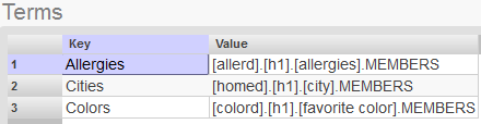
-
Use the preceding steps, with the following changes:
-
Action — Select Choose Row Spec or Choose Column Spec.
-
Type — Select auto (which becomes a drop-down list), dropdown, or radio (if there is a small number of choices). The radio option is available only when you reconfigure a control.
-
Row Spec List or Choose Column Spec (as appropriate; this option is available only when you reconfigure a control) — Select the term list that you created for this purpose.
-
Adding a Control to Set a Pivot Variable
Pivot variables provide another way for your end users to interact with your dashboards. A pivot table can be defined so that its underlying query uses pivot variables in selected parts of the query. (Similarly, an MDX-based KPI can use pivot variables in the same way.) When a dashboard includes this pivot table, that dashboard can include a pivot variable control, with which the user can change the value of the corresponding pivot variable. DeepSee simply substitutes the given value into the query, executes the query, and then redisplays the pivot table.
To add a control to set a pivot variable, add a control as described earlier in this chapter and configure it as follows:
-
Action — Select Apply Pivot Variable.
-
Pivot Variable — Select the pivot variable.
-
Control Label or Icon — Optionally type the text that you want to display on the control. Or select an icon to display next to the control.
-
Control Tooltip — Optionally type a tooltip to display when the user hovers the cursor over the control.
The control is useful only if the data source for the widget uses the given pivot variable.
Adding a Control to Display a Different Pivot Table
For a pivot table widget, you can provide a control that displays a different pivot table as the data source. The original data source does not have to be a pivot table. To add a control to display a specific pivot table in a widget, add a control as described earlier in this chapter and configure it as follows:
-
Location — Select either Widget (the default) or Dashboard.
-
Target — Leave this blank.
-
Action — Select Set Data Source.
-
DataSource (this option is available only when you reconfigure a control) — Select the pivot table.
-
Type — Select auto or button.
-
Control Tooltip — Optionally type a tooltip to display when the user hovers the cursor over the control.
Such controls are supported only for pivot table widgets.
Variation: Providing a List of Choices
To provide a similar control that provides a list of choices:
-
Create a term list to hold the choices.
For each term list item, specify Key as the name of the specification and specify Value as the name of a pivot table, ending with .pivot
For example:
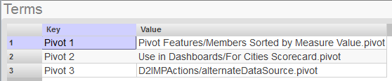
-
Use the preceding steps, with the following changes:
-
Action — Select Choose Data Source.
-
Type — Select auto (which becomes a drop-down list), dropdown, or radio (if there is a small number of choices).
-
DataSource List (this option is available only when you reconfigure a control) — Select the term list that you created for this purpose.
-
Adding a Control to Display a Listing
You can display listings from any pivot table widget whose data source defines a listing.
A map listing uses the Google Maps API. Be sure that your usage of this API is consistent with the Terms of Use, which you can access via a link displayed in this listing.
Note that in order to use the Google Maps API, you must obtain an API key. See Specifying Basic Settings in the DeepSee Implementation Guide for more information.
To add a control that displays a listing, add a control as described earlier in this chapter and configure it as follows:
-
Location — Select either Widget (the default) or Dashboard.
-
Target — Leave this blank.
-
Action — Select Show Listing or Show Geo Listing (which shows a map listing).
Then choose the listing from the drop-down list to the right.
-
Type — Select auto.
For a regular listing, this control appears as follows:
For a map listing, this control appears as follows:

-
Control Tooltip — Optionally type a tooltip to display when the user hovers the cursor over the control.
To use a custom button instead of the standard icon, specify the Type as button and specify a value for Control Label or Icon.
Adding a Control to Display the Pivot Analysis Window
For a widget that displays a pivot table, you can add a control that displays the Pivot Analysis window. To add such a control, add a control as described earlier in this chapter and configure it as follows:
-
Location — Select either Widget (the default) or Dashboard.
-
Target — Leave this blank.
-
Action — Select Pivot Analysis.
-
Analysis — Select the analysis option to display, from the following:
-
Cluster — Performs a cluster analysis.
-
Distribution — Performs a distribution analysis.
-
Regression — Performs a regression analysis.
-
Content Analysis — Performs an iKnow content analysis. This option is available only if the pivot table is based on a subject area that includes unstructured data.
-
Entity Analysis — Performs an iKnow entity analysis. This option is available only if the pivot table is based on a subject area that includes unstructured data.
For information on these options, see the chapter “Using the Pivot Analysis Window” in the DeepSee End User Guide.
If you do not choose an option, the user can select any option. If you do choose an option, the user sees only that option.
-
-
Type — Select auto (which is shown as the
 button in this case).
 -
Control Tooltip — Optionally type a tooltip to display when the user hovers the cursor over the control.
Adding a Control to Display Another Dashboard
To add a control that displays another dashboard, add a control as described earlier in this chapter and configure it as follows:
-
Location — Select either Widget (the default) or Dashboard.
-
Target — Leave this blank.
-
Action — Select View Dashboard.
-
Dashboard — Click the Search button
 , click the dashboard, and click OK.
 -
Type — Select button or auto (which is shown as a button in this case).
-
Control Label or Icon — Optionally type the text that you want to display on the control. Or select an icon to display next to the control.
-
Control Tooltip — Optionally type a tooltip to display when the user hovers the cursor over the control.
You can also configure a pivot table widget so that you can double-click a cell and drill to another dashboard. See the chapter “Adding Pivot Table Widgets.”
Adding a Control to Perform a Custom Action
To add a control that performs a custom action, add a control as described earlier in this chapter and configure it as follows:
-
Location — Select Widget (the default), Dashboard, or Onclick Event.
-
Target — Leave this blank.
-
Action — Select the custom action. The custom actions are at the end of the list.
For information on creating custom actions, see the DeepSee Implementation Guide.
-
Type — Select an option as follows:
-
If Location is Widget or Dashboard, select button or auto (which is shown as a button in this case).
-
Otherwise, ignore Type.
-
-
Control Label or Icon — Optionally type the text that you want to display on the button. Or select an icon to display next to the control.
-
Control Tooltip — Optionally type a tooltip to display when the user hovers the cursor over the control.
Specifying the Value of a Row
In some cases, a custom action might require information about the context — that is, the row that the user selected before launching the action. (Other actions operate the same way no matter what the context is.) When you use custom actions, make sure that you know whether this context is required.
If a custom action requires context, do the following to specify which column contains the value to pass to the actions:
-
Reconfigure that column or property and select the Value Column option.
Do not select the Value Column option for more than one property or column in the same widget; if you do, the result is indeterminate.
Hiding a Control
Sometimes it is useful to add a control, specify a default value, and hide it. To hide a control, for Type, select Hidden.