Zen Tables
A Zen table is data-driven. It takes the resultset returned by an SQL query and displays it as an HTML table. There are a number of ways to generate the resultset for a Zen table. You can specify an SQL statement, reference a predefined SQL query, or provide Zen with the inputs it needs to generate an SQL query for you.
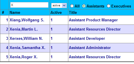
Once you have the data, you can style the resulting table in any way you wish. The following figure shows a simple example. This table uses “zebra” patterning for alternate rows. The user has entered data in the table header to filter the results that the table displays. In this case, the user has selected only entries whose names begin with X, with Active status, who are also Assistants.
This chapter explains how to work with Zen tables as follows:
-
How to place a table on a Zen page
-
How to identify the data source for a Zen table
-
How to supply parameters for the table query, if needed
-
How to specify column details, including filters and links
-
General style properties that Zen tables can have
-
How to define data-specific styling for rows and columns
-
How snapshot mode supports multipage tables and simplifies refresh operations
-
How a Zen table handles user interactions
-
What happens during table refresh operations, and how to request them
<tablePane>
<tablePane> is the XML projection of the versatile %ZEN.Component.tablePaneOpens in a new tab class. To place a table on a Zen page, place a <tablePane> component inside the page class XData Contents block.
This chapter describes the various component and auxiliary classes that Zen supplies to support tables. The following list summarizes the XML elements used to represent these classes in XData Contents. The most important of these is <tablePane>:
-
“<tablePane>” — Draws an HTML table based on an SQL query. Each row in the resultset is displayed as a row in the table. A <tablePane> may contain the following elements, as needed:
-
“<parameter>” — Each <parameter> element provides one of the parameters required to construct the <tablePane> query.
-
“<column>” — Each <column> element specifies layout, style, and behavior details for a particular column in the resulting table. <column> elements are optional when the table displays all columns in the resultset. <column> elements are required when a <tablePane> needs to select which columns in the resultset to display.
-
“<condition>” — Each <condition> element defines one data-specific detail that applies to rows and cells within the table. For example, cells that contain a certain value might display a certain background color, such as red to indicate an error condition. The specific cells that contain this value might be different each time the table refreshes. Zen keeps track of these details for you and colors all cells appropriately.
-
-
“<tableNavigator>” — Automatically provides a standard set of buttons for moving through the pages of a multipage table.
-
“<tableNavigatorBar>” — An alternative to <tableNavigator>, this element provides extra buttons to help users navigate large, multipage tables.
<tablePane> has the following general-purpose attributes.
| Attribute | Description |
|---|---|
| dataSource |
Specifies which columns from the %ResultSetOpens in a new tab to display, and in what order. Possible values are:
When you omit dataSource from the <tablePane>, Zen uses the value "query" by default, unless there are <column> entries defined, in which case Zen ignores any dataSource value and uses "columns". |
| initialExecute |
If initialExecute is true, the <tablePane> executes the associated query when the table first displays. Otherwise the <tablePane> executes the query only on demand. The default is true. initialExecute has the underlying data type %ZEN.Datatype.booleanOpens in a new tab. See “Zen Attribute Data Types.” |
| unlockSession | Indicates whether updates to the <tablePane> component should unlock the CSP session while retrieving data from the server. Setting this attribute to true makes it easier to maintain a responsive UI while running slower queries on the server. In general, you should use this feature when the server does not update the session data. The default value is false.
unlockSession has the underlying data type %ZEN.Datatype.booleanOpens in a new tab. See “Zen Attribute Data Types.” |
<tablePane> offers many additional attributes that you can use to configure layout, style, and behavior. The following topics describe them.
Data Sources
A <tablePane> element must indicate a data source for the table in one of the following ways:
-
“Generating an SQL Query” by providing a simple description that Zen uses to generate an SQL statement
-
“Referencing a Class Query” to obtain a result set
-
“Using a Callback Method” to obtain a result set
-
“Changing the Data Source Programmatically” for a table at runtime
The next several topics describe each option in detail.
Regardless of which option you use, all techniques support the maxRows attribute. It controls the size of the data returned. The following table provides maxRows details.
| Attribute | Description |
|---|---|
| maxRows |
The maximum number of rows to fetch. For ordinary tables this is the maximum number of rows to display. For snapshot tables, maxRows is the maximum size of the snapshot and pageSize is the number of rows to display per page. The default value for maxRows is 100. The <radioSet>, <select>, <dataListBox>, <dataCombo>, and <repeatingGroup> components also support the maxRows attribute. |
Specifying an SQL Query
A <tablePane> can provide a complete SQL statement as the value of its sql attribute. For example:
<tablePane id="table"
           sql="SELECT ID,Name FROM MyApp.Employees
                WHERE Name %STARTSWITH ? ORDER BY Name"
           >
     <parameter value="Z"/>
</tablePane>
The following table provides sql details.
| Attribute | Description |
|---|---|
| sql |
The value of this attribute is a complete SQL statement, which Zen executes at runtime to provide the contents of the table. The <radioSet>, <select>, <dataListBox>, <dataCombo>, and <repeatingGroup> components also support the sql attribute. You may provide any input parameter values for the SQL query by placing <parameter> elements inside the <tablePane> container. For details, see the section “Query Parameters.” |
The sql attribute is the XML projection of the %ZEN.Component.tablePaneOpens in a new tab property sql. Therefore, the sql attribute value must escape any XML special characters. For example, in place of the less-than symbol < you must substitute the XML entity < as follows:
sql="select * from infonet_daten.abopos where lieferadresse=? and status<9"
The following table lists XML special characters that cause problems when they appear in sql strings, and the XML entities to substitute for them.
| Character | XML Entity | Description |
|---|---|---|
| > | > | Right angle bracket or “greater than” symbol. |
| < | < | Left angle bracket or “less than” symbol. |
| & | & | Ampersand. |
| ' | ' | Single quotation mark or apostrophe. A string enclosed in single quotes needs the ' entity to represent the ' character. |
| " | " | Double quotation mark. A string enclosed in double quotes needs the " entity to represent the " character. |
Unlike most other %ZEN.Component.tablePaneOpens in a new tab properties, you cannot set the sql property from the client at runtime. You can set it only from XData Contents. This is because sql is an encrypted attribute. The sql attribute value is encrypted (using the current session key) when it is sent to the client. If this value is returned to the server, it is automatically decrypted.
This prevents users from seeing the definition of an SQL statement if they view page source within their browser and prevents client logic from constructing arbitrary queries. For security reasons, query activities should always be restricted to the server.
Generating an SQL Query
The <tablePane> component supports attributes that allow you to automatically generate the query based on a simple description. This approach is similar to using a callback method, as described in a later topic, except that Zen generates the callback method for you, based on your description of the query. <dataListBox> and <dataCombo> also supports these attributes.
| Attribute | Description |
|---|---|
| groupByClause | An SQL GROUP BY clause such as "Year,State". The groupByClause value can be a literal string, or it can contain a Zen #()# runtime expression. |
| orderByClause | An SQL ORDER BY clause such as "Name,State". If not provided, then whenever the user clicks on a column header, the next query contains the appropriate ORDER BY clause based on the user’s choice. The orderByClause value can be a literal string, or it can contain a Zen #()# runtime expression. |
| tableName | The name of the SQL table that provides the data for the table. This value is used in the FROM clause for the generated query. The tableName value can be a literal string, or it can contain a Zen #()# runtime expression. |
| whereClause |
An SQL WHERE clause such as "Name='Elvis'". When a whereClause is provided in the <tablePane> definition in XData Contents, this sets an initial value for the whereClause property of the tablePane object. If client-side or server-side code later changes the value of this whereClause property, the new value overrides the original value. This means you can initially set up a table to show only certain values, but another line of code can change the whereClause value, causing your users to see a different set of values when it refreshes. For example, if any column filters are defined in this table, Zen dynamically creates a WHERE clause for the <tablePane> based on the current filter values selected by the user. The whereClause value can be a literal string, or it can contain a Zen #()# runtime expression. |
To have the <tablePane> generate an SQL query, you must do the following:
-
Provide a value for the tableName attribute.
-
Do not provide values for the sql, queryClass, queryName, or OnCreateResultSet. All of these attributes take precedence over the behavior described in this topic.
After you satisfy the first two conditions, Zen assumes a "columns" value for dataSource.
-
Define the names of one or more columns by providing <column> elements inside the <tablePane>. You must define at least one column or Zen generates a “Missing SELECT list” error.
-
You can add query parameters by providing <parameter> elements inside the <tablePane>.
-
You can add clauses for the generated query by providing the <tablePane> attributes groupByClause, orderByClause, or whereClause, or by allowing defaults to prevail as described in the table above.
The following is a simple example:
<tablePane id="table"
    tableName="MyApp.Employee">
    <column colName="ID" hidden="true"/>
    <column colName="Name"/>
</tablePane>
This <tablePane> example generates an SQL statement similar to the following:
SELECT ID,Name FROM MyApp.Employee
Zen executes this query to provide the contents of the table. In the example, the ID column is marked as hidden. This means that its value is fetched (it can be used for conditions or actions) but not displayed. For details about hidden and other <column> attributes, see the section “Table Columns.”
Referencing a Class Query
A <tablePane> can reference a pre-existing class query to obtain a %ResultSetOpens in a new tab object. The following components also support this approach: <radioSet>, <select>, <dataListBox>, <dataCombo>, and <repeatingGroup>.
| Attribute | Description |
|---|---|
| queryClass | The name of the class containing the query. You must also provide a value for queryName. |
| queryName | The name of the class query that provides the %ResultSetOpens in a new tab for this <tablePane>. You must also provide a value for queryClass. |
You may provide any input parameter values for the query by placing <parameter> elements inside the <tablePane>. For example:
<tablePane id="table"
           queryClass="MyApp.Employee"
           queryName="ListEmployees">
    <parameter value="Sales"/>
    <parameter value="NEW YORK"/>
</tablePane>
The value of the parameter in the <tablePane> is the value used to create the %ResultSetOpens in a new tab object. It overrides any default value set in the class query in all cases.
Using a Callback Method
A <tablePane> can use a callback method to obtain a %ResultSetOpens in a new tab object. The following <tablePane> attributes support this approach. <dataListBox>, <dataCombo>, and <altJSONSQLProvider> also support these attributes.
| Attribute | Description |
|---|---|
| OnCreateResultSet |
Name of a server-side callback method in the Zen page class. For more information, see OnCreateResultSet. |
| OnExecuteResultSet |
Name of a server-side callback method in the Zen page class. For more information, see OnExecuteResultSet. |
| showQuery |
showQuery works only if an OnCreateResultSet callback is used to generate the table, and only if this callback sets the queryText property of the QueryInfo object to contain the text of the query. Of the various components that use callback methods to generate SQL queries, only <tablePane> and <dataCombo> support the showQuery attribute. If showQuery is true, the Zen page displays the SQL query used to provide the contents of the <tablePane> or <dataCombo> component. This is useful for troubleshooting purposes, during application development. The default showQuery value is false. showQuery has the underlying data type %ZEN.Datatype.booleanOpens in a new tab. See “Zen Attribute Data Types.” The showQuery value can be a literal string, or it can contain a Zen #()# runtime expression. |
OnCreateResultSet
Name of a server-side callback method in the Zen page class. This method instantiates the %ResultSetOpens in a new tab object and set any %ZEN.Auxiliary.QueryInfoOpens in a new tab “QueryInfo Properties” appropriately. Zen invokes this method whenever it draws the table, automatically passing it the following parameters:
-
%StatusOpens in a new tab — an output parameter for method status
-
%ZEN.Auxiliary.QueryInfoOpens in a new tab — the QueryInfo object for the <tablePane>
The callback must return a %ResultSetOpens in a new tab object. The following is a valid method signature. Also see the detailed example following this table:
Method CreateRS(Output tSC As %Status,
     pInfo As %ZEN.Auxiliary.QueryInfo)
     As %ResultSet
{ }
To use the above method as the callback, the developer would set OnCreateResultSet="CreateRS" for the <tablePane>.
If defined, OnCreateResultSet takes precedence over any other techniques for providing data for a <tablePane>.
OnExecuteResultSet
Name of a server-side callback method in the Zen page class. This method executes the %ResultSetOpens in a new tab object returned by the OnCreateResultSet callback. Zen automatically invokes the OnExecuteResultSet callback after the OnCreateResultSet callback, passing it the following parameters:
-
%ResultSetOpens in a new tab — the result set from OnCreateResultSet
-
%StatusOpens in a new tab — an output parameter for method status
-
%ZEN.Auxiliary.QueryInfoOpens in a new tab — the QueryInfo object for the <tablePane>
Optionally, you can suppress invocation of the OnExecuteResultSet callback by setting the QueryInfo queryExecuted property to true at the end of the OnCreateResultSet callback.
The OnExecuteResultSet callback must return a%ZEN.Datatype.booleanOpens in a new tab indicating whether or not the result set was executed. The following is a valid signature for this callback:
Method ExecuteRS(myRS As %ResultSet,
     Output pSC As %Status,
     pInfo As %ZEN.Auxiliary.QueryInfo)
     As %Boolean
{ }
To use the above method as the callback, the developer would set OnExecuteResultSet="ExecuteRS" for the <tablePane>.
Callback Example
The following is a detailed example of using a callback method to create a %ResultSetOpens in a new tab for a tablePane. The callback method constructs a dynamic SQL statement in response to current values of tablePane properties sortOrder and sortColumn. The tablePane automatically passes these values to the callback method as the corresponding properties of the input %ZEN.Auxiliary.QueryInfoOpens in a new tab object.
Also note how the method places the SQL statement text in the queryText property of QueryInfo before exiting. If the <tablePane> showQuery value is true, this table displays itself, plus the query that generated it.
Method CreateRS(Output tSC As %Status,
                pInfo As %ZEN.Auxiliary.QueryInfo) As %ResultSet
{
    Set tRS = ""
    Set tSC = $$$OK

    Set tSELECT = "ID,Name,Title"
    Set tFROM = "MyApp.Employee"
    Set tORDERBY = pInfo.sortColumn
    Set tSORTORDER = pInfo.sortOrder
    Set tWHERE = ""

    // Build WHERE clause based on filters
    If ($GET(pInfo.filters("Name"))'="") {
        Set tWHERE = tWHERE _ $SELECT(tWHERE="":"",1:" AND ") _
                "Name %STARTSWITH '" _ pInfo.filters("Name") _ "'"
    }
    If ($GET(pInfo.filters("Title"))'="") {
        Set tWHERE = tWHERE _ $SELECT(tWHERE="":"",1:" AND ") _
                "Title %STARTSWITH '" _ pInfo.filters("Title") _ "'"
    }

    Set sql = "SELECT " _ tSELECT _ " FROM " _ tFROM
    Set:tWHERE'="" sql = sql _ " WHERE " _tWHERE
    Set:tORDERBY'="" sql =
       sql _ " ORDER BY " _tORDERBY _ $SELECT(tSORTORDER="desc":" desc",1:"")

    Set tRS = ##class(%ResultSet).%New()
    Set tSC = tRS.Prepare(sql)
    Set pInfo.queryText = sql

    Quit tRS
}
QueryInfo Properties
The following table describes the properties on the %ZEN.Auxiliary.QueryInfoOpens in a new tab object that appears in the signature for both callback methods.
Like tablePane, the dataCombo, dataListBox, and repeatingGroup components can also use callbacks to generate a component from a %ResultSetOpens in a new tab. Some of the properties in the QueryInfo object apply only to tablePane queries. dataCombo, dataListBox, and repeatingGroup ignore any table-only properties, including those for columns, filters, and sorting.
Only tablePane and dataCombo support the queryText property.
| Property | Description |
|---|---|
| columnExpression | The colExpression values from each <column> in the <tablePane>. columnExpression organizes these values as a multidimensional array subscripted by <column> colName. |
| columns | The colName values from each <column> in the <tablePane>. columns organizes these values as a multidimensional array subscripted by column number (1–based). |
| filterOps | The filterOp values from each <column> in the <tablePane>. filterOps organizes these values as a multidimensional array subscripted by <column> colName. |
| filters | The filterValue values from each <column> in the <tablePane>. filters organizes these values as a multidimensional array subscripted by <column> colName. |
| filterTypes | The filterType values from each <column> in the <tablePane>. filterTypes organizes these values as a multidimensional array subscripted by <column> colName. |
| groupByClause | The groupByClause value for the <tablePane>, if supplied. |
| orderByClause | The orderByClause value for the <tablePane>, if supplied. |
| parms | Multidimensional array, subscripted by parameter number (1–based). This array contains any input values provided by <parameter> elements within the <tablePane>. |
| queryExecuted | Set this property to true in the method identified by OnCreateResultSet, to indicate that the newly created %ResultSetOpens in a new tab has already been executed and you do not want the method identified by OnExecuteResultSet to be called. The default is false. |
| queryText | The method identified by OnCreateResultSet can set this value to the actual query text, to be displayed if the showQuery value is true. |
| rowCount |
If this value is set by the callback, upon return the rowCount property contains the number of rows returned by the query. After the query is executed, rowCount could be different from rows. Note that rowCount is a string, and not numeric, as its value might be "" or "100+". Any number of rows greater than 100 is represented as "100+". When testing rowCount from JavaScript, if you want to convert to a numeric value use parseInt for base 10: rowCount = parseInt(rowCount,10); |
| rows | The number of rows requested. For tables, this is the maxRows value. |
| sortColumn | The colName of the current sort column selected by the user. |
| sortOrder | The table’s current sort order (usually determined by user clicks) such as "asc" or "desc". |
| tableName | The <tablePane> tableName value. |
| whereClause | The whereClause value for the <tablePane>, if supplied. |
Changing the Data Source Programmatically
You can change the data source for a <tablePane> at runtime in a variety of ways. The principle at work here is that the data source is on the server, so if you want to change the data source for a table based on user actions on the client side, you must work your way back to the server, as this topic shows.
In the following example, queryClass and queryName were used to define the data source, so we need to change them to new values on the server side. This example uses a JavaScript method in step 2 and a ZenMethod in step 3. Using an intervening JavaScript method as in step 2 is convenient if there are other actions you need to perform on the client side while changing the data source. Alternatively, the onclick from step 1 could invoke the ZenMethod directly, bypassing step 2:
-
There is a component on the Zen page whose response to onclick (or to some other user action) is to invoke a client side JavaScript method. For example:
<button caption="Display Form" onclick="zenPage.setUpContextForm()" /> -
The client side JavaScript method invokes a server side ZenMethod that manipulates data source properties of the <tablePane>. For example:
ClientMethod setUpContextForm() [ Language = javascript ] { this.SetQueryClassAndName("LTD.DomainModel.ContextList","GetAll") ctrl = this.getComponentById('ctrlList') ctrl.setModelClass('LTD.DomainModel.ContextList',this.getCurrentListId()) zenSetProp('ContextId', 'hidden', 0) zenSetProp('ContextType', 'hidden',0) } -
The server side ZenMethod gets the <tablePane> component and set its data source properties. For example:
Method SetQueryClassAndName(queryClass As %String,
                            queryName as %String)
                            As %Status [ ZenMethod ]
{
  Set obj=%page.%GetComponentById("listTable")
  Set obj.queryClass = queryClass
  Set obj.queryName = queryName
  Quit $$$OK
}
Query Parameters
When you are working with SQL queries to generate the data for a Zen table, you sometimes need to provide values for query input parameters, defined as ? characters within the query. To do this, use <parameter> elements within the <tablePane> element. <radioSet>, <select>, <dataListBox>, <dataCombo>, <repeatingGroup>, and <multiSelectSet> can also contain <parameter> elements to support queries.
| Attribute | Description |
|---|---|
| value |
Specifies the parameter value: <parameter value="Here is my value!"/> The value supplied for a parameter can be a literal string, or it can contain a Zen #()# runtime expression. |
When you supply a query directly, as with a sql attribute, each <parameter> element substitutes for one ? in the query syntax, in order from left to right, even if the values are the same. For example:
<tablePane id="table"
sql="SELECT ID,Name FROM MyApp.Employees
WHERE Name %STARTSWITH ? AND
((Salary < ?) OR (TotalCompensation < ?))
ORDER BY Name"
>
<parameter value="Z"/>
<parameter value="100000"/>
<parameter value="100000"/>
</tablePane>The “Data Sources” section in this chapter provides several other examples of how to use the <parameter> element, including the following class query example. Here each <parameter> element substitutes for one argument in the class query:
<tablePane id="table"
           queryClass="MyApp.Employee"
           queryName="ListEmployees">
    <parameter value="Sales"/>
    <parameter value="NEW YORK"/>
</tablePane>
When you work with %ZEN.Component.tablePaneOpens in a new tab programmatically, If you are using one of the classes <radioSet>, <select>, or <multiSelectSet>, which do not implement the setProperty, you must first set an id for the parameter:
<parameter value="Sales" id="param1"/>The following example changes the value of the first parameter to Finance, re-executes the query on the server, and updates the contents of the tablePane to display the new results:
 ClientMethod changeParams() [ Language = javascript ]
 {
     // find the tablePane component
     var table = zenPage.getComponentById('table');
     var param1 = zenPage.getComponentById("p1");
     param1.value='Finance';
     table.executeQuery();
 }
Table Columns
The “Data Sources” section in this chapter explains that a <tablePane> draws an HTML table based on an SQL query. The table displays each row in the query resultset as a table row. A <tablePane> may also contain one or more <column> elements. <column> elements select which of the columns in the query resultset to display, and specify layout, style, and behavior for each column.
<tablePane> has a showRowSelector attribute which is true by default. If showRowSelector is true, the table displays an extra column at far left. This column appears empty when the table first displays. The purpose of this column is to indicate which rows are selected when the user selects them. If you want to suppress this column in your <tablePane>, set showRowSelector to false.
The “Generating an SQL Query” section includes the following example of how <column> elements can generate a table:
<tablePane id="table"
    tableName="MyApp.Employee">
    <column colName="ID" />
    <column colName="Name"/>
    <column colName="Title" style="color: blue;"/>
</tablePane>
The <column> element is the XML projection of the %ZEN.Auxiliary.columnOpens in a new tab class. <column> supports the general-purpose attributes described in the following table.
| Attribute | Description |
|---|---|
| cellTitle |
Text specifying the tooltip message for any cell within the column. Although you can enter ordinary text for this attribute, it has the underlying data type %ZEN.Datatype.captionOpens in a new tab. See “Zen Attribute Data Types.” |
| colExpression | If the table is automatically constructing an SQL query, this is the SQL expression used to get the value of this column. For example: colExpression="Customer->Name".
Does not support aliasing. When using colExpression, you must also specify colName. |
| colName |
The name of the SQL data column that this column is associated with. For more information, see colName. |
| disableSort |
If true, disables sorting this column when the user clicks on the column header. If false, enables sorting. The default is for column sorting to be enabled in each column as long as the useSnapshot attribute for the containing <tablePane> is set to true. |
| header |
Text specifying the column header. Although you can enter ordinary text for this attribute, it has the underlying data type %ZEN.Datatype.captionOpens in a new tab. See “Zen Attribute Data Types.” The header value can be a literal string, or it can contain a Zen #()# runtime expression. |
| hidden |
If true, this column is not be displayed. The default is false. hidden has the underlying data type %ZEN.Datatype.booleanOpens in a new tab. See “Zen Attribute Data Types.” The hidden value can be a literal string, or it can contain a Zen #()# runtime expression. |
| OnDrawCell |
Name of a server-side callback method in the Zen page class. For more information see OnDrawCell. |
| seed | Allows you to pass some arbitrary value to the OnDrawCell callback. |
| style |
CSS style value to be applied to the cells (HTML <td> elements) within this column. For example: "color: red;" The style value can be a literal string, or it can contain a Zen #()# runtime expression. |
| title |
Text specifying the tooltip displayed when the user moves the mouse over the column header. Although you can enter ordinary text for this attribute, it has the underlying data type %ZEN.Datatype.booleanOpens in a new tab. See “Zen Attribute Data Types.” |
| width |
Usually, the HTML style value for Zen tables is "fixed". This means that each column has a specific width value in the generated HTML page. Zen determines these values as follows:
The width value can be a literal string, or it can contain a Zen #()# runtime expression. |
<column> also provides attributes that support dynamic filtering and linking for Zen table columns. Later topics describe these special-purpose <column> attributes:
Finally, if you wish column layout to respond dynamically to user selections, the <tablePane> provides attributes that facilitate this for all columns in the table. See these sections:
When you work with %ZEN.Component.tablePaneOpens in a new tab programmatically, you work with <column> elements as members of the tablePane columns property, a list collection of %ZEN.Auxiliary.columnOpens in a new tab objects. Each <column> in the <tablePane> becomes a member of the columns collection in tablePane, associated with its ordinal position: 1, 2, 3, etc.
colName
The colName attribute provides the name of the SQL data column that this column is associated with. The colName value can be a literal string, or it can contain a Zen #()# runtime expression.
If any colName values in the <tablePane> are duplicates, the second column displays as “(duplicate) colName” to indicate that unless the second column is renamed, the <tablePane> may display unexpected behavior.
If no colName is specified for a column, the column is displayed without a data value. Typically this technique is used to display a link action in a row.
OnDrawCell
The OnDrawCell attribute provides the name of a server-side callback method in the Zen page class. This method injects HTML content into cells in the column using &html<> syntax or WRITE commands. Zen invokes this method whenever it draws the column, automatically passing it the following parameters:
-
A pointer to the <tablePane> object.
-
A string that gives the name of the SQL data column that this <column> is associated with.
-
The seed attribute value from the <column>.
The callback must return a %StatusOpens in a new tab data type. The following is a valid method signature:
Method DrawYesNo(pTable As %ZEN.Component.tablePane,
     pName As %String,
     pSeed As %String) As %Status
{ }
To use the above method as the callback, the developer would set OnDrawCell="DrawYesNo" in the <column> statement:
<column colName="WorkDone" header="Complete?"
     OnDrawCell="DrawYesNo"  />
The following OnDrawCell callback method interprets a Boolean value (1 or 0) to display the string Yes or No in the <tablePane> column.
Method DrawYesNo(pTable As %ZEN.Component.tablePane,
     pName As %String,
     pSeed As %String) As %Status
{
  If %query(pName)
  {
    Write $$$Text("Yes")
  }
  Else
  {
    Write $$$Text("No")
  }
  Quit $$$OK
}
To retrieve the data value from the SQL column while inside your OnDrawCell callback method, use the %query function as shown in the code example above. %query is a function that takes one argument, a string that identifies the name of the SQL column. The signature of your OnDrawCell method provides this value automatically in the input parameter pName. Thus, the expression %query(pName) in your method resolves to the value contained in the SQL column that corresponds to this <tablePane> <column>.
The example tests to see if the expression %query(pName) is non-zero. If so, it places the word Yes in the <tablePane> column; otherwise it places the word No in the <tablePane> column.
Using the %query function in an OnDrawCell callback method is not the same as using the %query special variable in Zen runtime expressions. For information and examples using the %query special variable, with dot syntax, see the sections “Zen Special Variables” and “Zen Runtime Expressions” in the book Developing Zen Applications.
Table Style
<tablePane> offers the following attributes to control the general style of the table.
| Attribute | Description |
|---|---|
| caption |
Text specifying the caption to display for this table. Although you can enter ordinary text for this attribute, it has the underlying data type %ZEN.Datatype.booleanOpens in a new tab. See “Zen Attribute Data Types.” |
| extraColumnWidth | The HTML width to allow for extra columns, such as when multiple rows are selected or row numbers are displayed in the tablePane. The default width for an extra column is 30. |
| fixedHeaders |
If true, the header of the table stays in position when the body of the table scrolls. The default is false. This attribute has the underlying data type %ZEN.Datatype.booleanOpens in a new tab. See “Zen Attribute Data Types.” |
| bodyHeight | If fixedHeaders is true, bodyHeight provides an HTML length value that specifies the height of the body section of the table. The default bodyHeight is "20.0em". |
| nowrap |
If true, table cells disallow word wrapping. If false, they allow it. The default is true. This attribute has the underlying data type %ZEN.Datatype.booleanOpens in a new tab. See “Zen Attribute Data Types.” |
| showRowNumbers |
If true, display a row number column on the left-side of the tablePane. The default is false. This attribute has the underlying data type %ZEN.Datatype.booleanOpens in a new tab. See “Zen Attribute Data Types.” |
| showValueInTooltip |
If true, the tooltip (HTML title attribute) displayed for cells within the table consists of the current value of the cell. The default is false. This attribute has the underlying data type %ZEN.Datatype.booleanOpens in a new tab. See “Zen Attribute Data Types.” |
| showZebra |
If true, use zebra striping (alternating dark and light rows) to display the tablePane. The default is false. This attribute has the underlying data type %ZEN.Datatype.booleanOpens in a new tab. See “Zen Attribute Data Types.” |
Conditional Style for Rows or Cells
A <tablePane> may contain one or more <condition> elements. Each <condition> is a simple expression, based on the values of a given row, that controls the style of the row or of an individual cell within the row. For example:
<tablePane id="table"
    sql="SELECT Name,Home_State FROM MyApp.Employee">
    <condition colName="Name"
               predicate="STARTSWITH"
               value="A"
               rowStyle="background: plum;"/>
</tablePane>
In the above example, every row in which the value of the Name column starts with “A” is displayed with a plum background.
Typically, the conditional style mechanism is used to highlight rows or cells containing special values (such as out-of-range or error cases). Adding conditions does increase the amount of processing needed to display a table, so use them sparingly.
The <condition> element supports the following attributes:
| Attribute | Description |
|---|---|
| cellStyle |
CSS style to be applied to cells within the target column, for rows in which this condition evaluates true. For example: "color: red;" |
| colName | Required. The name of the column that provides the data value to be evaluated by the <condition>. colName can be a literal string, or it can contain a Zen #()# runtime expression. |
| predicate |
The logical operator used to evaluate the condition. predicate may be one of the following comparison operators: "", "GT", "EQ", "LT", "NEQ", "GTEQ", "LTEQ", "EXTEQ", "STARTSWITH", or "CONTAINS". The default predicate is "EQ". For details about each operator, see the “<condition> predicate Values” table, below. |
| rowStyle |
CSS style to apply to rows in which this condition evaluates to true. For example: "font-weight: bold;" |
| targetCol |
The name of the column that cellStyle applies to. If not specified, colName is used. If the target column displays a link, as discussed in the section Column Links, the targetCol must match the linkCaption attribute of the <column>. targetCol can be a literal string, or it can contain a Zen #()# runtime expression. |
| value |
The literal value to be compared against the value in the column identified in colName. If enclosed within {} (for example, "{Title}") value is treated as the name of another column, and the value in that column is used. value can be a literal string, or it can contain a Zen #()# runtime expression. |
When a table is displayed, all <condition> elements within the <tablePane> are evaluated individually for each row in the table. If a <condition> evaluates true, then the rowStyle or cellStyle for the condition is applied to the row or cell, respectively.
The <condition> predicate attribute may have the following values.
| Predicate | Description |
|---|---|
| CONTAINS | True if the value in the column identified by colName contains (as a substring) the value specified by value. |
| EQ | True if the value in the column identified by colName is equal to the value specified by value. |
| EXTEQ | True if the filename in the column identified by colName has the file extension specified by value. |
| GT | True if the value in the column identified by colName is greater than the value specified by value. |
| GTEQ | True if the value in the column identified by colName is greater than or equal to the value specified by value. |
| LT | True if the value in the column identified by colName is less than the value specified by value. |
| LTEQ | True if the value in the column identified by colName is less than or equal to the value specified by value. |
| NEQ | True if the value in the column identified by colName is not equal to the value specified by value. |
| STARTSWITH | True if the value in the column identified by colName starts with the value specified by value. |
When you work with %ZEN.Component.tablePaneOpens in a new tab programmatically, you work with <condition> elements as members of the tablePane conditions property, a list collection of %ZEN.Auxiliary.conditionOpens in a new tab objects. Each <condition> in the <tablePane> becomes a member of the conditions collection in tablePane, associated with its ordinal position: 1, 2, 3, etc.
Snapshot Mode
A <tablePane> can operate in snapshot mode. In this mode, Zen runs the table query once and copies these results to a temporary location on the server. Subsequent screen refresh operations display data from this temporary location, rather than resubmitting the query. Zen automatically manages the creation and lifecycle of the temporary snapshot data. Snapshot mode is particularly useful for working with multipage tables. Note that refreshRequired has no effect when you are using snapshot mode.
There is a limit on the size of the data values that the temporary snapshot data structure can hold. For this reason, no single data value in a column can contain more than n characters. In turn, this means that no data value in the column can have its MAXLEN set to a value greater than n. Otherwise, a <SUBSCRIPT> error is generated when the user tries to sort the column. The value of n depends on the character set being used. n is the maximum length of a global subscript string in ObjectScript. This length depends on the character set; for English the limit is 508 and for Japanese it is less than 200. For details, see the “Determining the Maximum Length of a Subscript” section of Using Caché Globals.
The <tablePane> element supports the following attributes for snapshot mode.
| Attribute | Description |
|---|---|
| useSnapshot |
When true, this <tablePane> is in snapshot mode. This means that whenever data is fetched, it is copied into a server-side temporary location. Paging and sorting operations use this snapshot data and do not re-execute the query. If you want the user to be able to sort table columns by clicking on column headers, you must set useSnapshot to true. The default is false. This attribute has the underlying data type %ZEN.Datatype.booleanOpens in a new tab. See “Zen Attribute Data Types”. |
| pageSize | For snapshot tables, this attribute specifies that you wish to display the data as multiple pages, and what the page size should be. 0, the default, means show all data on first page. This can only be set to a non-zero value when the table is in snapshot mode. Compare maxRows, which is the total number of rows to fetch in the <tablePane> query. |
Any of the query mechanisms described in this chapter can be used with snapshot or direct (non-snapshot) mode. The following example specifies an SQL query to be used in snapshot mode:
<tablePane id="table"
    sql="SELECT Name,Home_State FROM MyApp.Employee"
    useSnapshot="true"
    pageSize="25"
/>
The following %ZEN.Component.tablePaneOpens in a new tab properties are not available as XML attributes in the <tablePane> definition, but they can be useful for working with snapshot tables once the page has been created.
| Attribute | Description |
|---|---|
| clearSnapshot | A runtime flag that the client can set to true to force re-execution of the table query when Zen would otherwise use the stored snapshot. The default is false. |
| currPage | For snapshot tables with multiple pages of data, this is the (1–based) index number of the currently displayed page of data. |
You can also programmatically adjust the values for useSnapshot and pageSize that were originally set by <tablePane> in XData Contents.
Fetching Data From the Server
The %ZEN.Component.tablePaneOpens in a new tab class offers a getRowData method for tables in snapshot mode only. getRowData fetches the data values for a given row (0-based) from the server-side snapshot data. This data is packaged into a JavaScript object whose properties correspond to the names of the columns in the snapshot table; type conversion is handled appropriately. For non-snapshot tables or out-of-range row numbers, getRowData returns null.
Column Filters
A Zen table can create a “filter” to place above the header for any column. A filter is a simple box with an input field where a user can enter one or more search criteria. When the user submits these changes, the query associated with the <tablePane> is re-executed using the new criteria. Zen updates the table and nothing else on the page changes.
Filtering works only if the <tablePane> is using an automatically generated SQL statement or an OnCreateResultSet callback, and the callback generates the appropriate WHERE logic to implement the data filtering. When your table uses a generated SQL query, your page class can gather what the user enters; format it appropriately into the %ZEN.Component.tablePaneOpens in a new tab properties groupByClause, orderByClause, and whereClause; then re-execute the table query.
If you do not provide a colName value with the <column> element that specifies the filter, Zen does not create the filter.
The <column> element offers the following attributes for filters.
| Attribute | Description |
|---|---|
| filterEnum |
If filterType is "enum", filterEnum defines the set of enumerated values used by the filter as a comma-separated list. For example: "red,green,blue" The enumerated values are displayed within a combo box. The names supplied in the filterEnum list appear as selections in the combo box unless filterEnumDisplay is defined. |
| filterEnumDisplay |
If filterType is "enum", and if filterEnumDisplay provides a comma-separated list of values, the combo box displays these values in place of the corresponding filterEnum values. The filterEnumDisplay attribute has its ZENLOCALIZE datatype parameter set to 1 (true). This makes it easy to localize its text into other languages, and permits use of the $$$Text macros when you assign values to this property from client-side or server-side code. Any localized filterEnumDisplay string that was a comma-separated list in the original language must remain a comma-separated list. |
| filterLabel | If specified, this is a label to display for the filter control. If there is a multipart filter control (such as a filterType of "range"), then filterLabel is assumed to contain a comma-separated list of labels. |
| filterOp | If this column has a filter, filterOp is the name of the SQL operator that should be used in conjunction with the filter. Supported values are: "", "%STARTSWITH", "=", ">=", "<=", "<>", ">", "<", "[", "BETWEEN", "IN", "%CONTAINS", and "UP[". |
| filterQuery | If filterType is "query", filterQuery defines the SQL statement used to provide the set of values for a drop-down list. If the query has more than one column, the first column is used as the logical value (this is what is used in a search) and the second column is used as a display value. |
| filterTitle |
Text specifying the tooltip displayed when the user moves the mouse over the filter control. Although you can enter ordinary text for this attribute, it has the underlying data type %ZEN.Datatype.captionOpens in a new tab. See “Zen Attribute Data Types.” |
| filterType | Specifies that this column should display a search filter control and indicates what type of filter control to display. Possible filterType values are:
|
| filterValue |
Current value of the column filter for this column. Typically this acquires a value after the user enters a value within a filter control, but you can set the filterValue to define an initial value. The meaning of filterValue depends on filterOp. When filterOp is:
|
| maxDate | Specifies the maximum date available in the calendar selector if filterType is “date” or “datetime”. |
| minDate | Specifies the minimum date available in the calendar selector if filterType is “date” or “datetime”. |
| OnDrawFilter |
Name of a server-side callback method in the Zen page class. This method injects HTML content into the filter for this column using &html<> syntax or WRITE commands. Additional information follows this table. |
Zen invokes the OnDrawFilter method when it draws the column, but only if the value of filterType is "custom" at that time. Zen automatically passes the method the following parameters:
-
%ZEN.Component.tablePaneOpens in a new tab — the <tablePane> object
-
%StringOpens in a new tab — the colName value from the <column>
-
%ZEN.Auxiliary.columnOpens in a new tab — the <column> object
The callback must return a %StatusOpens in a new tab data type. The following is a valid method signature:
Method DrawFil(pTable As %ZEN.Component.tablePane,
               pName As %String,
               pColinfo As %ZEN.Auxiliary.column)
               As %Status

{ }
To use the above method as the callback, the developer would set OnDrawFilter="DrawFil" for the <column>.
The following sample <tablePane> generates an SQL statement that displays the Name and Department of employees:
<tablePane id="table"
           useSnapshot="true"
           tableName="MyApp.Employee">
    <column colName="ID" hidden="true"/>
    <column colName="Name" filterType="text" />
    <column colName="Department"
            filterType="enum"
            filterEnum="Sales,Accounting,Marketing"
            filterOp="=" />
</tablePane>
This example uses the <column> filterType attribute to specify that the Name column should display a column filter (“text” indicates that this filter displays a box in which the user may type text). If the user enters a value in the box (such as “A”) and presses Enter, the table is updated to only show rows where the Name column starts with “A”. (If the <column> does not specify a filterOp value, the default matching operation is %STARTSWITH.)
For the Department column the example displays a more sophisticated filter: a combo box showing 3 possible values. To do this, it sets the <column> filterType to “enum” and sets filterEnum to a comma-separated list of possible values. It also specifies that an exact match is required, by setting the filterOp value to "=".
A <tablePane> has filters active and enabled by default. You do not need to supply any <tablePane> attributes to enable filtering. However, should you want to override the default settings, <tablePane> offers the following attributes that control filtering for the table as a whole, not just for individual columns.
| Attribute | Description |
|---|---|
| autoExecute |
If true, this attribute causes the table query to be executed whenever a filter value is changed. autoExecute is "true" by default. When false, a page must explicitly cause the <tablePane> to run its query by calling its executeQuery method. This attribute has the underlying data type %ZEN.Datatype.booleanOpens in a new tab. See “Zen Attribute Data Types.” |
| filtersDisabled |
If true, disable column filters (if any). When true, column filters are still displayed, but they are inactive. The default is false. This attribute has the underlying data type %ZEN.Datatype.booleanOpens in a new tab. See “Zen Attribute Data Types.” |
| headerLayout |
Controls how to display the table header when column filters are used. Possible values are:
|
| showFilters |
If true, display column filters (if any) above the column headers. If false, do not display filters. The default is true. This attribute has the underlying data type %ZEN.Datatype.booleanOpens in a new tab. See “Zen Attribute Data Types.” |
Column Links
Columns within a Zen table can display links, such as a link that takes the user to another page to edit the details of the object displayed within the current row. This link can either be displayed within a column that contains a data value (in this case, the data value is displayed as a link), or as an extra column in the table that contains the link.
The <column> element offers the following attributes for links.
| Attribute | Description |
|---|---|
| link |
If specified, this column is displayed as a link using the value of the link property as a URI. If you want to invoke a client-side JavaScript method in the link, start the URI with javascript: as in: link="javascript:zenPage.myMethod();" For more about this convention, see the example following the table. Alternatively, set link to # and use the onclick event to determine the action when the user clicks on this column. Doing this causes the linkCaption text to be formatted using whatever link styles are assigned by your CSS stylesheet: <column onclick="return zenPage.test('#(%query.Name)#');" linkCaption="Test" link="#"/> |
| linkCaption |
If this column has an action defined (link or onclick) and does not display a data value, the linkCaption specifies the text to use as the caption for the link. If you are using a conditional style, as described in the section Conditional Style for Rows or Cells, linkCaption must match the targetCol attribute of the <condition> element that supplies the style. Although you can enter ordinary text for this attribute, it has the underlying data type %ZEN.Datatype.captionOpens in a new tab. See “Zen Attribute Data Types.” |
| linkConfirm |
If specified and this column has a link defined, the linkConfirm text is displayed as a confirmation message before the link is executed. If there is an onclick action defined for this column, then linkConfirm is ignored. Although you can enter ordinary text for this attribute, it has the underlying data type %ZEN.Datatype.captionOpens in a new tab. See “Zen Attribute Data Types.” |
| onclick |
The event handler that runs each time the user clicks the mouse on a cell in this column. See “Zen Component Event Handlers.” If the column does not have data associated with it then you must set the linkCaption property so that the user has text to click. When you use onclick, set link to # as described for link in this table. |
The following is an example of using JavaScript code to further process the <column> link value before using it to go to another page:
<tablePane id="table"
    sql="SELECT TOP 100 ID,Item,Price FROM MyApp.Inventory ORDER BY Price">
    <column colName="ID" hidden="true"/>
    <column colName="Item"
            link="MyApp.ItemEdit.cls?ID=#(%query.ID)#"
            linkCaption="View information on this item."
    />
    <column link="javascript:zenPage.addToCart('#(%query.ID)#');"
            linkCaption="Add to cart"
            linkConfirm="Do you wish to add this item to your cart?"
    />
</tablePane>
This example does the following:
-
The <tablePane> sql value specifies that this table displays information about the top 100 items in the MyApp.Inventory table ordered by price.
-
The <tablePane> needs the value of the “ID” column (as part of the links) but there is no need to display this value. Therefore, the <column> hidden value is true.
-
The <tablePane> needs the “Item” column to contain a link to a page that displays information about a specific item. Therefore, the <column> link value defines this link. The <column> linkCaption value defines a tooltip message that is displayed when the user moves the mouse over this link.
-
The <tablePane> defines an extra column (with no data displayed in it) that contains an “Add to cart” link. This link invokes a client-side addToCart method when the user clicks on it. The linkConfirm property specifies a confirmation message displayed to the user before executing the link.
The two link values used within this <tablePane> example make use of the Zen expression syntax to include the value of row-specific data within the link. See the section “Zen Runtime Expressions” in the “Zen Pages” chapter of Developing Zen Applications. The following expression refers to the ID column within the current row of the table:
#(%query.ID)#
For the second of the two link examples to work, the client-side addToCart method must compose the URI and invoke the new page. Using a client-side method is important when you need to encode special characters that may appear in the text value returned by the query; for example:
ClientMethod addToCart(identifier) [Language = javascript]
{
  var page = "MyApp.AddToCart.cls?ID=" + encodeURIComponent(identifier);
  this.gotoPage(page);
  return;
}
User Interactions
Zen tables provide built-in mechanisms to support basic user interactions such as navigating pages, sorting columns, and selecting rows in a table.
Sorting Tables
The <tablePane> must use snapshot mode to allow users to sort table columns. If you want the user to be able to sort table columns by clicking on their headers, you must set the <tablePane> useSnapshot attribute to true; by default, useSnapshot is false. For details and important limitations, see the “Snapshot Mode” section.
When useSnapshot is true, you can selectively disable sorting for a column by setting the <column> disableSort attribute to true. For more about column attributes like disableSort see the “Table Columns” section.
When snapshots are enabled, the user can sort the table according to a particular column simply by clicking on a column header: First click, ascending order; second click, descending order; third click, unsorted; and so on. You can set an initial value for sortOrder when you add the <tablePane> to the page, as described in the following table. However, sortOrder usually takes its value based on user actions (clicking column headers in the table).
| Property | Description |
|---|---|
| sortOrder |
When the user clicks on a column header, Zen sorts the table based on the values in that column and the order specified by the sortOrder value. sortOrder toggles between its possible values "asc" (sort in ascending order) and "desc" (sort in descending order) each time the user clicks in that column header. sortOrder does not affect the query itself (it does not interact with the query ORDER BY setting). sortOrder simply controls the order in which the table displays the resultset returned by the query. The sortOrder value can be a literal string, or it can contain a Zen #()# runtime expression. |
For columns that contain date data, clicking on the column header sorts the dates in correct chronological order only if the display format for the dates is either the default format dictated by the current locale setting, or ODBC format. Other formats are sorted in alphabetical order.
For more information on date formats, see the description of dformat in the “Parameters” section for the $ZDATETIME ($ZDT) function in the Caché ObjectScript Reference.
Selecting Rows and Columns
The user can select rows or columns within a Zen table by clicking on them. Zen indicates the current row visually and notifies the application of the event by triggering the event handler provided by the <tablePane> onselectrow attribute.
%ZEN.Component.tablePaneOpens in a new tab supports a number of properties for row and column selection. Many of these properties can be set as <tablePane> attributes, but some of them can only take their values at runtime in response to user actions.
| Property | Description |
|---|---|
| currColumn | The colName of the column most recently selected by the user. You may allow user actions to provide a value for this property, or you can set it. The currColumn value can be a literal string, or it can contain a Zen #()# runtime expression. |
| multiSelect | If true, the user can select multiple rows within the table. Zen displays an extra column, containing check boxes, to indicate which rows are selected. The default is false. multiSelect and rowSelect can be true or false independently of each other. |
| ondblclick |
The event handler for events generated when the user double-clicks on a row in this table. See “Zen Component Event Handlers.” |
| onheaderClick | Client-side JavaScript expression that runs whenever the user clicks on a column header within this table. Zen stores the name of this column in the currColumn property. |
| onmultiselect | If multiSelect is true, this is the client-side JavaScript expression that runs whenever the user changes the set of multiply selected rows within this table. |
| onselectrow | If rowSelect is true, this is the client-side JavaScript expression that runs whenever the user selects a new row within this table. This happens only if showRowSelector is true. |
| rowSelect | If true, the user can select a row within the table (one row at a time). The default is true. multiSelect and rowSelect can be true or false independently of each other. |
| selectedIndex | The (0–based) index number of the currently selected row. This value is relevant only if the showRowSelector property is true. For snapshot tables, this is row number within the current page. |
| selectedRows |
Read-only. When the <tablePane> has multiSelect set to true and a valueColumn defined, its selectedRows string indicates which rows are currently selected in the table. The string does this by providing a comma-separated list of the valueColumn values in each selected row. Consecutive commas in the string indicate that the row in that position is not selected. The selectedRows string looks like the following example, in which 3 of the 14 rows are selected: ",,,value,,,value,,,,,value,," If the <tablePane> has no valueColumn defined, but has multiSelect set to true, the selectedRows string provides no information about selected rows, and looks like this: ",,,,,,,,,,,,," |
| showRowSelector | If true, the table displays an extra column at far left. This column appears empty when the table first displays. The purpose of this column is to indicate which rows are selected when the user selects them. showRowSelector is true by default. If you want to suppress this extra column in your table, set showRowSelector to false. |
| value |
This is the logical value used to determine which is the currently selected row. value works with valueColumn. The value may be empty (""). Do not access this value directly; use getProperty('value') instead. |
| valueColumn |
A <tablePane> can have a logical value defined. Each time the table is refreshed, in each row Zen tests this logical value against the actual value that appears in the valueColumn in that row. Zen selects any row(s) that contain value in valueColumn. This implies the following:
|
Table Refresh
When you refresh a table, only the table refreshes. It is not necessary for the entire Zen page to refresh itself in order to refresh a table.
Typically, Zen refreshes the visible contents of the table automatically as needed. When you work with tables programmatically, you can also explicitly refresh table contents. The techniques are as follows:
-
Call the %ResetQuery method of the %ZEN.Component.tablePaneOpens in a new tab from a server-side method. This forces the tablePane to re-execute its query.
-
Call the executeQuery method of the %ZEN.Component.tablePaneOpens in a new tab. This causes the data query to be re-executed and updates the visible contents of the table to reflect the current values of tablePane properties.
Note that calling %ResetQuery has no effect when you are using snapshot mode.
Table Touchups
Any time you set an attribute value for <tablePane> in XData Contents, the corresponding property in the tablePane object automatically acquires this value. This might be just enough programming for your purposes. Nevetheless, %ZEN.Component.tablePaneOpens in a new tab offers many more opportunities for programmatic interaction on the client or server sides.
Data Values
If you wish to touch up the data values displayed in the table, you have these options:
-
Touching up values set in XData Contents, just prior to display, by setting tablePane properties in the %OnAfterCreatePage callback of the page class.
-
Examining read-only properties of %ZEN.Component.tablePaneOpens in a new tab such as lastUpdate and rowCount to determine the current state of the table. Note that rowCount is a string, and not numeric, as its value might be "" or "100+". Any number of rows greater than 100 is represented as "100+".
-
Resetting values of certain tablePane properties and then refreshing the table.
Header and Body Alignment
When viewed in Internet Explorer with fixedHeaders set to true, <tablePane> headers and body columns may become misaligned. For this reason, the %ZEN.Component.tablePaneOpens in a new tab class offers a client-side JavaScript method called resizeHeaders that checks for alignment issues in the rendered table and, if needed, reformats the header with padding to account for the space taken up by a vertical scrollbar in the body of the table.
resizeHeaders calculates the size of the padding based on the actual size of the scrollbar on the rendered page, and automatically accounts for the differences between Internet Explorer 6 and 7 as well as any of the minor variations in scrollbar width that crop up under some of the Windows desktop themes. You do not need to use resizeHeaders unless you actually observe problems in Internet Explorer when viewing <tablePane> components with fixedHeaders set to true. Then, if you see this problem, you can fix it as follows:
-
Implement the client-side JavaScript method onresizeHandler in the Zen page class that displays the <tablePane>. onresizeHandler must be implemented in the page class because the resize event is only supported for the current zenPage object and does not propagate to any components on the page. For a list of similar client-side callback methods. see the section “Client-Side Page Callback Methods” in the “Zen Pages” chapter of Developing Zen Applications.
-
Ensure that you onresizeHandler implementation explicitly calls the resizeHeaders method of the tablePane object.