Zen Layout
Previous chapters have introduced Zen components as classes. It is true that components are classes. All Zen components extend the class %ZEN.Component.componentOpens in a new tab. However, when you place Zen components on the page, your primary programming language is usually not ObjectScript. It is XML.
This chapter explains how to lay out Zen pages using XML:
-
The chapter begins with an XData Contents example.
-
The next several sections discuss the XML elements in the example:
-
<page> is the top-level container element.
-
<html> allows you to place HTML directly on the page.
-
Several types of group component may be arranged on the page to control layout, including the following simple group elements that appear in the example:
-
<spacer> creates space between groups.
-
<pane> subdivides the page into regions.
-
-
The chapter ends by discussing:
-
How to organize XData Contents using template pages.
-
The HTML page that Zen generates from XData Contents.
-
XData Contents
When you prepare a Zen page class for an application, you place components on the page by providing an XData Contents block that describes the layout, style, and behavior of the page using XML extensions defined by Zen. The syntax inside XData Contents must be “well-formed XML” as defined by the World Wide Web Consortium (W3C)Opens in a new tab specification for XMLOpens in a new tab. Among the essential requirements are that each starting element, such as <page>, must have a balancing end element, such as </page>, and nesting rules must be respected. All of the examples in this document fulfill these requirements.
Each XML element in the document corresponds to a component class of the same name. The following sample XData Contents block includes the XML elements <page>, <html>, <hgroup>, <vgroup>, <pane>, and <spacer>. These XML elements represent the Zen classes %ZEN.Component.pageOpens in a new tab, %ZEN.Component.htmlOpens in a new tab, %ZEN.Component.hgroupOpens in a new tab, and so on.
XData Contents [XMLNamespace="http://www.intersystems.com/zen"]
  {
    <page xmlns="http://www.intersystems.com/zen" title="HelpDesk">
      <html id="title">My Title</html>
      <hgroup>
        <pane paneName="menuPane"/>
        <spacer width="20"/>
        <vgroup width="100%" valign="top">
          <pane paneName="tablePane"/>
          <spacer height="20"/>
          <pane paneName="detailPane"/>
        </vgroup>
      </hgroup>
    </page>
  }
When you compile the class that contains the previous XData Contents block, Zen generates the code that displays this page in the browser. At runtime, this code instantiates the indicated component classes as children of the page object. Zen handles these details automatically and transparently, as described in the chapter “Zen Application Concepts.”
As the programmer laying out an XData Contents block, you do not work with component classes directly. You work with the XML projection of the component classes. For each component, this projection consists of:
-
An XML element with the same name as the class (<page>, <html>, <hgroup>, etc.)
-
XML attributes, which are properties of that class (width, height, etc.)
This convention gives you the power of the Zen runtime environment for serving Zen pages, without requiring you to understand the underlying mechanisms in detail. You use the XML projection to place components on the page, and Zen generates the HTML that displays these components in the browser.
Pages
The XData Contents block contains one <page> element that acts as the top-level container for all the XML elements in the block. A <page> is a group component with the attributes listed in the following table.
| Attribute | Description |
|---|---|
| Zen group attributes | Pages have the same general-purpose attributes as any Zen group. For descriptions, see the section “Group Layout and Style Attributes.” |
| dragAndDrop |
If true, the data drag and drop feature is enabled for components on this page. If false, the feature is disabled. Data drag and drop means it is possible for the user to pick up data from one Zen component and drop it onto another Zen component, replacing the value in that field. Specifically, the user moves the data by clicking on it with the mouse, “dragging” it into position while holding down the mouse button, then “dropping” it on the destination field by releasing the mouse button. Some controls support additional drag and drop features. For example, the <listBox> element allows the application user to drag and drop items within a list to rearrange their order. The dragAndDrop value must be set before the page is initially displayed; it cannot be used to enable or disable data drag and drop once the page has been loaded. The default value for dragAndDrop is false. This attribute has the underlying data type %ZEN.Datatype.booleanOpens in a new tab. It has the value "true" or "false" in XData Contents, 1 or 0 in server-side code, true or false in client-side code. |
| useSVG |
If true, the various JavaScript include files that support SVG components are included for this page. This enables SVG features while increasing the overall page size. The default value for useSVG is false. If a <page> contains one or more <svgFrame> components, useSVG is automatically true and there is no need to include it as an attribute of the <page>. A <page> component only needs the useSVG attribute when the initial page definition does not contain any <svgFrame> components but the page later creates SVG components dynamically. useSVG must be set before the page is initially displayed, or it has no effect. This attribute has the underlying data type %ZEN.Datatype.booleanOpens in a new tab. It has the value "true" or "false" in XData Contents, 1 or 0 in server-side code, true or false in client-side code. |
| title |
Use this attribute to store page title text. This text is not automatically used on the page, but the attribute is available should you want to refer to this text programmatically. If you do not specify a value for title it takes its value from the page class parameter PAGETITLE. Although you can enter ordinary text for this attribute, it has the underlying data type %ZEN.Datatype.captionOpens in a new tab. This makes it easy to localize its text into other languages, as long as a language DOMAIN parameter is defined in the Zen page class. The %ZEN.Datatype.captionOpens in a new tab data type also enables you to use $$$Text macros when you assign values to the title property from client-side or server-side code. The title value can be a literal string, or it can contain a Zen #()# runtime expression. |
| xmlns |
Allows you to include an XML namespace declaration for the <page>. As you add custom components, chances increase for conflicts between components in different namespaces. Adding the xmlns attribute prevents this. |
Titles
The first item most pages need is a title bar. The title bar answers the user’s implicit question: “Where am I?” Zen offers several elements that can serve this purpose. They work in entirely different ways:
-
A custom component to use as your title bar
Simple Titles
<titleBox> draws a title box along with an optional subtitle. You can use <titleBox> to provide a simple title for any component, including the page itself. Simply make <titleBox> the first child component inside the component whose title you want it to be. For example:
<page>
  <titleBox id="sampleTitle"
            title="Welcome to My Application!"
            subtitle="You are Here:"
            />
  <pane paneName="Everything Else on the Page" />
</page>
Components like <button> have a caption attribute and so do not need <titleBox> to provide a label. <titleBox> is most useful and appropriate for a <page> or <pane>. <titleBox> has the following attributes.
| Attribute | Description |
|---|---|
| subtitle |
(Optional) Subtitle text. Although you can enter ordinary text for this attribute, it has the underlying data type %ZEN.Datatype.captionOpens in a new tab. This makes it easy to localize its text into other languages, as long as a language DOMAIN parameter is defined in the Zen page class. The %ZEN.Datatype.captionOpens in a new tab data type also enables you to use $$$Text macros when you assign values to the subtitle property from client-side or server-side code. The subtitle value can be a literal string, or it can contain a Zen #()# runtime expression. |
| title |
Title text. Although you can enter ordinary text for this attribute, it has the underlying data type %ZEN.Datatype.captionOpens in a new tab. This makes it easy to localize its text into other languages, as long as a language DOMAIN parameter is defined in the Zen page class. The %ZEN.Datatype.captionOpens in a new tab data type also enables you to use $$$Text macros when you assign values to the title property from client-side or server-side code. The title value can be a literal string, or it can contain a Zen #()# runtime expression. |
| titleStyle |
(Optional) String containing a CSS style statement such as: "color:red; background: yellow;" |
There is also a <titlePane> element that omits the subtitle and titleStyle attributes and simply offers a title.
Complex Titles
The <html> element permits you to insert an arbitrary HTML excerpt on the Zen page. You can use the <html> component to output title text in the appropriate font and size. You can use <html> to quickly produce a title when you are first drafting the page. Simply enclose the desired HTML tags inside <html> and </html>. For example:
<page>
  <html id="sampleTitle">
    <h1>Welcome to My Application!</h1>
    <h2>You are Here:</h2>
  </html>
  <pane paneName="Everything Else on the Page" />
</page>
The real power of the <html> element comes from its optional OnDrawContent attribute. OnDrawContent identifies a server-side callback method that provides HTML content by using &html<> syntax or by the WRITE command. If defined, this callback is invoked on the server when this component is drawn. The value of OnDrawContent must be the name of a server-only method in the page class that contains this component. This method must accept an optional %StringOpens in a new tab as input and return a %StatusOpens in a new tab data type. What is significant about this feature is that server-side methods normally consist of ObjectScript code, whereas a callback referenced by OnDrawContent may consist of ObjectScript code plus as much HTML as you wish to embed within &html<> or WRITE.
Thus, a page class that contains an XData Contents block with this line:
<html id="msgBox" OnDrawContent="DrawMessage" />
must also contain a server-side callback method called DrawMessage that meets the above criteria. The following example is from the ZENApp.HelpDeskOpens in a new tab class in the SAMPLES namespace:
Method DrawMessage(pSeed As %String) As %Status
{
  #; create a random message
  Set tColors = $LB("red","green","blue","black","orange")
  Set tColor = $LG(tColors,$R($LL(tColors))+1)
  Set tMsgs = $LB("Fresh coffee in kitchen!",
                   "Company share price has gone up.",
                   "The boss is coming!",
                   "Customer crisis!",
                   "Lunch Time!")
  Set tMsg = $LG(tMsgs,$R($LL(tMsgs))+1)

  &html<#($ZDT($H,11))#<div style="color: #(tColor)#;">#(tMsg)#</div>>

  Quit $$$OK
}
For more detail, see the section <html> in the “Other Zen Components” chapter of Using Zen Components.
Groups
A group component extends %ZEN.Component.groupOpens in a new tab. A group component is the only type of component that can contain child components. That is why components such as pages, panes, menus, forms, and composites all inherit from %ZEN.Component.groupOpens in a new tab.
Layout Strategy
Each group is responsible for the layout of its children on the page. In general, a group has a horizontal or vertical layout. With the exception of <hmenu> and <hgroup>, every Zen group and page has vertical layout by default. You can reset to horizontal layout by providing the layout attribute for the group. layout may have the following values:
-
"horizontal" — Lay out components horizontally. When Zen generates the page, it constructs an HTML table row to contain the child components.
-
"vertical" — Lay out components vertically. When Zen generates the page, it constructs an HTML table column to contain the child components.
-
"" or omitted — Default to vertical layout.
A layout value of "none" is also possible. "none" tells Zen to use a client side layout manager instead of determining page layout statically on the server as being either horizontal or vertical. For details about this more flexible, but more complex approach to laying out pages, see “Client Side Layout Managers” in the book Developing Zen Applications.
Simple Group Components
The following table lists group components such as you have seen in previous code examples. These are all derived from %ZEN.Component.groupOpens in a new tab.
| Component | Description |
|---|---|
| <group> | The basic group. Used to create a group of components, either for layout purposes or to treat a set of components as a logical unit (for example making them hidden or visible as a unit). The attributes of the group component control the layout of its child components. |
| <hgroup> |
A horizontal group, identical to a <group> component with its layout property set to "horizontal". For example:<hgroup> <button caption="Button 1" /> <spacer width="10" /> <button caption="Button 2" /> </hgroup> |
| <page> | A specialized group component with layout set to "vertical" and cellVAlign set to "top". |
| <pane> | A specialized group component with an additional attribute, paneName, that references an XData block outside XData Contents. |
| <spacer> | The <spacer> is not a group component, but it is useful within groups. Use <spacer> with a width value to inject additional space in a horizontal group, or height for additional space within a vertical group. |
| <vgroup> |
A vertical group, identical to a <group> component with its layout property set to "vertical". For example:<vgroup> <button caption="Button 1" /> <spacer height="10" /> <button caption="Button 2" /> </vgroup> |
Active Group Components
The following table lists the active group components. For full information about active groups and how to use them to enable the user to manipulate page layout from the client, see the “Client Side Layout Managers” chapter in Developing Zen Applications.
| Component | Description |
|---|---|
| <activeHGroup> | A two-part split pane with left and right partitions, optionally separated by a moveable adjustment bar. |
| <activeVGroup> | A two-part split pane with top and bottom partitions, optionally separated by a moveable adjustment bar. |
| <corkboard> | A <corkboard> may contain several <dragGroup> components. These components may overlap within the <corkboard> container. When the user drags and drops a component within a <corkboard>, the dragged component comes to the foreground and overlays all the other components inside the <corkboard> group. No other component is moved out of its current position when the dragged component is dropped back onto the <corkboard>. |
| <desktop> | A <desktop> “tiles” all of the components that it contains so that each one is fully visible and none of them overlap. A <desktop> may contain several <dragGroup> components, which the user can drag and drop into new positions. When a dragged component is dropped, it moves all the other components in the <desktop> out of the way. |
| <dragGroup> | The only Zen group component that can be the direct child of a <desktop> or <corkboard>. Any <dragGroup> may contain any component suitable for placing within a group. |
Other Group Components
The Zen library contains a number of other classes derived from %ZEN.Component.groupOpens in a new tab. The following table lists these group components. The book Using Zen Components describes them as indicated in the table.
| Component | Description |
|---|---|
| <expando> | A specialized form of the group component that lets the user show or hide the members of a group by clicking on a small icon: a plus sign to expand (show) the group, or a minus sign to contract (hide) the group. See “Expanding Group” in the “Zen Navigation” chapter of Using Zen Components. |
| <fieldSet> | A group that wraps its members within an HTML <fieldSet> element. The <fieldSet> draws an outer box around the children and displays a title within this box. <fieldSet> creates a visual panel that organizes a large form. See “Field Sets” in the “Other Components” chapter of Using Zen Components. |
| <form> | A form is defined as a group, so that it can contain the child components that provide its controls. See the “Zen Forms” chapter of Using Zen Components. |
| <modalGroup> | Defines a set of components that act together as a modalGroup. This is a set of components that are initially not displayed but can later be displayed with modal behavior. See “Modal Groups” in the “Popup Windows and Dialogs” chapter of Using Zen Components. |
| <repeatingGroup> | A specialized group that defines the layout for a single entry, then lays out multiple entries of this type based on data supplied by a runtime query. See “Repeating Groups” in the “Other Components” chapter of Using Zen Components. |
Group Layout and Style Attributes
The following table lists the XML attributes that apply to all group components. These attributes can affect the positioning or appearance of components in the groups.
| Attribute | Description |
|---|---|
| Zen component attributes |
Groups have the same general-purpose attributes as any Zen component. For descriptions, see these sections:
|
| cellAlign |
Specifies horizontal alignment for child components within the group table. The possible values are "left", "right", "center", and "even". cellAlign behavior depends on the layout strategy for the group:
When specifying cellAlign, also set the height or width property of the group, to control how the group takes up the space provided by its container. For vertical alignment, set cellVAlign instead of cellAlign. |
| cellSize |
How much space (in the direction specified by the layout strategy) to allot to the <td> elements used to contain each child component within the layout table. Possible values are:
|
| cellStyle |
String containing a CSS style statement such as: "color:red; background: yellow;" Zen applies this style to the <td> elements used to contain each child component within the layout table. For components that also have a left-aligned label, the cellStyle also applies to the <td> element that contains the label. An individual child component can override cellStyle by setting its own containerStyle value. For containerStyle, see the “Component Style Attributes” section in the chapter “Zen Style.” |
| cellVAlign |
Specifies vertical alignment for child components within the group table. The possible values are "top", "bottom", "middle", and "even". cellVAlign behavior depends on the layout strategy for the group:
When specifying cellVAlign, also set the height or width property of the group, to control how the group takes up the space provided by its container. For horizontal alignment, set cellAlign instead of cellVAlign. |
| disabled |
If true, this group and its children are disabled. The default is false. This attribute has the underlying data type %ZEN.Datatype.booleanOpens in a new tab. It has the value "true" or "false" in XData Contents, 1 or 0 in server-side code, true or false in client-side code. |
| groupClass | Name of a CSS style class. When Zen lays out this group, it assigns this value to the HTML <table> class attribute. |
| groupStyle |
String containing a CSS style statement such as: "color:red; background: yellow;" When Zen lays out this group, it assigns this value to the HTML <table> style attribute. |
| labelPosition | Specifies where labels should be displayed for components within this group. Possible values are "top" and "left". "top" places the labels above the components; "left" places the labels to the left of the components. The default is "top". |
| layout |
The layout strategy used by this group, usually "horizontal" or "vertical". If "" or omitted, the default is vertical. If layout is specifically set to the keyword "none" Zen turns layout management over to a client side layout manager, rather than using its own, default layout manager. For details about each of these options, see the section “Layout Strategy.” |
| onclick |
(Optional) Client-side JavaScript expression that Zen invokes when the user clicks on the group. Generally this expression invokes a client-side JavaScript method. This method becomes the “onclick handler” for the group. When providing a value for an event handler attribute such as onclick, use double quotes to enclose the value and single quotes (if needed) within the JavaScript expression. For example: <link onclick="alert('HEY');"/> The JavaScript expression may contain Zen #()# runtime expressions. See additional details following the table. |
To successfully specify an onclick event for a group, you must be very familiar with event handling in HTML and JavaScript. Your event handling code must take into consideration the fact that this event is fired whenever the mouse is clicked within the enclosing <div> element for this group. For example, clicking on a <button> within a group fires the onclick handlers for both the button and the group.
You can detect if a click was on the group by examining the event object passed via the zenEvent special variable. The following example retrieves the zenEvent.target value to find out whether the click was on the group itself (which has an enclosing <div> and therefore a zen attribute) or on a component within the group.
// look at source element; IE does not support standard target property.
var target = (null == zenEvent.target) ? zenEvent.srcElement : zenEvent.target;

// all enclosing divs will define an attribute called 'zen'.
var zen = target.getAttribute('zen');
if (zen) {
    // do something
    }
For details about the zenEvent special variable, see the section “zenEvent” in the “Zen Pages” chapter of Developing Zen Applications.
Template Pages
You can define an page class that provides the characteristics that you want on all your pages for the application, then define all application pages as children of the template class. This would be your template page class:
Class MyApp.TemplatePage Extends %ZEN.Component.page]
{
  /// Class details here
}
Class MyApp.AnotherPage Extends MyApp.TemplatePage
{
  /// Class details here
}
All your page classes would look like this:
Template pages offer a convenient way to organize Zen applications for a consistent look and feel. To view an example of this practice, start Studio, and in the SAMPLES namespace, open the page classes ZENApp.ChartOpens in a new tab and ZENApp.HelpDeskOpens in a new tab. Each of these pages inherits from the template page ZENApp.TemplatePageOpens in a new tab, which you can also view.
The effect of class inheritance on XData Contents is one of simple replacement. The child class uses the child XData if it is present, and if not, it uses the parent XData.
| Parent Defines XData Contents | Child Defines XData Contents | Result |
|---|---|---|
| Yes | Yes | Child uses its own XData Contents definition. |
| No | Yes | |
| Yes | No | Child inherits XData Contents from parent. |
| No | No | The page is empty. |
Inheritance works a bit differently for style. Style involves a cascade of decisions that may coexist without overriding or replacing each other. Thus, the simple rules for inheritance of XData Contents are not always true for inheritance of XData Style. To understand how Zen applies style, see the chapter “Zen Style.”
Panes
You can organize your page layout into panes for convenience. A <pane> is a specialized group component with an additional attribute, paneName, that references an XData block outside XData Contents. At compile time, Zen substitutes the appropriate XData block wherever the <pane> element appears in XData Contents.
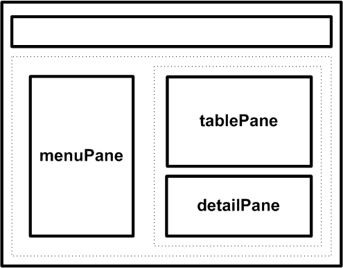
Consider the following Zen page. This sample was introduced at the beginning of this chapter. It organizes a page into three panes — menuPane, tablePane, and detailPane:
XData Contents [XMLNamespace="http://www.intersystems.com/zen"]
  {
    <page xmlns="http://www.intersystems.com/zen" title="HelpDesk">
      <html id="title">My Title</html>
      <hgroup>
        <pane paneName="menuPane"/>
        <spacer width="20"/>
        <vgroup width="100%" valign="top">
          <pane paneName="tablePane"/>
          <spacer height="20"/>
          <pane paneName="detailPane"/>
        </vgroup>
      </hgroup>
    </page>
  }
The reference to a specific pane looks like this:
<pane paneName="menuPane"/>
At compile time, Zen resolves this reference by finding an XData block in the page class whose name matches paneName. In the example above, the value of paneName is menuPane, so Zen looks for an XData block called menuPane. Zen substitutes this block for the <pane> reference. At display time, whatever is contained within the XData menuPane block appears on the page in the position occupied by the element <pane paneName="menuPane"/>. The following is a conceptual view of the result.
The following XData block defines the menuPane referenced by the sample <pane>:
XData menuPane
{
  <pane xmlns="http://www.intersystems.com/zen">
    <html>
      <table cellspacing="0" cellpadding="0">
        <tr>
          <td bgcolor="#C6930A">
            <img src="images/spacer.gif"
                 alt="-"
                 width="200"
                 height="4"
                 border="0"/>
          </td>
        </tr>
      </table>
    </html>
    <lookoutMenu id="lookout" expandable="true">
      <tab caption="Home" id="tabHome">
        <menuItem caption="Home"
                  link="MyApp.Home.cls"
                  image="images/spacer.gif"
                  help="Home Page" />
        <!-- MORE ITEMS HERE -->
      </tab>
      <!-- MORE TABS HERE -->
    </lookoutMenu>
  </pane>
}
If you are using template pages, you can place a <pane> reference in the parent class and allow it to resolve in either the parent class or the child class. Suppose the reference in the child class is:
<pane paneName="myPane"/>
The following table discusses the options for inheritance.
| Parent Defines XData myPane | Child Defines XData myPane | Result |
|---|---|---|
| Yes | No | Child inherits XData myPane from parent. |
| Yes | Yes | Child uses its own XData myPane definition. The parent may reference <pane paneName="myPane"/> and allow this reference to resolve in the child class. This common practice is illustrated in the ZENApp.HelpDeskOpens in a new tab sample class. |
| No | ||
| No | No | Any reference to <pane paneName="myPane"/> in either class is ignored. |
Generated HTML
The generated code from XData Contents expresses the Zen page as an HTML table, using the standard HTML elements <table>, <tr>, <td>, and <th>. Vertical groups become columns in the table; horizontal groups become rows. If you are familiar with encoding HTML by hand, you probably recognize this technique for ensuring the position of items on the page.
Zen groups are easy and convenient to set up, and require no coding in HTML. Rather than arranging HTML <table>, <tr>, <td>, and <th> elements into complex nests, all you need to do is place your Zen components into groups. Groups handle all the layout details for you.