Client Side Layout Managers
At runtime, Zen builds a page description on the server and ships it to the client, where the page description is unpacked, expanded, and displayed as specified. This is the classic browser-based web application that serves previously laid-out pages to remote users upon receiving their requests for display. In this case, the Zen application maintains full control over what it shows to the user.
For more about this typical case, see the section “Zen Pages at Runtime” in the “Zen Client and Server” chapter of Using Zen.
Client side layout provides a useful exception to this typical case. This chapter explains how to add components to Zen pages that permit a user to initiate client side adjustments to the page layout after the page has been rendered on the client. That is, the user directly manipulates the page layout by clicking and dragging the mouse.
Under this model, the user interface runs in a web browser, but it is not confined to the strict request-response interchange of a web application. Rather, the browser is the means for delivering a dynamic user interface that might otherwise be written in a language such as Visual Basic. Zen supports this type of application by providing several options for client side layout management.
Using Active Groups to Manage Layout
The simplest option for client side layout management is to write Zen pages using the built-in client side layout managers. These built-in components are called active group components. Each of them is a Zen group component, with special capabilities to permit direct manipulation on the client side. Each active group is also a client side layout manager; the terms are interchangeable.
The built-in active groups are:
-
<corkboard>, which may contain <dragGroup> components
-
<desktop>, which may contain <dragGroup> components
-
<snapGrid>, which may contain <dragGroup> components
This chapter describes how to use the built-in active groups. The next several sections describe:
If you want to customize active group behavior in a way that applies to all components within the group, you can use the Zen client side library module to write your own client side layout manager (active group). For a full reference guide, see the chapter “Client Side Library” in this book.
Vertical and Horizontal Active Groups
Suppose a designer wants to divide the screen into four regions:
-
A fixed menu area across the top
-
An output pane across the bottom
-
A detailed information display area on the right
-
A main work area that would expand to use all remaining window real estate once the other areas had been addressed
The designer also wants the user to be able to interactively adjust how much of the screen is devoted to the output and detail panes at runtime. Furthermore, the designer wants the layout to automatically adjust to changes in window size. That is, increasing the browser window to full screen mode would resize the main work and supplemental detail areas while leaving the size of the menu and output areas fixed. The following figure shows a conceptual view of this design:
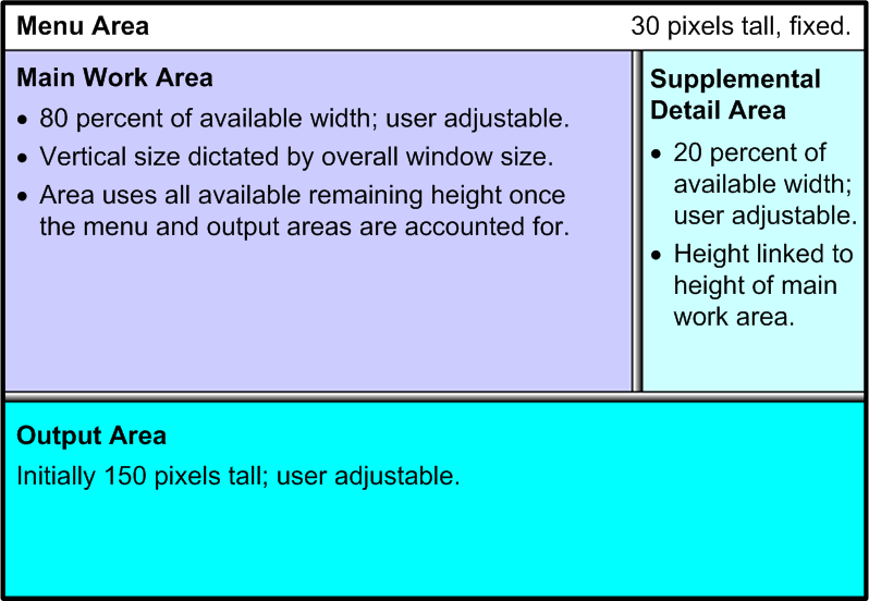
The <activeVGroup> and <activeHGroup> are ideally suited for addressing these design objectives. Unlike <vgroup> and <hgroup> which are ultimately based on HTML tables, active groups use CSS and JavaScript to divide their available screen area into discrete subsections. This subdivision is always a binary split, resulting in top and bottom children for vertical divisions, or left and right for horizontal divisions.
This binary geometry is an implementation constraint, but not a design restriction. Active groups can be nested within one another to create the illusion of multi-way splitting of the available screen real estate. An example of this is shown in the previous figure where there are three divisions along the vertical: the menu area at the top, the combined main and supplemental areas across the center, and the output area at the bottom.
You can provide the layout shown in the previous figure by using three nested active groups as shown in the following Zen page class:
Class MyApp.ActiveTest Extends %ZEN.Component.page
{
Parameter PAGENAME = "ActiveGroupLayout";

XData Style
{
<style type="text/css">
  #outerSplit {
    width:100%;
    height:100%;
    }
</style>
}

XData Contents [ XMLNamespace = "http://www.intersystems.com/zen" ]
{
<page xmlns="http://www.intersystems.com/zen" layout="none">
  <activeVGroup id="outerSplit" noResize="true" handleThickness="1" split="30" >
    <group enclosingStyle="width:100%;height:100%;background:white;">
      <!-- Menu Area -->
    </group>
    <activeVGroup id="innerVSplit"  split="-150" >
      <activeHGroup id="horizontalSplit" split="80%" >
        <group enclosingStyle="width:100%;height:100%;background:#ccccff;">
          <!-- Main Work Area -->
        </group>
        <group enclosingStyle="width:100%;height:100%;background:#ccffff;">
          <!-- Supplemental Detail Area -->
        </group>
      </activeHGroup>
      <group enclosingStyle="width:100%;height:100%;background:cyan;">
        <!-- Output Area" -->
      </group>
    </activeVGroup>
  </activeVGroup>
</page>
}

ClientMethod onloadHandler() [ Language = javascript ]
  {
    ZLM.refreshLayout();
  }

ClientMethod onlayoutHandler() [ Language = javascript ]
  {
    ZLM.notifyResize(document.body);
  }
}
In the previous code example:
-
The <activeVGroup> called outerSplit divides the window vertically into two regions. The top area is 30 pixels tall, is not user adjustable, and is partitioned off from the bottom area by a divider that is 1 pixel wide. The bottom area uses all but 31 pixels of the window’s height; 31 is the top height plus the handle thickness. The top area contains the label identifying the menu area. The bottom area contains an additional <activeVGroup>.
-
The <activeVGroup> called innerVSplit again divides the window vertically where one region is 150 pixels tall. In this case, however, the split property is negative, indicating that the property is referring to space reserved for the bottom area. By default, the split is user adjustable and displays an adjustment bar of sufficient thickness to be easily grabbed by the mouse pointer.
-
The constraints set up by the two <activeVGroup> elements have the effect of reserving 30 pixels at the top of the window, 150 pixels at the bottom, and a few (actually, 8) for adjustment and partition bars. All remaining vertical pixels are funneled into the first child of the innerVSplit group. This child is an <activeHGroup> that partitions the middle band of the window into the main work area and the supplemental detail area. This split is an 80% division of the available window width and is user adjustable by default.
Active Groups that Resize Proportionally
<activeVGroup> and <activeHGroup> allow “size to fit” operations on their contents. The following four steps are required to enable this functionality. Once this is set up, the groups automatically expand to fill the window on initial page load and adjust their sizes automatically in response to window resize events:
-
The <page> component must have its layout attribute set to "none":
<page xmlns="http://www.intersystems.com/zen" layout="none">This shifts responsibility for page layout from the server to the browser.
-
The outermost active group in the XData Contents block must have its CSS width and height explicitly set to 100%. This can be set using the enclosingStyle attribute for the <activeVGroup> or <activeHGroup>. Alternatively you can do it as shown in the previous example of a Zen page class:
-
Define a CSS style rule:
XData Style { <style type="text/css"> #outerSplit { width:100%; height:100%; } </style> } -
...and apply this rule to the outermost active group using the id attribute:
XData Contents [ XMLNamespace = "http://www.intersystems.com/zen" ]
{
<page xmlns="http://www.intersystems.com/zen" layout="none">
  <activeVGroup id="outerSplit" noResize="true" handleThickness="1" split="30" >
    <!-- Everything else -->
  </activeVGroup>
</page>
}
-
-
The following must be true all the way down the hierarchy of group components, from the top-level <page> container down to any group that you wish to resize automatically along with the window that contains it. If you do not wish a group to resize in this way, these restrictions are not necessary:
-
No active group can use the layout attribute.
-
Every group that is not an active group must have its CSS width and height attributes set to 100%.
The previous Zen page class example adheres to these rules. It also shows examples of using the enclosingStyle attribute, instead of a formal CSS style rule, to define the CSS width and height. For example:
<group enclosingStyle="width:100%;height:100%;background:#ccffff;"> -
-
onloadHandler and onlayoutHandler methods in the Zen page class must call back into the Zen client side library module to ensure that any user adjustments to the window size force a recalculation of the active groups’ geometry. The previous Zen page class example shows the correct calls, as follows:
ClientMethod onloadHandler() [ Language = javascript ]
  {
    ZLM.refreshLayout();
  }

ClientMethod onlayoutHandler() [ Language = javascript ]
  {
    ZLM.notifyResize(document.body);
  }
Calculating Percentages for Three-Way Splits
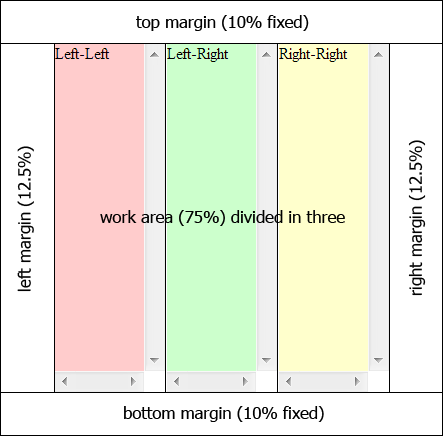
The following class code shows how to implement a page that requires areas of the screen to be split three ways, using the binary splits provided by <activeVGroup> and <activeHGroup>. This design has the following features:
-
The screen has a 10% top margin, 10% bottom margin, 12.5% left and right margins and a work area in the middle. Thus, the main work area consumes 75% of the width and 80% of the height of the available pixels in the window.
-
The main work area is divided into thirds. Each of these thirds has its own vertical scroll bar. Resizing the window resizes these areas automatically.
-
Visible handle thicknesses shows how the screen is being cut up. Setting handleThickness to zero would make these handles disappear entirely.
The following figure shows a conceptual view of this design:
You can create the layout by using active groups as shown in the following Zen page class:
Class MyApp.LayoutTest Extends %ZEN.Component.page
{

Parameter PAGENAME = "LayoutTest";

/// This Style block contains page-specific CSS style definitions.
XData Style
{
<style type="text/css">
#outerSplit {
    width:100%;
    height:100%;
  }
</style>
}

/// This XML block defines the contents of this page.
XData Contents [ XMLNamespace = "http://www.intersystems.com/zen" ]
{
<page xmlns="http://www.intersystems.com/zen" >
  <activeVGroup id="outerSplit" noResize="true"
                handleThickness="1" split="90%" >
    <activeVGroup id="topMarginSplit" noResize="true"
                  handleThickness="1" split="11%" >
      <!-- Top Margin -->
      <group id="Top"/>
      <activeHGroup id="rightMarginSplit" handleThickness="1"
                    noResize="true" split="88%" >
        <activeHGroup id="leftMarginSplit" handleThickness="1"
                      noResize="true" split="14%" >
          <!-- Left Margin -->
       <group id="Left"/>
          <group layout="none"
                 enclosingStyle="width:100%;height:100%;background:#ccccff;">
            <!-- Main Work Area -->
            <activeHGroup id="outerThreeway" noResize="true"
                          handleThickness="2" split="67%" >
              <activeHGroup id="innerThreeway" noResize="true"
                            handleThickness="2" split="50%" >
                <group id="leftLeft"
    enclosingStyle="width:100%;height:100%;overflow:scroll;background:#ffcccc;">
                  <label value="Left-Left"/>
                </group>
                <group id="leftRight"
    enclosingStyle="width:100%;height:100%;overflow:scroll;background:#ccffcc;">
                  <label value="Left-Right"/>
                </group>
              </activeHGroup>
              <group id="rightRight"
    enclosingStyle="width:100%;height:100%;overflow:scroll;background:#ffffcc;">
                <label value="Right-Right" />
              </group>
            </activeHGroup>
          </group>
        </activeHGroup>
        <!-- Right Margin -->
      </activeHGroup>
    </activeVGroup>
    <!-- Bottom Margin -->
  </activeVGroup>
</page>
}

ClientMethod onloadHandler() [ Language = javascript ]
  {
    ZLM.refreshLayout();
  }

ClientMethod onlayoutHandler() [ Language = javascript ]
  {
    ZLM.notifyResize(document.body);
  }
}
In this example, the binary nature of active group splits, combined with this design’s requirement that all geometries be measured in percentages, requires the developer to pay close attention to the underlying constraints enforced by active groups. Within the main work area, the developer achieves an equal three-way split by nesting two horizontal splits. The outer split divides the total area at 67%, giving two-third of the horizontal pixels to the left child and one-third to the right. The inner split divides the left child at 50%, not 33%. Dividing the two-thirds area evenly in half yields the desired result of visually splitting the total area into equal thirds.
A similar technique correctly balances the left and right margins of the page relative to the central work area. The outer split divides the total area at 88%, giving the larger portion to the left child and creating a 12% right margin. The inner split divides the left child at 14%, not 12%. This produces a left margin that is of equal width to the right margin created by the outer split. The central work area is now approximately 75% of the window width and is correctly centered between the left and right margins.
Adding Objects Dynamically
In order to dynamically add a child object to an active group such as <desktop>, <corkboard>, or <snapGrid>, the active group needs to do client-side initialization of the child object.
The first step is to make sure that the entire DOM object is ready before calling the initialize code. Do this by calling the refreshContents() method with a parameter of 1 or true, to force a synchronous object creation.
Next re-initialize the active group and its children. You can do this with a call to ZLM.initLayout(), provided that the active group itself was statically defined as part of the base page.
You can call ZLM.initLayout() repeatedly as needed, but does take time to run, so if you know you are creating a number of drag groups in a row, it is best to call refreshContents() once after all the new children have been added, and call ZLM.initLayout() once after refreshContents() returns. You can add windows individually, but batching them when feasible cuts down on server chatter and client-side processing.
As an example, the following code shows the proper order for the calls to add an empty, resizable drag group from the client without a full page refresh.
XData Contents [ XMLNamespace = "http://www.intersystems.com/zen" ]
{
 <page xmlns="http://www.intersystems.com/zen">
  <hgroup>
   <button caption="add" onclick="zenPage.addClientSide();"/>
  </hgroup>
  <snapGrid id="snapGrid" cols="10" rows="10"
   enclosingStyle="height:500px;width:500px;background-color:silver">
  </snapGrid>
 </page>
}

ClientMethod addClientSide() [ Language = javascript ]
{
 var sg=zen("snapGrid");
 var dg=zenPage.createComponent("dragGroup");
 dg.homeCol=1;
 dg.homeRow=1;
 dg.rowSpan=2;
 dg.colSpan=2;
 dg.header="new";

 sg.addChild(dg);
 sg.refreshContents(1)
 ZLM.initLayout();
}
<activeHGroup> and <activeVGroup>
An <activeHGroup> is an active group that displays a two-part split pane with left and right partitions, optionally separated by a moveable adjustment bar. An <activeHGroup> can have only two child components. The first child defined in the <activeHGroup> appears in the left partition and the second child appears in the right partition. The “H” in the <activeHGroup> name means horizontal.
There is also an <activeVGroup> for the same functionality with vertical alignment. The split panes for <activeVGroup> are top and bottom rather than left and right.
Usually, both children of an <activeHGroup> or <activeVGroup> are groups. Each of these child groups defines the layout for its partition. The two children of an <activeHGroup> or <activeVGroup> may contain any number or type of Zen components, according to their usual allowances and restrictions, depending on which types of group they are: <hgroup>, <desktop>, <activeVGroup>, and so on.
<activeHGroup> and <activeVGroup> each have the following attributes.
| Attribute | Description |
|---|---|
| Zen group attributes | <activeHGroup> and <activeVGroup> have the same style and layout attributes as other Zen groups, except that the layout attribute is not used for active groups. For descriptions, see “Group Layout and Style Attributes” in the “Zen Layout” chapter of Using Zen. |
| autoExpand |
If defined, this property indicates that one of the two partitions is an automatic open, automatic close sidebar panel. When this is the case, the designated panel should expand when the mouse enters the bounds defined by the split between the partitions, and grow until it reaches the width given by the autoExpand value. The autoExpand value is always interpreted in pixels. A positive value designates the left (top) partition for automatic expansion. A negative value designates the right (bottom) partition. The default value (null) disables the feature for this group. |
| handlePattern |
String indicating a file name for an image to use to paint the dragable partition handle. For <activeHGroup>, this image should be at least as wide as the handle thickness and is repeated vertically along the length of the handle. Correspondingly, for <activeVGroup>, this image should be at least as tall as the handle height and is repeated horizontally along the length of the handle. The default is a PNG image that produces a gray gradient effect. |
| handleThickness |
Width in pixels of the adjustment handle, which is displayed along the dividing line between the two partitions. Due to the dynamic nature of active groups, the width of this bar cannot be set using CSS and must be specified via the handleThickness property. The default is "7" which produces a drag handle of one-eighth inch (2 mm) on most screens. |
| noResize |
If true, the user is not allowed to resize the partitions. If false, the user can adjust partition size by dragging the adjustment handle with the mouse. The default is false. If resizing is enabled (noResize is false) the mouse pointer changes to an east-west (or north-south) resize cursor when the mouse is in a potential drag position. |
| onresizeBottom | Specifies a handler for the onresizeBottom event. This event fires when the user resizes the bottom panel of this <activeVGroup>. |
| onresizeLeft | Specifies a handler for the onresizeLeft event. This event fires when the user resizes the left panel of this <activeHGroup>. |
| onresizeRight | Specifies a handler for the onresizeRight event. This event fires when the user resizes the right panel of this <activeHGroup>. |
| onresizeTop | Specifies a handler for the onresizeTop event. This event fires when the user resizes the top panel of this <activeVGroup>. |
| soundFX | String indicating a file name for a sound file to be played when an automatic expansion group grows or shrinks. If not defined or null (a blank string) no sound accompanies the animation. The default is null. |
| split |
A string that defines the division between the two panes. Zen interprets the split value as follows:
The default split value is this string: 50% Manual adjustment of the panes changes the size of the fixed width or percentage. The new sizes or ratios are respected when the base container is resized. |
<activeHGroup> and <activeVGroup> divide the screen as specified by the split property based on the size of the window at the time the page is loaded, and allow the user to readjust this layout as desired with the adjustment handles. You can reset the size of the panes programmatically, including changing whether the split is calculated as a fixed size or a ratio. If the value of the split property is a string ending in a percent sign, such as “75%,” the split is calculated as a ratio. If the value of split is a string ending in px, such as “75px,” the split is calculated as a fixed width. If the value of split is a number, such as 50%, the split is resized using the specified number and retaining whatever units are in use at the time. For example, the following code fragment creates an <activeVGroup> with split set to the default value of 50%:
<activeVGroup id="activeVGroup" handleThickness="5">
 <vgroup>
  <hgroup>
   <button caption="Change To Pixels" valign="top"
    onclick="zenPage.changeSize('pixels');" />
   <button caption="Change To Percent" valign="top"
    onclick="zenPage.changeSize('percent');" />
   <button caption="Change Size Same Units" valign="top"
    onclick="zenPage.changeSize('same');" />
  </hgroup>
 </vgroup>
</activeVGroup>
The onclick event handler for the buttons changes the size and units of the split, as follows:
ClientMethod changeSize(mode) [ Language = javascript ]
{
  var avgr = zenPage.getComponentById('activeVGroup');
    switch (mode)
    {
      case 'pixels':
        avgr.setProperty('split',"75px");
        break;
      case 'percent':
        avgr.setProperty('split',"75%");
        break;
      case 'same':
        avgr.setProperty('split',30);
        break;
    }
}
If you want the groups to automatically recalculate their layouts in response to a resize of the base window itself, you need to add the following call inside the optional onlayoutHandler JavaScript callback method for the Zen page:
ZLM.notifyResize(document.body);
When this call is in place, the notifyResize function is called automatically both when the page first loads and in response to window resizing at the browser level. Placing notifyResize in the onlayoutHandler callback allows you to place other “resizing reactions” in the onlayoutHandler callback, if you desire further processing.
For more about onlayoutHandler, see the section “Zen Layout Handler.”
<corkboard>
A <corkboard> may contain one or more <dragGroup> components. A <corkboard> is an active group whose child components may visually overlap. As soon as the user clicks on a <dragGroup> in a <corkboard>, that <dragGroup> comes to the foreground. The user can subsequently drag the <dragGroup> and drop it in a new position in the <corkboard>. The dragged component overlays everything else inside the <corkboard>. No other component, besides the dragged component, is moved out of its current position.
The user cannot move components into or out of the <corkboard>. Direct manipulation can only occur within the <corkboard> container.
The immediate children of a <corkboard> component must be <dragGroup> components, but there are no restrictions placed on the contents of the <dragGroup> components themselves. A <dragGroup> may contain any component that is valid in a group.
<corkboard> has the following attributes.
| Attribute | Description |
|---|---|
| Zen group attributes | <corkboard> has the same style and layout attributes as other Zen groups. For descriptions, see “Group Layout and Style Attributes” in the “Zen Layout” chapter of Using Zen. |
<desktop>
A <desktop> may contain one or more <dragGroup> components. A <desktop> is an active group that “tiles” its child components so that each one is fully visible and none of them overlap. As soon as the user clicks on a <dragGroup> in a <desktop>, that <dragGroup> comes to the foreground. The user can subsequently drag the <dragGroup> and drop it in a new position in the <desktop>. When the user drags and drops a <dragGroup> component into a new position, the dragged component moves the other <dragGroup> components in the <desktop> out of its way. All <dragGroup> components change position after the dragged component is dropped.
The user cannot move components into or out of the <desktop>. Direct manipulation can only occur within the <desktop> container.
The immediate children of a <desktop> component must be <dragGroup> components, but there are no restrictions placed on the contents of the <dragGroup> components themselves. A <dragGroup> may contain any component that is valid in a group.
<desktop> has the following attributes.
The underlying geometric model for the <desktop> is a simple one based on rows and columns. For this reason the <desktop> component supports row and column style settings that can enforce row and column alignment constraints on the <dragGroup> components that it contains.
The arrangement of <dragGroup> components within the <desktop> varies, but in general this arrangement is biased in favor of “row collapse.” This means that if a <dragGroup> is removed from a given row, any other groups in the same row move to the left, collapsing the length of the row and possibly creating blank space at the extreme right end of the row. This convention maximizes the use of the visible portions of the window and minimizes the need for horizontal scrolling.
You can suggest an initial layout of the <dragGroup> components within the <desktop> by supplying CSS styles such as valign:top and align:left for these components. You can also set the CSS style properties top and left to explicit pixel values; for example:
<dragGroup enclosingStyle="top:150px; left:233px;" >
    <!-- contents of drag group here -->
</dragGroup>
When rendering the <desktop> component, Zen makes every effort to abide by such suggestions within the other constraints that are currently active. However, row and column styles, automatic row collapse, and the prohibition against overlapping <dragGroup> components make it impossible to guarantee that the placement suggested via CSS is respected exactly.
The <desktop> component has the following attributes.
| Attribute | Description |
|---|---|
| Zen group attributes | In addition to its capabilities as an active group, <desktop> has the same style and layout attributes as other Zen groups. For descriptions, see “Group Layout and Style Attributes” in the “Zen Layout” chapter of Using Zen. |
| colStyle | The <desktop> can enforce sizing and alignment constraints on the <dragGroup> components within its columns. You can choose a column configuration by assigning a value to the colStyle attribute as described in the section “<desktop> Column Style” following this table. |
| rowStyle | The <desktop> can enforce sizing and alignment constraints on the <dragGroup> components within its rows. You can choose a row configuration by assigning a value to the rowStyle attribute as described in the section “<desktop> Row Style” following this table. |
It is possible to query, save, and restore the <desktop> state. The <desktop> component provides JavaScript methods that allow you to save and restore a particular user’s choice of geometry for the <desktop> — that is, how the user sized and placed components within the <desktop> during a previous session with the Zen page. You can work with this information as follows:
layout=getState()
The getState method returns a string that records the <desktop> state. The format for this string is an internal encoding that you do not need to understand in order to use this method. Simply store the string, in any way desired, to retrieve it for later use with restoreState.
restoreState(layout)
Inputs a string that tells the <desktop> which geometry to use when it displays. layout must be a string that was previously acquired using getState. The restoreState method does not actually open any windows. It takes whatever windows happen to be open, and restores them to where they were when the layout string was saved.
<desktop> Row Style
The <desktop> can enforce sizing and alignment constraints on the <dragGroup> components within its rows. You can choose a configuration by assigning a value to the rowStyle attribute. Valid values are:
-
FILL_ROW — All groups within a row have the height of the tallest group in the row. By default the top and bottom edges of all the sub-windows align. Height is allowed to vary from one row to the next.
-
ALIGN_ROW_TOP — (the default) The top edge of all <dragGroup> components within a row align. The height of individual <dragGroup> components within the row is allowed to vary. The row spacing is driven by the tallest group within the row.
-
ALIGN_ROW_CENTER — All <dragGroup> components are centered vertically within their respective rows. The height of individual <dragGroup> components is allowed to vary. The row spacing is driven by the tallest group within the row.
-
ALIGN_ROW_BOTTOM — The bottom edge of all <dragGroup> components within a row align. The height of individual <dragGroup> components within the row is allowed to vary. The row spacing is driven by the tallest group within the row.
-
FILL_UNIFORM — All <dragGroup> components within the desktop take on the height of the tallest <dragGroup>. This results in all rows being uniformly spaced vertically and all <dragGroup> components being both top and bottom aligned.
-
ALIGN_UNIFORM_TOP — All rows within the desktop take on uniform spacing dictated by the height of the tallest group within the component. Within each row, the top edges of individual <dragGroup> components align. The height of individual <dragGroup> components is allowed to vary.
-
ALIGN_UNIFORM_CENTER — All rows within the desktop take on uniform spacing dictated by the height of the tallest group within the component. Within each row, individual <dragGroup> components are centered vertically. The height of individual <dragGroup> components is allowed to vary.
-
ALIGN_UNIFORM_BOTTOM — All rows within the desktop take on uniform spacing dictated by the height of the tallest group within the component. Within each row, the bottom edges of individual <dragGroup> components align. The height of individual <dragGroup> components is allowed to vary.
<desktop> Column Style
In general, the <desktop> geometry conventions are biased towards rows. In fact, by default the <desktop> does not recognize the existence of columns.
However, assigning a value to the colStyle attribute alters this behavior, so that the <desktop> counts all the first elements of the rows as column one, all the second elements as column two, and so forth. Unlike rows, which repack themselves when they are removed or added, columns are allowed to have embedded gaps in which a short row does not reach a given column.
You can choose a column style, and force <desktop> to recognize columns, by assigning a value to the colStyle attribute. If you do not, the concept of columns is ignored and only row-based constraints apply.
Valid values for colStyle are:
-
FILL_COLUMN — All <dragGroup> components within a given column take on the width of the widest group within the column. All <dragGroup> components become both left and right aligned. The spacing of the columns is allowed to vary from one column to the next
-
ALIGN_COLUMN_LEFT — The width of the column is dictated by the width of the widest group within that column but the width of individual sub- windows is allowed to vary. All <dragGroup> components are left aligned within their columns. The spacing of the columns is allowed to vary from one column to the next
-
ALIGN_COLUMN_CENTER — The width of the column is dictated by the width of the widest group within that column, but the width of individual <dragGroup> components is allowed to vary. All <dragGroup> components are centered within their columns. The spacing of the columns is allowed to vary from one column to the next
-
ALIGN_COLUMN_RIGHT — The width of the column is dictated by the width of the widest group within that column, but the width of individual <dragGroup> components is allowed to vary. All <dragGroup> components are right aligned within their columns. The spacing of the columns is allowed to vary from one column to the next
-
FILL_WIDTH — The total width of the longest row dictates the layout bounds for the entire <desktop>. The widths of <dragGroup> components within shorter rows are scaled up proportionately to ensure that right edge of the last group in each row is aligned with that of every other row in the <desktop>.
-
ALIGN_WIDTH_LEFT — Similar to FILL_WIDTH. The <dragGroup> components within rows are horizontally spaced based on the width of the longest row. The widths of individual <dragGroup> components are not padded, creating the appearance of random spacing within a row.
-
ALIGN_WIDTH_CENTER — Similar to FILL_WIDTH. The <dragGroup> components within rows are horizontally spaced based on the width of the longest row. The widths of individual <dragGroup> components are not padded, and the <dragGroup> components are centered within the revised spacing bounds.
-
ALIGN_WIDTH_RIGHT — Similar to FILL_WIDTH. The <dragGroup> components within rows are horizontally spaced based on the width of the longest row. The widths of individual <dragGroup> components are not padded, and the <dragGroup> components are right aligned within the revised spacing bounds.
-
FILL_UNIFORM — All columns take on the width and spacing dictated by the widest <dragGroup> within the <desktop>. All <dragGroup> components are given uniform width, and are automatically left and right aligned
-
ALIGN_UNIFORM_LEFT — Similar to FILL_UNIFORM, but all <dragGroup> components within a column are left aligned.
-
ALIGN_UNIFORM_CENTER — Similar to FILL_UNIFORM, but all <dragGroup> components within a column are centered within the column spacing.
-
ALIGN_UNIFORM_RIGHT — Similar to FILL_UNIFORM, but all <dragGroup> components within a column are right aligned.
<snapGrid>
A <snapGrid> is an active group which can contain one or more <dragGroup> components, organized so that each one is aligned with a grid. The number of rows and columns specified defines the underlying grid. The resulting grid is a normalized space, meaning that a four column layout results in the width of each column being 25% of the total width.
You can define different layouts for portrait and landscape page orientation, such that the number of columns and rows changes if the geometry of the <snapGrid> becomes taller than it is wide (or vise versa). This is particularly useful for adapting layouts on devices such as tablets and mobile phones.
The immediate children of a <snapGrid> component must be <dragGroup> components, but there are no restrictions placed on the contents of the <dragGroup> components themselves. A <dragGroup> may contain any component that is a valid child of a group.
Child components may visually overlap. A <dragGroup> in a <snapGrid> comes to the foreground when the user clicks on it. If the appropriate user gestures are enabled, the user can drag and drop the <dragGroup>. When dropped, a <dragGroup> snaps to the closest grid lines. The grid itself does not scroll, however the <dragGroup> components in the grid may.
The user cannot move components into or out of the <snapGrid>. Direct manipulation can only occur within the <snapGrid> container.
<snapGrid> has the following attributes.
| Attribute | Description |
|---|---|
| Zen group attributes | In addition to its capabilities as an active group, <snapGrid> has the same style and layout attributes as other Zen groups. For descriptions, see “Group Layout and Style Attributes” in the “Zen Layout” chapter of Using Zen. |
| cols | Specifies the number of columns used for both portrait and landscape layouts. The default value is 3. |
| colsLandscape | Specifies the number of columns used when the rendered width of the <snapGrid> is greater than or equal to its height. |
| colsPortrait | Specifies the number of columns used when the rendered width of the <snapGrid> is less than its height. |
| rows | Specifies the number of rows used for both portrait and landscape layouts. The default value is 2. |
| rowsLandscape | Specifies the number of rows used when the rendered width of the <snapGrid> is greater than or equal to its height. |
| rowsPortrait | Specifies the number of rows when the rendered width of the <snapGrid> is less than its height. |
Dynamic and Static Layout
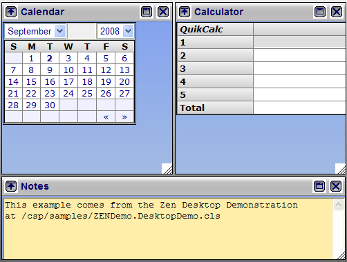
The ability to resize and drag and drop <dragGroup> components in a <snapGrid> is primarily controlled by the <dragGroup>. The attributes moveEnabled and resizeEnabled specify whether you can move or resize the group. <dragGroup> also relies on the header and the resize button to provide affordances for user drag and resize gestures. Without them, the drag group cannot be moved or resized. You can use the <snapGrid> method broadcast to control various aspects of appearance and behavior for all <dragGroup> components in the grid. The method restyleHeaderStyles in the class ZENDemo.SnapGridDemoOpens in a new tab in the SAMPLES namespace illustrates this use of broadcast.
broadcast sends a signal to each of the active drag group components in the snap grid. Valid signals include:
-
resize – call the onresize handler for each of the drag groups.
-
disableResize – remove the resize button from the lower right corners of the drag groups.
-
disableMaxToggle – redefine the drag group header to be a drag handle rather than a maximize button.
-
enableMaxToggle – redefine the drag group header to be a maximize button rather than a drag handle.
-
enableResize – restore the resize button to the lower right corners of the drag groups.
-
processAppMessage – simply pass the value given to the <dragGroup> children. Subclasses of <dragGroup> can override the default processAppMessage() method to extend the broadcast facility to address application specific signals. The mechanism only passes a single value argument, but this value can take the form of a JSON string or an arbitrary JavaScript object so multiple discrete data can be packaged into a single broadcast value.
-
removeDragHeader – completely hide the drag handle and resize the window to use the recovered space.
-
restoreDragHeader – restore the drag handle and resize the window to account for the newly used space.
-
setBodyStyle– given a JSON representation of a style object in value, add the given rules to the existing style of the drag body.
-
setHeaderStyle – given a JSON representation of a style object in value, add the given rules to the existing style of the drag header.
-
setHeaderLayout – set the headerLayout property of all child drag groups to the given value.
Note that when you run ZENDemo.SnapGridDemoOpens in a new tab, it comes up with headers and resize buttons visible, and you can move and resize the drag groups. The Remove Headers button removes these affordances, and as a result, the grid layout is static. The Restyle Headers button restores the headers functioning as maximize buttons.
Orientation-specific Layout
The <snapGrid> component can adjust the layout of rows and columns in response to the geometry of the window it is being viewed in. The properties rowsPortrait and colsPortrait specify the number of rows and columns for portrait mode, and rowsLandscape and colsLandscape for landscape mode. If you set only one of these two sets of properties, Zen uses the default row and column values for the unspecified set.
This feature is useful when creating applications to be viewed on a device such as a cell phone or tables, that changes the display orientation when the orientation of the device changes. The following example codes a page that responds to changes in window geometry when viewed in a browser. CSS sets the height and width of the <snapGrid> to 100%, and the page layout must be set to “none” as described in the section “Active Groups that Resize Proportionally.”
Class demo.SnapGridLP Extends %ZEN.Component.page
{
 /// This Style block contains page-specific CSS style definitions.
 XData Style
 {
  <style type="text/css">
   #snapGrid {
    width: 100%;
    height: 100%;
    background-color: silver;
   }
  </style>
}
 /// This XML block defines the contents of this page.
 XData Contents [ XMLNamespace = "http://www.intersystems.com/zen" ]
 {
  <page xmlns="http://www.intersystems.com/zen"
   layout="none">
   <snapGrid id="snapGrid"
    colsLandscape="10"
    colsPortrait="5"
    rowsLandscape="5"
    rowsPortrait="10"
   >
    <dragGroup id="dg1" onclick=""
     moveEnabled="true" resizeEnabled="true"
     headerLayout="C" header="1"
     homeCol="1" homeRow="1"
     colSpan="1" rowSpan="1">
    </dragGroup>
   </snapGrid>
  </page>
 }
}
<dragGroup>
A <dragGroup> is the only Zen group component that can be the direct child of a <desktop>, <corkboard>, or <snapGrid>. The <dragGroup> itself can contain any component you can put in a group.
A <dragGroup> can display a header bar, which can have a text label and various buttons. A <dragGroup> can be resized, maximized, minimized, closed, and restored by clicking its buttons and by dragging the header or the resize icon in the lower right corner. In many ways the <dragGroup> is similar to a desktop window such as you would typically see on a Macintosh or PC desktop.
<dragGroup> has the following attributes.
| Attribute | Description |
|---|---|
| Zen group attributes | <dragGroup> has the same style and layout attributes as other Zen groups. For descriptions, see “Group Layout and Style Attributes” in the “Zen Layout” chapter of Using Zen. |
| centerHeader | If set, this boolean flag indicates that the title section of the header should be centered over the <dragGroup>. |
| colSpan |
If the <dragGroup> is a child of a <snapGroup>, this specifies the initial width of the <dragGroup> in columns of the <snapGroup>. See Dynamic and Static Layout for more information on resizing a <dragGroup> in a <snapGroup>. |
| header |
Title to display in the header bar that displays across the top of this <dragGroup>. Although you can enter ordinary text for this attribute, it has the underlying data type %ZEN.Datatype.captionOpens in a new tab. This makes it easy to localize its text into other languages, as long as a language DOMAIN parameter is defined in the Zen page class. The %ZEN.Datatype.captionOpens in a new tab data type also enables you to use $$$Text macros when you assign values to the invalidMessage property from client-side or server-side code. |
| headerLayout | The header layout pattern determines the order in which controls are added to the header section of the <dragGroup> window frame. This is encoded as a five character string consisting of the following tokens :
This string allows you restructure the location of the controls with a single call and can be useful if you are trying to match the look and feel of a given operating system. For example, MS-Windows systems follow the pattern of 'TIFC' whereas macOS adopts the standard of CIFT with the title centered (see centerHeader). The Title section represent something of a breakpoint in the header layout. Everything prior to the header floats from the left end of the header; everything after the header, floats from the right end. |
| homeCol |
If the <dragGroup> is a child of a <snapGroup>, this specifies the initial column where the top of the <dragGroup> is positioned. See Dynamic and Static Layout for more information on repositioning a <dragGroup> in a <snapGroup>. |
| homeRow |
If the <dragGroup> is a child of a <snapGroup>, this specifies the initial row where the left edge of the <dragGroup> is positioned. See Dynamic and Static Layout for more information on repositioning a <dragGroup> in a <snapGroup>. |
| imageClose |
URI of the image to display on the button that the user clicks to close this <dragGroup>. If you do not specify imageClose, Zen uses its default:
If imageClose is the relative pathname of a file, it is understood to be relative to the CSP directory in the Caché installation directory. Typically this path identifies the images subdirectory for your Zen application. For example, the following value: <dragGroup imageClose="myApp/images/myClose.png"/> finds image files in the directory: install-dir/CSP/myNamespace/myApp/images/myClose.png This holds true for any image attribute of <dragGroup>. |
| imageCloseHover |
The URI of the image to display for the close group button when the mouse hovers over the icon. |
| imageCloseWidth | The width (in pixels) of the space allocated for the images for the close group button. The default images are 16 by 16 pixels. You cannot specify a different image height. |
| imageContract |
URI of the image to display on the button that the user clicks to contract this <dragGroup>. If you do not specify imageContract, Zen uses its default: |
| imageContractHover | The URI of the image to display for the contract group button when the mouse hovers over the icon. |
| imageContractWidth | The width (in pixels) of the space allocated for the images for the contract group button. |
| imageExpand |
URI of the image to display on the button that the user clicks to expand this <dragGroup>. If you do not specify imageExpand, Zen uses its default: |
| imageExpandHover | The URI of the image to display for the expand group button when the mouse hovers over the icon. |
| imageExpandWidth | The width (in pixels) of the space allocated for the images for the expand group button. |
| imageMinimize |
URI of the image to display on the button that the user clicks to minimize this <dragGroup>. If you do not specify imageMinimize, Zen uses its default: |
| imageMinimizeHover | The URI of the image to display for the minimize group button when the mouse hovers over the icon. |
| imageMinimizeWidth | The width (in pixels) of the space allocated for the images for the minimize group button. |
| imageResize |
URI of the image to display on the button that the user clicks to resize this <dragGroup>. If you do not specify imageResize, Zen uses its default: |
| imageResizeSize | Size of the square to reserve for the resize icon. This is an integer value, in pixels. The default value is 16, which indicates a 16x16 pixel square. |
| minWidth | This sets the minimum width (in pixels) for a dragGroup when the user is resizing it interactively. The value of minWidth has no bearing on programmatic setting of the dragGroup's size. If used within a snapGrid context, the actual minimum width is set to the next highest even multiple of the snapGrid column width.
The property is an integer with the implied units of pixels. It can be set either statically in the XData block or at run time with a call to setProperty() on the object. The default value is 96. |
| moveEnabled | If true, this flag allows the user to reposition the <dragGroup> by drag and drop gestures within the containing active group area. The default value is true. moveEnabled has the underlying data type %ZEN.Datatype.booleanOpens in a new tab. See Zen Attribute Data Types. |
| onclosepending | The onclosepending event handler: This event is fired when the user clicks the close button of this <dragGroup>. Unlike native browser windows, it is possible to prevent the window closure by calling abortClose() in response to this event. |
| onresize | The onresize event handler: This event is fired when the user resizes the <dragGroup>. |
| onwindowdrop | The onwindowdrop event handler: This event is fired when the user releases the title bar of this <dragGroup> after a drag and drop gesture. |
| onwindowgrab | The onwindowgrab event handler: This event is fired when the user grabs this <dragGroup> by the title bar for a drag and drop gesture. |
| resizeEnabled | If true, this flag allows the user to resize this <dragGroup>. The default value is true. resizeEnabled has the underlying data type %ZEN.Datatype.booleanOpens in a new tab. See Zen Attribute Data Types. |
| rowSpan |
If the <dragGroup> is a child of a <snapGroup>, this specifies the initial height of the <dragGroup> in columns of the <snapGroup>. See Dynamic and Static Layout for more information on resizing a <dragGroup> in a <snapGroup>. |

 . See
. See 

