Navigation Components
The “Zen Layout” chapter of Using Zen introduces Zen group components as the key to laying out the Zen page. In that chapter, the “Groups” section describes the simple group components <hgroup>, <vgroup>, <page>, <pane>, and <spacer>.
This chapter describes a more complex set of group and menu components. A developer can use these components to support navigation through Zen applications:
-
“Links” link to other Zen pages, or other application content, via a URI.
-
“Menus” present and manage a structured set of choices, usually links.
-
“Navigator” creates a navigation interface similar to that found on mobile devices.
-
“Tabs” define tabbed menus and tabbed forms.
-
“Trees” provide a hierarchical outline of links that expands or contracts in response to user clicks.
-
“Filters” allow you to filter the available choices by category.
The following table organizes Zen navigation components into two categories: containers (at left) and contained (at right). This chapter describes each component in the order listed in the table.
| Container | Purpose | Components It Typically Contains |
|---|---|---|
| (Any) | Provide a link to another page or to a popup message. | <link> for each link. |
| <locatorBar> | Navigation bar for the top of the page. | <locatorLink> for each link in the navigation sequence. |
| <menu> | Menu container. The default layout is vertical but you can use the layout attribute to change to horizontal layout. Alternatively, you may use <hmenu> or <vmenu>. |
<menuItem> for each option. <menuSeparator> for the space between options. |
| <hmenu> | Horizontally oriented menu | |
| <vmenu> | Vertically oriented menu | |
| <tabGroup> | Traditional set of tabs from which the user can choose one to be displayed on top of the set. | <tab> for each option. |
| <lookoutMenu> | A tabbed menu that displays a button for each tab. Clicking on a button makes the tab contents display beneath the button. Each tab consists of menu items. | |
| <tab> | A tab is a group that may contain any combination of components. | Inside a <lookoutMenu>, each <tab> contains <menuItem> and <menuSeparator> components. |
| <expando> | Expanding and contracting group which may contain any combination of components. | For a simple navigation tree, you can provide <link> components within <expando>. |
| <dynaTree> | Expandable tree of links. | Generated links. These either use the data within the global or are supplied by the callback. <dynaTree> is not a group and does not contain other components. |
| <buttonView> | Set of links that permits filtering according to categories. | Buttons laid out in a grid according to the number of columns specified. <buttonView> is not a group and does not contain other components. |
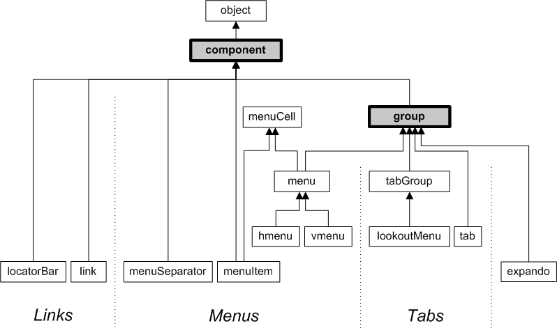
The following figure lists most of the components described in this chapter. All of the classes shown in the diagram are in the package %ZEN.Component, for example %ZEN.Component.tabOpens in a new tab. The diagram shows the inheritance relationships for these classes. It also highlights which of these components can contain other components, by showing which components inherit from %ZEN.Component.groupOpens in a new tab.
Links
The following Zen components provide links to content that is available via a URI:
-
“<link>”
<locatorBar>
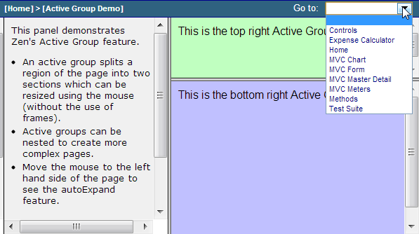
A <locatorBar> looks like the following example, based on the class ZENDemo.ActiveGroupDemoOpens in a new tab in the SAMPLES namespace. The <locatorBar> is the horizontal bar along the top of the illustration.
The corresponding <locatorBar> definition follows:
<locatorBar id="locator" OnGetQuickLinks="GetQuickLinks">
  <locatorLink caption="Home" title="Home page"
               href="ZENDemo.Home.cls"/>
  <locatorLink caption="Active Group Demo"
               title="Active Group Demo" />
</locatorBar>
This <locatorBar> definition contains two <locatorLink> entries, which display in sequential order beginning at the far left end of the bar:
[Home] > [Active Group Demo]
The caption for each <locatorLink> is enclosed in square brackets and is separated by a right angle bracket from the next <locatorLink> in the sequence, from left to right. The user can display the title as a tooltip.
At the far right end of the bar is the drop-down list of quick links that this <locatorBar> has established by identifying an OnGetQuickLinks callback. The illustration shows that the user is hovering the cursor over this list and is about to make a selection. Doing so would cause the page identified by that link to display.
<locatorBar> has the following attributes:
| Attribute | Description |
|---|---|
| Zen component attributes |
<locatorBar> has the same general-purpose attributes as any Zen component. For descriptions, see these sections:
|
| OnDrawBar |
Name of a server-side callback method in the Zen page class. This method provides HTML content for the locator bar using &html<> syntax or WRITE commands. Zen invokes this method whenever it draws the locator bar, automatically passing it a %StringOpens in a new tab that contains the seed value from the <locatorBar>. The callback must return a %StatusOpens in a new tab data type. The following is a valid method signature: Method DrawBar(pSeed As %String) As %Status To use the above method as the callback, the developer would set OnDrawBar="DrawBar" for the <locatorBar>. |
| OnGetQuickLinks | Name of a server-side callback method in the Zen page class. This method defines a set of quick links to appear as a Go to drop-down list at the top right of the locator bar. For details, see the discussion following this table. |
| seed | Allows you to pass some arbitrary value to the OnDrawBar callback. The seed value can be a literal string, or it can contain a Zen #()# runtime expression. |
The OnGetQuickLinks attribute provides the name of a server-side callback method in the Zen page class. This method must fill the array that is provided to it. If the method constructs a valid array, Zen displays each entry in the array as a Go to drop-down list at the top right of the locator bar. Zen invokes this method whenever it draws the locator bar, automatically passing in its single output parameter, an array subscripted by link caption. The callback must return a %StatusOpens in a new tab value.
The following sample ObjectScript statement provides one entry for the array:
Set pLink("caption")="uri"
Where:
-
caption is the label that appears on the link
-
uri is the URI string, which may include query parameters in addition to the base URI
The following example shows a valid method signature and use of parameters. It generates the quick links shown in the illustration at the beginning of this topic. To use the following method as the callback, the developer would set OnGetQuickLinks="GetLinks" for the <locatorBar>.
ClassMethod GetQuickLinks(Output pLinks) As %Status
{
  Set pLinks("Home") = "ZENDemo.Home.cls"
  Set pLinks("Expense Calculator") = "ZENDemo.ExpenseCalculator.cls"
  Set pLinks("MVC Master Detail") = "ZENMVC.MVCMasterDetail.cls"
  Set pLinks("MVC Chart") = "ZENMVC.MVCChart.cls"
  Set pLinks("MVC Meters") = "ZENMVC.MVCMeters.cls"
  Set pLinks("MVC Form") = "ZENMVC.MVCForm.cls"
  Set pLinks("Test Suite") = "ZENTest.HomePage.cls"
  Set pLinks("Controls") = "ZENDemo.ControlTest.cls"
  Set pLinks("Methods") = "ZENDemo.MethodTest.cls"
  Quit $$$OK
}
If you want to define the same set of quick links to use on more than one page in your application, you can define a method in your Zen application class and then have the callback in each page class invoke this application method, as follows. Note the dot (.) in front of the parameter pLinks in the call to the application class method. This is because it is an output parameter:
ClassMethod GetQuickLinks(Output pLinks) As %Status
{
  #; dispatch to our application class
  Quit %application.GetQuickLinks(.pLinks)
}Menus
Menu components permit you to create classic navigation menus, with lists of choices from which the user can select an item by clicking on it. With each choice of a menu item, an event may occur depending on how the menu and menu item have been defined:
-
A submenu might display
-
A message might pop up
-
A different page might display
-
The contents of the current page might change
-
Something else might happen, depending on how you have programmed the menu to respond when the user selects each <menuItem>
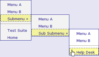
A vertical menu, expanded to three levels, looks like the following example, based on the class ZENTest.MenuTestOpens in a new tab in the SAMPLES namespace. Any options that produce submenus use the » right angle quote to indicate this, as shown for “Submenu” and “Sub Submenu”.
The <menu> definition that produced this illustration is shown below:
<menu id="menu2" layout="vertical">
  <menuItem caption="Menu A" link="javascript: alert('A');" />
  <menuItem caption="Menu B" link="javascript: alert('B');" />
  <menu id="menu2B" caption="Submenu" layout="vertical"
        onactivate="zenPage.activateMenu2B();">
    <menuItem caption="Menu A" link="javascript: alert('A');" id="menu2B_A" />
    <menuItem caption="Menu B" link="javascript: alert('B');" />
    <menu id="menu2BB" caption="Sub Submenu"  layout="vertical">
      <menuItem caption="Menu A" link="javascript: alert('A');" />
      <menuItem caption="Menu B" link="javascript: alert('B');" />
      <menuSeparator />
      <menuItem caption="Help Desk" link="ZENApp.HelpDesk.cls" />
    </menu>
  </menu>
  <menuSeparator />
  <menuItem caption="Test Suite" link="ZENTest.HomePage.cls" />
  <menuItem caption="Home" link="ZENDemo.Home.cls" />
</menu>
The next several sections explain details of the menu components in this example. For now, simply note:
-
In many cases, the example uses JavaScript alerts in place of URI links for demonstration purposes. link values can take this form, or they can redirect the browser to other pages in the Zen application, as the example shows:
-
A <menu> can contain a <menu>. If so, the contained <menu> becomes a submenu and its caption is listed in sequence along with any <menuItem> components at the same level. The above example provides three levels of <menu>.
-
The example provides a <menuSeparator> on the first- and third-level menus. Note how the <menuSeparator> component generates the divider bar between “Submenu” and “Test Suite” and between “Sub Submenu” and “Help Desk” in the output.
The “Client Side Menu Components” chapter in Developing Zen Applications describes more sophisticated menu components that are more easily fine-tuned and customized. Try the components in this chapter first, and if they do not suit your needs, consult the other book.
Tabs
The following Zen components support tabbed menus and forms for Zen applications:
-
“<tab>”
<tabGroup>
A <tabGroup> displays a set of <tab> components. It can only display one <tab> at a time. The user can choose one of these tabs to be displayed on top of the set. A <tabGroup> looks like the following example, based on the class ZENTest.TabTestOpens in a new tab in the SAMPLES namespace.
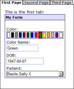
In the above example, the user has clicked the tab labelled “First Page.” In the following example, the user has clicked the tab labelled “Second Page” and has clicked the down-arrow to select a “Home City” option from the <dataCombo> control.
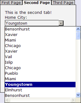
The <tabGroup> definition that produces these illustrations is shown below:
<tabGroup id="tabGroup" showTabBar="true"
          onshowTab="zenPage.updateButtons();" remember="true">
  <tab caption="First Page">
    <hgroup>
      <spacer width="15" />
      <vgroup>
        <spacer height="5"/>
        <html>This is the first tab!</html>
        <form width="75%" layout="vertical"
              cellStyle="padding: 2px; padding-left: 5px; padding-right: 5px;"
              groupStyle="border:1px solid darkblue;">
          <titleBox title="My Form" titleStyle="background: #DDDDFF;"
                    containerStyle="padding: 0px;" />
          <spacer height="5"/>
          <colorPicker title="This is a custom control!"
                       label="Color:" name="Color" />
          <text label="Color Name:" name="ColorName" size="12" />
          <text label="DOB:" id="DOB" name="DOB" size="15"
                maxlength="10" valign="bottom"/>
          <dataCombo label="Patient:" name="Patient" size="24"
                     sql="SELECT Name FROM ZENDemo_Data.Employee
                          WHERE Name %STARTSWITH ? ORDER BY Name"/>
        </form>
      </vgroup>
    </hgroup>
  </tab>
  <tab caption="Second Page">
    <spacer height="5"/>
    <html>This is the second tab!</html>
    <dataCombo label="Home City:" name="City" size="24"
               sql="SELECT Location FROM ZENApp_Data.Customer
                    WHERE Location %STARTSWITH ? ORDER BY Name"/>
  </tab>
  <tab caption="Third Page" tabResource="MyResource">
    <spacer height="5"/>
    <html>This is the third tab!</html>
    <dynaGrid id="grid">
      <gridColumn label="Name"   width="25%" />
      <gridColumn label="Salary" width="25%"  />
      <gridColumn label="Comment" width="50%" />
      <gridRow label="R1" />
      <gridRow label="R2" />
      <gridRow label="R3" />
    </dynaGrid>
  </tab>
</tabGroup>
When a <tabGroup> has contents that do not fit within its defined height or width, Zen clips the display of excess content at the right and bottom edges of the defined <tabGroup> size, leaving room for a horizontal or vertical scrollbar that allows the user to scroll to view the contents. Application and page level stylesheets can override this default behavior by applying the CSS property overflow to the element class tabGroupBody.
<tabGroup> has the following attributes. Since either <tabGroup> or <lookoutMenu> may display <tab> components, both <tabGroup> and <lookoutMenu> share these attributes. <lookoutMenu> has additional attributes. For descriptions, see the <lookoutMenu> section.
| Attribute | Description |
|---|---|
| Zen group attributes | <tabGroup> and <lookoutMenu> each have the same style and layout attributes as any Zen group. For descriptions, see “Group Layout and Style Attributes” in the “Zen Layout” chapter of Using Zen. For <tabGroup>, the height attribute has no effect; it is necessary to control the height of the <tabGroup> from the CSS stylesheet. |
| currTab |
1–based sequential number of the tab currently displayed. The default is 1. The currTab value may contain Zen #()# runtime expressions. |
| onhideTab |
The onhideTab event handler for the menu item. Zen invokes this handler when a previously displayed tab becomes hidden. See “Zen Component Event Handlers.” |
| onshowTab | Client-side JavaScript expression that Zen invokes when a previously hidden tab becomes the displayed tab. Generally this expression invokes a client-side JavaScript method. |
| remember |
If true, remember the most recently displayed tab number in a session cookie and return to this tab when redisplayed. The default is false. remember has the underlying data type %ZEN.Datatype.booleanOpens in a new tab. See “Zen Attribute Data Types.” |
| showBody |
If true, display the set of tabs that belong to this <tabGroup>. By setting showBody to false, and setting showTabBar true, you can display a set of tab bar buttons with no tab contents underneath. The default for showBody is true, and for showTabBar is false. showBody has the underlying data type %ZEN.Datatype.booleanOpens in a new tab. See “Zen Attribute Data Types.” |
| showTabBar |
If true, display a set of tab buttons along the top of this group. The default is false. showTabBar has the underlying data type %ZEN.Datatype.booleanOpens in a new tab. See “Zen Attribute Data Types.” |
<lookoutMenu>
A <lookoutMenu> presents a stack of buttons, one for each tab. Clicking on a button shifts the other buttons down so that they display below the contents of the currently selected tab.
The following example is based on the class ZENTest.LookoutMenuTestOpens in a new tab in the SAMPLES namespace. In the illustration, the user has clicked the “Animal” button to reveal the contents of that tab. This selection moved the remaining buttons to the bottom of the lookout menu. The cursor is now on the “Vegetables” menu item. If the user clicks this item, the content of its link is activated as defined in the corresponding <menuItem>.
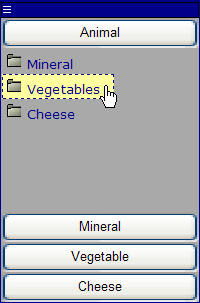
A <lookoutMenu> contains a set of <tab> components, which in turn contain <menuItem> and <menuSeparator> components. These tabs are groups that can contain any component, but when they are present inside a <lookoutMenu> they contain the components that would normally define a <menu>.
The <lookoutMenu> definition that produced the above illustration follows:
<lookoutMenu id="lookout" expandable="true">
  <tab caption="Animal" id="animal">
    <menuItem caption="Mineral"
              link="javascript: zenPage.toggleTab('mineral');"
              image="images/folder.gif" />
    <menuItem caption="Vegetables"
              link="javascript: zenPage.toggleTab('vegetable');"
              image="images/folder.gif" />
    <menuItem caption="Cheese"
              link="javascript: zenPage.toggleTab('cheese');"
              image="images/folder.gif" />
  </tab>
  <tab caption="Mineral" id="mineral" tabResource="MyResource">
    <form>
      <text label="Name:" />
      <text label="Weight:" />
    </form>
  </tab>
  <tab caption="Vegetable" id="vegetable" disabled="false">
    <menuItem caption="Menu A"
              link="javascript: alert('A');"
              help="Option A" image="images/folder.gif" />
    <menuItem caption="Menu B"
              link="javascript: alert('B');"
              help="Option B" image="images/folder.gif" />
    <menuSeparator />
    <menuItem caption="Disable"
              link="javascript: zenPage.toggleTab('vegetable');"
              image="images/folder.gif" />
  </tab>
  <tab caption="Cheese" id="cheese">
    <menuItem caption="Menu C" link="javascript: alert('C');"
              help="Option C" image="images/folder.gif" />
  </tab>
</lookoutMenu>
<lookoutMenu> has the following attributes:
| Attribute | Description |
|---|---|
| Zen tab group attributes | <lookoutMenu> has the same general-purpose attributes as <tabGroup>. For descriptions, see the “Tab Group Attributes” table in the <tabGroup> section. |
| expandable |
If true, this <lookoutMenu> group is expandable. The default is false. When expandable is true, an expansion bar displays along the top of the <lookoutMenu> as shown in the illustration above. The user clicks on this bar to toggle the expanded state of the <lookoutMenu>. When the menu is contracted, only the expansion bar is visible. The user clicks the bar again to expand the <lookoutMenu>. This attribute has the underlying data type %ZEN.Datatype.booleanOpens in a new tab. See “Zen Attribute Data Types.” |
| expanded |
If true, this <lookoutMenu> group is expanded (children visible). If false, it is contracted (children not visible). The default is true. expanded has the underlying data type %ZEN.Datatype.booleanOpens in a new tab. See “Zen Attribute Data Types.” |
| oncontract |
The oncontract event handler for the <lookoutMenu>. Zen invokes this handler just before contracting (hiding) the children of this <lookoutMenu> group. See “Zen Component Event Handlers.” |
| onexpand | Client-side JavaScript expression that Zen invokes just before expanding (displaying) the children of this <lookoutMenu> group. |
Trees
The following Zen components each provide a hierarchical outline of links. The outline expands or contracts in response to user clicks:
<expando>
The <expando> is a group with the ability to show or hide its children. A right-arrow graphic ( ) beside the <expando> label indicates that the group is expanded (displayed), and a down-arrow graphic (
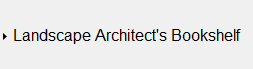
 ) indicates that the group is contracted (hidden). A fully contracted <expando> group looks like the following example.
The user expands the group by clicking on its label. The contents of the <expando> then display below the label. As a Zen group, an <expando> may contain any type of Zen component. In particular, each level of the <expando> may contain additional, nested <expando> groups that can be expanded or contracted independently of the containing <expando> group.
In the following example, the user has just clicked on the label to expand the group. The cursor is now poised to contract the <expando> by clicking the label again. This example contains three nested <expando> groups. The innermost <expando> uses a horizontal layout, and contains <button> components instead of <titleBox> components as in the other levels.
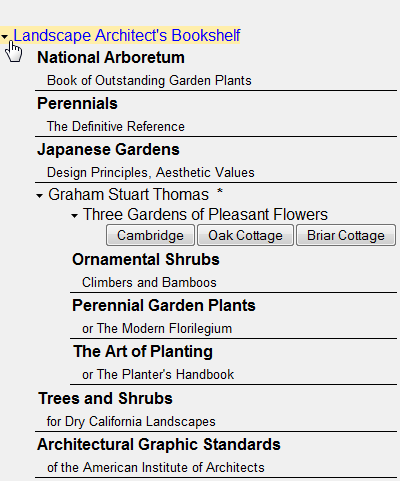
The <expando> definition that produced this example follows:
<expando caption="Landscape Architect's Bookshelf"
         childIndent="35px" remember="true">
   <spacer height="1" />
   <titleBox title="National Arboretum"
             subtitle="Book of Outstanding Garden Plants" />
   <titleBox title="Perennials"
             subtitle="The Definitive Reference" />
   <titleBox title="Japanese Gardens"
             subtitle="Design Principles, Aesthetic Values" />
   <spacer height="1" />

   <expando caption="Graham Stuart Thomas" OnDrawContent="DrawContent"
            childIndent="35px" remember="true">

      <expando caption="Three Gardens of Pleasant Flowers"
               layout="horizontal" childIndent="35px" remember="true">
         <button caption="Cambridge" onclick="zenPage.cambridgeClick()"/>
         <button caption="Oak Cottage" onclick="zenPage.oakCottageClick()"/>
         <button caption="Briar Cottage" onclick="zenPage.briarCottageClick()"/>
      </expando>

      <titleBox title="Ornamental Shrubs"
                subtitle="Climbers and Bamboos" />
      <titleBox title="Perennial Garden Plants"
                subtitle="or The Modern Florilegium" />
      <titleBox title="The Art of Planting"
                subtitle="or The Planter's Handbook" />
   </expando>

   <spacer height="1" />
   <titleBox title="Trees and Shrubs"
             subtitle="for Dry California Landscapes" />
   <titleBox title="Architectural Graphic Standards"
             subtitle="of the American Institute of Architects" />
</expando>
This definition references a number of methods defined in the page class. For example, the second-level <expando> references the server-side callback method DrawContent to produce additional formatted text, in this case a list of honors awarded to the author of the books listed. DrawContent looks like this:
Method DrawContent(ByRef expando As %ZEN.Component.expando) As %Status
{
  &html<<b> (OBE, VMH, DHM, VMM)</b>>
  Quit $$$OK
}
The <expando> component has the following attributes:
| Attribute | Description |
|---|---|
| Zen group attributes | <expando> has the same style and layout attributes as any Zen group. For descriptions, see “Group Layout and Style Attributes” in the “Zen Layout” chapter of Using Zen. The default layout for <expando> is vertical. |
| animate |
If true, Zen animates the appearance and disappearance of the <expando> group contents. If false, it does not. animate has the underlying data type %ZEN.Datatype.booleanOpens in a new tab. See “Zen Attribute Data Types.” |
| caption |
Text to display as the title of this <expando> group. This text displays even when the <expando> is contracted. This text is not automatically HTML escaped. Although you can enter ordinary text for this attribute, it has the underlying data type %ZEN.Datatype.captionOpens in a new tab. See “Zen Attribute Data Types.” |
| childIndent | HTML length value giving the amount to indent the children in the expanded list of items. The above example uses 35px. The default is to use no indentation, aligning the children with the caption. |
| expanded |
If true, this <expando> group is expanded (children visible). If false, it is contracted (children not visible). The default is true. expanded has the underlying data type %ZEN.Datatype.booleanOpens in a new tab. See “Zen Attribute Data Types.” |
| framed |
If true, display a border around the entire group and display the caption within a more formal title box. This more formal version of the <expando> component is also known as a disclosure. The default is false. framed has the underlying data type %ZEN.Datatype.booleanOpens in a new tab. See “Zen Attribute Data Types.” The %ZEN.Component.expandoOpens in a new tab class offers a server-side callback method %OnDrawTitleOptions which, if defined in a subclass of %ZEN.Component.expandoOpens in a new tab, provides a way to add content to the right side of the title bar when framed is true. Any HTML written by %OnDrawTitleOptions is injected into the title bar when the <expando> is displayed. |
| imageContracted |
URI of the image to display when the <expando> group is contracted. The path that you provide for imageContracted must be relative to the CSP directory in the Caché installation directory. The default for imageContracted is a right-arrow graphic ( |
| imageExpanded |
URI of the image to display when the <expando> group is expanded. The path that you provide for imageExpanded must be relative to the CSP directory in the Caché installation directory. The default for imageExpanded is a down-arrow graphic ( |
| oncontract |
The oncontract event handler for the <expando>. Zen invokes this handler just before contracting (hiding) the children of this <expando> group. See “Zen Component Event Handlers.” |
| OnDrawContent |
Name of a server-side callback method in the Zen page class. This method injects HTML content into the <expando> using &html<> syntax or WRITE commands. Zen invokes this method whenever it draws the <expando>, automatically passing it a %StringOpens in a new tab that contains the seed value from the <expando>. The callback must return a %StatusOpens in a new tab data type. The following is a valid method signature:Method DrawMe(pSeed As %String) As %Status To use the above method as the callback, the developer would set OnDrawContent="DrawMe" for the <expando>. |
| onexpand | Client-side JavaScript expression that Zen invokes just before expanding (displaying) the children of this <expando> group. |
| remember |
If true, remember the most recent expanded state in a session cookie and return to this state when redisplayed. The default is false. remember has the underlying data type %ZEN.Datatype.booleanOpens in a new tab. See “Zen Attribute Data Types.” |
<expando> can be particularly useful in navigation when combined with <link>.
<dynaTree>
The <dynaTree> component displays a hierarchical collection of user-defined items as an expandable tree. In many ways <dynaTree> is similar to <expando>. However, instead of specifying the components that it contains, <dynaTree> acquires its contents dynamically at runtime. You can provide data for a <dynaTree> as follows:
-
Use the “dataGlobal attribute” to specify a global whose data supplies the contents of the tree.
-
Use the “OnGetNodeInfo callback” to get data for each node within the tree.
-
Use the “OnGetTreeInfo callback” to fill in a local array that supplies the contents of the tree.
Note that <dynaTree> builds the tree from the root of the global or array. It does not support starting the tree from a node other than the base node.
<dynaTree> Using a Global
The simplest way to define a <dynaTree> is to use a Caché global (multidimensional array). For background information about globals, refer to the book Using Caché Globals.
The following <dynaTree> definition references the ^myTree global by providing the dataGlobal attribute:
<dynaTree id="tree" dataGlobal="^myTree" /> This definition causes the contents of the ^myTree global to be displayed on the page as nodes within an expandable tree.
Node Labels
Suppose you define ^myTree using the following statements at the Terminal command line:
 Set ^myTree("Root","Item 1") = "ZENMVC.MVCForm.cls"
 Set ^myTree("Root","Item 2") = "http://www.intersystems.com"
 Set ^myTree("Root","Item 2","SubItem") = "ZENDemo.Home.cls"
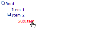
Each global node now has one or more subscripts, such as "Root" or "Item 2". Zen uses these subscripts as the display values for nodes in the <dynaTree>. The logical value for each node is the value of the global at that subscript. Our ^myTree global can now generate a <dynaTree> that looks like the following illustration. This <dynaTree> is fully expanded, with the user holding the cursor over the node "SubItem" at the lowest level. Based on the previous SET statements, the logical value for this node is "ZENDemo.Home.cls" and its display value is "SubItem"
When you use a global to define a <dynaTree>, the resulting nodes always appear in alphabetical order (by label) because that is the way globals are organized in the database.
Node Values
When the user clicks on a <dynaTree> node label such as:
"SubItem"
The corresponding node value is triggered. If the values are set as described in the “Node Labels” section of this chapter, then this value is:
"ZENDemo.Home.cls"
Each node value is a string. Typically the node values are URI values. For example:
-
The name of a Zen page class:
"ZENMVC.MVCForm.cls"
-
A web site:
"http://www.intersystems.com"
-
Or the URI of some other content.
If you want a link to invoke JavaScript, you can start the URI with the string javascript: as in the following examples:
-
You can invoke a client-side JavaScript method in the page class:
"javascript: zenPage.myMethod();"
-
Or simply execute a JavaScript expression:
"javascript: alert('You clicked me!');"
When providing a JavaScript expression, use double quotes to enclose the value and single quotes (if needed) inside the expression, as shown above.
Parameters for <dynaTree> Callback Methods
A <dynaTree> can contain zero or more <parameter> elements. Each <parameter> specifies an input parameter for the callback method that generates the <dynaTree>. This callback method might be:
-
“OnGetNodeInfo” to get data for each node within the tree.
-
“OnGetTreeInfo” to fill in a local array that supplies the contents of the tree.
The <parameter> element has the following attributes:
| Attribute | Description |
|---|---|
| paramName | The paramName must be unique within the <dynaTree>. It becomes a subscript in the array of parameters passed to the callback method. |
| value | The value supplied for a <parameter> can be a literal string, or it can contain a Zen #()# runtime expression. |
<dynaTree> OnGetNodeInfo Callback Method
<dynaTree> can get its list of nodes by invoking a server-side callback method defined in the page class. The method name is specified using the OnGetNodeInfo attribute. For example:
<dynaTree id="myTree"
          OnGetNodeInfo="GetNodeInfo"
          onclick="zenPage.treeClick(zenThis);" >
  <parameter paramName="a" value="10" />
  <parameter paramName="b" value="20" />
</dynaTree>
This example defines a tree whose nodes are provided by the server-side callback method GetNodeInfo. When the user clicks on an item, the treeClick method is called. The example also provides two parameters for the GetNodeInfo method.
The OnGetNodeInfo callback is called repeatedly to get information about each node displayed within the tree. Zen handles this repetition as follows:
-
A tree contains a set of top-level nodes at level 1. A node may contain child nodes; each child is considered to have a level number one greater than its parent: 2, 3, 4, etc.
-
Starting with level 1, Zen calls the OnGetNodeInfo callback repeatedly until it returns false, indicating that there are no more nodes at the current level.
-
If a node reports that it has child nodes, Zen calls the OnGetNodeInfo callback repeatedly (with the appropriate value for pLevel) to get information on each child node until false is returned for that child level.
The OnGetNodeInfo callback method must have a signature that looks like this:
Method GetNodeInfo(Output tSC As %Status,
    ByRef pParams As %String,
    pLevel As %Integer,
    ByRef pHandle As %String,
    pNodeInfo As %ZEN.Auxiliary.NodeInfo) As %Boolean
Where:
-
The method returns a %BooleanOpens in a new tab value indicating whether or not there is a node at the level indicated by pLevel.
-
tSC is a status code, returned by reference, that indicates success.
-
pParms represents any <parameter> elements defined by the <dynaTree>. pParms is an array. Each member of this array uses its paramName as a subscript and its value as a value.
-
pLevel is the current level of the tree.
-
pHandle is user-definable value that is passed, unchanged, to each call to the callback. The callback can use this store any state information it needs while providing the view information.
-
pNodeInfo is a pre-instantiated %ZEN.Auxiliary.NodeInfoOpens in a new tab object and is used to specify how the tree node should be displayed. A %ZEN.Auxiliary.NodeInfoOpens in a new tab object has the following properties.
| Property | Description |
|---|---|
| expanded |
If true, this node (if it has children) is initially displayed as expanded. If false, it is initially displayed as contracted. The default is true. expanded has the underlying data type %ZEN.Datatype.booleanOpens in a new tab. See “Zen Attribute Data Types.” It has the value 1 or 0 in server-side code, true or false in client-side code. |
| hasChildren |
If true, this node has one or more child nodes. If this is the case, the next call to the OnGetNodeInfo callback fetches information about these child nodes. The default is true. hasChildren has the underlying data type %ZEN.Datatype.booleanOpens in a new tab. See “Zen Attribute Data Types.” It has the value 1 or 0 in server-side code, true or false in client-side code. |
| link |
If non-empty, link defines a link that is used if the user clicks on this node. This can be a URI such as the name of a page to display, or a JavaScript expression. If you want to invoke a client-side JavaScript method in the link, start the URI with javascript: as in: link="javascript:zenPage.myMethod();" When providing a JavaScript expression, use double quotes to enclose the value and single quotes (if needed) inside the expression. |
| text | A string containing a value to display for this node within the tree. |
| value | A string containing a logical value to associate with this node within the tree. |
The following code example provides a complete OnGetNodeInfo method.
XData Contents [XMLNamespace="http://www.intersystems.com/zen"]
{
<page xmlns="http://www.intersystems.com/zen" title="">
<dynaTree id="myTree" OnGetNodeInfo="GetNodeInfo">
</dynaTree>
</page>
}

Method GetNodeInfo(
    Output tSC As %Status, ByRef pParams As %String,
    pLevel As %Integer, ByRef pHandle As %String,
    pNodeInfo As %ZEN.Auxiliary.NodeInfo) As %Boolean
{
    // We store our personal state information in pHandle that is passed,
    // unchanged, to each call to the callback.
    // In the beginning: pHandle = ""
    If pHandle = ""
    {
        Set pHandle = 1
    }
    // Let's create 10 nodes
    ElseIf (pHandle = 10)
    {
        Quit 0
    }
    // Set the node count as name and value
    Set pNodeInfo.value = "Node "_pHandle
    Set pNodeInfo.text = "test"_pHandle
    Set pNodeInfo.expanded = 1

    // We add subnode within the 3rd node...
    If (pHandle = 3)
    {
        Set pNodeInfo.hasChildren = 1
    }
    // ...and also subnode for the 6th subnode of the 3rd node.
    ElseIf (pHandle = 6)
    {
        Set pNodeInfo.hasChildren = 1
    }

    Set pHandle = pHandle + 1

    Quit 1
  }
<dynaTree> OnGetTreeInfo Callback Method
<dynaTree> can get its complete tree as an multidimensional array of node information, by invoking a server-side callback method defined in the page class. The method name is specified using the OnGetTreeInfo attribute. For example:
<dynaTree id="tree"
          OnGetTreeInfo="GetTreeInfo"
          onclick="zenPage.treeClick(zenThis);">
  <parameter paramName="count" value="20"/>
</dynaTree>
The OnGetTreeInfo callback method must have a signature that looks like this:
ClassMethod GetTreeInfo(pRoot As %String, Output pTree, ByRef pParms) As %Status
Where:
-
The method returns a status code.
-
pParms represents any <parameter> elements defined by the <dynaTree>. pParms is an array. Each member of this array uses its paramName as a subscript and its value as a value.
-
pRoot is the display name of the node to be loaded.
The previous example defines a <dynaTree> whose data is provided by the server-side callback method GetTreeInfo. When the user clicks on an item, the treeClick method is called with the value 20 in its parameter array subscripted by the key "count".
If you use OnGetTreeInfo to define the <dynaTree> this excludes using the OnGetNodeInfo or dataGlobal attributes in the same <dynaTree>.
The following example implements GetTreeInfo from the previous example. This shows the required method signature for an OnGetTreeInfo callback. For further examples, see the class ZENTest.DynaTreeTestOpens in a new tab in the SAMPLES namespace. In that example there are several different OnGetTreeInfo callbacks. The user clicks a radio button to choose which of these callbacks is used to generate the <dynaTree> on this page.
ClassMethod GetTreeInfo(pRoot As %String, Output pTree, ByRef pParms) As %Status
{
  if pRoot=""
  {
    #; top-most nodes are children of 0
    Set pTree(0,"ch",1) = ""
    Set pTree(0,"ch",2) = ""
    Set pTree(0,"ch",3) = ""

    #; each node supplies: $LB(caption, value, hasChildren, link, expanded, icon)
    Set pTree(1) = $LB("Animal","Animal",1,"",1,,"General types of animal")
    Set pTree(2) = $LB("Mineral","Mineral",1,"",1,,"General types of mineral")
    Set pTree(3) = $LB("Vegetable","Vegetable",1,"",1,,"General types of vegetable")
  }
  elseif pRoot="Animal" //id 1
  {
    Set pTree(4) = $LB("Mammal","Mammal",1,"",1)
    Set pTree(0,"ch",4) = ""
  }
  elseif pRoot="Mineral" //id 2
  {
    Set pTree(7) = $LB("Rock","Rock",0,"",1)
    Set pTree(0,"ch",7) = ""
  }
  elseif pRoot="Vegetable" //id 3
  {
    Set pTree(8) = $LB("Fruit","Fruit",1,"",1)
    Set pTree(0,"ch",8) = ""
  }
  elseif pRoot="Mammal" //id 4
  {
    Set pTree(5) = $LB("Cat","Cat",0,"",1)
    Set pTree(6) = $LB("Dog","Dog",0,"",1)
    Set pTree(0,"ch",5) = ""
    Set pTree(0,"ch",6) = ""
  }
  elseif pRoot="Fruit" //id 8
  {
    Set pTree(9) = $LB("Apple","Apple",0,"",1)
    Set pTree(10) = $LB("Banana","Banana",0,"",1)
    Set pTree(11) = $LB("Cherry","Cherry",0,"",1)
    Set pTree(0,"ch",9) = ""
    Set pTree(0,"ch",10) = ""
    Set pTree(0,"ch",11) = ""
  }
  Quit $$$OK
}
<dynaTree> Attributes
The <dynaTree> component is the XML projection of the %ZEN.Component.dynaTreeOpens in a new tab class. This topic has already described the dataGlobal, OnGetNodeInfo, and OnGetTreeInfo attributes in detail. The following table lists all the <dynaTree> attributes.
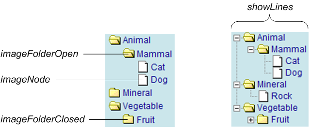
The purpose of many <dynaTree> attributes is to configure the images that the user clicks to control expansion and contraction. The following diagram shows many of the images that the <dynaTree> displays while the component is in use. The following table describes how to configure these images, if you wish to substitute your own images instead.
| Attribute | Description |
|---|---|
| Zen component attributes |
<dynaTree> has the same general-purpose attributes as any Zen component. For descriptions, see these sections:
|
| childIndent |
HTML length value giving the amount by which each level within the dynaTree should be indented. The default is to use no indentation. childIndent applies only when showLines is false. When showLines is true, indentation is controlled by the <dynaTree> to fit the lines that it provides. |
| dataGlobal |
Name of a Caché global (multidimensional array) that can provide the contents of the <dynaTree>. This string must include the ^ prefix that is characteristic of Caché global names, for example: dataGlobal="^myTree" Using dataGlobal excludes OnGetNodeInfo. For details, see the section “<dynaTree> Using a Global” in this chapter. |
| imageContracted |
File name for the image to display when the <dynaTree> is contracted. The user clicks on this image to expand the group. The default for imageContracted is the plus sign You may specify an alternate image. The image file that you identify must reside in the images directory under the Caché installation directory. imageContracted applies only when showLines is false. When showLines is true, a plus sign automatically appears as part of the graphical image that displays the lines. |
| imageExpanded |
File name for the image to display when the <dynaTree> is expanded. The user clicks on this image to contract the group. The default for imageExpanded is the minus sign You may specify an alternate image. The image file that you identify must reside in the images directory under the Caché installation directory. imageExpanded applies only when showLines is false. When showLines is true, a minus sign automatically appears as part of the graphical image that displays the lines. |
| imageFolderClosed |
File name for the image to display beside a closed folder node. This is a node that has children but is currently closed (contracted). The user clicks on this image to expand the node. The default for imageFolderClosed is a closed folder icon You may specify an alternate image. The image file that you identify must reside in the images directory under the Caché installation directory. |
| imageFolderOpen |
File name for the image to display beside an open folder node. This is a node that has children and is currently open (expanded). The user clicks on this image to contract the node. The default for imageFolderOpen is an open folder icon You may specify an alternate image. The image file that you identify must reside in the images directory under the Caché installation directory. |
| imageNode |
File name for the image to display beside a leaf node. This is a node with no children in the <dynaTree>. The user clicks on this image to select the node. The default for imageNode is a file icon You may specify an alternate image. The image file that you identify must reside in the images directory under the Caché installation directory. |
| showLines |
If true, show dashed lines between the nodes of the tree. The default is false. This attribute has the underlying data type %ZEN.Datatype.booleanOpens in a new tab. See “Zen Attribute Data Types.” |
| onchange |
The onchange event handler for the <dynaTree>. Zen invokes this handler when the current value of the <dynaTree> changes. See “Zen Component Event Handlers.” |
| onclick | Client-side JavaScript expression that Zen invokes when the user clicks on a node within the <dynaTree>. |
| ondblclick | Client-side JavaScript expression that Zen invokes when the user double-clicks on a node within the <dynaTree>. |
| OnGetNodeInfo | Name of a server-side callback method that reports information about each node within the tree. Using OnGetNodeInfo excludes dataGlobal. For details, see the section “<dynaTree> Using an OnGetNodeInfo Callback” in this chapter. |
| OnGetTreeInfo | Name of a server-side callback method that fills in a local array that supplies the contents of the tree. Using OnGetTreeInfo excludes both OnGetNodeInfo and dataGlobal. For details, see the section “<dynaTree> Using an OnGetTreeInfo Callback” in this chapter. |
| selectedIndex | 0-based index of the currently selected node in the <dynaTree>. The default selectedIndex is –1 (nothing is selected). |
 whose file name is
  whose file name is
  whose file name is
 When you work with %ZEN.Component.dynaTreeOpens in a new tab programmatically, you must also know about the following properties of the dynaTree class:
-
Each <parameter> element provided in the original <dynaTree> definition in XData Contents becomes a member of the dynaTree parameters property, a list collection of %ZEN.Auxiliary.parameterOpens in a new tab objects. Each <parameter> acquires an ordinal position in the parameters collection: 1, 2, 3, etc.
-
The read-only text property holds the text (display) value of the currently selected node within the tree. This is the node label that displays in the <dynaTree>.
-
The read-only value property holds the logical (actual) value of the currently selected node within the tree. This is the string that is activated when the user clicks the corresponding label in the <dynaTree>.
<dynaTree> Drag and Drop
<dynaTree> supports data drag operations when its dragEnabled attribute is set to true. This is possible because each node in a <dynaTree> has a logical value and a display value defined.
Data drag is explained in the “Data Drag and Drop” section in the chapter “Zen Controls.” Essentially, the user clicks the mouse button down while the cursor is positioned on a <dynaTree> node, then moves the mouse away from the <dynaTree> while still holding down the button. Data drag captures the current value of the <dynaTree> node where the drag operation began. If the logical value and displayed value are different, this difference is preserved when the data is captured.
The data acquired from a <dynaTree> node can be dropped on any Zen component that has drop enabled. Generally this is a Zen control. <dynaTree> does not support data drop, as it is not a control and cannot accept data input from the client side.
Filters
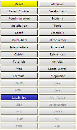
Zen offers a <buttonView> component that allows you to lay out a set of navigation choices as buttons in a grid. Typically, <buttonView> is used to display progressive filter buttons that allow a user to narrow down a search, as on the InterSystems documentation home page:
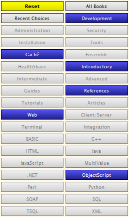
In the previous example, the user has just clicked the JavaScript button. This has disabled all the other buttons in the same category as JavaScript, and has caused the Reset button to activate and change color. To re-enable all the buttons in this category, the user could click the JavaScript button again.
A <buttonView> may contain multiple categories of buttons. Each category works like a set of radio buttons, in that only one button in the category may be selected at any time. In the following example, many more categories in the <buttonView> have been selected.
Every <buttonView> component automatically provides a Reset button that is enabled only when the user has made at least one selection. Reset appears as the top left entry in the grid. If clicked, Reset cancels all current user selections in the <buttonView>.