Zen Component Concepts
Components provide layout, style, and behavior for the page. The following table defines these commonly used terms. These definitions are important because each Zen component provides a large number of attributes that you can manipulate as you program the application. Some of these attributes affect layout, some style, and some behavior. With a strong grounding in these concepts, you can manipulate attributes fluently to get the results you want from Zen components.
| Term | Illustration | Summary |
|---|---|---|
| Page | 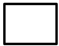 |
The rectangular display in a browser window. |
| Layout | 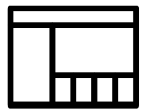 |
The position of each component, and of each group of components, on the page. |
| Style | 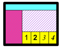 |
The visual appearance of components, regardless of their position on the page. |
| Behavior |  |
An application action that results from user input, a timer, or some other event. |
Page
A page is initially empty. It fills with components as you add them. A layout strategy is necessary to determine where these components appear on the page.
Layout
As Zen constructs a page for display, it adds components individually, one after another, according to the description that you have provided in the page class. The user is not aware of the page construction process. The user only sees that a page appears. However, as a Zen programmer, you must understand the construction process so that your pages lay themselves out exactly as you intend.
Components are contained within groups: a special type of component that can contain zero or more components. A group is responsible for the placement of its components on the page. The page is itself a group. Zen generates standard HTML table elements based on the group definition. You can cause components to line up vertically or horizontally, by enclosing them within a vertical or horizontal group. Generally, the largest width or height of any component in a group determines the overall width or height of the group on the page. A spacer component is available to help insert additional space between components in the group. The entire group places itself on the page as one component.
Certain components permit layers, similar to sheets of paper that occupy one position in a stack. Only one layer is revealed at one time, based on user clicks. Menus and tabs work on this principle.
Other components may have variable size, depending on their state. For example, if an <expando> list is closed, it contains only one item and is short. If the list is opened, it may contain many items; then it is long. The opened list could push aside other components later in the layout, causing a shift in the physical geography of the page. Or, the containing group may have a fixed size larger than the maximum expected list size, allowing the list to expand and contract within the larger boundary without affecting the page layout.
Zen manages layout by generating HTML and CSS style statements based on the inputs that you provide Zen. Essentially there are three ways to specify your layout intentions to Zen:
-
Let the containing group lay out its components.
-
Provide CSS style statements to Zen.
-
Use client-side JavaScript to dynamically change the geography of the page.
For details, see the chapter “Zen Layout.”
Scalable Vector Graphics (SVG) components are handled differently from other types of page content. For details, see the “Zen and SVG” chapter in Using Zen Components.
Style
Style determines the visual appearance of a component. Zen manages style by generating standard CSS statements based on the inputs that you provide Zen.
There are many style attributes that you can set for each component. These include background color, size, fill patterns, line width, and font family, just to name a few. You can accept the default styles. You can also override styles at the component, page, or application level.
For details, see the chapter “Zen Style.”
Behavior
Behavior refers to an internal or external application action that is triggered by user input, a timer, or some other type of event. Behavior encompasses a wide range of topics in this book, from processing user clicks and key presses to automatically generating tables based on database queries. For the most part, component behavior is unique per component. However, there are some attributes that all components share in common. This topic lists them.
Display
All Zen components provide the XML attributes listed in the following table. These attributes control basic display behavior for the component: onshow, onhide, and onrefresh.
| Attribute | Description |
|---|---|
| onhide | Client-side JavaScript expression that runs whenever this component is made hidden. |
| onrefresh | Client-side JavaScript expression that runs whenever the contents of this component are refreshed from the server. |
| onshow |
Client-side JavaScript expression that runs whenever this component is made visible. Generally this expression invokes a client-side JavaScript method defined in the page class. This method becomes the “onshow event handler” for the component. When providing a value for an event handler attribute such as onshow, use double quotes to enclose the value and single quotes (if needed) within the JavaScript expression. For example: <tablePane ondblclick="alert('HEY');"/> |
Drag and Drop
Drag and drop describes a simple mechanical operation that permits the application user to change the positions of items on the Zen page by direct manipulation on the client side. The user clicks on an item with the mouse and holds down the mouse button to “drag” the item to another position on the page. Releasing the mouse causes the item to “drop” into its new position. The item being dragged could be:
-
A Zen component that the user wishes to reposition on the page. Zen provides several active group components that permit the user to rearrange their internal layout by dragging and dropping components within the group. For details, see the “Client Side Layout Managers” chapter in Developing Zen Applications.
-
A single item within a Zen component that the user wishes to add or reposition. The <listBox> control allows the user to reorder entries in a list, or move an entry from one list to another, using drag and drop gestures. This is in addition to data drag and drop, which the <listBox> also supports. For details, see “<listBox> Drag and Drop” in the “Zen Controls” chapter of Using Zen Components.
-
Data, such as the contents of a <text> control on a form. Data drag and drop means that the user picks up data from one Zen component and drops it onto another component, replacing the value of the field where the data was dropped. Specifically, the user moves the data by clicking on it with the mouse, dragging it into position while holding down the mouse button, then dropping it on the destination field by releasing the mouse button. For details, see “Data Drag and Drop” in the “Zen Controls” chapter of Using Zen Components.
For the most part, data drag and drop applies only to control components, each of which has a logical value and a display value to be dragged. However, <dynaTree>, which is not a control, also supports data drag. Each of its nodes has a logical value and a display value. For details, see “<dynaTree> Drag and Drop” in the “Other Zen Components” chapter of Using Zen Components.
Drag and drop is enabled only when the <page> has its dragAndDrop attribute set to true. When this is the case, the following attributes may apply to any Zen component on the page. These attributes are most frequently used to configure Zen controls, but they are actually available for, and apply to, any Zen component.
| Attribute | Description |
|---|---|
| dragEnabled |
If true, and if dragAndDrop is enabled for the page, then this component can serve as a drag source. That is, users can start a drag and drop operation over this component. The default for dragEnabled is false. This attribute has the underlying data type %ZEN.Datatype.booleanOpens in a new tab. It has the value "true" or "false" in XData Contents, 1 or 0 in server-side code, true or false in client-side code. |
| dropEnabled |
If true, and if dragAndDrop is enabled for the page, then this component can serve as a drop target. That is, users can end a drag and drop operation over this component. The default for dropEnabled is false. This attribute has the underlying data type %ZEN.Datatype.booleanOpens in a new tab. It has the value "true" or "false" in XData Contents, 1 or 0 in server-side code, true or false in client-side code. |
| onafterdrag |
If dragEnabled is true and dragAndDrop is enabled for the page, this client-side JavaScript expression runs whenever a drag operation that started within this component completes. Generally this expression invokes a client-side JavaScript method defined in the page class. This method becomes the “onafterdrag event handler” for the component. When providing a value for an event handler attribute such as onafterdrag, use double quotes to enclose the value and single quotes (if needed) within the JavaScript expression. For example: <tablePane ondblclick="alert('HEY');"/> |
| onbeforedrag | If dragEnabled is true and dragAndDrop is enabled for the page, this client-side JavaScript expression runs whenever a drag operation has been initiated within this component but before the component has started to process the event. This is for cases in which you want to override the default drag behavior of a component. For example, you might want to change the visual representation of the data being dragged from a text caption to a graphical image while it is being dragged. |
| ondrag | If dragEnabled is true and dragAndDrop is enabled for the page, this client-side JavaScript expression runs whenever a drag operation has been initiated within this component. |
| ondrop | If dropEnabled is true and dragAndDrop is enabled for the page, this client-side JavaScript expression runs whenever a drop operation occurs within this component. |
Rather than providing values for onafterdrag, onbeforedrag, ondrag, and ondrop attributes in the previous table, it can be more convenient to build the desired behavior into a custom component. This can be useful to ensure consistency, because this way application developers are not required to specify the attributes for drag and drop each time they place the component on the page. Instead, developers choose the custom component, which already has the desired drag and drop behavior built into it. For information about customizing drag and drop behavior, see “Data Drag and Drop Methods” in the “Custom Components” chapter of Developing Zen Applications.
Zen reports performs drag and drop initialization when a page is loaded. If you dynamically add or remove elements from the page, you need to call the method ZLM.initTargetNodes to activate drag and drop behavior for the new elements. The Document Object Model (DOM) needs to be stable when you call this method. The circumstances under which the DOM is stabile, and ways to test for stability, vary from one browser to another.
Customization
Zen serves a wide audience range. At one end is the programmer who wants to use Zen to quickly assemble a user interface for a data-rich web application. This programmer rapidly places Zen components on the page with the goal of allowing the user to see and manipulate the underlying data.
At the other end of this range is the programmer who wants to use Zen for pinpoint control of the layout, style, and behavior of each component on the page. This programmer may react to introductory topics with this phrase: “But I want to...”
Everyone can relax.
Zen provides ample opportunities for customization. In addition to the wide range of variations available by manipulating layout, style, and behavior of built-in components, you can create new components, or even replace the Zen layout handler with custom code. For details, see the “Custom Components” chapter in the book Developing Zen Applications.
On the other hand, customization is entirely optional. Everyone should begin by reading the next several chapters. Come to appreciate the power, ease, and flexibility of Zen. Then, after understanding what Zen provides, make your own decision about whether or not to extend it. The option is always there.