Other Zen Components
This chapter describes components that fit into none of the categories defined in other chapters of this book: layout, tables, meters, charts, forms, controls, navigation aids, or popups.
-
“<colorPane>” — A large, detailed palette from which the user can select colors
-
“<colorWheel>” — A continuous color gradient from which the user can select colors.
-
“<dynaView>” — Display a view box based on data provided by a callback method.
-
“<fieldSet>” — A group component that helps visually organize a form
-
“<finderPane>” — A Finder-like browser for hierarchically organized data.
-
“<html>” — A snippet of arbitrary HTML content
-
“<iframe>” — A static image or other content within a frame
-
“<repeatingGroup>” — Repeat the same layout for each item returned by a runtime query.
-
“<schedulePane>” — Display a daily, weekly, or monthly calendar with time slots for each date.
-
“<timer>” — A non-visible component that fires an event after a time interval
If you have examined the full roster of components, including those listed above, and still do not see the functionality you need, consider adding a custom component to the Zen library. For full instructions, see the “Custom Components” chapter in Developing Zen Applications.
HTML Content
The Zen <html> component provides a way to place arbitrary HTML content within a Zen page. The HTML content is displayed within the Zen page exactly as specified. This content is drawn within an enclosing HTML <div> in the same manner as any other Zen component.
There are several ways to define the content displayed by the <html> element:
-
Literally specify the content within the <html> component:
<html id="myContent">
This is some <b>HTML</b>.
</html>
The content must be well-formed. That is, any HTML elements within the content must have matching closing elements, and any attribute values must be quoted correctly. The <script> tag is not allowed.
The content may not reference other Zen components. However, it may contain Zen #()# runtime expressions.
-
Define a server-side OnDrawContent callback method that writes HTML content. If you define such a method, and reference it from the <html> element, this method is called whenever the <html> component is displayed.
<html id="myContent" OnDrawContent="GetHTMLContent" />The method itself would look something like this:
Method GetHTMLContent(pSeed As %String) As %Status { &html<This is some HTML!> Quit $$$OK } -
The <html> component has a content property that is a string of HTML statements. You can set the content property’s initial value by placing the desired HTML tags in between the <html> and </html> elements in XData Contents, or by referencing an OnDrawContent callback.
Client code can change the value of the content property by resetting it from JavaScript. The following example uses the JavaScript utility function zenSetProp() to do this:
// get html content
zenSetProp('myContent','content','some new content');
The <html> component has the following attributes:
| Attribute | Description |
|---|---|
| Zen component attributes |
<html> has the same general-purpose attributes as any Zen component. For descriptions, see these sections:
|
| OnDrawContent |
Name of a server-side callback method in the Zen page class. This method provides HTML content using &html<> syntax or WRITE commands. Zen invokes this method whenever it draws the <html> component, automatically passing it a %StringOpens in a new tab that contains the component’s seed value. The callback must return a %StatusOpens in a new tab data type. The following is a valid method signature:Method DrawMe(pSeed As %String) As %Status To use the above method as the callback, the developer would set OnDrawContent="DrawMe" for the <html> component. |
| seed | Allows you to pass some arbitrary value to the OnDrawContent callback. |
Framed Content
The Zen <iframe> component is a wrapper for the HTML <iframe> element. It may display images or other content within a frame.
<iframe> Attributes
The Zen <iframe> component has the following attributes:
| Attribute | Description |
|---|---|
| Zen component attributes |
<iframe> has the same general-purpose attributes as any Zen component. For descriptions, see these sections:
|
| longdesc | URI that provides the link to the long (text) description of the frame. |
| frameAlign | The align value for the HTML <iframe>: "left", "right", or "center". |
| frameBorder |
The frameborder value for the HTML <iframe>. If true, the frame has a border; if false it does not have a border. This attribute has the underlying data type %ZEN.Datatype.booleanOpens in a new tab. See “Zen Attribute Data Types.” |
| scrolling | The scrolling value for the HTML <iframe>: "auto", "yes", or "no". |
| src |
Identifies the pathname and filename of the frame content. The path is either an absolute pathname or a path relative to the Caché installation directory, for example: <iframe id="myFrame" src="/csp/myApp/myPic.png" /> |
If you wish to change the contents of the frame from the client, you can do so programmatically by resetting the value of the src property of the iframe object.
When changing the src property value on the client side, do not simply set the property, as in:
var frame=zen('contentFrame');
frame.src='C:\myfile';
Instead, use the setProperty() method, as in:
var frame=zen('contentFrame');
frame.setProperty('src','C:\myfile');
Rendering Image Data Streams
InterSystems advises that you do not use <iframe> to render image data streams. Instead, use <image> as described in the chapter “Zen Controls.” This convention is imperative when the image is in JPG format and the browser is Internet Explorer (IE). This topic explains the details.
Suppose you want to use an <iframe> to render content retrieved from the database via a CSP routine that serves up a data stream. The stream could be PDFs, GIFs, JPGs, Docs, RTFs, etc. It turns out that, when the image is in JPG format and the browser is IE, rendering JPG data in an <iframe> incapacitates core Zen functionality.
The root of the problem is in the way IE renders data streams.
When browsers like Firefox see that the data stream isn’t an HTML page, they create a dummy DOM to wrap around the incoming stream; GIFs and JPGs become HTML <IMG> tags with their src attribute set to the URI provided, PDFs automatically generate HTML <EMBED> tags to launch the viewer, etc. In these cases, a DOM is always created and the normal scoping rules of JavaScript execution apply.
IE is different. It does not create a DOM; it swaps out normal page processing in favor of a dedicated viewer for the content in question. For ordinary web pages this is usually not an issue. If you are just loading a picture or downloading a PDF, there is nothing to interact with the DOM, so it does not matter if the DOM is there or not.
The problem arises when the content is being loaded into an <iframe> under IE.
Content requiring an external plug-in, such a PDFs or RTFs, seem to work fine with IE. The embedded GIF viewer also seems to play well. The JPG viewer, however, does not. If a JPG image is loaded as a direct stream into an <iframe>, when IE initializes the embedded viewer it obliterates, not just the JavaScript execution space for the <iframe>, but the entire JavaScript namespace for the page, deleting global client-side variables and JavaScript function definitions. After the viewer is initialized, JavaScript continues to function outside the <iframe> for event callbacks and such, but chances are good that any client-side data initialized before the loading of the <iframe> has been reset to null.
The best cross-platform solution for dealing with cases like these is to use the Zen components <iframe> and <image> as follows:
-
<iframe> for HTML documents or data streams requiring external plug-ins (such as PDFs)
-
<image> to render data streams of types GIF, JPG or PNG
The only downside to this solution is that if streams are being retrieved from the database, two queries are required: one to determine the type of data being sent and a second to send the actual data. The overhead in this case is almost exclusively the network overhead, as the data volume is trivial. Therefore, the best practice for rendering data streams retrieved from the database is as follows:
-
Define the template display page with both an <iframe> and an <image>. Both components are initially hidden (hidden='true').
-
Query to find out what type of data is to be rendered.
-
Based on this query, set the src attribute of either the <iframe> or the <image> to the URI of the data stream and set the corresponding component to be visible (hidden='false')
-
When the page is closing, reset the displayed component to be hidden (hidden='true') so that the page is ready for the next data stream.
Other permutations are possible, but this is the basic idea. It is not necessary to use an <iframe> to display image data on a web page, and doing so with a JPG under IE breaks Zen, so do not use <iframe> for this purpose; use <image> instead.
Timer
The <timer> component has no visual representation. It raises a client-side event after a specified time period. You may place a <timer> on the Zen page within XData Contents as follows:
XData Contents [XMLNamespace="http://www.intersystems.com/zen"]
{
<page>
  <timer ontimeout="zenPage.timeout(zenThis);" timeout="10000" />
</page>
}
<timer> has the following attributes:
| Attribute | Description |
|---|---|
| ontimeout |
The ontimeout event handler for the timer. Zen invokes this handler whenever the timer runs out. It must accept an argument, timer, that represents this timer object. The <timer> element can use the built-in variable zenThis to pass the timer object to the method. See “Zen Component Event Handlers.” |
| timeout |
Number of milliseconds in the timer. Zen automatically starts the timer when the page is first loaded. When the timeout time has elapsed, Zen fires the ontimeout expression. The example above sets a timeout value of 10,000 milliseconds. This provides an timeout value of 10 seconds. |
The client-side ontimeout method might look something like the following. A <timer> only fires its ontimeout event once, so your JavaScript method must restart the timer (by calling its startTimer method) before exiting. The following example does this:
ClientMethod timeout(timer) [ Language = javascript ]
{
  // ...do something

  // restart the timer
  timer.startTimer();
}
Field Sets
A <fieldSet> is a group component that draws an outer box around the children and displays a title within this box. This creates a visual panel that can help to organize a page. The following example from the SAMPLES namespace class ZENApp.HelpDeskOpens in a new tab defines a panel called “Details” that contains a form with several different controls.
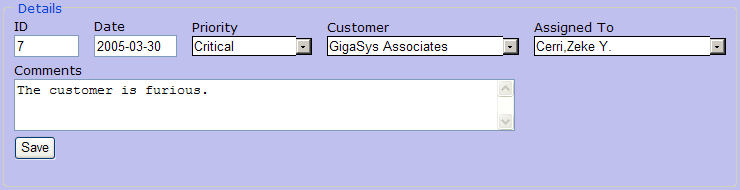
The <fieldSet> that produces the above example looks like this:
<fieldSet id="detailGroup" legend="Details">
  <form id="detailForm" layout="vertical" labelPosition="top"
        cellStyle="padding: 2px; padding-left: 5px; padding-right: 5px;"
        onchange="zenPage.detailFormChange(zenThis);" >
    <hgroup>
      <text id="ID" name="ID" label="ID" readOnly="true" size="5"/>
      <spacer width="15"/>
      <text id="CreateDate" name="CreateDate" label="Date"
            readOnly="true" size="8"/>
      <spacer width="15"/>
      <dataCombo id="Priority" name="Priority" label="Priority" size="12"
                 dropdownHeight="150px" editable="false" unrestricted="true"
                 sql="SELECT Name FROM ZENApp_Data.Priority ORDER BY Name"/>
      <spacer width="15"/>
      <dataCombo id="Customer" name="Customer" label="Customer" size="24"
                 dropdownHeight="150px" editable="false" unrestricted="true"
                 sql="SELECT ID,Name FROM ZENApp_Data.Customer ORDER BY Name"/>
      <spacer width="15"/>
      <dataCombo id="AssignedTo" name="AssignedTo" label="Assigned To" size="24"
                 dropdownHeight="150px" editable="false" unrestricted="true"
                 sql="SELECT ID,Name FROM ZENApp_Data.Employee ORDER BY Name"/>
    </hgroup>
    <textarea id="Comments" name="Comments"
              label="Comments" rows="3" cols="60"/>
    <button id="btnSave" caption="Save" disabled="true"
            onclick="zenPage.detailFormSave();" />
  </form>
</fieldSet>
A <fieldSet> group may contain a <form>, as above, or a <form> may contain a <fieldSet>. A <fieldSet> provides a visual grouping only; it is not a Zen form, because it does not provide any form behavior such as validation or submit. <fieldSet> has the following attributes:
| Attribute | Description |
|---|---|
| Zen group attributes | <fieldSet> has the same style and layout attributes as any Zen group. For descriptions, see “Group Layout and Style Attributes” in the “Zen Layout” chapter of Using Zen. |
| legend |
Text specifying the caption to display for this <fieldSet>. The legend can be a literal string, or it can contain a Zen #()# runtime expression. Although you can enter ordinary text for this attribute, it has the underlying data type %ZEN.Datatype.captionOpens in a new tab. See “Zen Attribute Data Types.” |
| title |
Text specifying a popup message to display for this <fieldSet>. The title can be a literal string, or it can contain a Zen #()# runtime expression. Although you can enter ordinary text for this attribute, it has the underlying data type %ZEN.Datatype.captionOpens in a new tab. See “Zen Attribute Data Types.” |
Color Selector
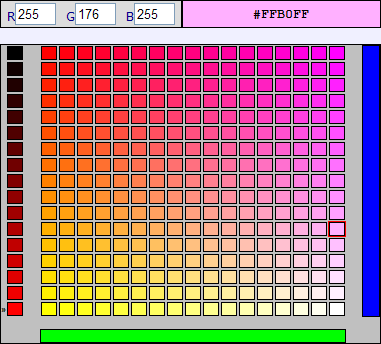
The <colorPane> component lets the user view and select colors or enter RGB values in a large color palette. The palette is a grid that can be visualized as one possible slice from a three-dimensional cube of available colors. The <colorPane> captures a slice from the cube by accepting the user’s choice of one of three faces (red, green, or blue) and slicing through the cube, parallel to that face, at some saturation level (brighter or dimmer) to produce a grid of colors.
From the user’s viewpoint, the <colorPane> has these features:
-
The user selects a color by clicking a square in the palette.
-
The user can cycle through different faces and slices of the color cube by clicking on the red, green, or blue color bars at left, bottom, and right. The segmented bar at left allows the user to select a slice that uses a brighter or dimmer range of color combinations.
-
The bar at top right displays the currently selected color and its corresponding HTML hexadecimal value. The user can copy (but not edit) the text value from this color bar.
-
At top left, the user can change the text entry fields R, G, and B to any number in the range 0–255, then click on the color bar at top right to apply these changes and see the result. The text fields R, G, and B also respond to user selections from the palette.
A <colorPane> with a color selected looks like this:
<colorPane> has the following attributes. For a simpler color selection component, see “<colorPicker>.”
| Attribute | Description |
|---|---|
| Zen component attributes |
<colorPane> has the same general-purpose attributes as any Zen component. For descriptions, see these sections:
<colorPane> is not a full-blown control component, but it does allow the user to select a value, and it can be used within Zen forms. Any control attribute not listed in this table is not available for <colorPane>. |
| currCol | 0–based column number of the currently selected cell in the color palette. The default is 0. The range is from 0 to 15. |
| currRow | 0–based row number of the currently selected cell in the color palette. The default is 0. The range is from 0 to 15. |
| currSlice | 0–based slice number of the currently selected slice of the 3–dimensional color cube. The default is 0. The range is from 0 to 15. |
| face | Face number of the currently selected face of the 3–dimensional color cube: 1, 2, or 3. The default is 1. |
| onchange |
The onchange event handler for the <colorPane>. Zen invokes this handler when the value of the <colorPane> component changes. See “Zen Component Event Handlers.” |
| ondblclick | Client-side JavaScript expression that Zen invokes when the user double-clicks on the <colorPane> component. |
| value |
String that identifies the most recently selected HTML hexadecimal value. The default is: #FFFFFF |
Color Wheel
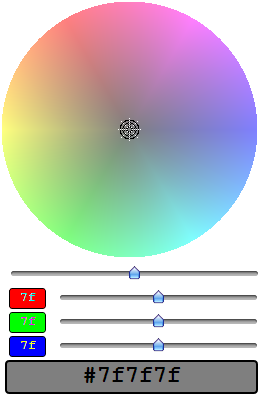
The <colorWheel> component lets the user view and select colors from a continuous color gradient. The color wheel actually provides two different groups of controls. You can either use the color wheel and intensity slider to pick a shade from the wheel, or use the separate RGB sliders to mix a specific color.
When you use the disk and intensity slider, move the slider to the left to see darker tones, or to the right to see lighter ones. The rendering of the disk offers real time feedback as to the current settings. Once you have the right range of colors displayed, click on the desired region of the disk. A cross-hair shows you where you clicked and the background of the preview box at the bottom of the widget updates to reflect your choice. Also, the RGB sliders update to reflect the selected color.
When you use the RGB sliders, drag the sliders to adjust the contributions of the individual RGB color guns. The current value for each gun displays in the box to the left of the slider. The color resulting from the contributions of all three guns appears in the background of the preview box at the bottom of the control. Also, the intensity slider, color disk, and cross-hair location update to reflect the current color.
A <colorWheel> with a color selected looks like this:
<colorWheel> has the following attributes. For a color selection component that lets you select from a color palette, see “<colorPane>.”. For a simple color selection component that lets you choose from a limited set of colors, see “<colorPicker>.”
| Attribute | Description |
|---|---|
| Zen component attributes |
<colorWheel> has the same general-purpose attributes as any Zen component. For descriptions, see these sections:
|
| showPreview | Show the preview box at the bottom of the control that is filled with the currently selected color and stamped with the HTML Hex color specification. |
| showRGBPanel | Show the panel containing three sliders that allows the user to select values for the RGB color guns. |
| value |
The value that is automatically initialized for the <colorWheel> when it is displayed. This property does not hold the value selected by the user. You need to use the getValueOpens in a new tab method to get the current value of a control. The default value is: #7f7f7f |
Repeating Group
A <repeatingGroup> is a specialized group component that defines the layout for a single group item, then outputs multiple items with this layout. The number of items, and the data contained in each item, is determined by a runtime query.
<repeatingGroup> has the following attributes:
| Attribute | Description |
|---|---|
| Zen group attributes | <repeatingGroup> has the same style and layout attributes as any Zen group. For descriptions, see “Group Layout and Style Attributes” in the “Zen Layout” chapter of Using Zen. The default layout for a <repeatingGroup> is vertical. |
| Data source attributes |
<repeatingGroup> has similar attributes to <tablePane> for specifying the data source. <repeatingGroup> supports maxRows, queryClass, queryName, and sql. For details and examples, see the following sections in the chapter “Zen Tables”:
|
| onclickitem |
The onclickitem event handler for the <repeatingGroup>. Zen invokes this handler when the user clicks on an item within the repeating group. See “Zen Component Event Handlers.” |
| selectedIndex | The (0–based) index number of the currently selected item. The default value is –1, which indicates there is no current selection. |
The typical layout strategy for a repeating group is for the <repeatingGroup> element to enclose a horizontal group that contains the individual item. Since the default layout for a <repeatingGroup> is vertical, the result of this arrangement is that each item is laid out horizontally, while the set of items is laid out from top to bottom.
The following excerpt from an XData Contents block provides an example of this layout strategy for <repeatingGroup>. This is similar to the XData Contents block in the class ZENTest.RepeatingGroupTestOpens in a new tab in the SAMPLES namespace. Note the <hgroup> that defines the individual entry. This <hgroup> contains a <button> and an <html> component.
<vgroup>
  <repeatingGroup id="repeatingGroup"
                  maxRows="1000"
                  sql="SELECT TOP ? Name,Title,SSN,Salary,FavoriteColor
                  FROM ZENDemo_Data.Employee WHERE Name %STARTSWITH ?">
    <parameter value="#(%page.Rows)#" />
    <parameter value="#(%page.SearchKey)#" />
    <hgroup>
      <button caption="#(%query.Name)#"
              title="Salary: $  #(%query.Salary)#"
              onclick="alert('Salary: $  #(%query.Salary)#\n
                              Favorite Color: #(%query.FavoriteColor)#\n
                              ID Number: #(%query.SSN)#')" />
      <html>
        <b>#(%query.Title)#</b>
      </html>
    </hgroup>
  </repeatingGroup>
  <spacer height="25"/>
  <form>
    <text id="search" label="Key:" value="#(%page.SearchKey)#" size="10"/>
    <text id="rows" label="Rows:" value="#(%page.Rows)#" size="5"/>
    <button caption="Search" onclick="zenPage.refreshGroup();" />
  </form>
</vgroup>
The following figure illustrates sample output from this excerpt. To produce this output, the user entered the key C, requested 10 rows, and then clicked Search. This caused Zen to display the repeating group using the first 10 entries that start with the letter C. The user then clicked an employee name in the group to display the alert window, which contains data retrieved from the server during the query.
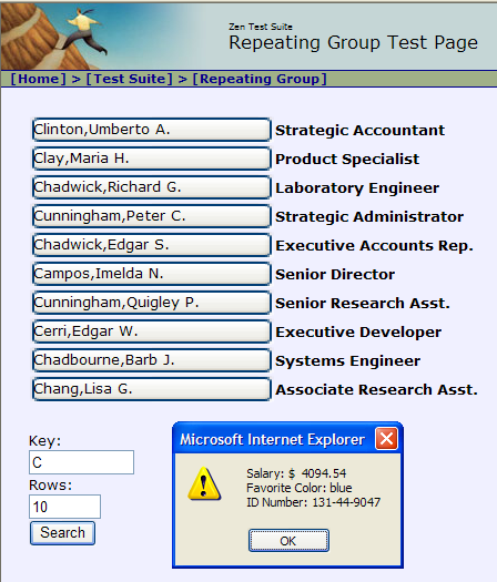
On the output side, only one object is created for each child of the repeating group, but there are multiple HTML renderings within that object, one for each child. The rendered HTML incorporates the current item number into each generated id value used to identify the HTML elements on the page.
InterSystems recommends that you keep the use of <repeatingGroups> reasonably simple. Repeating groups within repeating groups are not supported.
Dynamic View
The <dynaView> component displays a set of user-defined items within a view box, similar to the way a file dialog box might display a set of files or directories. <dynaView> items can displayed in one of two modes:
-
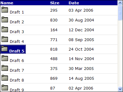
"list" — All items are displayed compactly in a grid. Only the first column of data is displayed.
-
"details" — Each item is displayed as one row within a table. Each row may present several columns of data.
A <dynaView> in “details” mode looks like the following example, based on the class ZENTest.DynaViewTestOpens in a new tab in the SAMPLES namespace.
<dynaView> OnGetViewContents Callback Method
<dynaView> gets its data by invoking a server-side callback method defined in the Zen page class. The method name is specified using the <dynaView> OnGetViewContents attribute, as shown in the following example. In this example, the method name is GetViewContents.
<dynaView id="view" viewType="details"
          OnGetViewContents="GetViewContents"
          onchange="zenPage.viewChange(zenThis);" >
  <parameter paramName="label" value="Draft" />
</dynaView>
A <dynaView> can contain zero or more <parameter> elements. Each <parameter> specifies an input parameter for the OnGetViewContents callback method. Each <parameter> may have the following attributes:
| Attribute | Description |
|---|---|
| id |
If you wish to be able to access the parameter to change its value at runtime, in response to user actions on the client side, then you must give the <parameter> element an id. With a parameter defined as follows:<parameter id="parmLabel" paramName="label" value="Draft" /> A client-side JavaScript method in the same Zen page class could change the value of this parameter to “Final” as follows:var parm = zen(parmLabel); parm.value = "Final"; |
| paramName | The paramName must be unique within the <dynaView>. It becomes a subscript in the array of parameters passed to the callback method. |
| value | The value supplied for a <parameter> can be a literal string, or it can contain a Zen #()# runtime expression. |
The OnGetViewContents callback method must have a signature that looks like this:
Method GetViewContents(
    ByRef pParms As %String,
    Output pContents As %String,
    Output pHeaders As %String) As %Status
Where:
-
The method returns a %StatusOpens in a new tab value indicating success or failure.
-
pParms represents any <parameter> elements defined by the <dynaView>. pParms is an array. Each member of this array uses its paramName as a subscript and its value as a value.
-
pContents is a multidimensional array that describes the set of items that is displayed within the view box. The array is subscripted by item number (starting with 1). Each array element is a $List structure containing the following information. You can use the ObjectScript function $LISTBUILD ($LB) to create each list item for pContents, using statements such as the following inside the callback method:
  Set pContents(n) =
  $LB(textValue,logicalValue,icon,col2,col3)
Where:
-
textValue is the value displayed for the item
-
logicalValue is a logical value associated with the item
-
icon is the URI of the image to be displayed with the item (if any)
-
Any subsequent values (col2, col3, and so forth) define the values to display in any additional columns when the dynaView is in “details” mode
-
-
pHeaders is a multidimensional array that provides a set of column headers, subscripted by column number. When the dynaView is in “details” mode, this is used to define how many columns of data to display and what the column headers are. For example:
    // define 3 column headers
    Set pHeaders(1) = "Name"
    Set pHeaders(2) = "Size"
    Set pHeaders(3) = "Date"
The icons used in a dynaView belong to a CSS class called dynaViewIcon, which enables you to use CSS to control the appearance of the icon. For example, the following CSS insures that the icon is displayed as 16px x 16px:
    .dynaViewIcon {
        height: 16px;
        width: 16px;
    }
Schedule Calendar
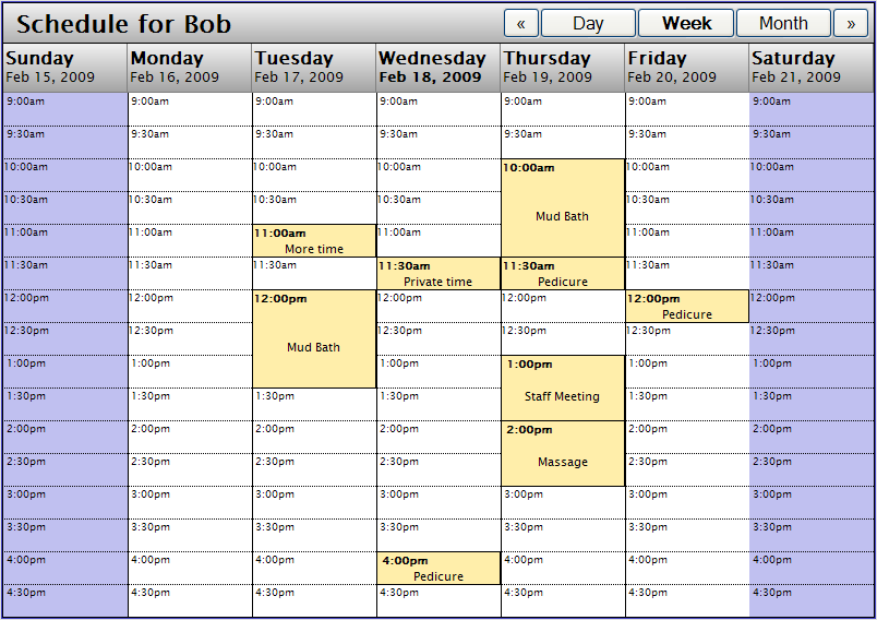
A <schedulePane> displays a daily, weekly, or monthly calendar with time slots for each date. Users can define appointments and place them in the appropriate time slots. The following example shows a <schedulePane> in Week mode with several appointments defined. This example is similar to the class ZENTest.SchedulePaneTestOpens in a new tab in the SAMPLES namespace.
The <schedulePane> is not a control, and does not return a value. For simple date selection controls that enable users to enter dates as values in forms, see the “Dates” section in the chapter “Zen Controls.”
<schedulePane> OnGetScheduleInfo Callback Method
<schedulePane> gets its data by invoking a server-side callback method defined in the Zen page class. The method name is specified using the <schedulePane> OnGetScheduleInfo attribute, as shown in the following example. In this example, the method name is GetScheduleInfo.
<schedulePane id="schedule" caption="Schedule for Bob"
  dateFormat="5" interval="30" startTime="540" endTime="1020"
  dropEnabled="true" ondrop="zenPage.scheduleDataDrop(dragData);"
  onselectitem="zenPage.selectItem(id,time);"
  OnGetScheduleInfo="GetScheduleInfo">
  <parameter id="parmPerson" paramName="Person" value="Bob" />
</schedulePane>
A <schedulePane> can contain zero or more <parameter> elements. Each <parameter> specifies an input parameter for the OnGetScheduleInfo callback method. Each <parameter> may have the following attributes:
| Attribute | Description |
|---|---|
| id |
If you wish to be able to access the parameter to change its value at runtime, in response to user actions on the client side, then you must give the <parameter> element an id. With a parameter defined as follows:<parameter id="parmPerson" paramName="Person" value="Bob" /> A client-side JavaScript method in the same Zen page class could change the value of this parameter to “Sally” as follows: var parm = zen('parmPerson'); parm.value = "Sally"; |
| paramName | The paramName must be unique within the <schedulePane>. It becomes a subscript in the array of parameters passed to the callback method. |
| value | The value supplied for a <parameter> can be a literal string, or it can contain a Zen #()# runtime expression. |
The OnGetScheduleInfo callback method must have a signature that looks like this:
ClassMethod GetScheduleInfo
  (ByRef pParms As %String,
   pStartDate As %Date,
   pEndDate As %Date,
   ByRef pInfo As %List) As %Boolean
Where:
-
The method returns a %BooleanOpens in a new tab value which is true to indicate success; otherwise it is false.
-
pParms represents any <parameter> elements defined by the <schedulePane>. pParms is an array. Each member of this array uses its paramName as a subscript and its value as a value.
-
pStartDate is the starting date and time in $HOROLOG ($H) format, the internal storage format for dates in Caché. As described in the Caché ObjectScript Reference, this format gives the number of days since December 31, 1840; then a comma; then the number of seconds since midnight. That is:
date,time
Where both date and time are integers.
-
pEndDate is the ending date and time in $HOROLOG ($H) format.
-
pInfo is a multidimensional array that describes the time slots that are displayed within the schedule calendar. The array is subscripted as follows:
-
time is an integer expressing the start time for this time slot as a number of minutes since midnight. Your code is more readable if you express this value as a calculated multiple of 60, using 9*60 for 9 a.m. instead of the literal value 540, but either is correct.
-
n is an integer (starting with 1, and usually equal to 1) that you can use as needed to distinguish between time slots that have the same day and time values.
Each pInfo array element is a $List structure containing the following information. You can use the ObjectScript function $LISTBUILD ($LB) to create each list item for pInfo, using statements such as the following inside the callback method:
  Set pInfo(day,time,n) =
  $LISTBUILD(duration,id,text,type,style)
Where:
-
duration is an integer specifying the number of minutes to reserve for this time slot in the schedule.
-
id is an integer that the onselectitem event handler uses to uniquely identify this time slot when it is selected in the schedule.
-
text is the text description to display in this time slot in the schedule.
-
type is either 0 or 1:
-
0 is an unavailable time slot
-
1 is a scheduled time slot
-
-
style is a CSS style to apply to this time slot in the schedule. This value overrides any competing styles that might otherwise apply to this time slot.
The following example sets up a 60-minute staff meeting at 9 a.m. on the given start date, designates it as a scheduled time slot, and colors its background green on the schedule calendar display:
ClassMethod GetScheduleInfo(ByRef pParms As %String,
                            pStartDate As %Date,
                            pEndDate As %Date,
                            ByRef pInfo As %List)
                            As %Boolean
{
  Set pInfo(pStartDate,9*60,1)
  = $LB(60,1,"Staff Meeting",1,"background: green;")
  Quit 1
}
You can also provide a style that applies to all of the time slots in a particular day by setting a top node of the pInfo array to a CSS style value. For example:
Set pInfo(day) = "background: yellow;"
<schedulePane> Attributes
This topic has already described the OnGetScheduleInfo attribute in detail. The following table lists all the <schedulePane> attributes.
| Attribute | Description |
|---|---|
| Zen component attributes |
<schedulePane> has the same general-purpose attributes as any Zen component. For descriptions, see these sections:
|
| caption |
Text to display as a caption along the top of the schedule. The text is not HTML escaped, so it can contain markup. The caption value can be a literal string, or it can contain a Zen #()# runtime expression. Although you can enter ordinary text for this attribute, it has the underlying data type %ZEN.Datatype.captionOpens in a new tab. See “Zen Attribute Data Types.” |
| cellHeight | Integer giving the height of time slots in the schedule calendar, in pixels. The default is 30, as shown in the illustration for dateFormat. Do not specify units with cellHeight. |
| date |
Date to display, in YYYY-MM-DD format. The default is the current date. The schedule calendar displays a range of days that contain this date value. The actual range depends on the current value of the view attribute: "day", "week", or "month". The date value can be a literal string, or it can contain a Zen #()# runtime expression. |
| dateFormat |
Integer that specifies the date format to use in the headers for the schedule calendar. The <schedulePane> automatically displays this date below the name of the day of the week. The default dateFormat is –1. This generates the date in the format “Feb 18, 2009” as shown in the following illustration. As the illustration shows, you can also configure the headerHeight and cellHeight attributes for this part of the schedule calendar display. 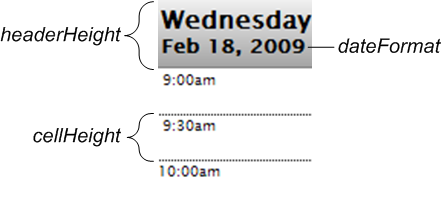 For a list of the integers you can use as values for dateFormat, see the description of dformat in the “Parameters” section for the $ZDATETIME ($ZDT) function in the Caché ObjectScript Reference. dateFormat allows nearly the same range of values as dformat. dateFormat supports –1 and the values 1 through 13. |
| dayList |
Comma-separated list of the full names of days of the week. The default dayList value uses the $$$Text macro with the English values Sunday through Saturday. Using this macro ensures that this dayList value is automatically included in the list of strings to translate for your application when you export them from the message dictionary, as long as you also set the DOMAIN parameter in the Zen class. For details, see the “$$$Text Macros” section in the “Zen Localization” chapter of Developing Zen Applications. You can use $$$Text with dayList because its ZENLOCALIZE datatype parameter is set to 1 (true). Any localized dayList string must remain a comma-separated list of seven items when translated. Be sure to coordinate dayList changes with shortDayList and firstDayOfWeek. |
| endTime |
Ending time for the daily time slots to be displayed on the schedule calendar. This is an integer expressing the number of minutes since midnight. The default endTime is 1080, which means 6 p.m. The range for endTime is 0 through 1440, which covers all 24 hours in the day. If the end user schedules an appointment that falls outside the startTime and endTime, the calendar expands to display that time slot. The endTime value can be a literal string, or it can contain a Zen #()# runtime expression. |
| firstDayOfWeek |
Integer that specifies which day of the week is displayed as the starting day of the week in the schedule calendar. 0 means Sunday, 1 means Monday, and so on up to 6, which means Saturday. The default firstDayOfWeek is 0. The purpose of the firstDayOfWeek attribute is to allow you to customize the schedule calendar for different locales. Be sure to coordinate firstDayOfWeek changes with dayList and shortDayList. |
| headerHeight | Integer giving the height of the header row at the top of the schedule calendar, in pixels. This header row is where Zen displays the names of days and their dates. The default is 40, as shown in the illustration for dateFormat. Do not specify units with headerHeight. |
| interval | Integer giving the number of minutes in each time slot on the calendar. The default interval is 30; the minimum is 5. The interval value can be a literal string, or it can contain a Zen #()# runtime expression. |
| monthList |
Comma-separated list of the full names of months of the year. The default monthList value uses the $$$Text macro with the English values January through December. You can use $$$Text with monthList because its ZENLOCALIZE datatype parameter is set to 1 (true). Any localized monthList string must remain a comma-separated list of twelve items when translated. |
| OnGetScheduleInfo |
Name of a server-side callback method in the Zen page class. This method gets the information needed to display the schedule. For details, see the section “<schedulePane> OnGetScheduleInfo Callback Method.” |
| onselectitem |
The onselectitem event handler for the <schedulePane>. Zen invokes this handler when the user clicks on an item within the schedule calendar. See “Zen Component Event Handlers.” An onselectitem definition generally looks like this:<schedulePane onselectitem="zenPage.selectItem(id,time);" ... > While the signature for the onselectitem handler method in the Zen page class looks like this:ClientMethod selectItem(id, time)[ Language = javascript ] The handler uses the following two special variables as arguments:
|
| shortDayList |
Comma-separated list of the abbreviated names of days of the week. The default shortDayList value uses the $$$Text macro with the following string: Sun,Mon,Tue,Wed,Thu,Fri,Sat You can use $$$Text with shortDayList because its ZENLOCALIZE datatype parameter is set to 1 (true). Any localized shortDayList string must remain a comma-separated list of seven items when translated. Be sure to coordinate shortDayList changes with dayList and firstDayOfWeek. |
| shortMonthList |
Comma-separated list of the abbreviated names of months of the year. The default shortMonthList value uses the $$$Text macro with the following string: Jan,Feb,Mar,Apr,May,Jun,Jul,Aug,Sep,Oct,Nov,Dec You can use $$$Text with shortMonthList because its ZENLOCALIZE datatype parameter is set to 1 (true). Any localized shortMonthList string must remain a comma-separated list of twelve items when translated. |
| startTime |
Starting time for the daily time slots to be displayed on the schedule calendar. This is an integer expressing the number of minutes since midnight. The default startTime is 480, which means 8 a.m. The range for startTime is 0 through 1440, which covers all 24 hours in the day. If the end user schedules an appointment that falls outside the startTime and endTime, the calendar expands to display that time slot. The startTime value can be a literal string, or it can contain a Zen #()# runtime expression. |
| view | Specifies what type of schedule to display. Possible values are "day", "week", or "month". The default is "day". The view value can be a literal string, or it can contain a Zen #()# runtime expression. |
When you work with %ZEN.ComponentEx.schedulePaneOpens in a new tab programmatically, you must also know about the following properties of the schedulePane class:
-
Each <parameter> element provided in the original <schedulePane> definition in XData Contents becomes a member of the schedulePane parameters property, a list collection of %ZEN.Auxiliary.parameterOpens in a new tab objects. Each <parameter> acquires an ordinal position in the parameters collection: 1, 2, 3, etc.
-
The read-only selectedTime property holds the start time of the currently selected time slot in the schedule calendar. The selectedTime is an integer that gives the number of seconds since 0, at midnight.
-
The read-only selectedInterval property holds the length, in minutes, of the currently selected time slot in the schedule calendar. Add the selectedInterval to the selectedTime to calculate an end time.
Finder Pane
The <finderPane> component implements a simple browser for hierarchically organized data. Data must be supplied in JavaScript Object Notation (JSON). The Zen component <altJSONProvider> provides data in this format. See the section “Zen JSON Components” in the book Developing Zen Applications. (But also see Using JSON in Caché.)
The sample class ZENTest.FinderPaneTestOpens in a new tab in the SAMPLES namespace, illustrates the use of <finderPane> with <altJSONProvider>. The following example shows the code that creates the JSON component, and sets the OnGetArray callback to the method GetFinderArray, which is defined in the class.
<altJSONProvider id="json" OnGetArray="GetFinderArray"/>The next example shows the code that creates the finder pane. It sets the ongetdata property of <finderPane> to the getContentObject method of the <altJSONProvider> component. This method returns the client-side version of the data supplied by the <altJSONProvider>. The properties onselectitem, ondrawdetails, and ondrawempty are set to methods defined in the class.
<finderPane id="finder"
        ongetdata="return zen('json').getContentObject();"
        onselectitem="return zenPage.itemSelected(item);"
        ondrawdetails="return zenPage.drawDetails(item);"
        ondrawempty="return zenPage.drawEmptyFinder();" />
<finderPane> has the following attributes:
| Attribute | Description |
|---|---|
| Zen component attributes |
<finderPane> has the same general-purpose attributes as any Zen component. For descriptions, see these sections:
|
| animate |
If true, then animate the appearance of the finder. The default is true. |
| caption |
Text to display as a caption along the top of the finder. The text is not HTML escaped, so it can contain markup. The caption value can be a literal string, or it can contain a Zen #()# runtime expression. Although you can enter ordinary text for this attribute, it has the underlying data type %ZEN.Datatype.captionOpens in a new tab. See “Zen Attribute Data Types.” |
| columnWidth |
Width of columns in the finder when in "columns" mode. The default is 200 pixels. Use the viewType attribute to select “columns” mode. |
| folderIcon |
The default icon to display for folder items in “icons” mode. Use the viewType attribute to select “icons” mode. The default value is the filename of an image file suppled by the system. You can use this attribute to set a different default image. The filename specifies the path from the csp/broker directory under the Caché install directory. The ongeticon event handler can return different image files for items displayed in the finder. |
| hilightTop |
If true, then apply a high light color to the top-level rows in "list" mode. The default is false. |
| itemIcon |
The default icon to display for items in “icons” mode. Use the viewType attribute to select “icons” mode. The default value is the filename of an image file suppled by the system. You can use this attribute to set a different default image. The filename specifies the path from the csp/broker directory under the Caché install directory. The ongeticon event handler can return different image files for items displayed in the finder. |
| listColumns |
If defined, this is a list of properties that supply the column values in 'list' mode. |
| oncancel |
The oncancel event handler: If defined, handles the event fired when the user presses the escape key within the finder. |
| ondblclick |
The ondblclick event handler: If defined, handles the event fired when the user double-clicks on an item within the finder. |
| ondrawdetails |
The ondrawdetails event handler: If defined, handles the event fired when an item with no children is selected. If this event handler returns a value, then it is used as DHTML to render the item details. |
| ondrawempty |
The ondrawempty event handler: If defined, handles the event fired when there is no data available to display within the finder. If this event handler returns a value, then it is used as DHTML providing content for the empty finder. |
| ondrawitem |
The ondrawitem event handler: If defined, handles the event fired when an item within the finder is about to be drawn. If this event handler returns a value, then it is used as DHTML to render the item contents. |
| ongetdata |
The ongetdata event handler: This defines the client-side code that returns a graph of javascript objects used to provide the contents of the finder. |
| ongeticon |
The ongeticon event handler. If defined, handles events fired when the finder is in "icons" view and returns the url of the icon to use for the current item. If it returns "" (the empty string), then the default icon is used. The current item is passed to the event handler as an item. |
| onlazyload |
The onlazyload event handler: Used to partially load data into the finder. This defines the client-side code that returns a graph of javascript objects that are used as the children of the current node. |
| onselectitem |
The onselectitem event handler. If defined, handles the event fired when the user clicks on an item within the finder. |
| parameters |
User-defined set of parameters. These are currently not used by the finder. |
| selectedList |
This is a list of numbers (0-based) indicating the current selected item(s). The first number is the index in the top-most list of items; the second is the index within the children of the top-most item and so on. |
| upIcon |
The default icon to display for the button that enables users to move up a level when the finder is in “icons” mode. Use the viewType attribute to select “icons” mode. The default value is the filename of an image file suppled by the system. You can use this attribute to set a different default image. The filename specifies the path from the csp/broker directory under the Caché install directory. |
| viewType |
How the contents of the finder component are displayed. Possible values are:
The default value is “columns”. |