Client Side Menu Components

This chapter describes built-in Zen components that are designed to make it easy to render a more “native application” look and feel for Zen pages through the use of a client side menu system. These menu components provide simple mechanisms for JavaScript post-processing on the client side, so that their appearance and layout can respond to user actions on the client side.

Note:

The style for more traditional menu components is defined with CSS and HTML, without the option for subsequent post-processing in JavaScript. For full information about those components, see the “Navigation Components” chapter of Using Zen Components.

Building Client Side Menus

The original <menu> component offers a simple HTML label in a box with all of its (limited) rendering done at the server with a little help from CSS preferences. It is perfectly serviceable as a menu, but its appearance has very little flexibility.

In contrast, the <csMenuBar> defers its rendering until it has actually been loaded by the client and has access to more information about the user’s machine (browser, operating system, available fonts, etc). The <csMenuBar> makes heavy use of JavaScript to do things that are difficult (or in some cases impossible) to do with CSS alone. It can render a menu that looks and acts more like a user might find in applications such as Microsoft Outlook or Word. This menu includes features such as icons, keyboard shortcuts, scrolling of long menus without scrollbars, and so on.

In general, the cs prefixed widgets such as <csMenuBar> form one set of tools, while the traditional menu widgets described in the “Navigation Components” chapter of Using Zen Components form another. These sets are not interchangeable. For example, a <csMenuBar> consists of <csMenuBarItem>, <contextMenu>, <csMenuItem>, and <csMenuSeparator> elements. A mixed specification in which <csMenuItem> elements are separated by <menuSeparator> elements causes the menu subsystem to break.

It is important to note that there is inconsistency in the naming conventions. Not all of the client side widget names start with cs. The cs prefix is used only when the newer, client side widget name conflicts with the older, original widget names. Unfortunately this means that <contextMenu>, the widget at the heart of the client side menu subsystem, does not use the cs prefix, but every element around it does.

The following is a summary of the nesting structure for the client side menu elements:

<csMenuBar>
    <csMenuBarItem>
        <contextMenu>
            <csMenuItem />
            <csMenuItem />
            <csMenuSeparator />
            <csMenuItem />
            <csMenuItem>
                <contextMenu>
                    <csMenuItem />
                    <csMenuItem />
                </contextMenu>
            </csMenuItem>
        </contextMenu>
    </csMenuBarItem>
</csMenuBar>

The next several sections describe how to work with client side menu components to provide:

For a syntax guide to specific components, see the later sections in this chapter:

Drop Down Menus

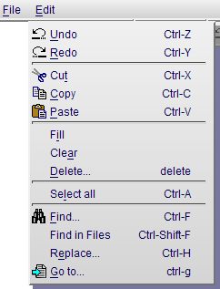
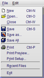
The following sample <csMenuBar> element defines a horizontal menu bar with two picks: File and Edit. Each of these picks displays a different <contextMenu>. The <csMenuItem> components in this example illustrate a variety of options for setting associated icons, alternate captions, keyboard shortcuts, and so on. The following figure illustrates the File pick from this menu.

File Drop Down Menu with Icons and Keyboard Shortcuts
generated description: csmenu file
<csMenuBar id="mainMenu" width="100%">
  <csMenuBarItem caption="File" contextKey="f" >
    <contextMenu id="fileMenu" >
      <csMenuItem icon="images/file.png" caption="New" key="Ctrl-N"
                  contextKey="n" onclick="alert('New requested');"  />
      <csMenuItem icon="/csp/broker/images/open.png" caption="Open..."
                  key="Ctrl-O" contextKey="o"
                  onclick="alert('Open requested');"  />
      <csMenuItem caption="Close" key="Ctrl-W"
                  contextKey="c" onclick="alert('Open requested');"  />
      <csMenuSeparator />
      <csMenuItem id="savePick" icon="/csp/broker/images/save.png"
                  iconDisabled="/csp/broker/user/images/save_g.png"
                  caption="Save" key="Ctrl-S" contextKey="s"
                  onclick="alert('Save requested');"  />
      <csMenuItem icon="/csp/broker/images/saveas.png" caption="Save as..."
                  contextKey="a" />
      <csMenuItem icon="/csp/broker/images/saveall.png" caption="Save All"
                  contextKey="l" />
      <csMenuSeparator />
      <csMenuItem icon="/csp/broker/images/print.png" caption="Print"
                  key="Ctrl-P" contextKey="p"
                  onclick="alert('Print requested');" />
      <csMenuItem caption="Print Preview..."  contextKey="v" />
      <csMenuItem caption="Print Setup..."  contextKey="r" />
      <csMenuSeparator />
      <csMenuItem caption="Recent Files"  contextKey="e" />
      <csMenuSeparator />
      <csMenuItem caption="Exit" contextKey="x" />
    </contextMenu>
  </csMenuBarItem>
  <csMenuBarItem caption="Edit" contextKey="e">
    <contextMenu id="editMenu" >
      <csMenuItem id="undoPick" icon="/csp/broker/images/undo.png"
                  caption="Undo" key="Ctrl-Z" altCaption="Can't undo"
                  contextKey="u" onclick="alert('undo');" />
      <csMenuItem id="redoPick" icon="/csp/broker/images/redo.png"
                  caption="Redo" key="Ctrl-Y" altCaption="Can't redo"
                  contextKey="r" onclick="alert('redo');" />
      <csMenuSeparator />
      <csMenuItem id="cutPick" icon="/csp/broker/images/cut.png"
                  caption="Cut" key="Ctrl-X" contextKey="t"
                  onclick="alert('cut');" />
      <csMenuItem id="copyPick" icon="/csp/broker/images/copy.png"
                  caption="Copy" key="Ctrl-C" contextKey="c"
                  onclick="alert('copy');"  />
      <csMenuItem id="pastePick" icon="/csp/broker/images/paste.png"
                  caption="Paste" key="Ctrl-V" contextKey="p"
                  onclick="alert('paste');"  />
      <csMenuSeparator />
      <csMenuItem caption="Fill" contextKey="i" onclick="alert('fill');" />
      <csMenuItem caption="Clear" contextKey="a" onclick="alert('clear');" />
      <csMenuItem caption="Delete..." key="delete"
                  contextKey="d" onclick="alert('delete');"  />
      <csMenuSeparator />
      <csMenuItem caption="Select all" key="Ctrl-A"
                  contextKey="l" onclick="alert('select all');" />
      <csMenuSeparator />
      <csMenuItem icon="/csp/broker/images/find.png" caption="Find..."
                  key="Ctrl-F" contextKey="f" onclick="alert('find');" />
      <csMenuItem caption="Find in Files" key="Ctrl-Shift-F"
                  onclick="alert('find next');" />
      <csMenuItem caption="Replace..." key="Ctrl-H" contextKey="e"
                  onclick="alert('replace');" />
      <csMenuItem icon="/csp/broker/images/goto.png" caption="Go to..."
                  key="ctrl-g" contextKey="g" onclick="alert('goto');" />
    </contextMenu>
  </csMenuBarItem>
</csMenuBar>

The following figure illustrates the Edit pick from this menu.

Edit Drop Down Menu with Icons and Keyboard Shortcuts
generated description: csmenu edit

Menu Picks or Choices

Zen client side menus support the following types of menu pick:

Type of Pick User Action Result
Regular menu Click

Zen invokes the callback specified by the onclick attribute.

You can define a regular menu pick with just a caption and an onclick callback, but you can also add an icon, or a keyboard shortcut using key or contextKey. For example:

For some images that you can use in menu picks, see the section “Icons.”

Cascading menu Roll over

Zen displays a submenu.

You can cascade menus by nesting <contextMenu> elements within <csMenuItem> elements. See the examples in the sections “Building Client Side Menus” and “Popup or Context Menus.”

Alternating caption Click

Zen invokes the callback specified by the onclick attribute. The toggleState property flips its value (from 0 to 1 or from 1 to 0) when the user clicks the menu pick. The caption label changes automatically, as in “Show” vs. “Hide.”

For an alternating caption pick, define both a caption and an alternate caption (altCaption) as shown in the following example:

Optionally, you can also specify an icon and altIcon so that the icon can be toggled along with the caption.

A toggleState of 0 displays the caption and icon; 1 displays the altCaption and altIcon. The toggleState changes only in response to user actions.

Popup or Context Menus

You can use client-side menu components to define a popup or context menu for a region. To accomplish this, wrap a <contextMenu> definition inside a group of some kind. The wrapper component can be nearly anything, but is most often a reasonably significant portion of the page: a <vgroup>, <hgroup>, <form>, etc. Define the <contextMenu> as a child of the wrapper component, and a sibling of other elements within the wrapper. You can optionally specify exact bounds, as for the <group> shown in the next example, but this is not required.

Subsequently, when the user right-clicks the mouse anywhere within the wrapper component, Zen displays and activates the <contextMenu> child component, rather than the browser’s default right-click menu.

<group width="400" height="800" enclosingStyle="background:#aaffaa;" >
  <contextMenu id="rightPopUp" >
    <csMenuItem caption="Fido Cascade" >
      <contextMenu >
        <csMenuItem caption="Sit" />
        <csMenuItem caption="Stay" />
        <csMenuItem caption="Play dead" />
      </contextMenu>
    </csMenuItem>
    <csMenuItem caption="Scout Cascade" >
      <contextMenu >
        <csMenuItem caption="Whoa" />
        <csMenuItem caption="Giddy Up" />
      </contextMenu>
    </csMenuItem>
    <csMenuItem caption="Kitty Cascade" >
      <contextMenu >
        <csMenuItem caption="Ignore me" />
        <csMenuItem caption="Do as you please" />
      </contextMenu>
    </csMenuItem>
  </contextMenu>
</group>

The following figure displays the popup menu that the previous example defines.

Popup Menu with Submenus
generated description: csmenu rightclick

Cascading Menus

You can cascade menus by nesting <contextMenu> elements within <csMenuItem> elements. This cascading technique works for regular menus as well as for popup or context menus. See the examples in the opening section of this chapter, “Building Client Side Menus,” and in the previous section, “Popup or Context Menus.”

Button Bars

The <buttonBar> component is closely related to the client side menu components. A <buttonBar> may appear inside any sort of group container, and may contain one or more <buttonBarItem> components. The following <hgroup> element defines a button bar with three buttons, rollover tool tips, and selection actions (the alert code).

<hgroup id="bbArea" >
  <buttonBar id="editStuff" >
    <buttonBarItem icon="images/cut.png" caption="Cut"
                   onclick="alert('Cut requested');"  />
    <buttonBarItem icon="images/copy.png" caption="Copy"
                   onclick="alert('Copy requested');"  />
    <buttonBarItem icon="images/paste.png" caption="Paste"
                   onclick="alert('Paste requested');"  />
  </buttonBar>
</hgroup>

The style for this bar is defined in the XData Style section as follows:

#bbArea {
  background:#bbbbbb;
  background-image: url(images/grad-halfgray-10x30.png);
  background-repeat:repeat-x;
}

The following figure displays the button bar that this example defines.

Button Bar with Icons
generated description: csbuttonbar

For some image files that you can use as icons in button bars, see the section “Icons.”

Icons

The following table lists the icons that are available in the csp/broker/images directory, which is a subdirectory of the Caché installation directory. The gray background color shown for icons in the table is just an example; the icons display over whatever background color the designer chooses for the containing component.

Icon images may be referenced using the icon, altIcon, or disabledIcon attributes in Zen components such as <buttonBarItem> or <csMenuItem>. When you reference these images, the prefix csp/broker is automatically implied. Reference them using this syntax:

images/filename

For example:

altIcon="images/cut.png"

Zen Icon Library
Icon File Name Meaning
generated description: icon buildall buildall.png Build all or compile all files
generated description: icon compile compile.png Compile current file
generated description: icon copy copy.png Copy
generated description: icon cut cut.png Cut
generated description: icon downarrow DownArrow.png Down arrow, larger size, for light background colors
generated description: icon downarrowinv DownArrowInv.png Down arrow, larger size, for dark background colors
generated description: icon smdownarrow SmDownArrow.png Down arrow, smaller size, for light background colors
generated description: icon smdownarrowinv SmDownArrowInv.png Down arrow, smaller size, for dark background colors
generated description: icon file file.png File or document
generated description: icon find find.png Find or search
generated description: icon goto goto.png Go to
generated description: icon inspect inspect.png Inspect
generated description: icon smleftarrow SmLeftArrow.png Left arrow, smaller size, for light background colors
generated description: icon smleftarrowinv SmLeftArrowInv.png Left arrow, smaller size, for dark background colors
generated description: icon open open.png Open file, folder, or document
generated description: icon output output.png Output
generated description: icon paste paste.png Paste
generated description: icon print print.png Print
generated description: icon redo redo.png Redo previous operation
generated description: icon redo g redo_g.png Redo previous operation, grayed out
generated description: icon reload reload.png Reload
generated description: icon rtarrow RtArrow.png Right arrow, larger size, for light background colors
generated description: icon rtarrowinv RtArrowInv.png Right arrow, larger size, for dark background colors
generated description: icon smrightarrow SmRightArrow.png Right arrow, smaller size, for light background colors
generated description: icon smrightarrowinv SmRightArrowInv.png Right arrow, smaller size, for dark background colors
generated description: icon save save.png Save file, folder, or document
generated description: icon save g save_g.png Save file, folder, or document, grayed out
generated description: icon saveall saveall.png Save all files or documents
generated description: icon saveas saveas.png Save current file or document to a new file
generated description: icon undo undo.png Undo previous operation
generated description: icon undo g undo_g.png Undo previous operation, grayed out
generated description: icon uparrow UpArrow.png Up arrow, larger size, for light background colors
generated description: icon uparrowinv UpArrowInv.png Up arrow, larger size, for dark background colors
generated description: icon smuparrow SmUpArrow.png Up arrow, smaller size, for light background colors
generated description: icon smuparrowinv SmUpArrowInv.png Up arrow, smaller size, for dark background colors
generated description: icon viewother viewother.png View other, such as the compiled routine for a class
generated description: icon watch watch.png Watch
generated description: icon workspace workspace.png Workspace
generated description: icon world world.png World, as in World Wide Web

The nameInv.png images are used automatically in place of their name.png counterparts when Zen detects that it is rendering the icon against a dark background color. name.png icons are intended for use against light background colors. This behavior can be seen in the system default color scheme for Zen, as follows:

  1. The dark arrow over the light background:

    generated description: csmenu rightclick before

  2. ...automatically changes to a light arrow when it is over a dark background:

    generated description: csmenu rightclick inv

  3. ...and changes back to a dark arrow when it is over a light background:

    generated description: csmenu rightclick

The switch to using light or dark icons happens automatically, as long as you define the foreground and background colors of both <csMenuItem> and <csActiveMenuItem> using CSS. This allows Zen to calculate which icon yields optimum contrast with the current color. This is important even if the foreground or background color is being created using an image to create a gradient effect, as seen in the dark blue selected items in the previous examples.

<csMenuBar>

The <csMenuBar> component may appear inside any type of group container. The <csMenuBar> element defines a horizontal menu bar with one pick for each <csMenuBarItem> that is its direct child. <csMenuBar> may contain as many sibling <csMenuBarItem> components as are required to define the choices on the menu bar. For a <csMenuBar> example, see the section “Building Client Side Menus.”

<csMenuBar> has the following attributes.

Attribute Description
Zen group attributes <csMenuBar> has the same style and layout attributes as other Zen groups. For descriptions, see “Group Layout and Style Attributes” in the “Zen Layout” chapter of Using Zen.

<csMenuBarItem>

The <csMenuBarItem> component may appear only within a <csMenuBar> container. Each <csMenuBarItem> defines one choice on the menu bar. For an example, see the section “Building Client Side Menus.”

<csMenuBarItem> has the following attributes.

Attribute Description
Zen group attributes <csMenuBarItem> has the same style and layout attributes as other Zen groups. For descriptions, see “Group Layout and Style Attributes” in the “Zen Layout” chapter of Using Zen.
caption

Text label to associate with this menu pick.

Although you can enter ordinary text for this attribute, it has the underlying data type %ZEN.Datatype.captionOpens in a new tab. This makes it easy to localize its text into other languages, as long as a language DOMAIN parameter is defined in the Zen page class. The %ZEN.Datatype.captionOpens in a new tab data type also enables you to use $$$Text macros when you assign values to the invalidMessage property from client-side or server-side code.

contextKey If defined, the contextKey is a single character that identifies which letter in the caption text can be pressed to invoke the functionality of the menu pick. contextKey is not case-sensitive. The contextKey character is underlined when the caption text is displayed.

<contextMenu>

The <contextMenu> component may appear inside any type of group container, including <csMenuItem>, <vgroup>, <hgroup>, <form>, etc.

The group may contain other elements besides <contextMenu>, but to allow other elements to appear inside the group along with <contextMenu> you must set the containing group’s layout attribute to "none". In the following example, a <button> appears in addition to the <contextMenu>, so the <form> has layout set to "none":

<form height="600" width="400" layout="none" > 
  <button caption="MyButton"/>
  <contextMenu id="cm1">
    <csMenuItem caption="context"/>
    <csMenuItem caption="menu"/>
    <csMenuItem caption="1"/>
  </contextMenu>
</form>

To understand more about how <contextMenu> may be used to specify various types of menus, see the examples in the sections “Building Client Side Menus” and “Popup or Context Menus.”

A <contextMenu> component may contain as many sibling <csMenuItem> and <csMenuSeparator> components as are required to define and organize the individual choices on the menu.

<contextMenu> has the following attributes.

Attribute Description
Zen group attributes <contextMenu> has the same style and layout attributes as other Zen groups. For descriptions, see “Group Layout and Style Attributes” in the “Zen Layout” chapter of Using Zen.

<csMenuItem>

The <csMenuItem> component may appear only within a <contextMenu> container. <contextMenu> may contain as many sibling <csMenuItem> and <csMenuSeparator> components as are required to define and organize the choices on the menu.

<csMenuItem> has the following attributes.

Attribute Description
Zen group attributes In addition to its capabilities as a menu item, <csMenuItem> has the same style and layout attributes as other Zen groups. For descriptions, see “Group Layout and Style Attributes” in the “Zen Layout” chapter of Using Zen.
altCaption Text to display for the menu item under alternate conditions, such as when the user toggles the menu item. The normal alternate to altCaption is caption.
altIcon

URI of the image to display beside the caption text under alternate conditions, such as when the user toggles the menu item. If it is a pathname on the local server, the URI is relative to the Caché installation directory, as in:

altIcon="images/cut.png"

The normal alternate to altIcon is icon. For some available icons, see the section “Icons.”

altKey If defined, the altKey is a keyboard shortcut that can invoke the functionality of the menu item under alternate conditions, such as when the user toggles the menu item. The normal alternate to altKey is key.
caption

Text to display for the menu item under normal conditions.

Although you can enter ordinary text for this attribute, it has the underlying data type %ZEN.Datatype.captionOpens in a new tab. This makes it easy to localize its text into other languages, as long as a language DOMAIN parameter is defined in the Zen page class. The %ZEN.Datatype.captionOpens in a new tab data type also enables you to use $$$Text macros when you assign values to the invalidMessage property from client-side or server-side code.

contextKey

If defined, the contextKey is a single character that identifies which letter in the caption text can be pressed to invoke the functionality of the menu item when it is active. contextKey is not case-sensitive:

The contextKey character is underlined when the caption text is displayed. For detailed examples, see the section “Drop Down Menus.”

icon

URI of the image to display beside the caption text under normal conditions. If it is a pathname on the local server, the URI is relative to the Caché installation directory, as in:

icon="images/cut.png"

For some available icons, see the section “Icons.”

iconDisabled

URI of the image to display beside the caption text when this menu item is disabled but still visible (“grayed out).”. If it is a pathname on the local server, the URI is relative to the Caché installation directory, as in:

iconDisabled="images/cut.png"

For some available icons, see the section “Icons.”

key

If defined, the key is a keyboard shortcut that can invoke the functionality of the menu item when it is active, bypassing the need for a mouse click:

For detailed examples, see the section “Drop Down Menus.”

onclick

Client-side JavaScript expression that runs each time the user clicks the mouse on this menu item. Generally this expression invokes a client-side JavaScript method defined in the page class.

When providing a value for this attribute, use double quotes to enclose the value and single quotes (if needed) within the JavaScript expression. For example:

<csMenuItem onclick="alert('HEY');"/>

The JavaScript expression may contain Zen #()# runtime expressions.

toggleMode

If defined, and true, a checkmark indicates the toggled state of the menu pick. The checkmark displays when toggleMode is true. The default for toggleMode is false.

toggleMode has the underlying data type %ZEN.Datatype.booleanOpens in a new tab. It has the value "true" or "false" in XData Contents, 1 or 0 in server-side code, true or false in client-side code.

<csMenuSeparator>

The <csMenuSeparator> component may appear only within a <contextMenu> container. <contextMenu> may contain as many sibling <csMenuItem> and <csMenuSeparator> components as are required to define and organize the choices on the menu. <csMenuSeparator> simply provides a horizontal line to separate sections of menu choices.

The <csMenuSeparator> component has no attributes. For example:

<csMenuSeparator />

For more detailed examples, see the section “Drop Down Menus.”
<buttonBar>

The <buttonBar> component may appear inside any type of group container. <buttonBar> may contain as many sibling <buttonBarItem> components as are required to define the choices on the button bar. For an example, see the section “Button Bars.”

<buttonBar> has the following attributes.

Attribute Description
Zen group attributes <buttonBar> has the same style and layout attributes as other Zen groups. For descriptions, see “Group Layout and Style Attributes” in the “Zen Layout” chapter of Using Zen.

<buttonBarItem>

The <buttonBarItem> component may appear only within a <buttonBar> container. Each <buttonBarItem> defines one choice on the button bar. For an example, see the section “Button Bars.”

<buttonBarItem> has the following attributes.

Attribute Description
Zen component attributes

<buttonBarItem> has the same general-purpose attributes as any Zen component. For descriptions, see these sections:

caption

If defined, this is the rollover tooltip to display when button is enabled

Although you can enter ordinary text for this attribute, it has the underlying data type %ZEN.Datatype.captionOpens in a new tab. This makes it easy to localize its text into other languages, as long as a language DOMAIN parameter is defined in the Zen page class. The %ZEN.Datatype.captionOpens in a new tab data type also enables you to use $$$Text macros when you assign values to the invalidMessage property from client-side or server-side code.

icon

URI of the image to display when the button is enabled. If it is a pathname on the local server, the URI is relative to the Caché installation directory, as in:

icon="images/cut.png"

For some available icons, see the section “Icons.”

iconDisabled

URI of the image to display when the button is disabled but still visible (“grayed out).”. If it is a pathname on the local server, the URI is relative to the Caché installation directory, as in:

iconDisabled="images/cut.png"

For some available icons, see the section “Icons.”

onclick

Client-side JavaScript expression that runs each time the user clicks the mouse on this button. Generally this expression invokes a client-side JavaScript method defined in the page class.

When providing a value for this attribute, use double quotes to enclose the value and single quotes (if needed) within the JavaScript expression. For example:

<csMenuItem onclick="alert('HEY');"/>

The JavaScript expression may contain Zen #()# runtime expressions.