Zen and SVG
Scalable Vector Graphics (SVG) is a language that allows you to describe two-dimensional vector graphics in XML format. The SVG language specification is available on the web site www.w3.org/TR/SVG/Opens in a new tab.
Zen uses SVG to display high-performance, data-driven charts and meters. You can use the built-in SVG components to define eye-catching corporate dashboards that update their statistics in real time. You can also define your own SVG components. An SVG component is any component that inherits from %ZEN.SVGComponent.svgComponentOpens in a new tab. These components render dynamic SVG images that change their appearance in response to data values.
If you want to display a static SVG file on the Zen page, use <iframe>. If you want to use a static SVG file as the image for a button control, use <image>. The conventions described in the following topics apply to dynamic SVG components only.
This chapter describes how to place SVG components on the Zen page. Topics include:
Fonts for SVG
If no font-family is specified, SVG graphics use whatever default font the SVG engine provides. If you wish, you can specify the SVG default font for your system by setting the global ^%ZEN.DefaultSVGFontFamily to the name of a font-family. This causes Zen to create a CSS font-family definition using that font name. Zen automatically applies this font-family to all SVG text elements unless they explicitly provide a value for a CSS font-family.
For example, the MingLiU font is useful when working in Japanese with Internet Explorer on Microsoft Vista:
Set ^%ZEN.DefaultSVGFontFamily="MingLiU"
SVG Component Layout
The following components allow you to place SVG components on a Zen page:
<svgFrame>
<svgFrame> is a Zen component that creates a rectangular frame on the Zen page, into which you can place SVG components. Only SVG components may appear inside this frame. Any dynamic SVG component, such as a meter or chart, requires an <svgFrame> to contain it.
<svgFrame> inherits from %ZEN.Component.componentOpens in a new tab. This gives <svgFrame> the usual component style attributes — height, width, label, etc — as described in the “Zen Style” chapter of Using Zen. This convention also allows <svgFrame> to be placed within a <page>, or contained within an <hgroup> or <vgroup>, just like any other Zen component. For details, see the “Zen Layout” chapter of Using Zen.
The following figure shows a mix of Zen components and SVG components on a page. This is similar to the output provided by the sample class ZENDemo.DashboardOpens in a new tab in the SAMPLES namespace.
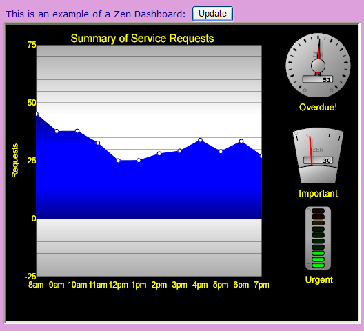
The following XData Contents block contains the components that produced the above figure. These are a mix of:
-
Zen components (<hgroup>,<vgroup>,<html>, <spacer>, <button>, <svgFrame>)
-
SVG components (<speedometer>, <fuelGauge>, <lightBar>, <lineChart>, <svgGroup>, <svgSpacer>)
XData Contents [XMLNamespace="http://www.intersystems.com/zen"]
{
<page cellStyle="background-color: plum;"
xmlns="http://www.intersystems.com/zen">
<hgroup>
<spacer width="10"/>
<vgroup valign="top">
<spacer height="20"/>
<hgroup>
<html
enclosingStyle="margin: 3px; font-size:1.2em; color: darkblue;">
This is an example of a Zen Dashboard:
</html>
<spacer width="10" />
<button caption="Update" onclick="zenPage.updateData();"/>
</hgroup>
<svgFrame id="svgFrame" width="600" height="430"
frameStyle="border-style: inset;"
backgroundStyle="fill: black;"
layout="horizontal">
<svgSpacer width="20" />
<svgGroup layout="vertical">
<svgSpacer height="20" />
<lineChart id="chart" width="400" height="420"
title="Summary of Service Requests"
backgroundStyle="fill: black;"
plotAreaStyle="fill: url(#glow-silver);"
lineStyle="stroke: black;" chartFilled="true"
seriesColors="url(#glow-blue)" seriesCount="1"
seriesSize="12" markersVisible="true"
marginRight="5" marginLeft="10"
ongetData="return zenPage.getChartData(series);"
ongetLabelX="return zenPage.getChartLabelX(value);">
<yAxis id="yAxis" baseValue="0"
minValue="-25" maxValue="75"
majorUnits="25" minorUnits="5"
title="Requests" minorGridLines="true"/>
</lineChart>
</svgGroup>
<svgGroup layout="vertical">
<svgSpacer height="20" />
<speedometer id="speed3" label="Overdue!" animate="true"
labelStyle="fill: yellow;"
lowLampColor="url(#glow-green)"
rangeUpper="100" width="125" height="125"/>
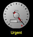
<fuelGauge id="speed1" label="Important" animate="true"
labelStyle="fill: yellow;"
rangeUpper="100" width="125" height="125"/>
<lightBar id="speed2" label="Urgent" animate="true"
labelStyle="fill: yellow;"
lowLampColor="url(#glow-green)"
rangeUpper="100" width="100" height="125"/>
</svgGroup>
</svgFrame>
</vgroup>
</hgroup>
</page>
}
An <svgFrame> element may contain as many nested <svgGroup> and <svgSpacer> elements as are required to achieve the desired layout. An <svgFrame> may also contain <parameter> elements to support its svgPage attribute. For details, see the svgPage description in the following table.
<svgFrame> has the following attributes:
| Attribute | Description |
|---|---|
| Zen component attributes |
<svgFrame> has the same general-purpose attributes as any Zen component. For descriptions, see these sections:
|
| backgroundStyle |
SVG CSS style definition (Styles within SVG are CSS compliant, but there is a different set of styles available.) Specifies the background style for the frame. This style must include a fill value, or mouse events within this frame do not work correctly. The default backgroundStyle is: "fill: white;" |
| disabled |
If true, this frame and its children are disabled. The default is false. This attribute has the underlying data type %ZEN.Datatype.booleanOpens in a new tab. See “Zen Attribute Data Types.” |
| dragCanvas |
If true, the user can use the pointing device (mouse) to drag the canvas of this frame. This updates the values of the offsetX and offsetY attributes and moves the shapes on the canvas. The default is false. This attribute has the underlying data type %ZEN.Datatype.booleanOpens in a new tab. See “Zen Attribute Data Types.” |
| editMode |
Edit mode for this frame. Possible values are:
|
| frameStyle |
CSS style definition that applies to this frame. For example, to produce the recessed, beveled border shown in the illustration above, you would use: frameStyle="border-style: inset;" |
| gridX | If snapToGrid is true, gridX defines the HTML width of each cell in the sizing grid. The default is 25. |
| gridY | If snapToGrid is true, gridY defines the HTML height of each cell in the sizing grid. The default is 25. |
| layout |
Specifies how the SVG components within this frame should be laid out. Possible values are:
|
| offsetX | Offset, along the x-axis, of the coordinates of this frame from its upper, left-hand corner. The default is 0. |
| offsetY | Offset, along the y-axis, of the coordinates of this frame from its upper, left-hand corner. The default is 0. |
| ondragCanvas |
The ondragCanvas event handler for the <svgFrame>. Zen invokes this handler each time the user drags the background canvas using a pointing device. See “Zen Component Event Handlers.” A boolean variable, done, is passed to this event handler to indicate if the operation is complete. |
| onmouseWheel | Client-side JavaScript expression that runs whenever the user moves the mouse wheel over the background rectangle of this frame. Currently only available in FireFox. |
| onmoveItem | Client-side JavaScript expression that runs whenever this frame is in drag mode and the user moves one or more selected items. Refer to the selectedItems property for the list of items. A boolean variable, done, is passed to this event handler to indicate if the operation is complete. |
| onresizeItem | Client-side JavaScript expression that runs whenever this frame is in drag mode and the user resizes one or more selected items. Refer to the selectedItems property for the list of items. A boolean variable, done, is passed to this event handler to indicate if the operation is complete. |
| onselectItem | Client-side JavaScript expression that runs whenever the user changes the number of selected items in this frame (by selecting or unselecting an item). A variable, item, is passed to this event handler and refers to the item most recently selected or unselected. |
| onzoom | Client-side JavaScript expression that runs whenever the user changes the zoom level for this frame. |
| snapToGrid |
If true, all mouse operations (sizing and dragging) are constrained to occur on the grid defined by gridX and gridY. The default is false. This attribute has the underlying data type %ZEN.Datatype.booleanOpens in a new tab. See “Zen Attribute Data Types.” |
| svgAutoSize |
Controls the size of the SVG drawing canvas within the frame. If dragCanvas is true, the svgAutoSize property is ignored. Otherwise, if svgAutoSize is true, Zen calculates (and updates) the canvas size automatically based on the frame contents, with the minimum canvas size being svgWidth by svgHeight. If svgAutoSize is false, the canvas size is determined by the values of svgWidth and svgHeight. This attribute has the underlying data type %ZEN.Datatype.booleanOpens in a new tab. See “Zen Attribute Data Types.” |
| svgHeight | Controls the size of the SVG drawing canvas within the frame. svgHeight gives the canvas height (using any valid SVG measurement units). If not specified, the default svgHeight is 100% of the height of the <svgFrame>. If height is also not specified, the default height (and svgHeight) is 100. |
| svgPage |
Identifies a specialized CSP page that serves SVG content, defining styles and colors for SVG components in the frame. If provided, the svgPage value must be the name of a class that extends %ZEN.SVGComponent.svgPageOpens in a new tab. Otherwise, the frame uses the base class %ZEN.SVGComponent.svgPageOpens in a new tab by default. When you provide a value for the svgPage attribute, you can also include <parameter> elements within the <svgFrame>. Zen passes the value strings from these <parameter> elements to the svgPage class as URI parameters. For example: <parameter value="I am a URI parameter!"/> The value supplied for a <parameter> can be a literal string, or it can contain a Zen #()# runtime expression. Use the <parameter> attribute paramName to assign names to the parameters you use with <svgFrame>. For example: <parameter paramName="First" value="I am a URI!"/> |
| svgWidth | Controls the size of the SVG drawing canvas within the frame. svgWidth gives the canvas width (using any valid SVG measurement units). If not specified, the default svgWidth is 100% of the width of the <svgFrame>. If width is also not specified, the default width (and svgWidth) is 300. |
| zoom | Decimal value, at least 1.0 (the decimal portion of the number may be omitted). This value indicates the zoom factor for the frame. 100 means no zoom; this is the default. Values larger than 100 increase image size, while smaller values decrease it. |
| zoomLevels |
Comma-separated list of suggested zoom values. The default is: "10,25,50,75,100,125,150,175,200,300,400,500" |
| zoomWithWheel |
If true, this frame automatically zooms in and out in response to mouse wheel events. The default is false. Currently only available in FireFox. This attribute has the underlying data type %ZEN.Datatype.booleanOpens in a new tab. See “Zen Attribute Data Types.” |
It is not possible for <svgFrame> to contain any component that inherits from %ZEN.Component.componentOpens in a new tab, such as <iframe>, <html>, <spacer>, <hgroup>, <vgroup>, <button>, <link>, or any of the other Zen components discussed in this book. <svgFrame> can contain SVG components only.
There are some cases where it is important to have programmatic access to the window object for the embedded SVG frame. The %ZEN.SVGComponent.svgFrameOpens in a new tab class has a client-side property called svgWindow that points to the SVG window object embedded within the <svgFrame> element
<svgGroup>
<svgGroup> is a special container designed to contain and lay out SVG components within <svgFrame>. <svgGroup> is not a Zen component (%ZEN.Component.componentOpens in a new tab), nor is it a Zen group component (%ZEN.Component.groupOpens in a new tab). <svgGroup> is an Zen SVG component (%ZEN.SVGComponent.svgComponentOpens in a new tab) with the ability to contain other Zen SVG components.
<svgGroup> has the following attributes:
| Attribute | Description |
|---|---|
| SVG component attributes | <svgGroup> has the same general-purpose attributes as any SVG component. For descriptions, see the section “SVG Component Attributes.” |
| disabled |
If true, this group and its children are disabled (hidden). The default is false. This attribute has the underlying data type %ZEN.Datatype.booleanOpens in a new tab. See “Zen Attribute Data Types.” |
| layout |
Specifies how the SVG components within this group should be laid out. Possible values are "horizontal" and "vertical". If layout is set to "none" or the empty value "", components may be placed using specific coordinates x and y. See the x and y attributes in the section “SVG Component Attributes.” |
<svgSpacer>
The <svgSpacer> element is useful within <svgGroup> containers. Use <spacer> with a width value to inject additional space in a horizontal <svgGroup>, or height for additional space within a vertical <svgGroup>.
<svgSpacer> has the same general-purpose attributes as any SVG component. For descriptions, see the section “SVG Component Attributes.”
<rect>
The Zen <rect> element draws a simple rectangle. This is not the same as the <rect> element defined by the SVG language specification. Zen <rect> is a built-in Zen SVG component that you can place within an <svgFrame> or <svgGroup>.
The Zen <rect> element takes up space within an <svgFrame> or <svgGroup>, but in a different way than <svgSpacer>. The conceptual difference between <svgSpacer> and <rect> is that <rect> may have visible style attributes, such as a fill color.
| Attribute | Description |
|---|---|
| SVG component attributes | <rect> has the same general-purpose attributes as any SVG component. For descriptions, see the section “SVG Component Attributes.” |
| rx | Radius of curve for the corners (using any valid SVG measurement units). |
| style | SVG CSS style definition. (Styles within SVG are CSS compliant, but there is a different set of styles available.) |
SVG Component Attributes
All SVG components have the following style attributes. These are entirely distinct from the attributes supported by ordinary Zen components.
| Attribute | Description |
|---|---|
| boundless |
If true, this component is boundless. That is, its enclosing SVG element is a simple group <g> instead of the usual SVG element. The default is false. This attribute has the underlying data type %ZEN.Datatype.booleanOpens in a new tab. See “Zen Attribute Data Types.” |
| height | Height of this component (using any valid SVG measurement units). The exact effect of setting this value depends on the component. In the case of built-in SVG components, the effect is usually straightforward. A height value larger than the height of the containing <svgFrame> causes the SVG component to appear cropped by the frame. |
| hidden |
If true, this component is disabled (hidden). The default is false. Changing the hidden state of an SVG component causes the layout of the SVG frame to be recalculated. That is, if layout is not equal to “none” the other components move into the space that was occupied by the hidden component. This attribute has the underlying data type %ZEN.Datatype.booleanOpens in a new tab. See “Zen Attribute Data Types.” |
| id | Name that can be used to select the SVG component so that its attributes can be updated. For example, displays that use meters might periodically update the value that the meter represents. |
| name | Specifies a name for the component. |
| onclick |
The onclick event handler for the SVG component. Zen invokes this handler each time the user clicks the mouse on this shape. See “Zen Component Event Handlers.” |
| position | Used for placing a fixed controller over the rest of an SVG canvas. If the position of an SVG component is "fixed" this shape does not scroll with its canvas, nor can it be dragged with the mouse. If position is "relative" (the default) this shape scrolls, and can be dragged. |
| preserveAspectRatio | By default, Zen preserves the aspect ratio (height relative to width) for any SVG component when you change its size. If you set preserveAspectRatio to "none", Zen does not preserve the aspect ratio and allows your height and width changes to operate independently of each other. |
| viewBoxHeight | Height of the view box for this component (using any valid SVG measurement units). If a viewBoxHeight attribute is provided, its value is used as the height of the view box. Otherwise, the height value for the component is used. |
| viewBoxWidth | Width of the view box for this component (using any valid SVG measurement units). If a viewBoxWidth attribute is provided, its value is used as the width of the view box. Otherwise, the width value for the component is used. |
| width | Width of this component (using any valid SVG measurement units). The exact effect of setting this value depends on the component. In the case of built-in SVG components, the effect is usually straightforward. A width value larger than the width of the containing <svgFrame> causes the SVG component to appear cropped by the frame. |
| x | x position of this component (using any valid SVG measurement units). The actual position of the component may depend on the layout of its enclosing <svgGroup>. If the <svgGroup> has vertical or horizontal layout, this x coordinate is ignored. However, if layout="" this x coordinate takes effect. x is a positive value relative to an origin of (0,0) at the top left corner of the <svgGroup>. |
| y | y position of this component. |
Meters
A meter is an SVG component that displays a graphical representation of a single numeric value. Each meter is a class derived from %ZEN.SVGComponent.meterOpens in a new tab that generates the SVG required to display itself.
Zen provides several built-in meters. To place one of them on the Zen page, provide the corresponding meter element within an <svgFrame> or <svgGroup>:
-
“<slider>”
-
“<smiley>”
-
To create your own style of meter, see the “Custom Components” chapter in Developing Zen Applications.
This topic describes how to supply a meter with a value, lists the attributes that all meters share in common, then describes the unique attributes for each type of meter listed above.
Providing Data for Meters
Your code can dynamically update the value displayed by a meter in one of two ways:
-
From a JavaScript method in the page class, set the meter’s value attribute using the meter class methods getComponentById and setValue as follows:
this.getComponentById("myMeterID").setValue(myNewValue);
Where myMeterID matches the id attribute value for the meter, and myNewValue is a variable that contains a single, numeric value.
-
Associate the meter with a data controller, as described in the chapter “Model View Controller.” For example, if your XData Contents block contains an <dataController> reference that looks like this:
<dataController id="source" modelClass="myPackage.MyModel" modelId="1"/>And if the referenced modelClass myPackage.MyModel contains a property called Automobiles, then your XData Contents block can also contain a meter definition that looks like this:
<trafficLight id="myLight" controllerId="source"
              height="150" width="75"
              dataBinding="Automobiles"
              label="Autos" labelStyle="fill: yellow;" />
This technique works when the meter’s controllerId value matches the <dataController> id value, and the meter’s dataBinding value matches the name of a property defined in the <dataController> modelClass.
Meter Attributes
All meters have the following attributes, which define their style and behavior.
| Attribute | Description |
|---|---|
| SVG component attributes | Meters have the same general-purpose attributes as any SVG component. For descriptions, see the section “SVG Component Attributes.” |
| animate |
Some of the built-in Zen meters provide animation. For example, if the meter uses a needle to indicate a value, animation causes the needle to “swing” from the previous value to the new value. If a meter supported animation, this attribute controls whether animation is on (true) or off (false). The default is "true". This attribute has the underlying data type %ZEN.Datatype.booleanOpens in a new tab. See “Zen Attribute Data Types.” |
| controllerId | Identifies the data controller that provides the data for this meter. The controllerId value must match the id value provided for that <dataController> component. For details, see the chapter “Model View Controller.” |
| dataBinding | If this meter is associated with a data controller, this attribute identifies the specific property within the <dataController> modelClass that provides the value for this control. For details, see the chapter “Model View Controller.” |
| label |
A text label for the meter. Although you can enter ordinary text for this attribute, it has the underlying data type %ZEN.Datatype.captionOpens in a new tab. See “Zen Attribute Data Types.” |
| labelStyle | SVG CSS style definition. (Styles within SVG are CSS compliant, but there is a different set of styles available.) When Zen lays out this meter, it applies this style to the label text. |
| onnotifyView |
The onnotifyView event handler for the meter. See “Zen Component Event Handlers.” This attribute applies if the meter is associated with a data controller. Zen invokes this handler each time the data controller connected to this meter raises an event. For details, see the chapter “Model View Controller.” |
| rangeLower | Integer or decimal value that defines the low end of the range for this meter. The default is 0. |
| rangeUpper | Integer or decimal value that defines the high end of the range for this meter. The default is 100. |
| scaleFactor | Integer or decimal factor used to scale the values provided to this meter. Zen scales the incoming values before comparing them with rangeLower, rangeUpper, and so on. The default is 1 (no scaling). |
| thresholdLower | Integer or decimal value that defines a threshold for meter behavior. The meter does something when the meter value falls below this value. Typically, the thresholdLower value is greater than rangeLower and serves as a warning that the meter value is approaching rangeLower. The default is 0. |
| thresholdUpper | Integer or decimal value that defines a threshold for meter behavior. The meter does something when the meter value rises above this value. Typically, the thresholdUpper value is less than rangeUpper and serves as a warning that the meter value is approaching rangeUpper. The default is 90. |
| value | The current integer or decimal value of the meter (actually stored as a string). Although you can set this value while placing the meter on the page, generally you do not do this. Instead, you use getComponentById and setValue, or associate the meter with a %ZEN.Auxiliary.dataControllerOpens in a new tab, as described in the paragraph prior to this table. |
<fuelGauge>
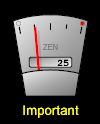
The fuel gauge is a narrow, vertical gauge with a needle that moves from left to right to indicate a value within a specific range. The gauge distributes marks or “ticks” proportionally across its range. The meter attributes rangeLower and rangeUpper define the range, with the rangeLower value at left and the rangeUpper value at right.
The fuel gauge displays its current value in a text box at the center of the gauge.
You may specify warning lights to appear at the upper left or right of the gauge, above the ticks. These lights change color as the needle approaches them. The light at right changes color when the meter value rises to or above thresholdUpper. The light at left changes color when the meter value falls to or below thresholdLower. There is always a thresholdLower warning light with a default setting of 0. You must specify a thresholdUpper value if you want a warning light to appear at the top of the range as well.
<fuelGauge> has the following attributes:
| Attribute | Description |
|---|---|
| Meter attributes | <fuelGauge> has the same general-purpose attributes as any meter. For descriptions, see the section “Meter Attributes.” |
| highLampColor |
String containing a CSS color value. This is the color that the <fuelGauge> displays when its value exceeds thresholdUpper. The default is a predefined Zen color that produces a “glowing” effect through shading: url(#glow-red) Several glow colors are defined in the class %ZEN.SVGComponent.svgPageOpens in a new tab. “<svgFrame>” always references this class, or some subclass of it, through its svgPage attribute, so these colors are always available to any SVG component in the frame. |
| logo |
Text label for the face of the meter (similar to "Zen" in the illustration above). Although you can enter ordinary text for this attribute, it has the underlying data type %ZEN.Datatype.captionOpens in a new tab. See “Zen Attribute Data Types.” |
| lowLampColor |
String containing a CSS color value. This is the color that the <fuelGauge> displays when its value exceeds thresholdUpper. The default is a predefined Zen color: url(#glow-red) |
<indicatorLamp>

The indicator lamp is a rectangular bar that changes its fill pattern depending on the meter value. Essentially there are three possible states: above thresholdUpper, below thresholdLower, or between the two values.
If the meter has a label attribute, this text appears in the middle of the indicator lamp with the style defined by labelStyle.
<indicatorLamp> has the following attributes:
| Attribute | Description |
|---|---|
| Meter attributes | <indicatorLamp> has the same general-purpose attributes as any meter. For descriptions, see the section “Meter Attributes.” |
| highStyle |
SVG CSS style definition. Specifies the fill style for the <indicatorLamp> when its value exceeds thresholdUpper. The highStyle must include a fill value, or mouse events within the shape do not work correctly. The default highStyle uses a predefined Zen color that produces a “glowing” effect through shading: "fill: url(#glow-green);" Several glow colors are defined in the class %ZEN.SVGComponent.svgPageOpens in a new tab. “<svgFrame>” always references this class, or some subclass of it, through its svgPage attribute, so these colors are always available to any SVG component in the frame. |
| lowStyle |
SVG CSS style definition. Specifies the fill style for the <indicatorLamp> when its value falls below thresholdLower. The lowStyle must include a fill value, or mouse events within the shape do not work correctly. The default lowStyle uses a predefined Zen color: "fill: url(#glow-red);" |
| normalStyle |
SVG CSS style definition. Specifies the fill style for the <indicatorLamp> when its value is between thresholdLower and thresholdUpper. The normalStyle must include a fill value, or mouse events within the shape do not work correctly. The default normalStyle uses a predefined Zen color: "fill: url(#glow-blue);" |
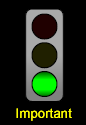
<lightBar>
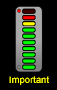
The light bar provides a stack of lamps arranged in a vertical bar. The light bar is similar to the traffic light, but its larger number of lamps provide a sense of movement from one end of the scale to the other.
The light bar is intended to appear “off” when the value is low, and fully lit when the value is high. The color of the bar shades from green (at the bottom of the scale) to yellow and red (at the top of the scale), implying that you should stop and address a problem when the value is high.
Sometimes a low number indicates a condition that requires attention. If this is the case you can reverse the sense of a light bar by inverting the values for rangeLower and rangeUpper. Then the fully lit lamp indicates low values, and the “off” lamp indicates high values.
Warning lights appear at the top or bottom left of the light bar. The top light changes color when the meter value rises to or above thresholdUpper. The bottom light changes color when the meter value falls to or below thresholdLower. You can specify what color you want to use for these lights. You cannot change the colors for the light bar itself (green, yellow, red).
When you reverse rangeLower and rangeUpper, do not at the same time reverse thresholdUpper and thresholdLower.
<lightBar> has the following attributes:
| Attribute | Description |
|---|---|
| Meter attributes | <lightBar> has the same general-purpose attributes as any meter. For descriptions, see the section “Meter Attributes.” |
| highLampColor |
String containing a CSS color value. This is the color that the <lightBar> displays when its value exceeds thresholdUpper. The default is a predefined Zen color that produces a “glowing” effect through shading: url(#glow-red) Several glow colors are defined in the class %ZEN.SVGComponent.svgPageOpens in a new tab. “<svgFrame>” always references this class, or some subclass of it, through its svgPage attribute, so these colors are always available to any SVG component in the frame. |
| lowLampColor | String containing a CSS color value. This is the color that the <lightBar> displays when its value falls below thresholdLower. The default is a predefined Zen color: url(#glow-red) |
<slider>
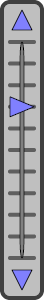
The slider is a vertical meter with a needle indicating a value between the rangeLower value at the bottom and the rangeUpper value at the top. The user can interact with the meter to edit its value, either by sliding the needle up and down with the mouse, or by clicking on the arrows at the top and bottom of the slider to increment the value along the tick marks.
<slider> has the following attributes:
| Attribute | Description |
|---|---|
| Meter attributes | <slider> has the same general-purpose attributes as any meter. For descriptions, see the section “Meter Attributes.” |
| constrained |
If true, the slider value is constrained (rounded) to the nearest tick mark displayed within the slider. If false, the slider value is based on the exact position of the needle relative to rangeLower and rangeUpper. The default is true. This attribute has the underlying data type %ZEN.Datatype.booleanOpens in a new tab. See “Zen Attribute Data Types.” |
| tickMarks | Number of tick marks to display between the rangeLower and rangeUpper. The minimum is 0. The default is 10. |
<smiley>
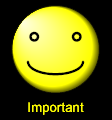
The smiley is the familiar yellow circle with two eyes and a smile. The mouth line changes depending on the meter value. The mouth forms a smile when the meter value is near rangeUpper. The mouth is a horizontal line at the midpoint between rangeLower and rangeUpper. The mouth forms a frown when the meter value is near rangeLower. This is useful when a large number indicates a positive condition, and a small number indicates a negative condition.
You can reverse the sense of a smiley by inverting the values for rangeLower and rangeUpper. Then the smile occurs at low values, and the frown at high values.
<smiley> has the same general-purpose attributes as any meter. For descriptions, see the section “Meter Attributes.” <smiley> ignores any threshold values.
<speedometer>
The speedometer is a circular gauge with a needle that moves from lower left, all the way around to lower right, to indicate a value within a specific range. The gauge distributes marks or “ticks” proportionally across its range. The meter attributes rangeLower and rangeUpper define the range, with the rangeLower value at left and the rangeUpper value at right.
By default, the speedometer displays its current value in a text box at the center of the gauge. However, you can specify that this text box actually contains a different value that you control separately. Use the independentOdometer and odometerValue attributes for this.
You may specify warning lights to appear at the lower left or lower right of the gauge. These lights change color as the needle approaches them. The light at right changes color when the meter value rises to or above thresholdUpper. The light at left changes color when the meter value falls to or below thresholdLower.
<speedometer> has the following attributes:
| Attribute | Description |
|---|---|
| Meter attributes | <speedometer> has the same general-purpose attributes as any meter. For descriptions, see the section “Meter Attributes.” |
| highLampColor |
String containing a CSS color value. This is the color that the <speedometer> displays when its value exceeds thresholdUpper. The default is a predefined Zen color that produces a “glowing” effect through shading: url(#glow-red) Several glow colors are defined in the class %ZEN.SVGComponent.svgPageOpens in a new tab. “<svgFrame>” always references this class, or some subclass of it, through its svgPage attribute, so these colors are always available to any SVG component in the frame. |
| independentOdometer |
If true, this meter can display an additional value independent of its needle value, in a text box at the center of the gauge. If false, the value in the text box is the same as the needle value. The default is false. This attribute has the underlying data type %ZEN.Datatype.booleanOpens in a new tab. See “Zen Attribute Data Types.” |
| logo |
Text label for the face of the meter (similar to "Zen" in the illustration above). Although you can enter ordinary text for this attribute, it has the underlying data type %ZEN.Datatype.captionOpens in a new tab. See “Zen Attribute Data Types.” |
| lowLampColor | String containing a CSS color value. This is the color that the <speedometer> displays when its value falls below thresholdLower. The default is a predefined Zen color: url(#glow-red) |
| odometerValue | If independentOdometer is true, this is the value to display in the text box at the center of the gauge. |
<trafficLight>
The traffic light consists of three circular lamps in a vertical column. From top to bottom, the lamps are red, yellow, and green.
When the meter value is at or below thresholdLower, the bottom lamp shows green. At values above thresholdLower but below thresholdUpper, the center lamp shows yellow. At values at or above thresholdUpper, the top lamp shows red. This is useful when a large number indicates a condition that requires attention.
Sometimes a low number indicates a condition that requires attention. If this is the case you can reverse the sense of a traffic light by inverting the values for rangeLower and rangeUpper. Then the red lamp indicates low values, and the green lamp indicates high values.
<trafficLight> has the same general-purpose attributes as any meter. For descriptions, see the section “Meter Attributes.” <trafficLight> looks best when width is half of height. You cannot change the colors for the traffic light.
Charts
Charts are SVG components that represent a series of data points. Zen provides several built-in chart types, including line charts, bar charts, and pie charts. As SVG components, charts have the SVG layout and style characteristics described in this chapter. However, charts also have many unique attributes. For a complete explanation, see the chapter “Zen Charts.”
<radialNavigator>
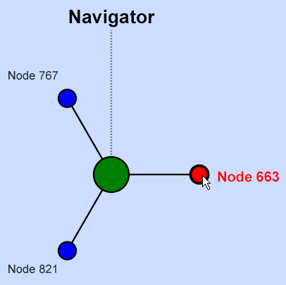
The radial navigator is a specialized SVG component that displays the relationship between a set of data items as a dynamic, radial diagram. There is a central circular hub surrounded by a set of evenly spaced nodes. As you click on a node at the outer rim of the diagram, it becomes the hub node and the nodes to which it connects are shown circling it.
You define the nodes in the <radialNavigator> data set by providing <radialNode> elements inside the <radialNavigator> element. For example:
<radialNavigator id="navigator" mainLabel="Navigator"
                 height="500" width="500" >
  <radialNode caption="Node 1" style="fill: green;"/>
  <radialNode caption="Node 2"/>
  <radialNode caption="Node 3"/>
</radialNavigator>
| Attribute | Description |
|---|---|
| SVG component attributes | <radialNavigator> has the same general-purpose attributes as any SVG component. For descriptions, see the section “SVG Component Attributes.” |
| backgroundStyle | SVG CSS style definition for the background panel. (Styles within SVG are CSS compliant, but there is a different set of styles available.) |
| hubStyle | SVG CSS style definition. Specifies the style for the central hub. This style must include a fill value, or mouse events within this shape do not work correctly. |
| mainLabel |
Label text for the central hub. Although you can enter ordinary text for this attribute, it has the underlying data type %ZEN.Datatype.captionOpens in a new tab. See “Zen Attribute Data Types.” |
| mainLabelStyle | SVG CSS style definition. Specifies the style for the mainLabel text. |
| nodeStyle | SVG CSS style definition. Specifies the style for the radial nodes. This style must include a fill value, or mouse events within this shape do not work correctly. |
| onselectNode |
The onselectNode event handler for the <radialNavigator>. Zen invokes this handler whenever the user clicks the mouse on a node shape. See “Zen Component Event Handlers.” |
| selectedIndex | When the onselectNode event is invoked, the selectedIndex contains the index (0-based) of the currently selected node. If the user clicks on the central hub node, selectedIndex is -1. When selectedIndex is –2, this means no node is selected. |
| title |
Title text for the radial navigator. Although you can enter ordinary text for this attribute, it has the underlying data type %ZEN.Datatype.captionOpens in a new tab. See “Zen Attribute Data Types.” |
| titleStyle | SVG CSS style definition. Specifies the style for the title text. |
The <radialNode> element is the XML projection of the %ZEN.Auxiliary.radialNodeOpens in a new tab class. <radialNode> has the following attributes:
| Attribute | Description |
|---|---|
| caption |
Text specifying the caption to display for this radial node. Although you can enter ordinary text for this attribute, it has the underlying data type %ZEN.Datatype.captionOpens in a new tab. See “Zen Attribute Data Types.” |
| onclick |
The onclick event handler for the <radialNode>. Zen invokes this handler whenever the user clicks the mouse on the node shape. See “Zen Component Event Handlers.” |
| style | SVG CSS style definition for the node. The style must include a fill value, or mouse events within the node shape do not work correctly. |
| value | Value associated with this node. The value may be a decimal or integer number, but it is represented as a string. |
When you work with %ZEN.SVGComponent.radialNavigatorOpens in a new tab programmatically, you work with <radialNode> elements as members of the radialNavigator nodes property, a list collection of %ZEN.Auxiliary.radialNodeOpens in a new tab objects. Each <radialNode> in the <radialNavigator> becomes a member of the nodes collection in radialNavigator, associated with its ordinal position: 1, 2, 3, etc.
<ownerDraw>
<ownerDraw> is an empty SVG component whose contents are filled dynamically by invoking a runtime callback method that provides SVG content. <ownerDraw> has the following attributes:
| Attribute | Description |
|---|---|
| SVG component attributes | <ownerDraw> has the same general-purpose attributes as any SVG component. For descriptions, see the section “SVG Component Attributes.” |
| onrender |
The onrender event handler for the <ownerDraw>. See “Zen Component Event Handlers.” This method provides the statements that render the SVG component on the page. |
The following is an example of an <ownerDraw> element:
<ownerDraw id="owner1"
           height="200" width="400"
           onrender="zenPage.doOwnerDraw(zenThis);"/>
In the above example, the JavaScript expression invokes the page class doOwnerDraw method with the <ownerDraw> object as its argument. The expression represents the page with the built-in variable zenPage, and the <ownerDraw> object with the built-in variable zenThis. Elsewhere in the page class, the doOwnerDraw method could look like this:
ClientMethod doOwnerDraw(svg) [ Language = javascript ]
{
  // clear contents of ownerDraw component
  svg.unrender();

  // create a line; add it to the svg component
  for (var n = 0; n < 30; n++) {
    var line = svg.document.createElementNS(SVGNS,'line');
    line.setAttribute('x1',200);
    line.setAttribute('y1',100);
    line.setAttribute('x2',Math.random() * 400);
    line.setAttribute('y2',Math.random() * 200);
    line.setAttribute('style','stroke: blue; stroke-width: 2;');
    svg.svgGroup.appendChild(line);
  }
}
The SAMPLES namespace offers <ownerDraw> examples in the page classes ZENDemo.SVGBrowserOpens in a new tab and ZENTest.SVGOwnerDrawTestOpens in a new tab.
You can also create custom SVG components. See the “Custom Components” chapter in Developing Zen Applications