Custom Components
One of the most powerful features of the Zen framework is that it lets you easily develop new, reusable components that automatically work with other Zen components.
From its first chapter, “Introducing Zen,” the book Using Zen asserts that the Zen application development framework is extensible. The claim is certainly true. However, Zen anticipates many of the features that you might consider adding yourself. It is worthwhile to examine all of the available Zen components before beginning a custom development effort. Possibly, the features you want are available in a Zen component that already exists.
The book Using Zen Components presents the details of existing Zen components by category: tables, meters, charts, forms, controls, menus, popups, and other. After examining all of these chapters, you might find that you still wish to create custom components. If so, continue with this chapter to view the options and instructions for doing so.
InterSystems strongly recommends that you do not create any classes in a package called ZEN.Component using any combination of uppercase and lowercase characters. Creating a package called ZEN.Component breaks the Zen framework for generating client-side code.
In general, the most common way to extend Zen is to create a custom component. Custom components fit into the existing Zen framework with minimal effort. They provide the style and behavior that you need while still obeying the Zen layout conventions and leveraging the Zen client/server framework. The following list outlines the options for creating custom components, and provides links to the sections in this chapter that describe each option:
-
“Composite Components” describes how to build a composite component. A composite arranges a group of existing, built-in Zen components in a particular way. You can place this arrangement on the page as if it were a single component.
-
“Overriding Component Style” explains how to make simple changes to the style of a built-in Zen component by subclassing it and overriding its XData Style block.
-
“Creating Custom Components” describes how to extend the roster of Zen components by writing a new component class that is a subclass of one of the standard base classes for Zen components. The resulting class is automatically projected as XML for use in any Zen page XData Contents block.
This chapter provides several sections that support “Creating Custom Components”:
-
“Custom Style” places an XData Style block in the subclass.
-
“Custom Properties” defines properties in addition to those inherited from the base class.
-
“The %DrawHTML Method” is a required method that provides the HTML (or SVG) needed to create the visual representation on the client side.
-
“Custom Methods” defines methods in addition to %DrawHTML and those inherited from the base class.
-
“Sample Code” provides a sample custom component class and shows how to reference it from the XData Contents block in a Zen page class.
-
-
“Creating Custom Meters” shows how to add a new type of meter to Zen by subclassing the base meter class and adding the method calls required to render the new meter’s SVG contents on the client.
Composite Components
A composite component assembles a group of built-in Zen components and lets you refer to the group from XData Contents as if it were a single component. Zen places the children of the composite within the page’s object model as if XData Contents referenced them explicitly. This shorthand is convenient, and it also prevents errors when you want to repeat identical component arrangements on different pages.
The following table is your checklist for building a composite component class. Not every item in the checklist is necessary for every composite. This checklist lists every possible item, and notes those that are optional. See the example of a composite component class that follows the table.
| Required | Optional | Description |
|---|---|---|
| Subclass | Extend %ZEN.Component.compositeOpens in a new tab to create a new class. The example creates a composite component class called myComposite in the MyApp package. Any class that extends %ZEN.Component.compositeOpens in a new tab is a group, with all of the attributes described in the section “Group Layout and Style Attributes” in the “Zen Layout” chapter of Using Zen. | |
| Parameters | Provide class parameters and appropriate values. For example, the NAMESPACE parameter is required to assign a namespace to the composite. You must reference this namespace when you place the composite component on a Zen page. | |
| Properties | Provide properties, if needed. The example does not require any new properties for the subclass. | |
| Methods | Provide supporting methods as needed for component behavior. The example provides an event handler method that is activated when the user clicks one of the buttons in the composite. | |
| XData Contents | Within the composite component class, define an XData Contents block that uses <composite> as its top-level element. The example provides two <button> elements within <composite>. | |
| XML Element | To add a composite element to a page, place its corresponding XML element in the page class XData Contents block. There is a specific syntax for this; see the example following this table. | |
| Compile Order | For a discussion of compile order that applies to composites as well as other types of custom component, see the section “Compile Order for Custom Component Classes.” |
The following is a sample composite component class that provides two buttons:
Class MyApp.myComposite Extends %ZEN.Component.composite
{

  /// Define xml namespace for this component
  Parameter NAMESPACE = "http://www.intersystems.com/myApp";

  /// Contents of this composite component:
  XData Contents [XMLNamespace="http://www.intersystems.com/zen"]
  {
    <composite>
      <button caption="OK"
              onclick="zenThis.composite.okBtn();"/>
      <button caption="Cancel" />
    </composite>
  }

  ClientMethod okBtn() [Language = JavaScript]
  {
    alert('ok');
  }
}
The correct way to reference this composite component from an XData Contents block is as follows:
XData Contents [XMLNamespace="http://www.intersystems.com/zen"]
{
<page xmlns="http://www.intersystems.com/zen"
      xmlns:myApp="http://www.intersystems.com/myApp">
  <myApp:myComposite />
</page>
}
Where:
-
The <page> element references the namespace defined for the composite component, and defines an alias for it, by providing the following attribute within the opening <page> element:
xmlns:myApp="http://www.intersystems.com/myApp"
This statement defines an alias myApp for the namespace that was defined in the composite component class
Parameter NAMESPACE = "http://www.intersystems.com/myApp";
-
The <myApp:myComposite> element references the myComposite component. This reference has the form:
<alias:component>
where alias is the namespace alias defined in the <page> element (myApp in this case) and component is the name of the custom component class (myComposite in this case).
The composite Property
When you work with composite components programmatically, every component within a composite has a property called composite that points to the containing composite object. This makes it easy to define actions for a composite that refer to methods of the composite class. You can see this in the first <button> element from the example above:
<button caption="OK"
        onclick="zenThis.composite.okBtn();"/>
The onclick attribute value for this <button> definition uses zenThis.composite to represent the containing composite object. This convention allows the <button> to call the okBtn method that is defined within the composite class.
Composites and Panes
To review panes and how their contents are defined, see the section “Panes” in the “Zen Layout” chapter of Using Zen.
When a <pane> component is placed within a composite element, the contents of the pane can be defined within the composite class (or subclass of the composite). At runtime, the composite first looks for a pane with a given name within the current page; if it does not find it there, it looks within the composite class.
Overriding Component Style
If you have subclassed one of the built-in Zen components, you can override the styles defined for that component. See “Overriding Built-in Styles” in the “Zen Style” chapter of Using Zen. Briefly noted, the instructions are:
-
Determine the relevant CSS style name
-
Subclass the built-in Zen component
-
Use the Zen Style Wizard to edit XData Style.
However, if you want to define an entirely new CSS style (with a new name) and apply that style to a component, there are additional steps to perform. You must not only define the CSS style, but also reference it from the class code that renders the custom component as HTML. At this point, you are truly creating a custom component. For details, see the section “Creating Custom Components.”
Creating Custom Components
Each Zen component is implemented as a class and is completely self-contained. The component class specifies its own behavior (server and client methods) and appearance (SVG or HTML, DHTML, and stylesheets) in one logic unit: the class. Each component class has an XML projection. This projection consists of:
-
An XML element with the same name as the class (<page>, <html>, <hgroup>, etc.)
-
XML attributes, which are properties of that class (width, height, etc.)
To build a Zen page you place a selection of the available XML elements and attributes in a well-formed XML document in the Zen page class. The container for this document is called XData Contents. At compile time, Zen generates the code required to display the page in the browser with the layout, style, and behavior that you have chosen for its components. At runtime, Zen handles all of the display details and correctly executes any snippets of JavaScript, HTML, or CSS that are embedded or referenced in the component or page classes.
Zen components provide all of these features automatically because they inherit them from their base classes. This is something you can do yourself. To create a custom component, simply choose the appropriate base class and extend it. Your new class automatically gets the following features:
-
An XML projection to use in the page class XData Contents
-
Any properties, methods, parameters, or other characteristics of its parent(s)
-
Appropriate handling of any client-side material in the class:
-
JavaScript
-
CSS style definitions
-
HTML
-
SVG
-
-
Properties can be exposed as settings, to be observed and modified using the client-side getProperty and setProperty methods.
The following table is your checklist for creating a custom component class. To understand syntax and usage details about each item in the table, use the links within the table, or consult the topics following the table.
| Required Task | Optional Task | Description |
|---|---|---|
| Package | InterSystems suggests you use one class package for all your custom component classes. This assists with various issues including compile order. | |
| XML Namespace | InterSystems suggests you use one XML namespace for all your custom components. | |
| Subclass | Choose a base class from a short list of candidates. | |
| Parameters | Provide class parameters, such as NAMESPACE or INCLUDEFILES. | |
| XData Style | Within the component class, provide an XData Style block that defines CSS styles. | |
| Properties | Provide properties, if needed. The various properties of a component can be exposed as settings, and can be observed and modified using the client-side getProperty and setProperty methods. | |
| %DrawHTML | Visual components must draw the HTML (or SVG) needed to create their client-side visual representation. You must ensure that the %DrawHTML method in the custom component class references any new CSS styles defined in the class. | |
| Methods | In addition to %DrawHTML, create or override component methods as needed to ensure the correct component behavior. | |
| Compile Order | You might encounter compile order issues when a Zen page references a custom component, or when a Zen page references a composite component that references a custom component. | |
| XML Element | To add a custom component to a page, place its corresponding XML element in the page class XData Contents block. There is a specific syntax for doing this; see the section “Sample Code.” |
Package for Custom Component Classes
InterSystems strongly recommends that you do not create any classes in a package called ZEN.Component using any combination of uppercase and lowercase characters. Creating a package called ZEN.Component breaks the Zen framework for generating client-side code.
InterSystems suggests you use one class package for all your custom component classes. There are several reasons for these conventions:
-
The Zen framework automatically generates JavaScript and CSS stylesheet include files for your custom components. These files are generated on a per-class-package basis, so it is much easier to organize this if your custom components are contained within their own package.
-
You might encounter compile order issues when a Zen page references a custom component, or when a Zen page references a composite component that includes a custom component. There are several ways to prevent compile order issues, as described in the next section, “Compile Order for Custom Component Classes.” One approach is to place all custom components in one package and ensure that your build procedure compiles that package before any package that contains Zen page classes.
When you reference the custom component in a Zen page XData block, do not use the package name. Use only the class name, as shown in the example in the next section, “XML Namespace for Custom Component Classes.”
XML Namespace for Custom Component Classes
Custom components need their own XML namespace to avoid naming conflicts with other components. Define and reference this namespace as follows:
-
Provide the NAMESPACE parameter in each custom component class that you create. In the following example:
-
The custom component class name is:
myCustom
-
The namespace is:
http://www.mycompany.com/mycomponents
Class MyPackage.myCustom Extends %ZEN.Component.textarea { /// This is the XML namespace for this component. Parameter NAMESPACE = "http://www.mycompany.com/mycomponents"; /// This Style block contains component-specific CSS style definitions. XData Style { } /* Here is the rest of the class... */ } -
-
Define a prefix for the namespace at the beginning of each XData block that references a custom component. Then, when referencing the custom component, use the prefix. In the following example:
-
The custom component class name is:
myCustom
-
The namespace is:
http://www.mycompany.com/mycomponents
-
The prefix is:
myco
XData demoPane [ XMLNamespace = "http://www.intersystems.com/zen" ] { <pane xmlns="http://www.intersystems.com/zen" xmlns:myco="http://www.mycompany.com/mycomponents" valign="top" > <myco:myCustom id="DemoText" name="DemoText" label="Operator Instructions:" cols="32" rows="8" title="Type comments and drag text into the editing area" hint="Describe how to use the product at this step." enclosingClass="myValid" /> <hgroup align="center"> <button caption="Clear" onclick="zenPage.clearAllValues()" /> <button caption="Revert" onclick="zenPage.revertToSaved()" /> <submit caption="Save" /> </hgroup> </pane> } -
InterSystems suggests that you define one XML namespace to use for all of your custom components, and use that XML namespace only for custom components.
Compile Order for Custom Component Classes
You might encounter compile order issues when a Zen page references a composite or custom component. The symptom of a compile order issue is when you receive a compile-time error message that you can fix by simply recompiling your code. In these cases, to prevent error messages and compile the application correctly, your build procedure must compile the classes in order beginning at the lowest level class and working upward, as follows:
-
Custom components. These are the lowest level classes for the compile order, so compile them first.
-
Composite components. These might reference custom components, so compile them after any custom components.
-
Pages. These might reference composite or custom components, so compile pages last, after you have already compiled custom and composite components.
There are several ways to prevent issues with compile order in Zen applications:
-
Allow all classes to remain in the same package, but provide the DependsOn keyword in higher-level classes that need to reference lower-level classes. This is easiest to achieve when there are a small number of classes and not much layering of references to other classes. Simply place a DependsOn statement at the beginning of each higher-level class definition that references a lower-level class. The DependsOn value must identify the package and class name of the lower-level class. For example:
Class MyPackage.MyZenPage Extends %ZEN.Component.page [ DependsOn = MyPackage.myCustom ] { /* Here is the rest of the class... */ } -
For larger applications, InterSystems recommends that you place all custom component classes in one package, all composite components in a second package, and all Zen page classes in a third package. Ensure that your build procedure compiles these three package in the proper order, from the lowest to the highest level, by invoking separate commands to compile each package individually.
-
It is also possible to allow larger applications to keep all classes in the same package if you assign the classes to separate compile groups. You can do this by adding the System keyword in the lower-level classes to sort them into compile groups, as follows:
-
Set custom component classes to [System=3] so these are compiled first.
-
Set composite components to [System=4] so these are compiled next.
-
Provide no System keyword or value for the remainder of the application classes, so these are compiled last.
You can set the System keyword in Studio. Setting the value for this property to 3 or 4 has the desired result. A value of 0 is the default value; it is the same as having no System value set for the class.
Caution:InterSystems strongly recommends you do not use the value 1 or 2 for the System keyword. Values larger than 4 are not supported and the Studio Inspector does not allow you to choose them.
-
Zen Component Wizard
Use the Studio New Zen Component Wizard to create a new Zen component class. You can start the wizard using the Studio File New command, selecting the Zen tab, and clicking the New Zen Component icon.
Component Base Classes
When creating a new component, you must choose a base class for it. There are five significant options to choose from. The following figure and table summarize the choices.
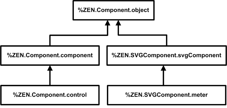
| Base Class | Purpose | Inherited Attributes |
|---|---|---|
| %ZEN.Component.componentOpens in a new tab | Visual, HTML based component. | Zen components |
| %ZEN.Component.controlOpens in a new tab | HTML based component can be placed within a form for the user to enter a value. | Zen components, Zen controls |
| %ZEN.SVGComponent.svgComponentOpens in a new tab | Visual, SVG based component. | SVG components |
| %ZEN.SVGComponent.meterOpens in a new tab | Dynamically updated SVG graphic that displays a value. | SVG components, meter components |
| %ZEN.Component.objectOpens in a new tab | Non-visual component. Typically this is a helper object that is used by visual components and requires a client-side object representation. | — |
Component Class Parameters
Depending on the base class you choose for your custom component, various class parameters are available for your use. Each of the component base classes sets its class parameters to values that are typically useful for that type of component. You can reset these values if you wish. The following table describes the class parameters that are most likely to be of interest.
For others, you may examine the Class Reference documentation for the your base class, as follows: Start the InterSystems online documentation. Select Class Reference from the menu bar at the top of the documentation home page. Choose the %SYS namespace and %ZEN.Component or %ZEN.SVGComponent package. Click on the class name.
| Parameter | Meaning |
|---|---|
| DEFAULTVISIBLE | True (1) or false (0). The %ZEN.Component.objectOpens in a new tab base class sets DEFAULTVISIBLE to 0. Any Zen component that needs to be visible on the page overrides this value to 1. All of the other base classes listed in the previous table set this value to 1, so if your custom component class inherits from these classes your component is visible by default. |
| INCLUDEFILES | Comma-separated list of JavaScript (.js) or Cascading Style Sheet (.css) files to include when this component is used on a page. Only simple file names may be used; for the physical path to these files, see the “Zen Application Configuration” section in the chapter “Zen Application Programming.” |
| NAMESPACE | The XML namespace used for components. See the section “Namespace for Custom Component Classes.” The default NAMESPACE value is "http://www.intersystems.com/zen" |
| POSTCOMPILEACTIONS |
Comma-separated list of actions to perform after this class is compiled. The list may be empty. The strings you may include in the comma-separated list are:
The %ZEN.Component.objectOpens in a new tab base class sets the default string to "schema,HTML" which is appropriate for Zen components and controls. The %ZEN.SVGComponent.svgComponentOpens in a new tab base class sets the default string to "schema,SVG" which is appropriate for Zen SVG components including meters. If you define MODULE and set POSTCOMPILATIONACTIONS to include either HTML or SVG then generated JavaScript is put in an external file, rather then being served inline with the page. You can use this feature to get the benefit of caching on the client and less overall overhead in serving content. |
Custom Style
To define a new CSS style for a custom component, you can place an XData Style block in the subclass. Within this block place a <style type="text/css"> tag and a closing </style> tag. Within the <style> element, place whatever CSS style definitions you like.
The built-in class %ZEN.Component.groupOpens in a new tab includes the following XData Style block:
XData Style
{
<style type="text/css">
/* @doc="Table used by groups." */
table.group {
  padding: 0px;
}

/* @doc="Cell within table used by groups." */
table.group td {
  padding: 0px;
}

/* @doc="Header within table used by groups." */
table.group th {
  padding: 0px;
}
</style>
}
Note the /* @doc="text" */ syntax in the above example. When you provide a comment for an XData Style entry using this syntax, the Zen Style Wizard automatically includes a description of your style in its list of available styles. To display this list while editing a Zen class in Studio, choose Tools > Templates > Templates or press CTRL-T to display the list of Zen templates. Select the Zen Style Wizard; a list of all defined styles appears. This list is organized alphabetically by component name.
While viewing the list of styles in the Zen Style Wizard, you can select the radio button next to the name of the styles you want to edit and click OK. Templates for these styles appear in your XData Style block.
If you are overriding existing styles in a subclass of one of the built-in Zen components, the Zen Style Wizard offers the most convenient way to select the styles you want to override.
The XData Style example above is a definition of styles for a built-in Zen component, %ZEN.Component.groupOpens in a new tab. Suppose you wish to create a custom component with entirely new styles. In that case you want to create styles named appropriately for your component. A component called MyComponent might include an XData Style block like the one shown in the following example. Zen automatically includes this style definition in any page that uses <MyComponent> in its XData Contents block:
XData Style
{
<style type="text/css">
/* @doc="Main style definition for MyComponent." */
.MyComponent {
    color: blue;
    background: yellow;
    white-space: nowrap;
}
</style>
}
Simply defining a XData Style block is not sufficient: the component class must actually use the newly defined CSS styles within the HTML that it generates. To accomplish this, you must provide a reference to the style in the %DrawHTML method that renders HTML for the custom component class. The following sample %DrawHTML method references the MyComponent style defined in the XData Style example above:
Method %DrawHTML()
{
    &html<<div class="MyComponent">Message</div>>
}
By convention, any CSS style names you provide in an XData Style block should use a name that is related to the name of the component, as in the example above. This helps to avoid conflicts (which cannot be detected in advance due to the nature of CSS) and makes it easier for users to determine how to override styles. A component should never redefine a style defined by another component, or define an element-wide style selector (such as “input” or “table”), as this causes interference with other components.
To review the order of precedence rules for CSS styles defined in component, page, and application classes, see the section “Cascade of Styles” in the “Zen Style” chapter of Using Zen. Custom components are subject to these rules.
XData SVGStyle
Style does not apply to Zen SVG components. Zen SVG components use XData SVGStyle.
To define styles for a custom Zen SVG component class, you can provide an XData SVGStyle block and add CSS statements between the <style type="text/css"> tag and the closing </style> tag. For example:
XData SVGStyle
{
<style type="text/css">
.customSVGComponent {
  fill: url(#myGrad);
  stroke: black;
  stroke-width: 2px;
}
</style>
}
XData SVGDef
The XData SVGStyle example above is from the class ZENTest.customSVGComponentOpens in a new tab in the SAMPLES namespace. It refers to a color myGrad as the fill color for the customSVGComponent shape.
myGrad is defined in the same class, but in a separate block called XData SVGDef. This block defines myGrad as a shaded gradient from blue to red:
XData SVGDef
{
<defs>
<linearGradient id="myGrad" x1="0%" y1="0%" x2="0%" y2="100%">
<stop offset="0%" style="stop-color:darkblue" />
<stop offset="30%" style="stop-color:#FF00FF" />
<stop offset="70%" style="stop-color:#FF00FF" />
<stop offset="100%" style="stop-color:darkred" />
</linearGradient>
</defs>
}
Zen Color Definitions
The built-in class %ZEN.SVGComponent.svgPageOpens in a new tab provides an XData SVGDef block with several useful color definitions:
-
The glow-silver color produces a metallic look for instrumentation items such as the <speedometer> meter.
-
Meters such as the traffic light use glow-red, glow-yellow, and glow-green for indicator lamps.
-
Lamp colors glow-blue, glow-purple, glow-orange, and glow-teal are also available.
<svgFrame> always references this class, or some subclass of it, through its svgPage attribute, so these colors are always available to any SVG component.
Custom Properties
Since a component is a class, it may define properties in addition to those it inherits. The definition of these properties influence how they work on the server, how they can be used within the component’s corresponding JavaScript class definition, and how they can be specified within an XML representation of the page.
Naming Conventions
There are case-sensitive naming conventions for properties in Zen classes. For details, see the section “Zen Naming Conventions” in the “Zen Tutorial” chapter of Using Zen. These conventions may be summarized as follows:
-
Client-only properties: myProperty
-
Server-only properties (the % is essential): %MyProperty
-
Properties that invoke an event handler via Javascript: onmousedown
-
Properties that identify a server-side callback method: OnCreateDataSet
-
Other properties: myProperty
XML Projection
All Zen components are derived from the %XML.AdaptorOpens in a new tab class and use its mechanisms for defining their XML behavior. If you would like more detail about this, see Projecting Objects to XML. In particular, for the XMLPROJECTION parameter introduced in this topic, see the section “Controlling the Projection for Simple Properties,” which contains a table that describes the effects of each possible value of XMLPROJECTION: "attribute", "element", "wrapped", "none", and more.
All simple properties of Zen components should have an XMLPROJECTION value of "attribute". If you do not want to make a property visible via XML, set its XMLPROJECTION parameter to "none" as in the following example:
Property beeswax As %ZEN.Datatype.string(XMLPROJECTION="none");
Datatypes from the %ZEN.Datatype package use a default XMLPROJECTION value of "attribute" so that they are projected as XML attributes. Zen datatypes offer many conveniences when you are defining properties in a custom component class. For details, see the section “Datatype Classes.”
setProperty Method
If you add a property to a custom component class, you must override the setProperty method in the subclass to implement cases for each property that you have added to the class. You can default to the superclass method for properties of the superclass. There is an example of this practice in this chapter. See the sample component class in the section “Helper Methods for %DrawHTML.”
Datatype Parameters
All Zen classes inherit (from %ZEN.componentParametersOpens in a new tab) the following set of property parameters, which you can apply to any property you add to a Zen class. The property does not need to have a Zen datatype to use these parameters:
ZENCLIENTONLY
There are cases when a Zen component might define properties whose value only makes sense within the client environment. For example, the window property of %ZEN.Component.objectOpens in a new tab, or the svgGroup property used by SVG components. If the property parameter ZENCLIENTONLY is set to 1 (true) this indicates that a given property should be part of the client object model, but is never synchronized with any server-side changes to the object, and is not included within the serial state of the object. The ZENCLIENTONLY parameter value is an internal notation and is typically not required for use by Zen developers.
ZENENCRYPT
ZENENCRYPT is not a data encryption tool. It is used to prevent a property that controls the behavior of a component from being manipulated on the client. The best example is the showQuery property of %ZEN.Component.tablePaneOpens in a new tab. ZENENCRYPT is set to true for this property so that no one can change the property in JavaScript on the client, and then be able to see the query being executed in the table. It is a protection mechanism in Zen to prevent modification of a component’s critical behaviors.
ZENEXPRESSION
When a property has ZENEXPRESSION to 1 (true) this indicates that the property can interpret a Zen #()# expression to get its value at runtime. For details, see the “Zen Runtime Expressions” section in the chapter “Zen Application Programming.”
You cannot cause a property to support runtime expressions by setting ZENEXPRESSION=1. Built-in Zen component classes provide ZENEXPRESSION=1 to indicate that the property supports runtime expressions, not to enable it to do so.
ZENLOCALIZE
Any Zen property that has its ZENLOCALIZE parameter set to 1 (true) automatically generates a message dictionary entry that can be used to translate the value of the property into another language. For details, see the chapter “Zen Localization.”
It is a good practice to localize any string-valued properties that contain messages that you want to display to communicate with the Zen application user. It is convenient to give these properties the Zen datatype %ZEN.Datatype.captionOpens in a new tab, which always has ZENLOCALIZE set to 1, but you can also set ZENLOCALIZE directly by including ZENLOCALIZE=1 in the property definition. Unlike the restriction on ZENEXPRESSION, setting the datatype parameter ZENLOCALIZE=1 actually enables the property to be automatically localized.
The ZENLOCALIZE parameter:
-
Applies only if the class that uses it also defines a localization domain by providing a value for the DOMAIN class parameter.
-
Applies only to code that Zen generates from the XML description within XData Contents in the page class. If you bypass XData Contents and work with Zen pages programmatically, then you are responsible for handling the equivalent localization tasks, including calls to $$$Text macros. See the chapter “Zen Localization. ”
ZENSETTING
Set ZENSETTING to 1 (true) to specify that the property should be considered as a “setting” within the client class definition. This means that:
-
The property becomes visible to Zen utilities such as the Control Test page
-
You can observe and modify its value using the client-side getProperty and setProperty methods
Every datatype class in the %ZEN.Datatype package already sets ZENSETTING to 1. When you use the %ZEN.Datatype classes, you must set ZENSETTING to 0 for any properties that you do not want to be treated as settings. For example, properties that are of type %ZEN.Datatype.listOpens in a new tab or are projected as an object type on the client do not behave correctly with getProperty and setProperty, which treat the property as a string.
Datatype Classes
For convenience, Zen provides a set of datatype classes that you can use when defining properties in Zen classes. The datatype classes are in the %ZEN.Datatype package. The following table lists them.
When you define new Zen classes, you are free to use any datatype classes you wish. Using the %ZEN.Datatype classes makes it easier to understand the purpose of a property in the context of a web application. Also, in many cases datatype classes automatically enable features that you would otherwise have to encode yourself, including easy localization, event handler conventions, and language-independence for Boolean values and list arrays.
Fundamentally, all Zen datatypes classes are strings. All of the datatypes listed in the following table share the same base class, %ZEN.Datatype.datatypeOpens in a new tab, whose value is defined as type %Library.StringOpens in a new tab. As you can see from the entries in the table, each of these strings is interpreted by its subclass in a uniquely useful way.
| Class | Description |
|---|---|
| align | HTML horizontal alignment value. Possible values for this are “left”, “right”, and “center”. For vertical alignment values, see valign. |
| boolean | Boolean value: It can have the text value "true" or "false" in XData Contents. When accessed programmatically from ObjectScript, Caché Basic, or Caché MVBasic code running on the server, it can have the value 1 or 0. When accessed programmatically from JavaScript code running on the client, it can have the value true or false. |
| caption | String that is automatically added to the set of localized text resources when this property is initialized by an XData Contents block, as long as the page has defined a localization DOMAIN and its ZENLOCALIZE parameter is set to 1. For details, see the chapter “Zen Localization.” |
| classMember | Name of a server-side class member (such as a property name or method name). This class defines a datatype parameter, MEMBERTYPE, that indicates the type of class member. When using this datatype to define a property, you must also provide a value for its MEMBERTYPE parameter. Possible values for MEMBERTYPE are “PROPERTY”, “METHOD”, “QUERY”, “INDEX”, or “XDATA”. |
| className | Name of a server-side class. |
| color | CSS color value. |
| cssClass | Name of a CSS style class. |
| csv | Comma-separated list of values such as “John,Paul,George,Ringo” |
| delegator | Name of a server-side method within the current page class that is used as a callback method. For example, the Zen <html> component has an OnDrawContent attribute that specifies the name of a server-side callback method that provides HTML content by using &html or by using the WRITE command. If defined, this callback is invoked on the server whenever this component is drawn. In the underlying class %ZEN.Component.htmlOpens in a new tab, OnDrawContent is defined to be of type delegator. |
| eventHandler |
JavaScript expression to be executed on the client in response to a client-side event. As an event handler, this JavaScript expression is expected to invoke a client-side method that is the “handler” for this event. For example, the Zen <button> component has an onclick attribute that specifies what should happen when a user clicks on the control. In the underlying class %ZEN.Component.buttonOpens in a new tab, onclick is defined to be of type eventHandler. You must use the eventHandler type if you wish to use the %GetEventHandlers helper method to access the event handler from %DrawHTML. For details, see the section “Custom Methods.” |
| expression | Server-side ObjectScript expression. |
| float | Floating point numeric value. |
| glvn | Name of a Caché global (multidimensional array) such as “^myGlobal”. |
| html | String of text that is marked up using HTML. |
| id | The id value for a component. It must not be used for any other purpose. |
| integer | Integer value. |
| length | HTML length value. For example: “5” or “5%”. |
| list | On the server a list represents a set of items as a piece-delimited string. On the client the list is converted to a JavaScript array. This datatype has a DELIMITER parameter, the value of which is used to delimit the server representation of the list. The default DELIMITER value is $C(5). Page properties that are of type %ZEN.Datatype.listOpens in a new tab or are projected as any "object" type on the client do not behave correctly with getProperty and setProperty, unless you set ZENSETTING to 0. |
| name | The name value for a component. It must not be used for any other purpose. |
| resource | Name of a Caché resource. If you are not familiar with Caché resources, see the “Assets and Resources” chapter in the Caché Security Administration Guide . |
| script | Client-side JavaScript expression. |
| sql | SQL statement. By default, properties of this type are encrypted when sent to the client (the ZENENCRYPT parameter is set to 1). |
| string | String with a default MAXLEN of 250. You can reset the MAXLEN value. |
| style | CSS style statement. For example: "color:red; background: yellow;" |
| svgStyle | SVG CSS style definition. Styles within SVG are CSS compliant, but there is a different set of styles available, so this datatype designates them. |
| uri | URI value. For example: “http://www.intersystems.com/zen” |
| valign | HTML vertical alignment value. Possible values are “top”, “bottom”, and “middle”. For horizontal alignment values, see align. |
| value | A value to be used as the value of an HTML control. |
The %DrawHTML Method
Each custom component class must provide an implementation of the %DrawHTML method. %DrawHTML is responsible for providing the HTML (or SVG) needed to create the client-side visual representation of a Zen component. The method is called when the page containing the component is first served. It may subsequently be called if the page needs to dynamically refresh the contents of the component, such as when the query for a <tablePane> is re-executed.
The basic operation of the %DrawHTML method is very simple: Any output that this method produces is served up as HTML within the browser. You can output from %DrawHTML using the WRITE command, as follows:
Method %DrawHTML()
{
        Write "This is some <b>HTML!</b>",!
}
As an alternative to WRITE, you can use the ObjectScript syntax for embedded HTML statements. This syntax uses &html followed by HTML statements enclosed in angle brackets <> as in the following example:
Method %DrawHTML()
{
        &html<This is some <b>HTML!</b>>
}
Any output from %DrawHTML is enveloped by the component’s enclosing <div> element, as supplied by the Zen framework.
What makes this convention powerful is that %DrawHTML is an instance method of the component class: it can execute logic and has access to the component’s properties and methods, as well as the underlying Caché database. It supports ObjectScript expression, CSP #()# syntax, and Zen #()# expression syntax. The following simple example uses a number of these features:
Method %DrawHTML()
{
        #; draw items as specified by myCount
        For i=1:1:..myCount {
                &html<This is item #(i)#.<br/>>
        }
}
Helper Methods for %DrawHTML
The Zen framework defines three server-side helper methods for use in the %DrawHTML method for custom components: %MakeId, %Attr, and %GetEventHandlers. The class code for <button> shows one way to use these methods effectively in %DrawHTML:
Class %ZEN.Component.button Extends control
{

Parameter DEFAULTCONTROLCLASS = "button";

/// Caption displayed for this button.<br>
/// This is a localized value.
Property caption As %ZEN.Datatype.caption;

/// defines style sheet used by this component
XData Style
{
<style type="text/css">
/* @doc="Style for button (input)." */
.button {
}
</style>
}

Method %DrawHTML()
{
  Set disabled = $S(..disabled:"disabled",1:"")
  Set tIgnore("onchange") = ""
  &html<
  <input type="button" class="#(..controlClass)#"
  id="#(..%MakeId("control"))#" #(..%Attr("title",..title))#
  #(..%Attr("name",..name))# #(..%Attr("value",..caption))# #(disabled)#
  #(..%Attr("style",..controlStyle))# #(..%GetEventHandlers(.tIgnore))#>
  >
}

/// This method fills in reasonable default values for
/// this control. Used by tools (such as Control Tester) to
/// dynamically create controls.
Method %SetDefaultValues()
{
  Set ..caption = "Button"
}

/// Set the value of a named property.
ClientMethod setProperty(property, value, value2) [ Language = javascript ]
{
  switch(property) {
  case 'caption':
    this.caption = value;
    var el = this.findElement('control');
    if (el) {
      el.value = this.caption;
    }
    break;
  case 'value':
    // do not set control value; just internal value
    this.value = value;
    break;
  default:
    // dispatch
    return this.invokeSuper('setProperty',arguments);
  }
  return true;
}
}This example is close, but not identical, to the built-in class %ZEN.Component.buttonOpens in a new tab.
The following topics discuss how each of the %DrawHTML helper methods is used:
-
%MakeId — Generate the id value for the HTML element that displays the component on the page. Use a consistent naming scheme so that the client-side method findElement can find the HTML element on the page.
-
%Attr — Assign a value to an attribute of the HTML element that displays the component on the page. This method may be called repeatedly to assign values to all the HTML attributes required to render the component.
-
%GetEventHandlers — Retrieve all of the event handling information from the component definition, so that the HTML representation of the component can correctly match each user event with the code that should execute.
Identifying HTML Elements
The %MakeId server-side method ensures uniqueness for the id of every HTML element on the output page. The example in the “Helper Methods for %DrawHTML” section calls %MakeId from embedded HTML to set the id for the HTML <input> element as follows:
id="#(..%MakeId("control"))#"
%MakeId concatenates the string provided by the caller with the underscore character “_” followed by the unique sequential number that Zen assigns to every component it places on the page. It then gives this identifier to Zen to use as the value for the id attribute in the enclosing <div> for the element. Additionally, if the component is part of a repeating group, Zen adds a further underscore character “_” followed by the tuple number.
Thus, if you view the source of any generated Zen page you see enclosing <div> elements with generated id values like spacer_23 in the following example:
<div class="spacer" id="spacer_23" style="width:20px;"/>The following more complex excerpt shows how Zen provides unique HTML id values for each element in a repeating group of radio buttons. This excerpt is part of the page that results when Zen renders the class ZENDemo.FormDemoOpens in a new tab from the SAMPLES namespace:
<tr valign="top">
<td style="padding: 4px; padding-left: 5px; padding-right: 5px;" >
<span id="zenlbl_26" class="zenLabel" >Marital Status:</span>
<div class="zendiv" id="MaritalStatus" >
<input type="hidden" id="hidden_26" name="$V_MaritalStatus" value="">
<span class="radioSetSpan"><input type="radio" id="textRadio_1_26"
name="r26" value="S" onclick="zenPage.getComponent(26).clickItem(1);">
<a class="radioSetCaption" id="caption_1_26" href=""
onclick="javascript:zenPage.getComponent(26).clickItem(1);return false;">
Single</a> </span>
<span class="radioSetSpan"><input type="radio" id="textRadio_2_26"
name="r26" value="M" onclick="zenPage.getComponent(26).clickItem(2);">
<a class="radioSetCaption" id="caption_2_26" href=""
onclick="javascript:zenPage.getComponent(26).clickItem(2);return false;">
Married</a> </span>
<span class="radioSetSpan"><input type="radio" id="textRadio_3_26"
name="r26" value="D" onclick="zenPage.getComponent(26).clickItem(3);">
<a class="radioSetCaption" id="caption_3_26" href=""
onclick="javascript:zenPage.getComponent(26).clickItem(3);return false;">
Divorced</a> </span>
<span class="radioSetSpan"><input type="radio" id="textRadio_4_26"
name="r26" value="W" onclick="zenPage.getComponent(26).clickItem(4);">
<a class="radioSetCaption" id="caption_4_26" href=""
onclick="javascript:zenPage.getComponent(26).clickItem(4);return false;">
Widowed</a> </span>
<span class="radioSetSpan"><input type="radio" id="textRadio_5_26"
name="r26" value="O" onclick="zenPage.getComponent(26).clickItem(5);">
<a class="radioSetCaption" id="caption_5_26" href=""
onclick="javascript:zenPage.getComponent(26).clickItem(5);return false;">
Other</a> </span>
</div>
</td>
</tr>
The client-side equivalent for %MakeId is a JavaScript method called makeId. The custom meter component examples use makeId.
Finding HTML Elements
When you are writing client-side code and need to access a specific HTML element on the page, you can use the findElement method. Its argument is the value that you assigned to the id attribute when placing the component on the page. findElement combines this string with the sequential identifier for the element on the output page to generate the appropriate HTML id for the element on the output page. It uses this information to obtain a pointer to the component object within the page object model for the rendered page, then returns that pointer so that you can use properties and methods of the component object.
Ordinary Zen components inherit findElement from %ZEN.Component.objectOpens in a new tab. For SVG components you must use findSVGElement from %ZEN.SVGComponent.svgComponentOpens in a new tab. The custom meter component examples use findSVGElement.
findElement and findSVGElement work correctly only if you have assigned HTML id values using %MakeId (on the server) or makeId (on the client).
Setting HTML Attribute Values
The %Attr server-side method assigns a value to an attribute of the HTML element that displays the component on the page. This method may be called repeatedly to assign values to all the HTML attributes required to render the component. The following sample %DrawHTML method uses %Attr in rendering the <button> component:
Method %DrawHTML()
{
  Set disabled = $S(..disabled:"disabled",1:"")
  Set tIgnore("onchange") = ""
  &html<<input type="button" class="#(..controlClass)#"
               id="#(..%MakeId("control"))#" #(..%Attr("title",..title))#
                   #(..%Attr("name",..name))# #(..%Attr("value",..caption))#
                   #(disabled)# #(..%Attr("style",..controlStyle))#
                   #(..%GetEventHandlers(.tIgnore))#>>
}
Suppose the value of the <button> controlStyle attribute is currently myActionStyle. As the %DrawHTML method outputs HTML, an expression in this format:
#(..%Attr("style",..controlStyle))#
Generates the following output:
style="myActionStyle"
Attaching Event Handlers to HTML Elements
The %GetEventHandlers server-side method gets all the event handler attributes for a given component and uses them to write out any event handler attributes for the HTML that displays that component in the output page.
%GetEventHandlers can only find event handler attributes whose underlying property has been defined using the datatype class %ZEN.Datatype.eventHandlerOpens in a new tab.
For a list of the event handler attributes that you can specify for a control component on a Zen form, see the section “Control Attributes” in the “Zen Controls” chapter of Using Zen Components. The types of events covered by this list include mouse movements, mouse clicks, or key clicks. Other types of Zen component have event handlers, but Zen controls offer the single largest pool for comparison.
Preceding chapters have explained that to set up an event handler for a built-in Zen component you must specify a JavaScript expression as the value of the corresponding event handler attribute. Generally this JavaScript expression invokes a client-side method that serves as the “handler” for this event. Of course, if you set up the component this way you must also write the client-side method that is being invoked.
For custom components, you must take additional steps to connect each user event with its appropriate handler. This connection takes place in the %DrawHTML method for the custom component. Consider the %DrawHTML method for the <image> component:
Method %DrawHTML()
{
  #; handle onclick directly
  Set tIgnore("onclick")=""
  Set tIgnore("onchange")=""

  #; select image to display
  Set tSrc = ..src
  If (..streamId '= "") {
    Set tSrc = ##class(%CSP.Page).Link(
    "%25CSP.StreamServer.cls?STREAMOID="_$ZCVT(..streamId,"O","URL"))
  }

  #; disabled logic
  Set tSrc = $Case(..disabled,0:tSrc,:$S(..srcDisabled="":tSrc,1:..srcDisabled))

  &html<<img id="#(..%MakeId("control"))#"
             #($S(..onclick="":"",1:"class=""imageLink"""))#
             #(..%Attr("src",tSrc))#
             #(..%Attr("title",..title))#
             #(..%Attr("width",..width))#
             #(..%Attr("height",..height))#
             #(..%GetEventHandlers(.tIgnore))#
             onclick="zenPage.getComponent(#(..index)#).imageClick();"/>>
}
In the above example, some interesting things take place with regard to event handlers. The following line tells %GetEventHandlers to ignore any value provided for the onchange event handler, even if it discovers that there is such a value:
Set tIgnore("onchange") = ""
You must provide one such line for each event handler that you want to handle directly in %DrawHTML, as shown for onclick and onchange in the example above. Then, at the end of %DrawHTML, pass the variable tIgnore to %GetEventHandlers by reference, as shown in the example:
#(..%GetEventHandlers(.tIgnore))#
The %DrawHTML example above asks %GetEventHandlers to ignore onclick and onchange, but for different reasons in each case: <image> ignores onchange because it does not accept user input. <image> ignores onclick because it is designed to handle all onclick events in the same way, without permitting the Zen programmer to specify a different behavior in the page class. Therefore, it provides code in %DrawHTML to handle this event directly. Any event handlers that are not expressly ignored by %DrawHTML in this way are written out to the page exactly as defined by the Zen programmer.
Now consider this expression from the example above:
#($S(..onclick="":"",1:"class=""imageLink"""))#
This expression uses the ObjectScript $SELECT function to return the first true expression it encounters in a list of expressions. Looking at the expressions provided: If the <image> component’s onclick attribute value is an empty string, this statement writes an empty string. Otherwise, this statement formats the HTML element on the output page by writing out the following string:
class="imageLink"
The following expression directs the client-side HTML page to invoke the component’s imageClick method in response to any user mouse clicks on the corresponding HTML element.
onclick="zenPage.getComponent(#(..index)#).imageClick();"
The imageClick method is a client-side JavaScript method in the <image> component class. It uses the JavaScript helper method zenInvokeCallbackMethod to invoke onclick callback method for this <image> component. The imageClick method looks like this:
ClientMethod imageClick() [ Language = javascript ]
{
  if (!this.disabled) {
    // invoke callback, if present
    zenInvokeCallbackMethod(this.onclick,this,'onclick');
  }
}
Where the zenInvokeCallbackMethod arguments are as follows:
-
this.onclick — The component’s onclick attribute value (a JavaScript expression that invokes a client-side JavaScript method)
-
this — A pointer to the component object
-
'onclick' — The HTML name for the event (must be quoted)
This completes the connection between the HTML element, the event, and its handler. You must provide similar conventions for any event that you intend your custom component to support.
HTML for Dynamic Components
%DrawHTML works differently for components that change in response to runtime information or that are generated using SVG.
The <calendar> is an example of a component that writes no static HTML at all. Its %DrawHTML method simply sets the values of properties such as the currently selected month and date, in preparation for the more complex JavaScript method renderContents that is invoked whenever the page needs to redraw the calendar. renderContents and its helper methods generate an array of dynamic HTML statements based on the user’s current selections of calendar month and date. For details, examine the class code for %ZEN.Component.calendarOpens in a new tab.
Custom Methods
Since a component is a class, it may define methods in addition to those it inherits. The definitions of these methods influence where and how they can be used. These rules are exactly the same for methods in Zen component classes as they are for methods within a Zen page. The following table summarizes the conventions for method in Zen classes. For details, see the “Zen Page Methods” section in the chapter “Zen Application Programming.”
| Callable From | Runs On | Code Language | Keywords | Naming Convention |
|---|---|---|---|---|
| Client | Client | JavaScript |
ClientMethod [Language = javascript] |
myMethod |
| Client | Server (but can send back code that runs on the client) | ObjectScript, Caché Basic, Caché MVBasic | [ZenMethod] | MyMethod |
| Server | Server | ObjectScript, Caché Basic, Caché MVBasic | — | %MyMethod |
The most important method in your custom component class is the required server-side method %DrawHTML. The previous section describes how to work with this method. The following sections describe other methods that you might want to override in a custom component class. These include:
%OnDrawEnclosingDiv
If defined in a component subclass, this callback method, makes it possible for the subclass to inject additional HTML attributes into the component’s enclosing <div> element at runtime. %OnDrawEnclosingDiv has no input arguments. If implemented, the method should return a %StringOpens in a new tab value. The string must include a leading space to avoid conflict with other attributes that may already be modifying the <div> element.
%OnDrawTitleOptions
The .expando class offers a server-side callback method %OnDrawTitleOptions which, if defined in a subclass of .expando, provides a way to add content to the right side of the title bar when the <expando> has its framed attribute set to true. Any HTML written by %OnDrawTitleOptions is injected into the title bar of the <expando> when it is displayed. For details, see “<expando>” in the “Navigation Components” chapter of Using Zen Components.
Data Drag and Drop Methods
It is possible to provide values for the component attributes onafterdrag, onbeforedrag, ondrag, and ondrop each time you place a component on the page, as described in the “Drag and Drop” section of the “Zen Component Concepts” chapter of Using Zen. However, rather than requiring Zen application developers to set data drag and drop attributes per component, you can build the desired behavior into a custom control component. This way, when placing a component on the page, developers can simply choose the custom control, which already has the desired behavior.
If you want to customize data drag and drop for a custom control class, there is a group of methods in the base classes %ZEN.Component.componentOpens in a new tab and %ZEN.Component.controlOpens in a new tab that you can override. Each of these methods accepts one parameter, dragData, which is a pointer to a JavaScript object whose methods and properties are defined in the Zen client side library. These methods also call functions defined within the library, such as ZLM.setDragAvatar. For full details about any of these items, refer to the “Client Side Library” chapter in this book.
Because the library is written in JavaScript, which does not facilitate generated class documentation, there is no Class Reference documentation for it in the InterSystems online documentation system. See the “Client Side Library” chapter for all details.
The following table traces the sequence of internal events when drag and drop occurs between a source Zen component and a target Zen component. During these events, certain JavaScript methods in the source and target component classes call certain JavaScript functions within the Zen client side library. The component methods are triggered automatically by the Zen framework. When you customize data drag and drop for a custom control class, you can change the details of what happens inside these methods when they are automatically invoked.
| User | Client Side Library | Component Method | |
|---|---|---|---|
| 1 | Starts the drag from the source component. | ||
| 2 | Calls the source component's dragHandler method. | ||
| 3 | Creates a zenDragData object named dragData to hold the data transferred by the drag. | ||
| 4 | Invokes the source component's onbeforedrag event, if defined. If the onbeforedrag event returns false or if dragData.value has not been set, the drag is cancelled and dragHandler exits. | ||
| 5 | Calls the source component's dragStartHandler method. This is where an individual component's default drag handling is implemented. dragStartHandler can return false to cancel the drag. | ||
| 6 | Invokes the source component's ondrag event, if defined. This gives a component a chance to modify the drag data or cancel the drag. If the ondrag event return false, then the drag is cancelled. | ||
| 7 | Releases the drop over the target component. | ||
| 8 | Calls the target component's dropHandler method | ||
| 9 | Invokes the target component's ondrop event, if defined. If the ondrop event returns false, then the dropHandler method exits. | ||
| 10 | Calls the target component's dropStartHandler method. This is where an individual component's default drop handling is implemented. dropStartHandler can return false to cancel the drop. | ||
| 11 | Calls the source component's dragNotifyHandler method to notify the source component that the drag is complete. | ||
| 12 | The dragNotifyHandler calls the source component's dragFinishHandler method and invokes the source component's onafterdrag event, if defined. |
There are several methods in the base classes %ZEN.Component.componentOpens in a new tab and %ZEN.Component.controlOpens in a new tab that are designed for you to override. The next several sections describe them. Other methods in the previous table are part of the Zen framework, and InterSystems recommends that you do not attempt to customize them. The methods designed for override are:
getDragData
getDragData is a JavaScript method that is called automatically each time the user begins a drag operation on any control or <image> component. Other components do not support the getDragData method. The base class for control components, %ZEN.Component.controlOpens in a new tab, implements a base version of getDragData that looks like the following example. Its purpose is to set the text and value fields in the dataDrag object.
ClientMethod getDragData(dragData) [ Language = javascript ]
{
  dragData.value = this.getValue();
  if (null != this.text) {
    // if there is a text property, use it as the text value
    dragData.text = this.text;
  }
  else {
    dragData.text = dragData.value;
  }
  return true;
}
Subclasses of %ZEN.Component.controlOpens in a new tab can override getDragData to provide customized behavior. It does not matter what happens inside the method as long as it sets values for dataDrag.text and dataDrag.value before it returns true. The next example shows how the class %ZEN.Component.imageOpens in a new tab overrides getDragData. This method assigns the string value of the <image> text attribute as both the logical value and the display value to be dragged:
ClientMethod getDragData(dragData) [ Language = javascript ]
{
  dragData.value = this.text;
  dragData.text = this.text;
  return true;
}
dragStartHandler
dragStartHandler is a JavaScript method that is automatically called whenever a drag operation is started within a component. The base class for control components, %ZEN.Component.controlOpens in a new tab, implements a base version of the dragStartHandler method, which looks like the following example. This dragStartHandler method does the following:
-
Calls getDragData to set dragData.text and dragData.value
-
Creates an avatar (icon) to represent the field as it is dragged across the page
-
Calls a client side library function (ZLM.setDragAvatar) to use this icon
ClientMethod dragStartHandler(dragData) [ Language = javascript ]
{
  // get drag data
  if (!this.getDragData(dragData)) {
    return false;
  }

  // avatar
  var icon = this.getEnclosingDiv().cloneNode(true);
  icon.style.position="absolute";
  icon.style.border ="1px solid darkgray";
  icon.style.background ="#D0D0F0";
  ZLM.setDragAvatar(icon);

  return true;
}
Subclasses of %ZEN.Component.controlOpens in a new tab can override dragStartHandler to provide customized behavior. For example, the class %ZEN.Component.abstractListBoxOpens in a new tab overrides dragStartHandler as shown in the next example. This example does the following:
-
Omits any call to getDragData.
-
Acquires a pointer (dragItem) to the specific list item where the drag began
-
Finds the exact pointer (anchor) to this item within the list control
-
Sets the sourceItem, value, and text fields in the dragData object
-
Creates an avatar (icon) to represent the field as it is dragged across the page
-
Calls a client side library function (ZLM.setDragAvatar) to use this icon
ClientMethod dragStartHandler(dragData) [ Language = javascript ]
{
  var ok = false;
  var dragItem = this._dragSource;
  if (null != dragItem) {
    delete this._dragSource;
    var anchor = this.findElement('item_' + dragItem);
    if (anchor) {
      dragData.sourceItem = dragItem;
      ok = true;
      dragData.value = this.getOptionValue(dragItem);
      dragData.text = this.getOptionText(dragItem);

      // avatar
      var icon = anchor.cloneNode(true);
      icon.style.position ="absolute";
      icon.style.width = this.getEnclosingDiv().offsetWidth + 'px';
      icon.style.border = "1px solid darkgray";
      ZLM.setDragAvatar(icon);
    }
  }
  return ok;
}
dragFinishHandler
dragFinishHandler is a JavaScript method that is automatically called whenever a drag operation that was started within this component is completed. This occurs as soon as the user releases the mouse button after having held it down for the “drag” operation. dragFinishHandler provides an opportunity to tie up any loose ends that may remain for the source component at this point.
dropStartHandler
dropStartHandler is a JavaScript method that is automatically called whenever a drop operation is started within a component. The base class for control components, %ZEN.Component.controlOpens in a new tab, implements a base version of dropStartHandler that looks like the following example. It sets the value of the target control to dragData.toString(). This value was previously set by the activities of other drag and drop methods in the class. Generally it is the value acquired from the source control.
ClientMethod dropStartHandler(dragData) [ Language = javascript ]
{
  this.setValue(dragData.toString());
  return true;
}
Subclasses of %ZEN.Component.controlOpens in a new tab can override dropStartHandler to provide customized behavior. For example, the class %ZEN.Component.listBoxOpens in a new tab overrides the base control dropStartHandler as shown in the next example. This example does the following:
-
Gets the value and text fields from the dragData object.
-
If this <listBox> is receiving a drop from some other component:
Call appendOption to:
-
Create a new list option that has the value and text fields as its logical and display values
-
Append this new option to the <listBox>
-
Redisplay the <listBox>
-
-
If this <listBox> is receiving a drop from itself:
-
Call the client side library function ZLM.getDragInnerDestination to retrieve the identifier for the innermost enclosing <div> where the drag operation ended.
-
Use this to calculate the appropriate dragData.targetItem identifier.
-
Call moveOption to:
-
Move the list option at position dragData.sourceItem to the position identified dragData.targetItem
-
Shift the other list options to make room
-
Redisplay the <listBox>
-
-
ClientMethod dropStartHandler(dragData) [ Language = javascript ]
{
  var value = dragData.value;
  var text = dragData.text;

  if (this != dragData.sourceComponent) {
    // drag from another component: append
    this.appendOption(value,text);
  }
  else {
    // move item within this list
    var tgtId = ZLM.getDragInnerDestination().id;
    var tgtIndex = -1;
    if (tgtId && tgtId.indexOf('item')!=-1) {
      tgtIndex = tgtId.split('_')[1];
    }
    dragData.targetItem = tgtIndex;
    var srcIndex = dragData.sourceItem;
    this.moveOption(srcIndex,tgtIndex);
  }
  return true;
}
Sample Code
The following is an example of a custom component that defines a title bar. This example is from the ZENDemo package in the SAMPLES namespace:
Class ZENDemo.Component.demoTitle Extends %ZEN.Component.component
{
/// XML namespace for this component.
Parameter NAMESPACE = "http://www.intersystems.com/zendemo";
/// Domain used for localization.
Parameter DOMAIN = "ZENDemo";
/// Title displayed within this pane.
Property title As %ZEN.Datatype.caption;
/// Category displayed within this pane (above the title).
Property category As %ZEN.Datatype.caption
[ InitialExpression = {$$$Text("ZEN Demonstration")} ];
/// defines style sheet used by this component
XData Style
{
<style type="text/css">
.demoTitle {
color: black;
background: #c5d6d6;
width: 100%;
padding: 0px;
border-bottom: 1px solid darkblue;
font-size: 1.4em;
font-family: verdana;
text-align: center;
}
</style>
}
/// Draw the HTML contents of this component.
Method %DrawHTML()
{
Set tCategory = ..category
&html<<table class="demoTitle" border="0" cellpadding="0" cellspacing="0"
width="100%">
<tr>
<td align="left" width="40">
<img width="185" height="60" src="images/zentitle.jpg"/>
</td>
<td align="left" width="90%" style="padding-left:20px;">
<div style="font-size: 0.6em;">#($ZCVT(tCategory,"O","HTML"))#</div>
<div>#($ZCVT(..title,"O","HTML"))#</div></td>
<td> </td></tr></table>>
}
}The purpose of defining a custom component for a title bar is to provide a consistent look for every page in a web application. Page classes in the ZENDemo package provide countless examples of the correct way to reference a custom component. An XData Contents block that provides a correct reference looks like this:
XData Contents [XMLNamespace="http://www.intersystems.com/zen"]
{
<page xmlns="http://www.intersystems.com/zen"
      xmlns:demo="http://www.intersystems.com/zendemo"
      title="Control Test">

  <demo:demoTitle id="title"
                  title="Zen Control Test Page"
                  category="Zen Test Suite" />

<!-- more page contents here -->

</page>
}
Where:
-
The <page> element references the namespace defined for the custom component, and defines an alias for it, by providing the following attribute within the opening <page> element:
xmlns:demo="http://www.intersystems.com/zendemo"
This statement defines an alias demo for the full namespace name.
-
The <demo:demoTitle> element references the demoTitle custom component. This reference has the form:
<alias:component>
where alias is the namespace alias defined in the <page> element (demo in this case) and component is the name of the custom component class (demoTitle in this case).
There are further examples of custom components, and references to these components, in the SAMPLES namespace. You can examine these classes in Studio. The examples of custom component classes include:
-
ZENDemo.Component.demoMenuOpens in a new tab, a subclass of %ZEN.Component.compositeOpens in a new tab
-
ZENDemo.Component.sidebarOpens in a new tab, a subclass of %ZEN.Component.componentOpens in a new tab
-
ZENDemo.Component.bulletOpens in a new tab, a subclass of %ZEN.Component.objectOpens in a new tab
-
ZENTest.customComponentOpens in a new tab, a subclass of %ZEN.Component.controlOpens in a new tab
-
ZENTest.customSVGComponentOpens in a new tab, a subclass of %ZEN.SVGComponent.svgComponentOpens in a new tab
Creating Custom Meters
The following table is your checklist for building a custom meter component. To supplement the information in this table, see the odometer, clock, and other custom meter examples that have been posted on the Zen Community pages:
http://www.intersystems.com/community/zenOpens in a new tab
| Task | Description |
|---|---|
| Subclass | Extend %ZEN.SVGComponent.meterOpens in a new tab to create a new class. |
| renderMeter | Any subclass of %ZEN.SVGComponent.meterOpens in a new tab must override this method to render the SVG contents of the meter by making SVG calls from the meter class. |
| Parameters | (Optional) Provide class parameters, such as DEFAULTHEIGHT and DEFAULTVIEWBOXHEIGHT, and give them appropriate values. |
| Properties | (Optional) Provide properties, if needed. For example, an odometer might set a maximum number of digits for its display. A clock might override the value property from its base meter class with an ObjectScript expression that calculates the current time each time the meter is displayed. |
| XData SVGStyle | (Optional) Provide any CSS style definitions for the meter. |
| XData SVGDef | (Optional) Provide any SVG definitions for the meter. |
| setProperty | (Optional) You may override this method to provide unique ways to set certain properties of the meter. A clock example might do this for the value property, as described above, then defer to the superclass for setting all other properties. |
| Methods | (Optional) Provide supporting methods as needed for component behavior. |
| renderLabel | (Optional) Any subclass of %ZEN.SVGComponent.meterOpens in a new tab may override this method to set the x and y positions of the meter label. |
| XML Element | To add the component to a page, place it within that page’s XData Contents block as an XML element. |