
Introduction to Dashboards
This page introduces dashboards in InterSystems IRIS® data platform Business Intelligence.
Also see Accessing the BI Samples.
Displaying Business Intelligence Dashboards
To access Business Intelligence dashboards from the Management Portal, click Analytics and then click User Portal.
Or use a supported browser (see Supported Web Browsers) and go to the following URL, using the <baseURL> for your instance:
http://<baseURL>/csp/samples/_DeepSee.UserPortal.Home.zen
In either case, the right area then lists the available dashboards in this namespace. This area initially displays the items in Covers View, as follows:
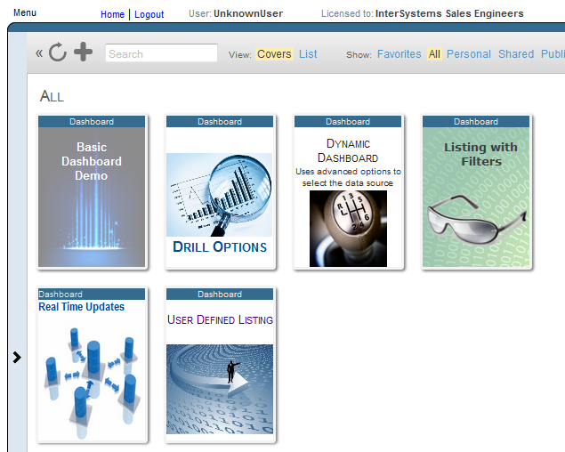
When you hover the cursor over a cover, the system displays an arrow on the cover, as follows:
If you click the cover arrow, the system displays the dashboard. If you have permission to do so, you can then edit the dashboard.
For more information on using the User Portal, see Using Dashboards and the User Portal.
About Dashboards
A dashboard typically includes multiple widgets and controls, as in the following example:
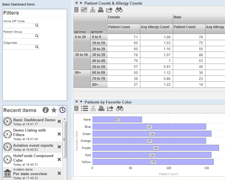
The left area of the dashboard displays two worklists. These are configurable areas you can use to display controls (such as the filters shown in the upper worklist) and other useful items (such as the recent items list shown in the lower worklist). (For information on using worklists, see Using Dashboards and the User Portal. For information on configuring them, see Implementing InterSystems Business Intelligence.)
This example dashboard also includes two widgets, which are both pivot table widgets. Note that a pivot table widget can display any kind of data source.
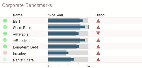
Dashboards can include other kinds of widgets, including meters and scorecards. A scorecard shows multiple rows of data in a tabular format that also includes features such as value-dependent lamps and arrows. For example:
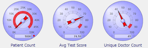
A meter shows one or more values in graphical objects like the following:
Location of Dashboard Definitions
When you create a dashboard, its definition is available within your IDEOpens in a new tab as a generated file with the extension .dashboard.dfi. If you are using Visual Studio CodeOpens in a new tab, you can access these pivot table definitions in the following ways:
-
Client-side editing: when a namespace is opened in the ObjectScript ExplorerOpens in a new tab, view the .dfi files in the Other directory.
-
Server-side editing: modify your workspace filtersOpens in a new tab so that they show generated files and include the desired .dfi files.
Pivot table definitions and other Business Intelligence folder items are accessible in the same manner.
These definitions are not class definitions but can be copied and pasted into a special container class for easier deployment. For details, see Packaging Business Intelligence Elements into Classes.