
Creating and Modifying Dashboards
This page describes how to create and edit Business Intelligence dashboards.
For information on customizing covers for dashboards, see Using Dashboards and the User Portal.
Introduction to the Autosave Feature
The system provides an optional autosave feature, which can automatically save the state of the User Portal for each user, for each dashboard. If the autosave feature is enabled for the User Portal:
-
When you access the User Portal, the system displays that user interface as you last saw it.
-
When you display a dashboard, the system displays that dashboard as you last saw it.
For information on this option, see Specifying Basic Settings. Note that there is a separate autosave feature for the Analyzer.
Creating a Dashboard
To create a dashboard, use the following overall process:
-
Log in to the User Portal in the desired namespace, as described earlier.
-
Click Menu > New Dashboard.
Or click the Add button
 , which is above the list of dashboards, as follows:
Then click Add Dashboard.
Or click the < button at the left side of the User Portal, click Add, and then click Add Dashboard.
In any case, the system then displays a dialog box that prompts you for basic information about the new dashboard.
-
For Folder, optionally type a folder name or select an existing folder.
Also see Preparing for Folder Item Localization.
-
For Dashboard Name, type the name of the dashboard.
Also see Preparing for Folder Item Localization.
Note that this name is used (along with Folder) as the logical name of the dashboard; the system displays this logical name when you use the Save As option, for example.
-
Optionally provide values for the other options as given in the next section.
-
Click OK.
The system creates, saves, and displays the dashboard, which is initially empty.
-
To configure the dashboard, use a combination of the following tools:
-
The Dashboard Editor. For an introduction, see Modifying Dashboard Settings.
-
The Menu. For an introduction, see Adding a Widget to a Dashboard.
-
Modifying Dashboard Settings
To modify settings of a dashboard or of the widgets in a dashboard:
-
Display the dashboard as described in Accessing Business Intelligence Dashboards.
-
Click the > button to the left of the dashboard. (If this button is not visible, either the dashboard is not editable or you do not have permission to edit it.) The following shows an example:
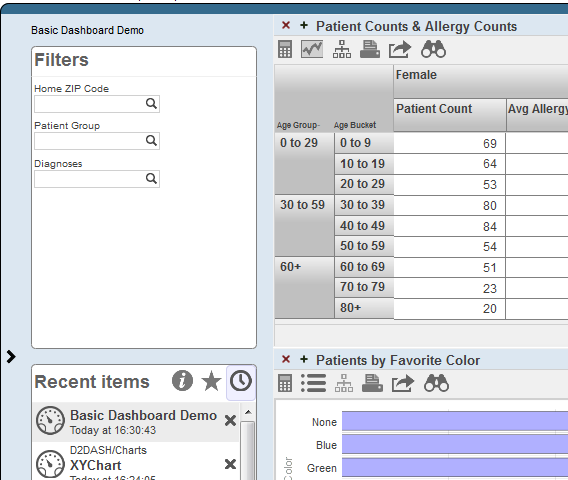
The system then expands the Dashboard Editor as follows:
To hide the Dashboard Editor, click the < button.
-
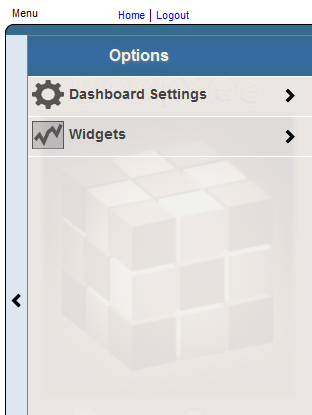
Click Dashboard Settings.
-
Specify any of the following options as needed:
-
Locked — Select this option to temporarily prevent changes to this dashboard. If you select this option, you cannot edit the dashboard again unless you first clear the Locked option again.
-
Public — Select this option to control whether this dashboard is displayed in the User Portal main area.
Important:This option does not control access to the dashboard. Access is controlled instead by the Owner and Resource options, discussed later in this list.
Note that even if the dashboard is not marked as public, you can access it via Main > Open. Also, you can find it in the User Portal by using the Find option. See Using Dashboards and the User Portal.
-
Page Settings > Company Name — Specify a name to display in the upper right corner. For example:
-
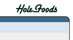
Page Settings > Company Logo — Select an image to display in the upper right corner. For example:
If you specify this option, Page Settings > Company Name is ignored.
-
Title — Specify the title of the dashboard.
If you specify a title, the main area of the User Portal displays the title of the dashboard. Otherwise, it displays the name of the dashboard.
Also see Preparing for Folder Item Localization.
-
Owner — Specify the InterSystems IRIS® data platform user who owns this dashboard. If a dashboard has an owner, then only the owner can specify the Resource option for the dashboard; see the next item.
-
Resource — Specify the resource that is used to control access to this dashboard. See Visibility of Folders and Folder Items.
-
Category — Specify the category to which this dashboard belongs. The User Portal uses this to group items in the Covers View. See Using Dashboards and the User Portal.
-
Description — Briefly describe the dashboard.
-
Keywords — List any keywords or phrases to help you find this dashboard later. Specify a comma-separated list of keywords or phrases.
These keywords are displayed in the User Portal.
-
Resize — Select this option to control whether users can move and resize the widgets on the dashboard.
-
Modify — Select this option to control whether users can modify the widgets on the dashboard.
-
Title Bars — Use this submenu to control the display of title bars on the widgets on this dashboard. You can also customize their appearance. This submenu has the following options:
-
Title Bars — Select ON or OFF.
-
Title Bar Color — Select a color to use for the title bar, to be used by default.
-
Title Bar Opacity — Specify the opacity of the title bar, to be used by default. The value 1 means 100%.
-
Text Color — Select a color for the text of the title bar, to be used by default.
-
Selected Color — Select a color to use for the title bar, to be used when the widget is selected.
-
Selected Opacity — Specify the opacity of the title bar, to be used when the widget is selected. The value 1 means 100%.
-
Selected Text Color — Select a color for the text of the title bar, to be used when the widget is selected.
-
Font — Select the typeface to use for the text in the title bar.
-
-
Widget borders — Use this option to hide or display borders on all widgets.
-
Work Lists — Specify the number of worklists in the dashboard. Note the following defaults:
-
In a two-worklist dashboard, by default, the top worklist is the Filters box, and the bottom worklist is the Favorites/Recent items box.
-
In a one-worklist dashboard, by default, the worklist is the Filters box.
-
-
Background — Use this submenu to specify the background of the dashboard. This submenu has the following options:
-
Background Color — Select the background color. Note that this color is used only if
-
Background Image — Select an optional background image. If you choose an image, the Background Color option is ignored.
-
Background Opacity — Specify the opacity of the background color or background image (whichever is used). The value 1 means 100%.
-
-
Scalable Grid, Grid Rows, and Grid Columns — Use these options to specify the position and size of all widgets relative to a resizeable grid.
If you enable the Scalable Grid option, when you move a widget, the upper left corner of widget aligns to the nearest grid point. Similarly, when you resize a widget, the lower right corner aligns to the nearest grid point. Use the Grid Rows and Grid Columns options to specify the grid. Note that the grid itself is not displayed.
If you resize the dashboard, all the widgets are automatically resized. Scalable Grid is the only option that supports this resizing behavior.
-
Snap Into Place — Use this option to control how widgets are placed on the dashboard. If you clear this option, you can position widgets freely anywhere on the dashboard, even overlapping each other. If you select this option, the system automatically aligns the widgets next to each other or below each other.
This option is available only if you clear the Scalable Grid option.
For details on the other parts of the Dashboard Editor, see the following articles:
In some cases, the changes are saved automatically.
In other cases, the system does not save the changes automatically. In these cases, it displays an indicator like the following as a reminder:
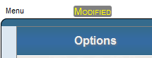
In such cases, save the dashboard as described in Saving a Dashboard.
-
Adding a Widget to a Dashboard
To add a widget to a dashboard, use the following general procedure:
-
Display the dashboard as described in Displaying Business Intelligence Dashboards.
-
If you make unrelated changes to the dashboard, and if you want to keep those changes, save them.
When you add a widget, the Dashboard Designer saves the dashboard with the newly added widget but discards other unsaved changes.
-
Do one of the following:
-
Click Menu > Add New Widget... — Use this option to add a new widget that does not include any configuration details.
-
Click Menu > Add Widget from Catalog.... — Use this option to reuse a configured widget that you previously saved to the widget catalog.
You can reconfigure this widget, if needed; you can change any detail except for the widget type. However, you generally use this option when you have saved widgets that are already configured in common ways for your needs.
-
Display the Dashboard Editor, click Widgets, and then click the plus sign button.
The system then displays a wizard where you select a widget and specify basic information for it.
-
-
Navigate to a widget type and (if applicable) subtype.
-
(For most types of widgets) Optionally specify of the following items:
-
Data Source — Select the data source for this widget. See Names of Data Sources and Kinds of Data Sources.
-
Link to — Select another widget on this dashboard to use as the source. See Linked Widgets.
Or specify a data source later, as described in Specifying the Data Source for a Widget.
-
-
Specify a name for Widget Name. Note that each dashboard widget must have a name.
-
Click OK to add the widget to your dashboard.
-
Optionally configure the widget. For information on specific types of widgets, see the following articles:
-
Optionally add controls to the widget. See Adding Widget Controls.
Overview of Widget Types
This section provides an overview of widget types.
Widget Types and Subtypes
After you add widgets, you can reconfigure them in any way other than modifying their type. Note that you can modify the subtype, if applicable. The system provides the following widget types and subtypes:
-
Pivot table widgets. This type of widget includes the table subtype and many chart subtypes.
Because there are so many chart options, charts are discussed separately from tables.
-
Meter widgets. This type of widget includes many meter subtypes.
-
Scorecard widgets. This type of widget includes two subtypes: regular and big.
-
Calendar widgets. This type of widget includes one subtype.
-
Map widgets. This type of widget includes one subtype.
-
Portlet widgets. The subtypes include any portlets that you define.
-
Controls widgets. This type of widget includes two subtypes: horizontal and vertical.
Comparison of Widget Types
For reference, the following table compares the key features of widgets, across the different widget types:
| Widget Type | Possible Data Sources | Print Option? | Export to Excel Option? | Mini Analyzer Option? | Drilldown Option? |
|---|---|---|---|---|---|
| pivot table widget | pivot table, KPI, or production business metric | Yes | Yes | Yes* | Yes* |
| meter | pivot table, KPI, or production business metric | Yes | No | Yes* | No |
| scorecard | pivot table, KPI, or production business metric | Yes | No | Yes* | No |
| calendar | none | No | No | No | No |
| map | pivot table, KPI, production business metric, or no data source | No | No | Yes* | No |
| controls widgets | pivot table, KPI, production business metric, or no data source | No | No | No | No |
*This option is available only if the data source is a pivot table.
For a portlet, all these details depend upon the implementation.
Reconfiguring a Widget
When you reconfigure this widget, you can change any detail except for the widget type. To select and reconfigure a widget on a given dashboard:
-
Display the dashboard as described in Displaying Business Intelligence Dashboards.
-
Display the Dashboard Editor.
-
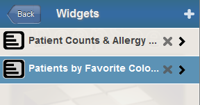
Click Widgets.
The system then displays a list of the widgets in the dashboard.
-
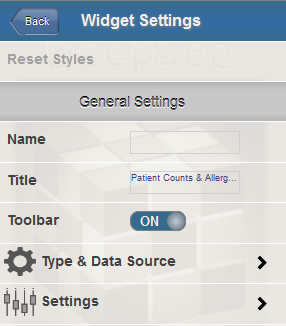
Click the name of the widget in this list. This action selects the widget.
The system then displays a list of settings that you can modify. In most cases, the list includes submenus. The following shows a partial example:
-
Optionally specify the following settings, which all widgets have:
-
Name — Specify a name for internal use within this dashboard. One widget can refer to other widgets (for example, to filter another widget). For these names, you might want to establish a set of naming conventions, for your convenience.
-
Title — Specify any text to display in the title bar of the widget.
Note that the dashboard can be configured to hide all title bars; see Modifying Dashboard Settings.
-
Toolbar — Configure the toolbar for this widget. See the first subsection for details on this submenu.
-
Sidebar — Configure optional sidebar text for this widget. See the second subsection for details on this submenu.
The other submenus list additional items, depending on the kind of widget you select. For information, see the following articles:
-
Toolbar Settings
Use this submenu to configure the toolbar for the widget. Specify the following options:
-
Toolbar — This option enables or disables the toolbar. Select ON or OFF.
When the toolbar is enabled, the system displays it if the widget is configured with any buttons or any controls that require it (but see the Show Maximized option). If the widget has none of these, the system does not display the toolbar.
When the toolbar is disabled, the system never displays the toolbar.
InterSystems recommends that you specify Toolbar as ON.
-
Bottom Border — This option displays or hides the bottom border of the toolbar. Select ON or OFF.
-
Show Maximized — If this option is ON, the system displays the toolbar only when the widget is maximized.
-
Toolbar Color — Select the color to use for the background of the toolbar. Or click X to restore the default color.
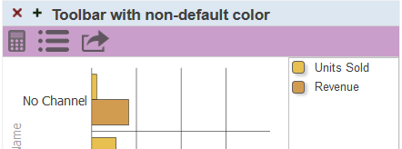
-
Toolbar Opacity — Use this option to specify the opacity of the toolbar. The default is 1 (which is 100%).
Sidebar Settings
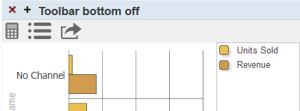
Use this submenu to configure optional sidebar text for the widget, which is displayed in a rectangle on the right side of the widget, as in the following example:
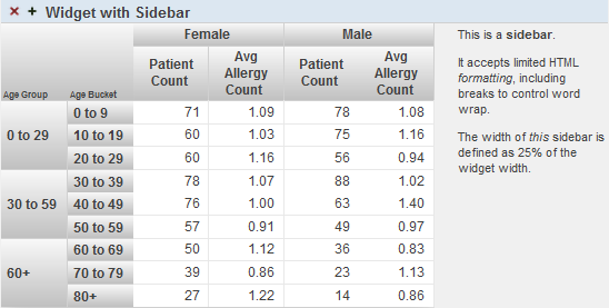
Specify the following options:
-
Sidebar — This option enables or disables the sidebar. Select ON or OFF.
-
Sidebar Content — Type the text to be displayed in the sidebar. You can include simple HTML markup such as the <p> and </p> tags, the <br> tag, the <i> and </i> tags, and the <b> and </b> tags.
If you enclose text in the <p> and </p> tags, that text is automatically wrapped as shown in the preceding example.
-
Sidebar Width — Specify the width of the sidebar. Specify either a number (which is interpreted as the width in pixels) or a number followed by % (which is interpreted as a percentage of the width of the entire widget).
Specifying the Data Source for a Widget
To specify the data source for a widget:
-
Access the Dashboard Editor and select the widget as described in Reconfiguring a Widget.
-
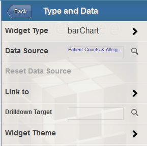
Click Type & Data Source.
The system then displays the Type and Data submenu.
-
Specify one of the following options:
-
Data Source — Select the data source for this widget. See Names of Data Sources and Kinds of Data Sources.
-
Link to — Select another widget on this dashboard to use as the source. See Linked Widgets.
-
Drilldown Target — This option enables the user to double-click a cell and access another dashboard. The newly opened dashboard is filtered by the context in which the user double-clicked. For example, if the user double-clicks in a cell that shows data for a specific city, the newly opened dashboard is filtered to that city.
To use this option, click the Search button
 , click a dashboard, and click OK.
Note that the Widget Type option enables you to choose a different widget subtype; it does not let you choose a type. See Widget Types and Subtypes, earlier in this page.
-
The following subsections provide details.
Names of Data Sources
When you specify the data source for a widget, you refer to that data source by name. This logic simplifies the process of deploying dashboards and pivot tables to end users. But it also means that if you rename items, you must update any dashboards that use those elements.
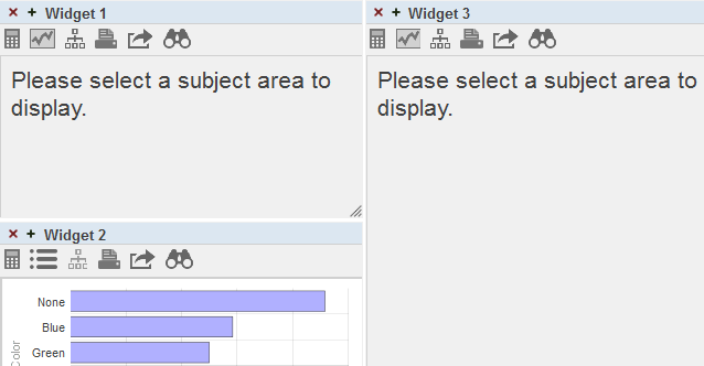
When you open a dashboard, if the system cannot find a data source that it uses, the system displays as much of the dashboard as possible. For example:
Kinds of Data Sources
With exceptions noted below, a dashboard widget can display data from any of the following data sources:
| Data source | Where created | For information, see |
|---|---|---|
| Pivot tables | Analyzer | Using the Analyzer |
| Detail listings | ||
| KPIs (key performance indicators) | IDE | Implementing InterSystems Business Intelligence |
| production business metrics (available only in an interoperability-enabled namespace) | IDE | Developing Productions |
Exceptions:
-
A detail listing can be displayed only in a pivot table widget (in table mode).
The kind of data source does not affect the appearance of the widget; for example, the user cannot tell if a given chart is displaying data from a pivot table, a KPI, or a business metric.
Note that some kinds of widgets do not use data sources.
Linked Widgets
When you specify the Link to option for a widget, you configure that widget as a dependent widget that is linked to another widget (an independent widget). The following rules govern linked widgets:
-
One independent widget can be linked to any number of dependent widgets in the same dashboard.
-
You cannot chain widgets; that is, Link to must be an independent widget rather than another dependent widget.
-
When you drill down on a row in the independent widget, the system also drills down in the dependent widgets.
-
If you filter the independent widget, the system also filters the dependent widgets. Any filters on the dependent widgets are ignored.
-
If you use the Mini Analyzer to redefine the independent widget, the system also redefines the dependent widgets.
Saving a Widget to the Widget Catalog
You can copy a widget (including all its configuration details) to the widget catalog. To do so:
-
Display the dashboard that contains the widget. See Displaying Business Intelligence Dashboards.
-
Display the Dashboard Editor.
-
Access the Dashboard Editor and select the widget as described in Reconfiguring a Widget.
-
Click Menu > Save Widget to Catalog ... .
The system displays a dialog box in which you specify details for the widget in the catalog.
-
Specify Folder, Widget Name, and other options. For information, see Adding a Widget to a Dashboard.
-
Click OK.
If you have already saved a widget with this name, in the given folder, the system prompts you to confirm that you want to overwrite the previously saved widget.
-
Click OK.
No change is made to the dashboard itself.
The saved copy does not include any local overrides. That is, if you have customized the pivot table by using the Mini Analyzer, those customizations are not included in the widget catalog.
Removing a Widget from a Dashboard
To remove a widget from a dashboard:
-
Display the Dashboard Editor.
-
If you make unrelated changes to the dashboard, and if you want to keep those changes, save them.
When you remove a widget, the Dashboard Designer automatically saves the dashboard, now without the removed widget. In this step, the Dashboard Designer discards other changes that you made and did not save.
-
Click Widgets.
-
Click the X button next to the widget name. The change is saved automatically.
Clearing the Autosave State of a Dashboard
If the autosave feature for the User Portal is enabled, then when you display a dashboard, the User Portal displays that dashboard with any unsaved changes that you might have made. To remove these unsaved changes, click Menu > Clear Autosave State. Then the User Portal displays the dashboard as defined in its saved definition.
Or save the dashboard, thus saving the changes and changing the definition. See the next topic.
Saving a Dashboard
To save the dashboard you are working on, do one of the following:
-
Click Save.
The system saves the dashboard immediately.
-
Click Menu > Save.
The system saves the dashboard immediately.
-
Click Menu > Save With Options....
Specify some or all of the following options and then click OK:
-
Folder — Specify the folder, if any, to which the dashboard belongs. Either type a folder name or select an existing folder. If desired, use the slash character (/) to specify a subfolder. For example, you can enter the following for Folder:
My Folder/My SubfolderDo not start the first folder name with a dollar sign ($); if you do, the dashboard definition is accessible only in your IDEOpens in a new tab.
-
Dashboard Name — Specify the name of the dashboard.
For information on the other options, see Modifying Dashboard Settings, earlier in this page.
-
Or use Menu > Save As.... See the next section.
Copying a Dashboard
To copy a dashboard, do the following:
-
Display the dashboard as described in Displaying Business Intelligence Dashboards.
-
Click Menu > Save As....
-
Specify the options as described in the previous section (and in Modifying Dashboard Settings)
-
Click OK.
Deleting a Dashboard
One way to delete a dashboard is as follows:
-
Display the dashboard as described in Displaying Business Intelligence Dashboards.
-
Click Menu > Delete Dashboard.
The system prompts you to confirm.
-
Click OK.
When you delete a dashboard, the system moves it into a folder named $TRASH, which the User Portal does not display.
Deleting a Dashboard in the User Portal
You can also delete a dashboard in the User Portal.
-
If the User Portal is in Covers View, click the dashboard cover and then click the X in the dialog box. Then click OK to confirm.
-
If the User Portal is in List View, click the X button in the row that lists the dashboard. Then click OK to confirm.
The User Portal does not display private dashboards. To delete a private dashboard, you must change it to be public and then delete it; see Modifying Dashboard Settings. Or delete the dashboard in the Folder Manager, which displays all items (both public and private); see Introduction to the Business Intelligence User Interfaces.