
Using the Pivot Analysis Window
This page describes how to use the Pivot Analysis window, which you can access via the Analysis button  on pivot table widgets.
Also see Accessing the BI Samples.
Using the Pivot Analysis Window
The system provides an analysis window that you can use for several specialized kinds of analysis. In each case, you first select one or more cells, and the analysis considers the lowest-level data associated with those cells. To access this window:
-
Select the data cells in the row or rows.
To select multiple cells, hold the Shift key down while selecting the cells.
To select an entire row, select the row label on the left. To select an entire column, select the column header.
The analysis option is not available for cells in a total row or a total column.
-
Select the Analysis button
.Depending on how the widget is configured, the system either provides a choice of analysis options or displays one of them without any choice.
-
(If applicable) For Analysis Option, select one of the following:
-
Cluster — Performs a cluster analysis.
-
Distribution — Performs a distribution analysis.
-
Regression — Performs a regression analysis.
Or select iKnow Plug-ins and then select one of the following:
-
Content Analysis — Performs a content analysis.
-
Entity Analysis — Performs a entity analysis.
The iKnow Plug-ins options are applicable only if your cube includes NLP measures.
-
The following sections provide the details.
This window is also available in the Analyzer.
Cluster Analysis
For background on the Pivot Analysis window, see Using the Pivot Analysis Window.
Cluster analysis or clustering is the assignment of a set of observations into subsets (called clusters) so that observations in the same cluster are similar in some sense. Clustering is a method of unsupervised learning, and is a common technique for statistical data analysis used in many fields, including machine learning, data mining, pattern recognition, image analysis, information retrieval, and bioinformatics.
For a cluster analysis, the top area of the page looks something like the following:
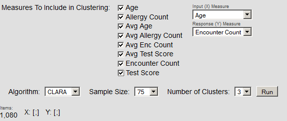
To use this page:
-
Specify details of the analysis in the top area of the page.
Details are beyond the scope of this book; it is assumed that the reader is familiar with cluster analysis.
-
Select Run.
The bottom area of the page displays the results. For example:
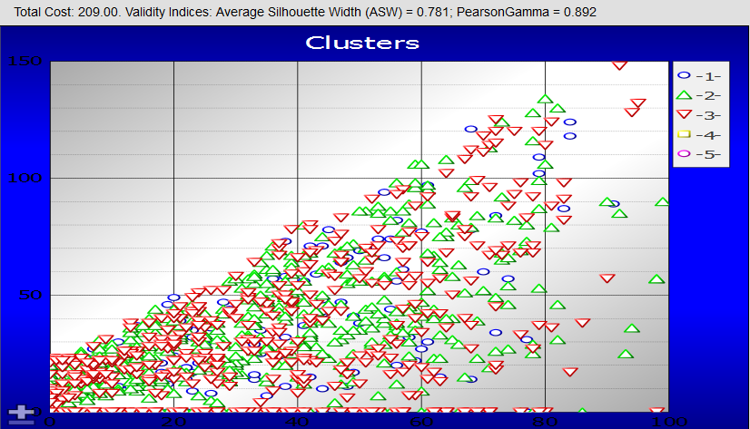
For general information on cluster analysis, see the Wikipedia page (https://en.wikipedia.org/wiki/Cluster_analysisOpens in a new tab). There are also many books available on this topic.
Distribution Analysis
For background on the Pivot Analysis window, see Using the Pivot Analysis Window.
A distribution analysis shows the number of occurrences of different values of specific measurement, across a set of records.
For a distribution analysis, the system displays something like the following:
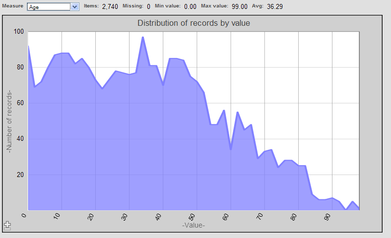
To use this page, select a measure (such as Age in this example).
The horizontal axis then shows all the values of this measure for the selected cells. For each measure value, the vertical axis shows the number of source records (for the selected cells) that have that value.
The top of the page shows the following values:
-
Items — Number of source records for the selected cells of the pivot table.
-
Missing — Number of source records (for the selected cells) that do not have a value for this measure.
-
Min value — Lowest value for this measure among these source records.
-
Max value — Highest value for this measure among these source records.
-
Avg — Average of these values.
Regression Analysis
For background on the Pivot Analysis window, see Using the Pivot Analysis Window.
A regression analysis attempts to determine the relationship between independent variables and a dependent variable. (The InterSystems IRIS Business Intelligence regression analysis considers only one independent variable.)
For a regression analysis, the system displays something like the following:
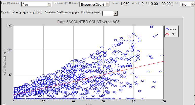
To use this page, specify the following details:
-
Input (X) Measure — Select the measure that you want to treat as independent (such as Age in this example). These values are shown on the horizontal axis.
-
Response (Y) Measure — Select the measure that you believe is dependent on the first measure (such as Encounter Count in this example). These values are shown on the vertical axis.
When you do so, the page displays a data point for each lowest-level record associated with the selected cells.
-
Fit — Select the type of fitting to perform:
-
line — Performs a linear regression.
-
exp — Performs an exponential regression.
-
log — Performs a logarithmic regression.
-
power — Performs a power regression.
-
-
Confidence Level — Optionally select the confidence level to use when calculating error bars for the values being determined.
In each case, the system determines the details of the equation that predicts Y as a function of X, and it plots the predicted X-Y curve on the page. The area above the chart displays details of the fit. For example, for a linear regression:

For another example, the page displays the following details for an exponential regression:

For general information on regression analysis, see the Wikipedia page (https://en.wikipedia.org/wiki/Regression_analysisOpens in a new tab). There are also many books available on this topic.
Text Analytics Content Analysis
For background on the Pivot Analysis window, see Using the Pivot Analysis Window.
The iKnow content analysis option displays information about the most typical and least typical unstructured text values. This analysis option is applicable only if your cube includes NLP measures.
For the content analysis, the system displays something like the following:
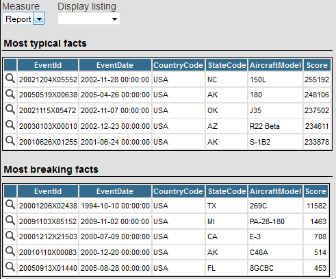
The Most typical facts section lists the records that have the most typical content, as determined by the Analytics Engine. The Most breaking facts section lists the records that have the breaking content. Breaking content is content in which the dominant entities in that source are least similar to the dominant elements of the group of sources. For more information, see Dominance and Proximity.
Each table lists the records and displays the fields listed in the selected detail listing.
On this page, you can do the following:
-
See the entire unstructured text for a given record. To do so, select the magnifying glass icon shown by that record.
-
Select a different NLP measure to analyze. To do so, select a choice for Measure.
An NLP measure is different from other kinds of measures and cannot be used in the same way as other measures. It is based on a source value that contains unstructured text such as a free-form text report. When you select an NLP measure to analyze here, you are examining results of the Analytics Engine for those source values.
-
Select a different detail listing to use. To do so, select a choice for Display Listing.
The system initially displays the listing named ShortListing (if that is defined) or the default listing for the subject area.
This example uses the Aviation Events sample.
Text Analytics Entity Analysis
For background on the Pivot Analysis window, see Using the Pivot Analysis Window.
The iKnow entity analysis option displays information about the entities in your unstructured text values. This analysis option is applicable only if your cube includes NLP measures.
For the entity analysis, the system displays something like the following:
This page provides three tabs, which display information about the records associated with the pivot table cells that you selected before you selected the Analysis button . These tabs work together as follows:
-
The Overview tab displays information for the 20 most common entities among those records. You use the Select by option to control how the system selects these entities; see the first subsection.
Select a rectangle in this chart to see further detail; see the next bullet item.
-
For a selected rectangle in the Overview tab, the Cell breakdown tab shows how that entity is distributed among the original pivot table cells. See the second subsection.
Select a bar in this chart to see further detail; see the next bullet item.
-
For a selected bar in the Cell breakdown tab, the Entities tab displays related entities. See the third subsection.
This example uses the Aviation Events cube demo in the BI samples.
Overview Tab
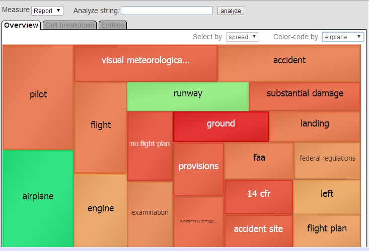
The Overview tab displays information about the top entities among the records associated with the pivot table cells that you selected before you selected the Analysis button . The chart on this tab displays one rectangle for each of the top 20 entities, according to your choice of metric.
Selecting the Top Entities
To determine how the system selects the top entities, select a metric from the Select by drop-down list. The options are as follows:
-
spread, the default, lists the top entities by their spread (total number of facts in which the entity appears).
-
BM25 lists the top entities using a frequency calculation algorithm in descending order by calculated BM25 score. It calculates this score using an algorithm based on the Okapi BM25 standard, which combines an entity's Term Frequency with its Inverse Document Frequency (IDF), taking into account document length.
-
TFIDF lists the top entities using a frequency calculation algorithm in descending order by calculated TFIDF score. It calculates this score by combining an entity’s Term Frequency (TF) with its Inverse Document Frequency (IDF). The Term Frequency counts how often the entity appears in a single source. The Inverse Document Frequency counts the number of times the entity appears in the collection of sources, and uses this overall frequency to diminish the Term Frequency. Thus an entity that appears multiple times in a small percentage of the sources is given a high TFIDF score; an entity that appears multiple times in a large percentage of the sources is given a low TFIDF score.
The BM25 and TFIDF options are computation-intensive and can take some time to complete.
Color Coding
The colors in this chart indicate how well each entity serves as an indicator for a given pivot table cell, based on the Naive Bayes probability for that entity, as follows:
-
If only one cell was originally selected in the pivot table, the colors indicate how well each entity serves as an indicator for that pivot table cell, compared to all other records.
-
If multiple cells were originally selected in the pivot table, the chart displays the Color-code by drop-down list, which lists the pivot table cells by name and includes the all option.
In this case, the colors indicate how well each entity serves as an indicator for the pivot table cell that is currently shown in the Color-code by drop-down list, compared to the records for all the other originally selected cells.
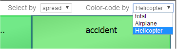
To use a different pivot table cell as the basis of comparison, select an option from the Color-code by drop-down list. For example:
The total option considers all the originally selected cells as a group.
Green generally denotes good indicators, and red denotes bad indicators. Solid green means that the term is a very good indicator, pale green means that the term is a good indicator, pale red means that it is a bad indicator, and solid red means that it is a very bad indicator. Note that in some cases, an entity is a bad indicator because it is common to all sources and thus does not enable you to discriminate categories of sources.
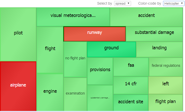
For example, suppose that we use a pivot table that displays aircraft type as rows. As the starting point for analysis, we select the pivot table cells Airplane and Helicopter. If we use Airplane to color-code, this chart looks as follows:
Notice that the entities airplane and runway are good indicators for the pivot table cell Airplane. The other entities (especially ground) are bad indicators.
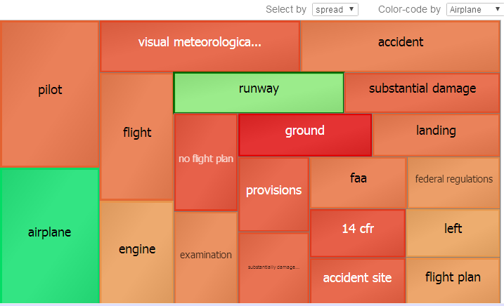
In contrast, if we use Helicopter to color-code, the chart would be colored as follows:
This shows that the entities airplane and runway are bad indicators for the pivot table cell Helicopter. The other entities (especially ground) are good indicators.
Other Options
On the Overview tab, you can also do the following:
-
Select a different NLP measure to analyze. To do so, select a choice for Measure.
An NLP measure is different from other kinds of measures and cannot be used in the same way as other measures. It is based on a source value that contains unstructured text such as a free-form text report. When you select an NLP measure to analyze here, you are examining results of the Analytics Engine for those source values.
-
Specify an additional string to analyze. To do so, type a string into Analyze string and then press analyze. The system then includes additional information for that string.
-
Select a rectangle in this chart to display a breakdown for the corresponding entity. See the next section.
Cell Breakdown Tab
The Cell breakdown tab is useful only if you started by selecting multiple cells of a pivot table.
This tab shows how an entity is distributed among the pivot table cells from which you started. When you select a rectangle in the Overview tab, the system displays the Cell breakdown tab with information for that entity.
The Cell breakdown tab looks like this:
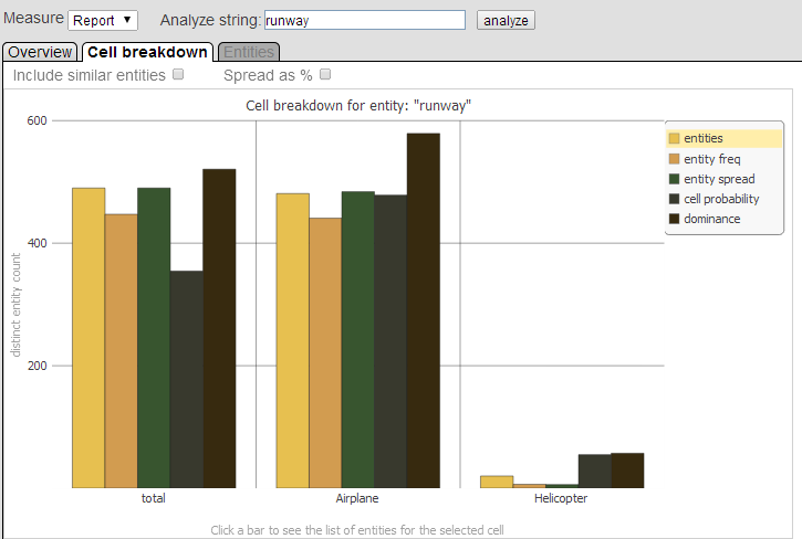
For the given entity, this tab shows how that entity is distributed among the pivot table cells that you selected before you selected the Analysis button. For each cell, the chart shows five color-coded bars, which display the following series:
-
entities — indicates the count of distinct, similar entities in records associated with the given pivot table cell or cells. This count includes all entities that are similar to the given entity.
-
entity freq — indicates the entity frequency; that is, the number of times the given entity occurred in records associated with the given pivot table cell or cells.
If you select Include similar entities, this calculation also includes similar entities.
-
entity spread — indicates the entity spread; that is, the total number of records in which the given entity appears, for the given pivot table cell or cells.
If you select Include similar entities, this calculation also includes similar entities.
-
cell probability — indicates how well the given entity serves as an indicator for the selected pivot table cell or cells, based on the Naive Bayes probability for that entity.
-
dominance — indicates how dominant the given entity is, within these records. For information, see Semantic Dominance.
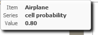
These series are scaled separately so the chart can show them all. The scale shown on the chart applies only to the entities series. To see the actual numeric value for any bar, hover the cursor over the bar. For example:
On this tab, you can do the following:
-
Select a different NLP measure to analyze. To do so, select a choice for Measure.
-
Include similar entities in the calculations for entity freq and entity spread. To do so, select Include similar entities.
-
Display entity spread % (the entity spread as a percentage of the total number of records) instead of entity spread. To do so, select Spread as %.
-
Specify an different string to analyze. To do so, type a string into Analyze string and then press analyze.
-
Select a bar in this chart to display related entities. See the next section.
Entities Tab
The Entities tab displays related entities in the given pivot table cell or cells. When you select a bar in the Cell breakdown tab, the system displays the Entities tab with the associated details.
The Entities tab looks like this:
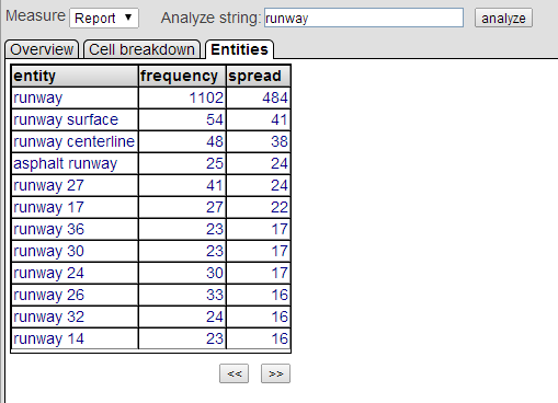
On this tab, you can do the following:
-
Select a different NLP measure to analyze. To do so, select a choice for Measure.
-
Specify a different string to analyze. To do so, type a string into Analyze string and then press analyze. The system then shows information for that string.
-
Page through the results. To do so, use the << and >> buttons.