Customizing the Appearance of a Chart Widget
The system provides a rich set of options that you can use to customize the appearance of a chart widget on a Business Intelligence dashboard. To access these options, access the Dashboard Editor, select the widget as described in Reconfiguring a Widget, and use the options in the Chart and Pivot section. The following submenus affect the appearance of a chart:
-
Chart Settings > Chart Type — Enables you to select a chart type.
-
Chart Settings > Size & Appearance — Provides options to control the chart overall.
-
Chart Settings > Titles & Labels — Provides options to control the text and formatting of titles and labels on the chart.
-
Chart Settings > No Data Warnings — Provides options to control an optional warning if there is no data to display.
-
Chart Settings > Colors & Style — Provides options to control colors and line styles in the chart.
-
Chart Settings > x Axis — Provides options to customize the text and formatting of the x-axis of the chart.
-
Chart Settings > y Axis — Provides options to customize the text and formatting of the y-axis or y-axes of the chart.
-
Chart Settings > Series Details — Provides options to customize how each series (row of the data source) is displayed.
-
Chart Legend — Provides options to disable, enable, and customize the chart legend.
The following subsections provide details.
The easiest way to systematically alter the appearance of dashboards is to define and use themes, which are discussed in Defining and Using Themes. Themes use the options described in many of the following subsections.
Size and Appearance Options
To customize the overall size and appearance of a chart, access the Dashboard Editor, select the widget as described in Reconfiguring a Widget, click Chart Settings > Size & Appearance, and use the options listed there. The following options are available:
-
Margins — Use this submenu to customize the margins of the chart. Use the Top, Left, Right, and Bottom sliders to separately control the top, left, right, and bottom margins. For each margin, use the Units setting to specify the margin either as a percentage of the widget size or in pixels.
Or specify Units as Auto to use the default margins.
-
Multiples — Select this option to display one chart for each series (row of the data source). For example:
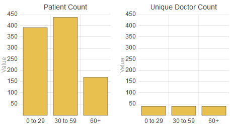
This option is recommended for pie charts and tree maps.
-
Pivot (applies only to charts that have x- and y-axes) — Select this option to switch the x- and y-axes.
-
Stacked (applies only to charts that have x- and y-axes) — Select this option to display the series (rows of the data source) in stacked form. For example:
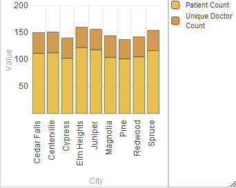
This option affects only the series that are displayed as bars.
-
Filled (applies only to line and area charts) — Select this option to control whether the system fills in the area below the series lines on the chart.
-
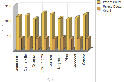
Appearance — Use this option to control whether the chart is displayed with a three-dimensional appearance. For example:
-
Zoom — Enable this option to display zoom buttons on the lower left of the chart. For example:

This option applies only to charts that have x- and y-axes.
-
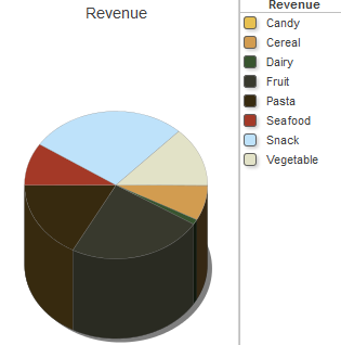
Pie Height (applies only to pie charts) — Use this option to control the height of the pie chart, if Appearance is 3D. For example:
-
Pie Size (applies only to pie charts) — Use this option to control the radius of the pie chart.
-
Pie Hole Size (applies only to pie charts) — Use this option to control the size of the pie hole. For example:
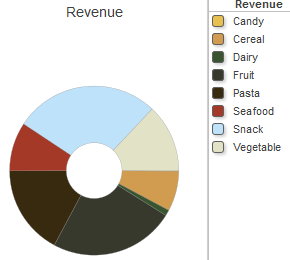
The default hole size is zero.
-
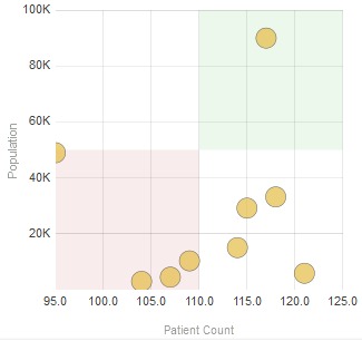
Quadrant (applies only to bubble charts) — Select this option to divide the chart into quadrants, marked by different colors. For example:
-
Radius (applies only to bubble charts) — Use this option to control the basic size of the bubbles in a bubble chart.
-
Opacity (applies only to bubble charts) — Use this option to control the opacity of the bubbles in a bubble chart.
-
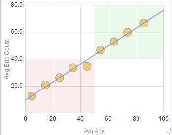
Regression (applies only to bubble charts) — Select this option to display a regression line on the chart. For example:
-
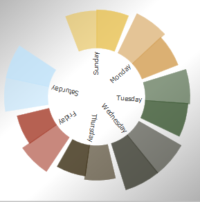
Separate Series Scale (applies only to swirl charts) — Controls the scaling of the wedges, in the case when the underlying pivot table has multiple columns. By default, the chart uses a single scale to determine the size of each wedge, and the wedge for the maximum of one column is likely to be different from the wedge for the maximum of another column. (For examples, see Plot By.)
If Separate Series Scale is On, the chart uses a separate scale for each column, and the maximum wedge for any column is the same size, as in the following example (which uses both Patient Count and Allergy Count as columns) :
-
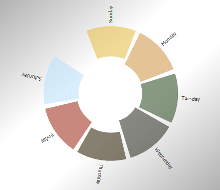
Invert (applies only to swirl charts) — Click On to display the labels in the outer area of the chart, rather than within the center. For example:
-
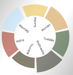
Gap (applies only to swirl charts) — Use this to control the size of the gaps between the wedges. The following shows an example with a minimal gap:
-
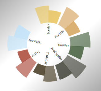
Plot By (applies only to swirl charts) — Controls how the wedges are colored; this is particularly useful if the underlying pivot table displays multiple columns. If you click items, the chart uses similar colors for the all wedges that belong to the same row in the pivot table on which this chart is based. For example, the following swirl chart is based on a pivot table that uses Patient Count and Allergy Count for columns. Notice that, for example, Sunday has two wedges of similar color; one is for Patient Count and the other is for Allergy Count.
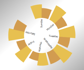
If you click series, the chart uses a single color for the all wedges that belong to the same column, so that the chart has a separate color for each column. For example, the following swirl chart is the same as the preceding except that Plot By is set to series:
Title and Label Options
To customize the titles and labels of a chart, access the Dashboard Editor, select the widget as described in Reconfiguring a Widget, click Chart Settings > Titles & Labels, and use the options listed there. The following options are available:
-
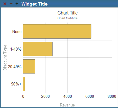
Title — Use this option to specify an optional title within the chart. For example:
-
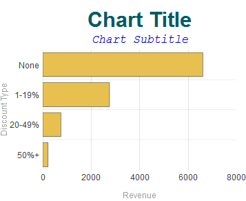
Title Style — Use this submenu to control the text style of the chart title. For example:
-
Subtitle — Use this option to specify an optional subtitle within the chart. See the example for Title.
-
Subtitle Style— Use this submenu to control the text style of the chart subtitle. See the example for Title Style.
-
Title Align — Use this option to control the alignment of the chart title and subtitle. These titles can be left-aligned, centered, or right-aligned.
-
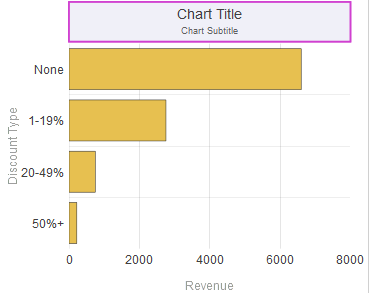
Title Box — Use this submenu to add an optional box around the chart title and subtitle. For example:
-
Title Image — Use this option to add an optional image to the title. For example:
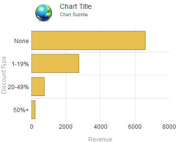
In this example, the titles are also left-aligned (see the Title Align option).
-
Image Width, Image Height, Image Top, and Image Left — Use these options to control the size and position of the optional title image.
-
Labels — Enable this option to display labels for the axes of the chart. The following shows a chart with labels displayed:

This example also uses the Value Labels option (which controls the labels shown at the top of each column).
To understand which labels are controlled by this option, recall that the axes of the chart are determined by the axes of the pivot table on which the chart is based. For example, the preceding chart is based on a pivot table whose x-axis (rows) displayed No Channel, Online, and Retail and whose y-axis (columns) displayed Revenue.
-
Label Style— Use this submenu to control the text style of the chart labels. For example:

-
Label Length— Use this option to specify the maximum length of the labels; any additional characters are truncated. For example:
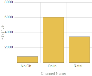
In this example, Label Length is 5.
-
Axis Title— Use this submenu to control the text style of the axis titles. For example:
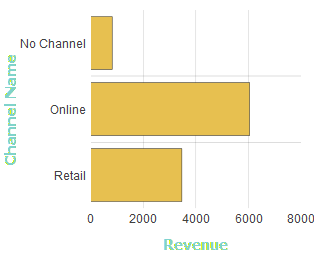
You can also separately control the style of the x-axis and the y-axis or y-axes.
-
Value Labels (applies only to bar charts) — Select this option to display a label above or next to each column, indicating the value displayed by the column. For examples, see Labels and Value Style.
-
Value Style— Use this submenu to control the text style of the value labels. For example:
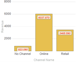
This example also uses a non-default option (#.###) for Value Format. See the next item.
-
Value Format— Use this option to control the numeric formatting of the value labels. See the example for Value Style.
No Data Warning
To customize the appearance of a chart when there is no data to display, select the widget as described in Reconfiguring a Widget, click Chart Settings > No Data Warning, and use the options listed there. The following options are available:
-
No Data Message — Type the message to display if there is no data to display in this chart.
-
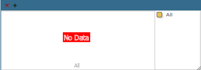
Warn if no data? — Select ON to display the given message if there is no data. The message is shown in a box in the widget as shown after this list. The default is OFF.
-
Background opacity — Specify the opacity of the background of the box that contains the given message. The value 1 means 100%.
-
Background color — Select the color of the box that contains the given message.
-
Message color — Select the color of the message.
The following shows an example:
Color and Style Options
To customize the colors and line styles in a chart, access the Dashboard Editor, select the widget as described in Reconfiguring a Widget, click Chart Settings > Colors & Style, and use the options listed there. The following options are available:
-
Series Scheme — Select a scheme, which is a set of colors to use for the series shown in this chart.
-
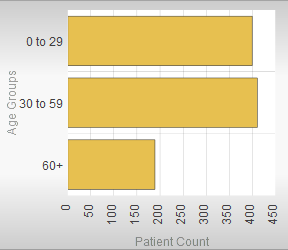
Background — Use this submenu to specify the style of the background that surrounds the chart. For example:
-
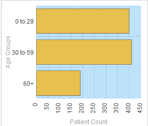
Plot Area — Use this submenu to specify the style of the plot area of the chart. For example:
-
Plot Style — Use this submenu to specify the style of the series that are plotted in the chart. This submenu affects only bar charts, area charts, and pie charts.
For example:
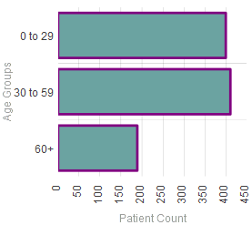
The Plot Style menu treats all series in the same way. Also note that this menu overrides the options in Chart Settings > Series Details; see Series Details.
-
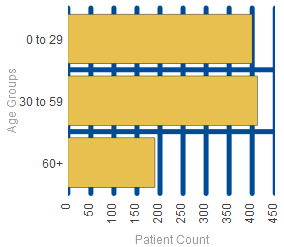
Grid Style — Use this submenu to specify the style of the grid (if any) displayed within the chart. For example:
-
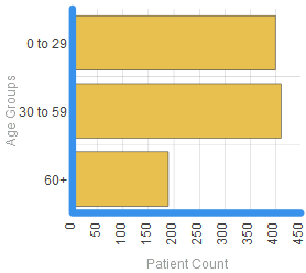
Axis Line Style — Use this submenu to specify the style of the axis lines. For example:
-
Base Line Style — Use this submenu to specify the style of the base line (if any) in the chart.
For example:
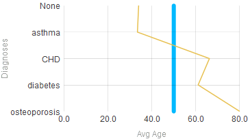
To specify a base line, see the Base Value option in the next section.
-
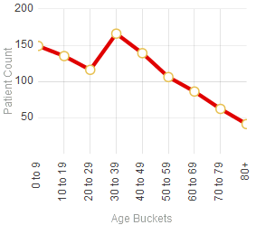
Line Style — Use this submenu to specify the style of the lines (if any) displayed in the chart. For example:
-
Markers Visible — Enable this option to display markers in the chart.
-
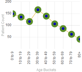
Marker Style — Use this submenu to specify the style of the markers (if any) displayed in the chart. For example:
-
Marker Size — Use this option to modify the size of the markers (if any).
-
Indicators Visible — Enable this option to display crosshairs when a user selects an item in the chart. For example:
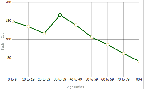
-
Indicator Style — Use this submenu to specify the style of the indicator (if any) displayed in the chart. See the previous item.
-
Band Upper — Type a value to define an upper area of this axis that is styled as a band. The following example uses both Band Upper (specified as 60) and Band Lower (specified as 20):
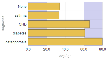
-
Upper Style — Use this submenu to specify the style of the upper band, if any.
-
Band Lower — Type a value to define a lower area of this axis that is styled as a band. See the example for Band Upper.
-
Lower Style — Use this submenu to specify the style of the lower band, if any.
-
Stripes — Use this option to add stripes to this axis. For example:
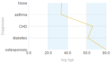
This example also uses Stripe Style.
-
Stripe Style — Use this submenu to specify the style of the stripes, if any.
-
Border Style — Use this submenu to specify the style of the border of the chart. The border surrounds the plot area, and is enclosed by the background. The following shows an example:
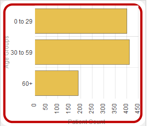
This example also uses a non-default value for Border Radius, discussed later in this list.
-
Border Offset — Use this option to modify the position of the border, relative to the background.
-
Border Radius — Use this option to modify the radius of the corners of the border. By default, these corners are right angles. For a non-default example, see Border Style.
-
Data-driven Colors, Termlist option — Use this option to specify a set of CSS colors to use for specific series in this widget. To use this option, first use the Term List Manager (see Defining Models for InterSystems Business Intelligence) and define a term list as follows:
-
The key for each item must be the exact display name of a series in this widget.
-
The value for the item must be a CSS color value. You can use any legal CSS color name. You can find these at https://www.w3.org/TR/css3-color/Opens in a new tab and other locations on the Internet.
The following shows an example:
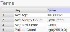
Then, for the Data-driven Colors, Termlist option, type the exact name of the term list.
If this term list does not include a term for a given series in the widget, the system displays that series in gray.
Note that this feature does not provide any support for localization.
-
For details on the submenus, see Specifying Line Styles.
x-Axis Options
To customize the x-axis of a chart, access the Dashboard Editor, select the widget as described in Reconfiguring a Widget, click Chart Settings > x Axis, and use the options listed there. The following options are available:
-
Axis Title — Specify the title to use on the x-axis. By default, this title is taken from the data source.
-
Major Grid — Use this option to enable or disable lines that mark major positions on the x-axis. By default, these lines are on.
-
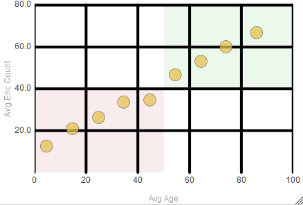
Major Style — Use this submenu to customize the style of the lines that mark major positions on the x-axis. In the following example, Major Style is specified for both the x- and y-axes:
-
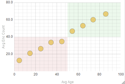
Minor Grid — Use this option to enable or disable lines that mark minor positions on the x-axis. By default, these lines are off. In the following example, these lines are on for both the x- and y-axes:
-
Minor Style — Use this submenu to customize the style of the lines that mark minor positions on the x-axis.
-
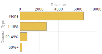
Label Position — Specifies the position (top or bottom) of the x-axis. By default, this axis is on the bottom. The following shows this axis at the top of the chart:
-
Label Style — Use this submenu to specify the text style of the labels of the x-axis. For example:
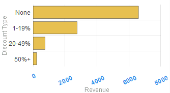
This example also uses the Label Angle option.
-
Label Angle — Use this option to specify the angle of the labels of the x-axis. See the example for Label Style.
-
Axis Type — Optionally select % to express the values on the x-axis as percentages. If you select this option, the system multiplies the values by 100 and displays % at the end of each value.
-
Min Value — Use this option to specify the minimum x value shown in the chart. If you use this option, the chart is rescaled to start at this minimum x value, and lower data points are ignored.
-
Max Value — Use this option to specify the maximum x value shown in the chart. If you use this option, the chart is rescaled to end at this maximum x value, and higher data points are ignored.
-
Base Value — Use this option to add a reference line at the given value. For example, the following chart has a reference line at the value of 50:

This example also uses the Base Line Style option in Chart Settings > Colors & Style; see the previous section.
The same options are available when you customize a y-axis.
y-Axis or Axes Options
To customize the y-axis or y-axes of a chart, access the Dashboard Editor, select the widget as described in Reconfiguring a Widget, click Chart Settings > y Axis, and use the options listed there. This menu lists the y-axes currently defined in this chart. For example:
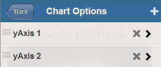
Here, you can do the following:
-
Add a y-axis. To do so, click the plus sign button. The system immediately adds a y-axis.
-
Remove a y-axis. To do so, click the X button in the row for that axis.
-
Rearrange the y-axes. To do so, drag the axis handles to the left of the axis names.
-
Customize a y-axis. To do so, click its name to display a submenu of options. For details on this submenu, see the previous section.
Some options, include Major Grid, Major Style, Minor Grid, and Minor Style, are supported only for the primary y-axis.
Series Detail Options
The system uses a default set of colors that it uses for each series (a row in the data source). You can override these. For line charts, you can also customize the markers used for the data points.
To customize how each series is displayed in a chart, access the Dashboard Editor, select the widget as described in Reconfiguring a Widget, click Chart Settings > Series Details, click a series, and then use the options listed there.
For each series, you can modify the following options (depending on the chart type):
-
Color — Specify the color for this series.
For information on specifying colors, see Specifying Table Text Styles.
-
y Axis — Specify the y-axis with which to associate this series (either 1 or 2).
Note that both y-axes are displayed in the same position by default. To change this position; see the Label Position option in Chart Settings > Y Axis.
-
Plot Type (combo charts) — Specify the plot type to use for this series.
-
Marker Shape (line, area, combo, and time charts) — Specify the marker shape to use for data points displayed in this series.
The following shows an example:
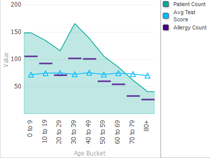
Chart Legend Options
To customize the legend of a chart, access the Dashboard Editor, select the widget as described in Reconfiguring a Widget, click Chart Legend, and use the options listed there. The following options are available:
-
Position — Select an option to specify the location (if any) of the chart legend. Select right, left, top, bottom, or none.
-
Title — Specify the title to show in the chart legend, if you want to override the default title, which is based on the chart definition.
-
Show Title — Select ON to display the chart legend title. Or select OFF to hide it.
-
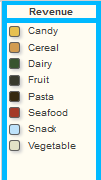
Border — Use this submenu to specify the border around the chart legend. The following shows an example:
-
Background — Specify the color of the background of the chart legend. See the preceding example.
-
Opacity — Specify the opacity of the chart legend. The value 1 means 100%.
-
Font — Specify the typeface of the chart legend.
-
Font Size — Specify the size of the text of the chart legend.
-
Text Color — Specify the style of the text of the chart legend. The following shows an example that uses this option and other style options:

-
Text Style — Specify the style of the text of the chart legend.
-
Padding — Specify the horizontal and vertical padding before and after the legend.
-
Width — Specify the width of the legend.
-
Height — Specify the height of the legend.
-
Show Box Shadow — Control whether the legend displays a faint shadow for each box in the legend. The shadow is displayed by default. The following magnified view shows an example:

If Show Box Shadow is OFF, the same legend appears as follows:
