
Adding Chart Widgets
This page describes how to add charts to a Business Intelligence dashboard.
Also see Specifying Widget Settings for a Pivot Table Widget, as well as Customizing the Appearance of a Chart Widget.
Adding a Chart Widget
To add a chart widget:
-
Click Menu > Add New Widget....
-
Click Pivots and Charts.
-
Click a chart type.
-
For Data source, do one of the following:
-
Click the Search button
 and then select a data source.
 -
Use the Link to drop-down list to select another widget on the same dashboard.
Note:If you use a pivot table as the data source, note that pivot tables are created in the Analyzer, discussed in Using the Analyzer. The Analyzer provides options for changing the state of the pivot table: filtering, drilling down, displaying listings, and displaying in chart format. When you save a pivot table, the system saves the state as part of the pivot table definition. The next time the pivot table is accessed (either in the Analyzer or in a widget on a dashboard), the system displays the pivot table in that state.
-
-
Optionally specify the basic settings, as described in Adding a Widget to a Dashboard.
-
Click OK.
-
Optionally customize the chart type, as described in the next section.
-
Optionally configure the widget further as described in the rest of this page.
-
Optionally add controls, as described in Adding Widget Controls.
Customizing the Chart Type
You can reconfigure a chart widget to use a different chart type. To do so:
-
Access the Dashboard Editor and select the widget as described in Reconfiguring a Widget.
-
Click Chart Settings.
-
Click Chart Type.
-
Click a type.
You can also use these steps to reconfigure a pivot widget to display a chart.
Chart Requirements
A chart is usually more useful if the data source uses members as rows and uses measures as columns.
Notes:
-
If you use a pivot table that has a summary row or summary column, that row or column is ignored.
-
Many of the chart types are also available in the Analyzer, where you can preview them before adding them to a dashboard.
-
Except in the case of line charts and time charts, only the first 400 chart items are displayed.
Available Chart Types
The following subsections show examples of the available chart types:
Bar and Column Charts
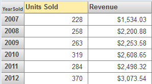
The system provides several styles of bar and column charts, both horizontal and vertical. One group of bars is created for each row of the data source. In a group of bars, each bar displays a different measure. The following example shows a chart with one measure:
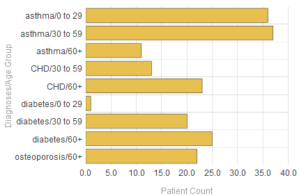
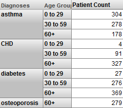
This chart is based on the following pivot table:
Line and Area Charts
The system provides two line charts and an area chart. For each of these, the horizontal axis has one label for each row of the data source. One line is created for each column of the data source. (For the area chart, the area below the line is filled in.)
The following shows an example:
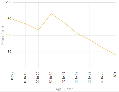
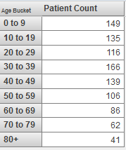
This chart is based on the following pivot table:
Combo Charts
Combo charts are available only in dashboards, not in the Analyzer.
The InterSystems IRIS Business Intelligence combo chart is similar to the preceding charts, but provides two unique features:
-
It can have multiple y-axes.
-
It can use different display types for different columns of the data source. The system automatically displays lines in the foreground, bars behind the lines, and areas behind the bars.
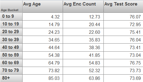
The following chart demonstrates both features:
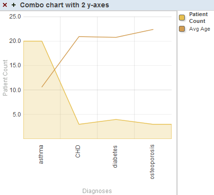
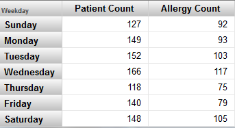
Notice that the y-axis is labeled Patient Count. The filled area that displays the Patient Count measure is scaled to match the values on this axis. In contrast, the line that displays Avg Enc Count does not correlate with the y-axis — this line is only scaled overall to fit within the chart.
To use a combo chart, the user clicks the box next to the name of a series, in the key. If we click the box next to Avg Age, the labels on the y-axis change as follows:
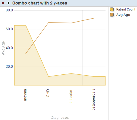
This chart is configured so that for the first series, y-Axis is 1, and for the second series, y-Axis is 2.
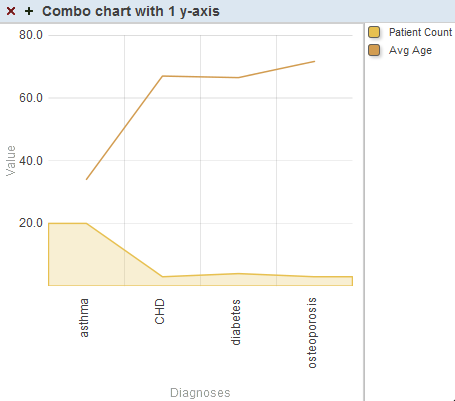
In contrast, if y-Axis is the same for both series, we would see the following (in which all the items are drawn to the same scale):
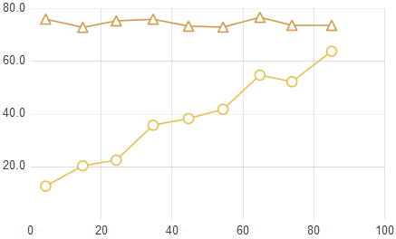
High Low Charts
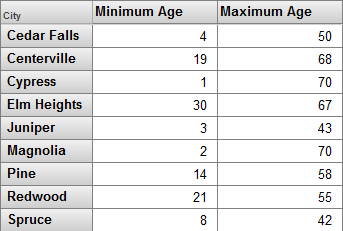
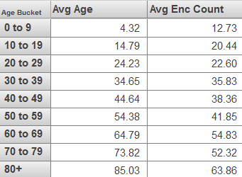
A high low chart is similar to a bar chart but instead uses each bar to display a low value and a high value. It requires at least two columns in the data source. It displays one bar for each row of the data source. The upper and lower values are determined by the first two columns in the data source. For example:
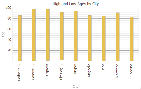
This chart is based on the following pivot table:
If there is a third column, the chart displays a triangle for that value. For example:
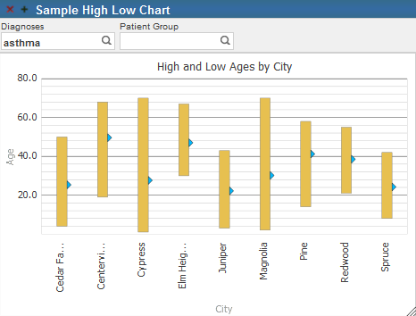
In this case, the third column displays the average values.
Other columns are ignored.
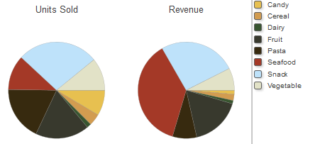
Pie Charts
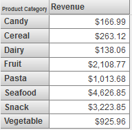
A pie chart displays one wedge for each cell of the data source. The area of each wedge is proportional to the value in the cell. If the data source displays only one column, a pie chart might look like this:
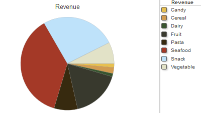
This chart is based on the following pivot table:
If you enable the Show Multiples option, the widget displays one chart for each column of the data source. The chart displays one wedge for each cell in that column. For example:
X/Y Charts
An X/Y chart plots one value on the x-axis and another value on the y-axis. The data source must have at least two columns. The chart displays a data point for each row of the data source, and it connects these data points with lines.
The first column determines the horizontal position of the data point, and the second column determines the vertical position. The following shows an example:
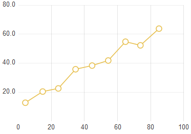
This chart is based on the following pivot table:
If the underlying pivot table contains additional columns, they are used to create additional sets of connected data points on the chart. That is, for each additional column, the chart contains a set of data points at the same horizontal positions. For example:
This chart is based on the following pivot table:
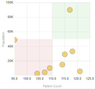
Bubble Charts
Bubble charts are available only in dashboards, not in the Analyzer.
A bubble chart is similar to the X/Y chart. It plots one value on the x-axis and another value on the y-axis. The data source must have at least two columns. The chart displays an elliptical bubble for each row of the data source. The measures are used as follows:
-
The first column determines the horizontal position of the bubble.
-
The second column determines the vertical position.
-
The third column, if included, determines the radius of the bubble.
-
The fourth column, if included, controls additional colorization that is added to the bubbles. All data rows that have the same value for the fourth measure are shown in the same color.
-
The fifth column, if included, determines the opacity of the bubble.
Other columns are ignored.
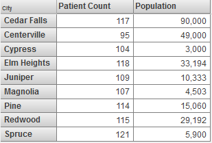
The following example shows a bubble chart that uses two columns:
This chart is based on the following pivot table:
Time Charts
Time charts are available only in dashboards, not in the Analyzer.
A time chart is useful for displaying values over time. For this kind of chart, the data source must have time members (such as years) for rows. The following shows an example:
This chart is based on the following pivot table:
Time charts are supported only for levels that are based on the following time functions: DayMonthYear, MonthYear, WeekYear, and Year. Also, time charts are not recommended for spans of time greater than approximately ten years.
Tree Maps
Tree maps are available only in dashboards, not in the Analyzer.
A tree mapOpens in a new tab has one rectangle divided into smaller rectangles, each of which corresponds to one cell in the data source. The area of each rectangle is proportional to the value in the cell. If the data source displays only one measure, a tree map might look like this:
This tree map uses the following pivot table:
If the data source has multiple columns, be sure to enable the Show Multiples option. In this case, the widget displays a subdivided rectangle for each column.
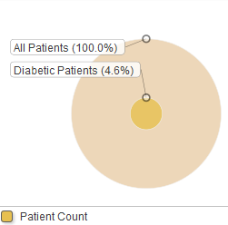
Bullseye Charts
Bullseye charts are available only in dashboards, not in the Analyzer.
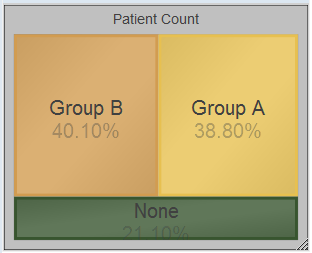
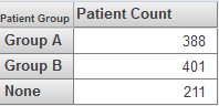
A bullseye chart can be useful to demonstrate the size of a set relative to a larger set. The following shows an example:
This chart is based on the following pivot table:
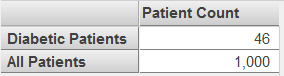
If the data source has multiple columns, be sure to enable the Show Multiples option. In this case, the widget displays a subdivided circle for each column in the data source.
Swirl Charts
Swirl charts are available only in dashboards, not in the Analyzer.
A swirl chart is similar to a pie chart. It displays one wedge (or group of wedges) for each row of the underlying pivot table. The following shows an example:
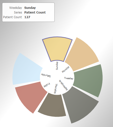
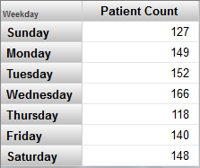
This chart is based on the following pivot table:
If the underlying pivot table has multiple columns, the swirl chart includes multiple wedges for any given row. For example:
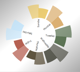
This chart is based on the following pivot table:
Displaying a Production Business Metric
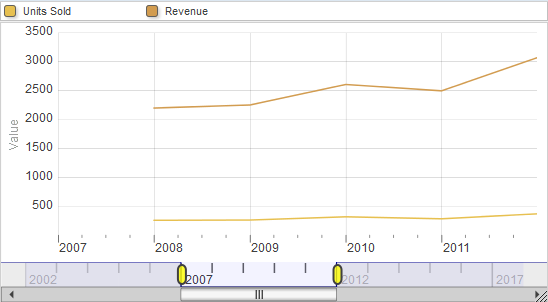
This section discusses suitable ways to display production business metrics in charts. There are four general possibilities:
-
The metric defines only one instance (the default) and does not define AUTOHISTORY for any of the properties. In this case, when you display the metric as a pivot table, it appears with one row as follows:
In this case, any kind of chart is suitable.
-
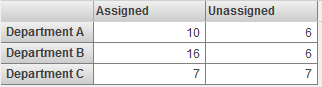
The metric defines multiple instances and does not define AUTOHISTORY for any of the properties. In this case, when you display the metric as a pivot table, it appears as follows:
In this case, the most suitable chart types are bar and column charts and combo charts.
-
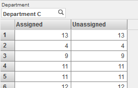
The metric defines only one instance (the default) and defines AUTOHISTORY for some or all of the properties. In this case, when you display the metric as a pivot table, it appears as follows:
In this case, the most suitable chart types are bar and column charts, line charts, and combo charts.
Or, if a given property does not specify AUTOHISTORY, the column for that property is empty except for the last row. You might prefer to display only the properties that specify AUTOHISTORY. To do so, you can add a filter control and filter the data to show only those properties. Note that you can hide this control from the user.
-
The metric defines multiple instances and defines AUTOHISTORY for some or all of the properties. In this case, when you display the metric as a pivot table, the AUTOHISTORY is ignored by default, and the metric appears as follows:
In this case, the most suitable chart types are bar and column charts and combo charts.
To force the metric to display the AUTOHISTORY, you can add a filter control and filter the data to show only one instance. Note that you can hide this control from the user. When filtered to display one instance, the metric appears as follows:
In this case, the most suitable chart types are bar and column charts, line charts, and combo charts.