
Adding Meter Widgets
This page describes how to add meter widgets to a Business Intelligence dashboard.
Adding a Meter Widget
To add a meter widget:
-
Click Menu > Add New Widget....
-
Click Meter.
-
Click a meter type.
-
For Data source, do one of the following:
-
Click the Search button
 and then select a data source.
 -
Use the Link to drop-down list to select another widget on the same dashboard.
Most InterSystems IRIS Business Intelligence data sources can have multiple rows and columns. When you display any of these in a meter widget, the widget uses only the first row of data. Any additional rows are ignored.
-
-
Optionally specify the basic settings, as described in Adding a Widget to a Dashboard.
Also see Basic Meter Options, in this page.
-
Click OK.
-
Add at least one property, as described in Adding Properties.
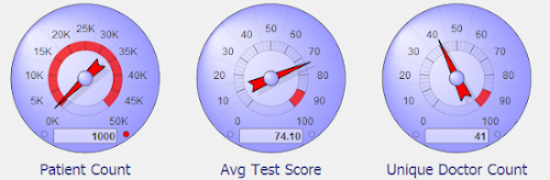
This property becomes a meter within the meter widget. For example, the following meter widget has three properties:
By default, the type of each meter is the same as the type of the parent meter widget, but you can modify the type for individual meters.
For additional details, see the following subsection.
-
Optionally configure the widget further as described in the rest of this page, which discusses the following kinds of meters:
For examples and a comparison, see the next section.
-
Optionally add controls, as described in Adding Widget Controls.
Data Sources, Properties, and Meters
A meter widget has multiple properties, each of which is displayed as a separate meter within the widget. Consider the preceding example, which shows a widget with three properties, each shown in a separate speedometer.
Most InterSystems IRIS Business Intelligence data sources can have multiple rows and columns. When you display any of these in a meter widget, the widget uses only the first row of data. Any additional rows are ignored.
For the first row of data, each column of the data source can be displayed as a property of the meter widget, that is, as a separate meter within the widget. In the examples shown here, all the meters in a meter widget are of the same type, but you can configure the widget to use different types within a single widget.
Specifying Widget Settings for a Meter
For a meter, the Widget Settings menu has the following options:
-
Print — Select this option to include the Print button
 on the toolbar. This button enables users to print the widget to a PDF file. For further details and requirements, see the section Customizing Print Settings for a Widget.
 -
Analyzer — Select this option to include the Mini Analyzer button
 on the toolbar. This button enables the users to open the data source in the Mini Analyzer.
 This option is supported only when the data source is a pivot table.
This menu includes additional options that control the look of the meter; the options depend on the kind of meter. The rest of the article provides the details.
These options add a button to the toolbar. If you use these options, be sure the toolbar is visible (its display is controlled via the Toolbar option in Settings). See Reconfiguring a Widget.
Meter Types
The system provides the following types of meter:
| Meter Type | Example | Basics | Notes |
|---|---|---|---|
| Speedometer | 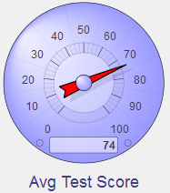 |
Range options control the possible positions of the needle |
|
| Text meter | 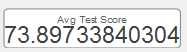 |
Meter displays the actual value and a label | |
| Fuel gauge |  |
Range options control the possible positions of the needle |
|
| Traffic light | 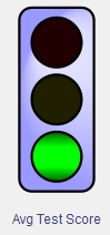 |
Threshold options control the use of the three lamps |
|
| Light bar | 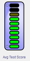 |
Range options control the bars and their colors |
|
| Smiley face | 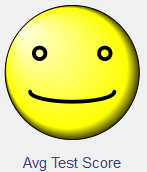 |
Range options control the possible shapes of the smile or frown |
|
Basic Meter Options
For any meter widget, you can customize a set of basic options. To customize the widget, access the Dashboard Editor, select the widget as described in Reconfiguring a Widget, click Meters, and use the options listed there. The following submenus are available:
-
Settings — Use this submenu to customize the entire meter widget. This submenu provides the following options:
-
Format — Select an option to control the numeric formatting of all meters in this meter widget. For example:
-
Analyzer — Use this option to control whether this widget displays the Mini Analyzer
button. This option is supported only when the data source is a pivot table.
-
High value color — Select the color to use for the section of the meter that displays values higher than the Upper Threshold option, which you specify in the meter name submenu.
This option applies only to speedometers.
-
Low value color — Select the color to use for the section of the meter that displays values lower than the Lower Threshold option, which you specify in the meter name submenu.
This option applies only to speedometers.
-
Background color — Select the color to use for the background around the meter widget.
-
Background opacity — Use this option to specify the opacity of the background. The value 1 means 100%.
-
-
meter name — Use this submenu to customize an individual meter (property) within the meter widget. This submenu provides the following options:
-
Type — Select the meter type. The default type is the meter type that you specify in the parent widget, as described in the previous section.
-
Data Property — Select the property to display in this meter.
-
Label — Specify the label for this meter.
-
Label Style — Use this submenu to specify the color, font size, typeface, and so on for the label of this meter. For example:
-
Apply Style to All Meters — Use this option to copy the styles from this meter to all other meters within this meter widget.
Other options depend on the kind of meter; see the following sections:
-
The easiest way to systematically alter the appearance of dashboards is to define and use themes, which are discussed in Defining and Using Themes. Themes use many of the options described in this page.
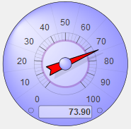
Customizing Speedometers
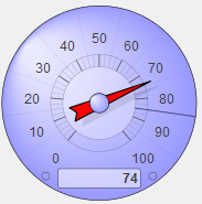
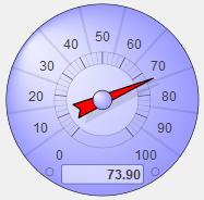
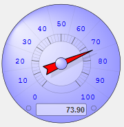
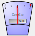
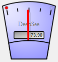
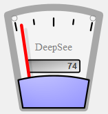
The speedometer is a round gauge with a needle that moves from lower left, all the way around to lower right, to indicate a value within a specific range. The gauge has tick marks with numeric labels. In the following example, the gauge extends from 0 to 100:
The speedometer includes an odometer box at the bottom; this box always displays the actual value from the data source, even if that value does not fall within the range of the gauge.
To customize a speedometer, access the Dashboard Editor, select the widget as described in Reconfiguring a Widget, click Meters, click a meter name, and use the options listed there. The following options are available:
-
Common options — See Customizing Meters, earlier in this page.
-
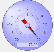
Upper Range and Lower Range — Use these options to specify the lowest and highest numbers displayed on the speedometer gauge. In the following example, these options are 20 and –20, respectively.
-
Upper Threshold — Use this option to specify the upper threshold value for the speedometer gauge; values above this are displayed in a contrasting color. In the following example, this option is 100:
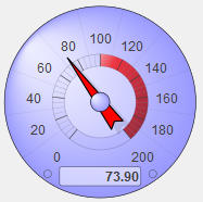
Use the Widget Settings menu to control the color used in the threshold area. See Customizing Meters, earlier in this page.
-
Lower Threshold — Use this option to specify the lower threshold value for the speedometer gauge; values below this are displayed in a contrasting color. In the following example, this option is 50:
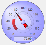
Use the Widget Settings menu to control the color used in the threshold area. See Customizing Meters, earlier in this page.
-
Target Value — Use this option to add a target line to the speedometer gauge. For example:
-
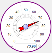
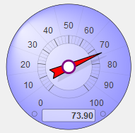
Outer Circle — Use this submenu to specify the color and style of the outer circle of the speedometer. For example:
-
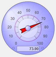
Mid Circle — Use this submenu to specify the color and style of the middle circle of the speedometer. For example:
-
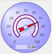
Ring — Use this submenu to specify the color and style of the ring just within the middle circle. For example:
-
Inner Circle — Use this submenu to specify the color and style of the inner circle. For example:
-
Nub — Use this submenu to specify the color and style of the nub at the center of the speedometer. For example:
-
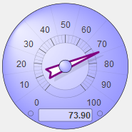
Needle — Use this submenu to specify the color and style of the needle. For example:
-
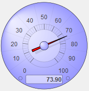
Thin Needle — Use this option to display a thin needle. For example:
-
Separator — Use this submenu to specify the color and style of the separators that radially divide the speedometer. For example:
-
Odometer Box — Use this submenu to specify the color and style of the odometer box. For example:

-
Odometer — Use this submenu to specify the color and style of the value shown in the odometer box. For example:

-
Value Style — Use this submenu to specify the color and style of the values marked on the speedometer gauge. For example:
The easiest way to systematically alter the appearance of dashboards is to define and use themes, which are discussed in Defining and Using Themes. Themes use many of the options described in this page.
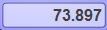
Customizing Text Meters
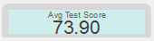
The text meter displays the given value as text:
To customize a text meter, access the Dashboard Editor, select the widget as described in Reconfiguring a Widget, click Meters, click a meter name, and use the options listed there. The following options are available:
-
Common options — See Customizing Meters, earlier in this page.
-
Background — Use this submenu to customize the outline and fill of the meter. For example:
-
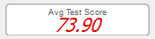
Fill — Use this submenu to customize the appearance of the value shown in the meter. For example:
-
Low Style — Use this submenu to customize the appearance of the value, when the value is below Lower Threshold.
-
High Style — Use this submenu to customize the appearance of the value, when the value is above Upper Threshold.
The easiest way to systematically alter the appearance of dashboards is to define and use themes, which are discussed in Defining and Using Themes. Themes use many of the options described in this page.
Customizing Fuel Gauges
The fuel gauge is a narrow, vertical gauge with a needle that moves from left to right to indicate a value within a specific range (specified by Lower Range and Upper Range). The gauge distributes marks or “ticks” proportionally across its range, with Lower Range at left.
The fuel gauge displays its current value in a text box at the center of the gauge.
To customize a fuel gauge, access the Dashboard Editor, select the widget as described in Reconfiguring a Widget, click Meters, click a meter name, and use the options listed there. The following options are available:
-
Common options — See Customizing Meters, earlier in this page.
-
Upper Range and Lower Range — Use these options to specify the range of values represented by tick marks on the fuel gauge.
-
Upper Threshold — Use this option to add a warning light to the right end of the meter. This warning light changes color when the meter value is equal to or greater than Upper Threshold. For example:
-
Lower Threshold — Use this option to add a warning light to the left side of the meter. This warning light changes color when the meter value is equal to or lower than Lower Threshold. For example:
-
Body Style — Use this submenu to control the outline and fill of the meter. For example:
The easiest way to systematically alter the appearance of dashboards is to define and use themes, which are discussed in Defining and Using Themes. Themes use many of the options described in this page.
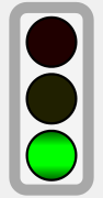
Customizing Traffic Lights
The traffic light consists of three round lamps in a column. From top to bottom, the lamps are red, yellow, and green.
To customize a traffic light, access the Dashboard Editor, select the widget as described in Reconfiguring a Widget, click Meters, click a meter name, and use the options listed there. The following options are available:
-
Common options — See Customizing Meters, earlier in this page.
-
Upper Range, Lower Range, Lower Threshold and Upper Threshold, — Use these options to control the three lamps in the traffic light. If Upper Range is greater than Lower Range (the default), this meter is lit as follows:
-
When the meter value is at or below Lower Threshold, the bottom lamp shows green.
-
When the meter value is between Lower Threshold and Upper Threshold, the center lamp shows yellow.
-
When the meter value is at or above Upper Threshold, the top lamp shows red.
The following figure demonstrates this logic:

This system is useful when a large number indicates a condition that requires attention.
Sometimes a low number indicates a condition that requires attention. If so, you can reverse the sense of the meter; to do so, set Lower Range to a larger number than Upper Range. Then the red lamp indicates low values, and the green lamp indicates high values. When you reverse the range values, do not also reverse the threshold values.
-
-
Body Style — Use this submenu to control the outline and fill of the meter. For example:
The easiest way to systematically alter the appearance of dashboards is to define and use themes, which are discussed in Defining and Using Themes. Themes use many of the options described in this page.
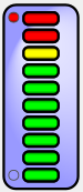
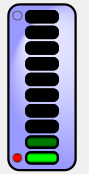
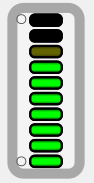
Customizing Light Bars
The light bar provides a stack of lamps arranged in a vertical bar. The light bar is similar to the traffic light, but its larger number of lamps provide a sense of movement from one end of the scale to the other.
To customize a light bar, access the Dashboard Editor, select the widget as described in Reconfiguring a Widget, click Meters, click a meter name, and use the options listed there. The following options are available:
-
Common options — See Customizing Meters, earlier in this page.
-
Upper Range and Lower Range — Use these options to specify the range of values represented by the light bar.
The light bar is intended to appear “off” when the value is low, and fully lit when the value is high. The color of the bar shades from green (at the bottom of the scale) to yellow and red (at the top of the scale), implying that you should stop and address a problem when the value is high. This system is useful when a large number indicates a condition that requires attention.
Sometimes a low number indicates a condition that requires attention. If so, you can reverse the sense of the meter; to do so, set Lower Range to a larger number than Upper Range. Then the fully lit lamp indicates low values, and the “off” lamp indicates high values. When you reverse the range values, do not also reverse the threshold values.
-
Upper Threshold — Use this option to add a warning light to the upper end of the meter. This warning light changes color when the meter value is equal to or greater than Upper Threshold. For example:
-
Lower Threshold — Use this option to add a warning light to the lower end of the meter. This warning light changes color when the meter value is equal to or lower than Lower Threshold. For example:
-
Body Style — Use this submenu to control the outline and fill of the meter. For example:
The easiest way to systematically alter the appearance of dashboards is to define and use themes, which are discussed in Defining and Using Themes. Themes use many of the options described in this page.
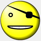
Customizing Smiley Faces
The smiley face is the familiar yellow circle with two eyes and a smile. The mouth line changes depending on the value.
To customize a smiley face, access the Dashboard Editor, select the widget as described in Reconfiguring a Widget, click Meters, click a meter name, and use the options listed there. The following options are available:
-
Common options — See Customizing Meters, earlier in this page.
-
Upper Range and Lower Range — Use these options to specify the range of values represented by the face, as follows:
-
The meter displays a smile when the meter value is near Upper Range.
-
The mouth is a horizontal line at the midpoint within the given range.
-
The meter displays a frown when the meter value is near Lower Range.
This system is useful when a large number indicates a positive condition, and a small number indicates a negative condition.
Sometimes a low number indicates a condition that requires attention. If so, you can reverse the sense of the meter. To do so, set Lower Range to a larger number than Upper Range. Then the smile occurs at low values, and the frown at high values.
-
-
Persona — Use this option to control the type of face shown in this meter. For example:
The easiest way to systematically alter the appearance of dashboards is to define and use themes, which are discussed in Defining and Using Themes. Themes use many of the options described in this page.