Using Dashboards
This page describes how to work with the dashboards that you may already have.
Also see Accessing the BI Samples.
Toggling the Display of the Worklists
Depending on the system configuration and the configuration of the dashboard, a dashboard might include zero, one, or two worklist areas on the right.
You can temporarily toggle the display of any worklists in the dashboard you are currently viewing. To do so, select Menu > Hide/Show Worklists. If you save the dashboard, this change is not saved.
Managing the Widget Windows
This section describes how to manage the size and placement of widgets. All these changes are discarded unless you do one of the following:
-
Select Menu > Save My Settings. This option saves your changes locally so that only you can see them.
-
Save the dashboard itself, as described in Creating Dashboards.
Resizing Widgets
To resize a widget, drag its resize handle in the lower right corner, if present:

Your ability to resize widgets is also affected by the Scalable Grid; see the next section.
Moving Widgets
Depending on how the dashboard is configured, it may be possible to move the widgets on it. There are three different possibilities:
-
The Scalable Grid option is enabled. In this case, there is an invisible grid of possible positions for the widgets. You can move widgets and resize them according to this grid.
If you resize the dashboard, all the widgets are automatically resized. Scalable Grid is the only option that supports this behavior.
-
The Snap Into Place option is enabled. In this case, if a dashboard contains only one widget, that widget is automatically positioned in the upper left and cannot be moved. If a dashboard contains at least two widgets, you can reposition them. To move a widget to the right, left, top, or bottom of another widget, select in its top bar and drag.
-
Neither option is enabled. In this case, you can freely reposition and resize widgets.
To access the Scalable Grid and Snap Into Place options, select Menu > Save With Options....
Filtering Data
Many dashboards include controls that you can use to filter the data shown in one or more widgets. Typically, if a control is in the Filters worklist, it affects the entire dashboard. In contrast, if it is in a widget toolbar, it typically affects only that widget.
Most filter controls are shown as searchable controls. The details depend on the type of data used in the control, as well as the source of the data; the following sections explain the variations.
In some cases, a filter control might be read-only. In this case, its purpose is simply to tell you how the data is filtered.
Using a Filter Control
A filter control might initially be like this:

To use this control, select the Search button  . In most cases, the system then displays something like this:
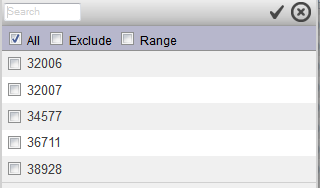
If this menu includes the word Required, then it is necessary to choose at least one item. In this case, the drop-down menu does not list the All choice. The following shows an example:
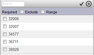
In this case, if you try to close the drop-down menu without selecting an option, the system displays a pop-up message saying that a value is required.
The Range option is not available if the data source for the widget is a KPI. The following subsections show other variations. In these filter controls, depending on their exact nature, you can do the following:
-
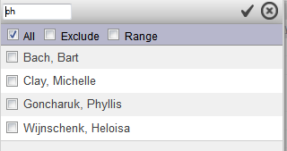
Type into the search box and press Tab.
If you do, the control is refreshed to display only members that include the string that you typed. For example:
-
Select an item or hold down the Ctrl key and select multiple items.
In some cases, it is not possible to select multiple items.
-
Select Exclude to exclude the selected item or items.
-
Select Range and then specify an inclusive range of members. When you select Range, the control changes to display two drop-down lists. In each drop-down list, select a member.
When you are done, select the check mark button to accept your selections. Or select the X button to discard them.
The widget or dashboard may or may not be refreshed immediately, depending on the dashboard configuration. Look for a standard Refresh button  or a button labeled Refresh, Rerun, or so on. If the dashboard has such a button, typically you must select that button to see the change due to the filters.
Filter Control for a Time Level
Depending on the data source, if the filter refers to a time level, the list includes a NOW member, which always refers to the date on which the pivot table was run. (More specifically, NOW refers to the applicable member of the time level for the date on which the pivot table was run. For a year filter, NOW refers to the year, for a year and month filter, NOW refers to the year and month, and so on.)
For example, consider the following:
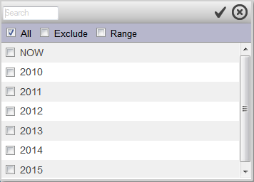
In this case, the NOW member refers to the current year, when this pivot table is run. For another example:
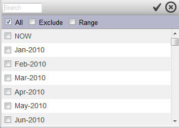
In this case, the NOW member refers to the current year and current month, when this pivot table is run.
Day levels are handled differently; see the next subsection.
For some kinds of time levels, if you click the NOW member and click Range, the system displays the following:
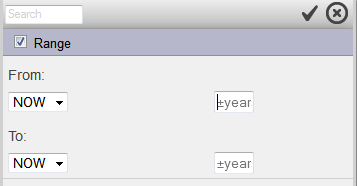
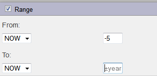
Here, you can specify a range of dates relative to the current date. To do so, type into the boxes shown on the right. For each box, to specify a date in the past, enter a minus sign (-), followed by an integer n. This specifies a date n time units in the past, where the time unit is determined by the kind of time level (in this case, years). Similarly, to specify a date in the future, specify a plus sign (+) followed by an integer n.
For example, the following filter selects a range of dates from five years in the past until now:
Filter Control for a Day Level
Depending on the data source, if the filter refers to a day level, the system shows the following control instead of a list:
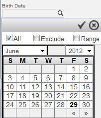
If you select Range, the system displays two calendars, side by side. Below each calendar, the filter displays a NOW option. NOW represents the current date (that is, the date when the dashboard queries are executed. The following shows the NOW options:
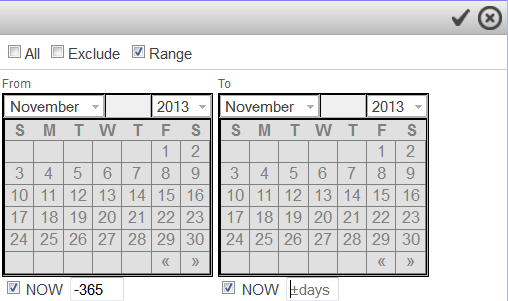
If you select NOW, you can specify an optional offset, which specifies an integer number of days before or after NOW. For example, NOW – 365 represents the date that is 365 days before the dashboard query was executed.
Filter Control for a Measure
If the filter refers to a measure, the system shows the following control instead of a list:
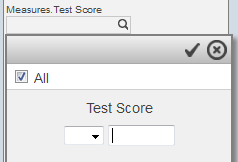
In this case, select an operator from the drop-down list and type a value into the box to its right.
Filter Control for a Computed Dimension
If the filter refers to a computed dimension, the system shows the following control instead of the usual drop-down list:
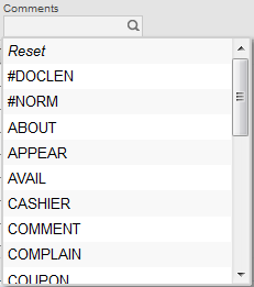
In this case, you can either select and item in the list or select Reset to clear the selection.
A computed dimension is a dimension whose members are defined at runtime, typically via SQL SELECT statements.
Filtering via OnClick
In some cases, if you select a row in a widget, that widget filters another widget. This is a type of onclick control.
For example, consider the following dashboard:
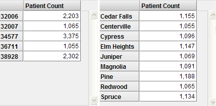
For this dashboard, when you select a ZIP code row in the left widget, the system automatically refreshes the right widget. For example:
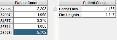
To clear the selection, select the left column header (for example, select above the 32006 cell).
Data Source Differences
For any widget that includes filter controls, if the data source is a KPI, a filter control has some or all of the following limitations:
-
Does not include a Range option.
-
Cannot be displayed in the calendar format.
-
Does not include the system NOW option. (It is possible, however, for a KPI to include a filter option labeled NOW with similar behavior.)
-
Does not necessarily enable you to select multiple items.
Understanding the Effects of Filters
In most cases, a filter includes or excludes members of a level. Each member is a set of base records, so a level filter includes or excludes records that correspond to the members you choose; the behavior is the same regardless of the contents and organization of the pivot table.
For example, consider the following dashboard:
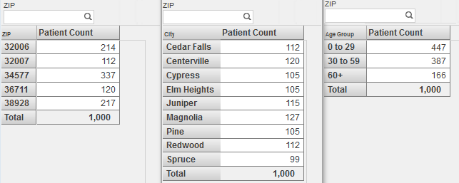
This dashboard contains three pivot table widgets, each of which displays a different pivot table. Each pivot table includes a total line. Each widget includes a level filter that uses the ZIP level (this is for demonstration purposes; more commonly, the Filters box would include a single filter that applied to all widgets).
Consider what occurs when we choose the same ZIP code in each of these widgets:

The first widget shows patients grouped by ZIP code. This widget now shows one row, corresponding to the selected ZIP code. The other ZIP codes are no longer shown, because this pivot table is not configured to display null rows.
The second widget shows patients grouped by home city. This widget now shows the three cities that correspond to the selected ZIP code. The other cities are no longer shown, because this pivot table is not configured to display null rows.
The third widget shows patients grouped by age groups. This widget displays all age groups, because the selected ZIP code includes patients of all ages.
Notice that the total count is the same in each pivot table.
In each case, when we select a ZIP code, the system selects only patients whose home address is in that ZIP code.
A measure filter refers to the value of a measure, instead of referring to members of a level. For example:

A measure filter examines each base record and includes or excludes it, depending on its value for the given measure. For example, consider the following dashboard:
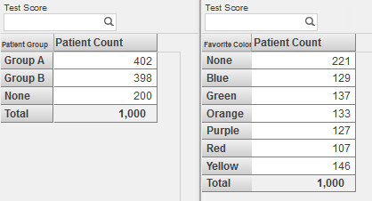
Consider what occurs when we filter by Test Score in the same way in both widgets:
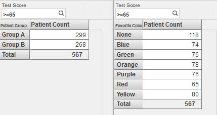
The first widget shows patients grouped by patient group. This widget no longer shows the patients in group None, which contains the patients who have no test score; this row is gone because this pivot table is not configured to display null rows.
The second widget shows patients grouped by favorite color. This widget shows all the same rows it used to show, because there are patients with the selected score or higher in all these groups.
Notice that the total count is the same in each pivot table.
Sorting Data
In a pivot table widget, you can sort the rows by the values shown in any data column. To do so, double-click the column header. For example:
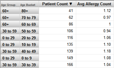
The first time you double-click the column header, the table is sorted in ascending order, by the values in that column, as shown in the preceding example.
If you double-click the column header again, the table is sorted in descending order instead. If you double-click a third time, the sorting is removed and the default order is restored.
In some cases, you might see a drop-down list that you use to control the sorting of the rows or column. Select Decreasing, Increasing, or Sort (removes the sorting). In this case, the control considers the values in the first data column or the first data row, as appropriate.
Specifying the Row or Column Count
In some widgets, you can specify how many rows or columns are shown. For example:

For another example:

Type or select a value as needed.
Changing the Display Type
In some widgets, you may be able to toggle the display between table format and chart format. To do so, use the following buttons:
| Button | Action |
|---|---|
 |
Displays the widget in table format. |
 |
Displays the widget in chart format. |
Note that for a chart, only the first hundred chart items are displayed.
Or the widget might include a control that lets you choose the chart type. For example:

In this case, select an option from the drop-down list. The widget is then redisplayed in the selected format.
Or the widget might include buttons that let you switch to specific types. For example:

In this case, when you click a button, the widget is redisplayed in the selected format. From left to right, the buttons shown here display the data as a pivot table, a bar chart, or a column chart. There are similar buttons for other chart types.
Using the Chart Zoom Feature
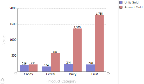
For some kinds of charts, you can zoom in and out, to see more or less data at once. To do so, select the zoom in button (+) in the lower left corner:

The chart then shows less data and includes arrow buttons that you can use to scroll left and right. For example:
Using Combo Charts
A combo chart provides two features that are not available in other charts:
-
It can have multiple y-axes.
-
It can use different display types for different measures.
The following chart demonstrates both features:
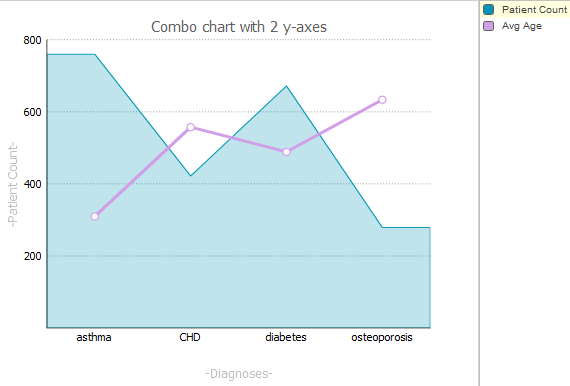
Notice that the y-axis is labeled Patient Count. The bars that display the Patient Count measure are scaled to match the values on this axis. In contrast, the bars that display Avg Enc Count do not correlate with the y-axis — these bars are correctly proportioned with respect to each other, but are scaled overall to fit within the chart.
To use a combo chart, select the box next to the name of a series, in the key. For example, if we select the box next to Avg Enc Count, the labels on the y-axis change as follows:

Displaying Listings
If a widget includes the Listing button  , you can display a listing, which shows the lowest-level data for the context you select. In some cases, the listing button might appear as a button with text (such as Toggle Details).
To display a listing:
-
Select one or more items.
-
For a table, select one or more cells.
To select multiple cells, hold down the Shift key while selecting the cells.
To select an entire row, select the row label on the left. To select an entire column, select the column header.
The listing option is not available for cells in a total row or a total column.
-
For a chart, select a single chart item. For example, select a bar in a bar chart.
The selected item or items are highlighted.
-
-
Select the Listing button
 .
. The widget then toggles to list the lowest level records for the selected cells. For example:
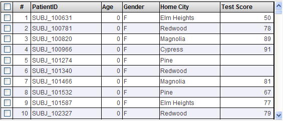
If there are more than 100 rows, the bottom area displays buttons that you can use to page through all the rows.
The check boxes enable you to select rows so that you can perform actions (particularly custom actions) that use those rows as input. Actions are usually shown as buttons at the top of the widget.
If your pivot table uses a subject area that includes an NLP (Natural Language Processing) measure, the NLP Measure Value
 button might be available; for details, see Displaying NLP Measure Values for Selected Facts.
 -
To toggle back to the original view, select the Table button
 .
.
Map Listing Variation
In some cases, the widget displays a Map Listing button:  . If you select this, the system displays a map that shows locations. For example, from the HoleFoods sample:
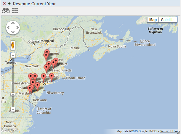
In this case, the displayed locations are locations of the sales for the selected records.
Map listings are also known as geo listings.
Displaying NLP Measure Values
When you display a listing for a pivot table that uses a subject area that includes an NLP measure, the listing might include a column that displays the NLP Measure Value  button. For example:

If you select this button, the system then displays a page like the following:
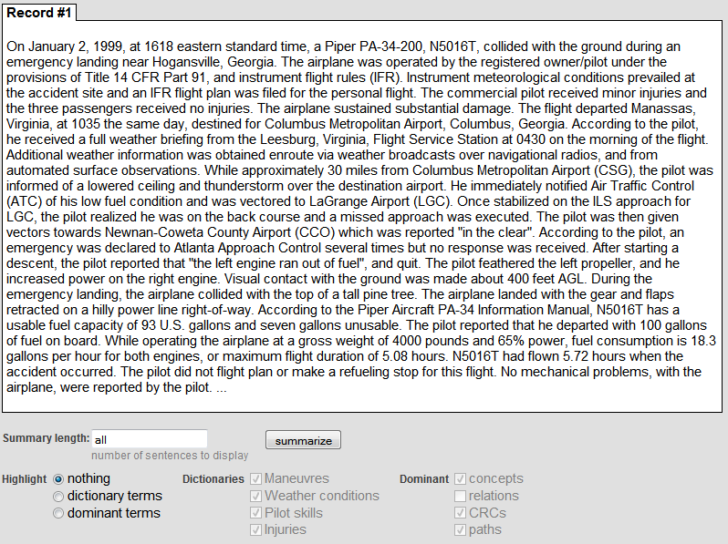
This page displays (by default), the complete text of an NLP measure, for that record.
On this page, you can do the following:
-
Select a tab to display the text for a different record.
-
Select the most relevant sentences of this text. To do so, type an integer into Summary length and then select summarize.
The system then displays that number of sentences, starting with the most relevant sentence, as determined by the Analytics Engine.
-
Highlight specific kinds of elements, as determined by the Analytics Engine. By default, nothing is highlighted.
Note the following points:
-
A dictionary term is a word or phrase found in a specific dictionary loaded into the system. In general, a dictionary defines a mapping that typically associates multiple synonyms with each other. You can select the dictionary or dictionaries to consider, among the available dictionaries in your system; these are specific to your implementation
-
A dominant term is a unit of text that is dominant within this text, as determined by the Analytics Engine. To understand the choices, it is necessary to review some concepts related to text analysis.
In text analysis, a key concept is the entity. The Analytics Engine processes the given text and identifies the entities in it. An entity is a minimal logical unit of text. It is a word or a group of words. Example entities are clear skies and clear sky. The Analytics Engine language model identifies two kinds of entities: relations and concepts. A relation is a word or group of words that join two concepts by specifying a relationship between them. A relation is commonly but not always a verb. A concept is a word or group of words that is associated by a relation. A concept is commonly but not always a noun or noun phrase.
The page can also highlight dominant CRCs and paths. A CRC is a concept-relation-concept sequence, and a path is a longer sequence.
Drilling Down
In some widgets, you may be able to drill down to lower levels. In the InterSystems IRIS Business Intelligence model, levels are contained within hierarchies, which are contained within dimensions. In some cases, there are multiple levels within a hierarchy. In these cases, a member of the higher level contains one or more members of the lower level, and you can drill down — navigate from the higher-level member to the lower-level members. You can do this via double-click or (if available) via the Drilldown button.
It is not possible to drill down from a total row. Also note that the drilldown action has no effect if the pivot table uses a manually entered MDX query (which is a rare scenario).
Drilling Down with Double-Click
If a pivot table row represents a higher-level member, you can double-click the member name to view the lower level members. For example, consider the following pivot table widget:
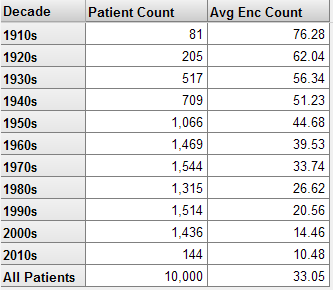
If you double-click the cell 1930s, the widget then displays the following:
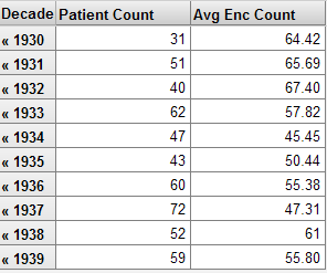
If you select the << characters in any row, the system restores the previous state of the widget.
This kind of drilldown action is not available in charts.
Using the Dimension List
A widget might include the Dimension List button  , which provides you with additional drill options.
If you select this button, the widget then displays a list of dimensions, to the left of the pivot table. For example:
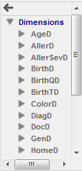
This list may or may not be the same as the dimensions defined in the cube, depending on how it was created.
To use this list:
-
Expand the folders as needed.
-
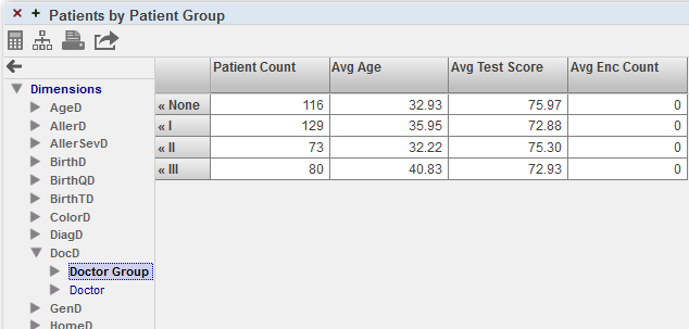
Drag and drop from the list onto the gray part of any row.
For example:
For another example:
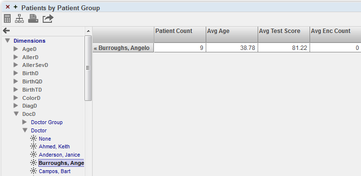
To reverse the effect, select the Reset button
 above the dimension list or select the << button in the pivot table.
Drilling to a Different Dashboard
In some pivot table widgets, you might be able to double-click a cell in order to display a different dashboard. The newly opened dashboard is filtered to the context in which you double-clicked. For example, suppose that the first dashboard includes the following widget:

Depending on how this pivot table widget is configured, if you double-click a data cell, the system might display a different dashboard, as follows:
-
If you double-click in the Female row, the newly opened dashboard is filtered to female patients.
-
If you double-click in the Male row, the newly opened dashboard is filtered to male patients.
-
If you double-click in the All Patients row, the newly opened dashboard is not filtered by gender.
Refreshing a Widget
To refresh the display in a widget, select the Refresh button  .
.
In some cases, this button might appear as a button with text. The text on the button might be Refresh, Redisplay, or any other suitable string.
In some cases, the widget might automatically refresh at a specified interval. In this case, there might not be a refresh button.
Reloading a Dashboard
To reload the dashboard itself, select the Reload Dashboard button  .
.
In some cases, this button might appear as a button with text. The text on the button might be Reload or some other suitable string.
Exporting Data to Microsoft Excel
You can export data to Microsoft Excel from a pivot table widget, but not from other types of widgets. To do so, select the Export to Excel button  in the widget.
The system generates an Excel file that contains all the data currently displayed in the widget. The file has the name %DeepSee.UI.MDXExcel.zen.xls, %DeepSee.UI.MDXExcel.zen-1.xls, or similar. Your browser then does one of the following, depending on your operating system, the configured file types on your machine, your browser, and your browser settings:
-
Opens the file with Excel (or other selected program).
You specify the program to use by setting a browser option. For example, on Firefox, you use Tools > Options > Applications. This option also enables you to specify whether the browser should open the file with this program or prompt you to save it to the hard drive.
-
Prompts you to open the file with Excel (or other selected program, as described in the previous bullet).
-
Opens this file within the current browser window.
This is the default behavior for Windows operating systems earlier than Windows Vista. You can change this behavior on the Edit File Type dialog box (which you access via My Computer > Tools > Folder Options or My Computer > View > Options, depending on the operating system version).
This option is not available on Windows Vista and later Windows operating systems.
-
Prompts you to save the file to the hard drive.
-
Automatically saves the file to the hard drive.
When you export to Excel, note that it is not possible to export more than 250000 rows. Also, if the subject area uses an external table, there is a limit of 1000 rows in the listing.
If no numeric formatting is specified, any numbers are formatted as integers by default. (The actual values are available in Excel, and you can change the formatting as needed to display them appropriately). If numeric formatting is specified in the model or in the pivot table definition, that formatting is used in Excel.
Printing Data
The dashboard might include one or more Print buttons  . Depending on how it is configured, a Print button might print only a single widget or multiple widgets. In any case, when you use this button, the system generates a .pdf file and opens it in your default browser. (If the output represents multiple widgets, the file contains one page for each widget.) You can then use options in the browser to print the file or to download it, for printing later.
Note that if you download the file, the browser saves the file to the default download directory for that browser; there is no mechanism for the system to specify a different location.
If the pivot table is extremely wide, it is not possible to generate a .pdf file for it.
Requirements for Printing
When a user invokes the Print option, InterSystems IRIS® data platform uses Java to call out to a third-party PDF rendering tool. This means that Java (or specifically JRE, Java Runtime Environment) is required on the user’s local machine. For information on the requirements, see Configuring InterSystems IRIS for PDF Output.
Using a Map Widget
A map widget includes a different set of options that are not present in other widgets:
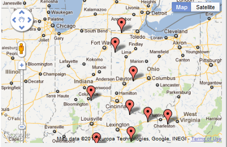
In a map widget, you can do the following:
-
Toggle the display between the map view and the satellite view. To do so, select the Map/Satellite button.
-
Display a different area. To do so, drag the cursor while holding down the left-select button.
-
Zoom in or out. To do so, drag the slider on the zoom bar.
-
Display additional details about a data point. To do so, select the data point. The widget then displays a popup window, if there is any additional data. For example:
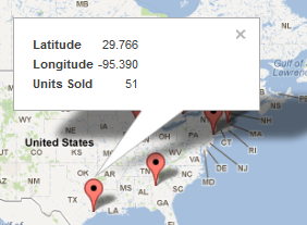
To close this window, select the X in the upper right.
Other Tasks
In a dashboard, you may also be able to do the following:
-
Reconfigure any widget. To do so, select the < button (if available) on the left of the dashboard to open the Dashboard Editor. Then make changes as described in Creating Dashboards.
-
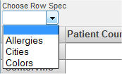
Select items that redefine the widget in different ways. There are many options. For example, the widget could include a drop-down list where you can choose a different pivot table to display:
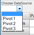
For another example, it could include a drop-down list that controls what is shown for rows or columns:
-
Display the Mini Analyzer and make local changes to the pivot table shown in a widget. Select the Mini Analyzer button
 , if included, and make changes as described in Using the Analyzer.
The changes do not affect other widgets, other dashboards, or other users.
Then to save your changes and exit the Mini Analyzer, select OK in the Mini Analyzer. Or, to discard your changes and restore the original pivot table, select Reset.
-
Perform custom actions. The Filters box and the widgets might include additional buttons to perform custom actions.
In some cases, you might first need to select a row or rows in a widget. To do so:
-
In a standard pivot table widget, to select a row, select the row. To select multiple rows, hold down the SHIFT key while selecting those rows.
-
In a pivot table widget that displays a listing, select the check boxes at the left of the rows.
A custom action can do any of the following:
-
Open a different dashboard in the same window.
-
Open a URL in the same window or in a new window.
-
Execute server-side code.
-
Execute client-side commands such as refreshing the dashboard.
-
Saving Your Changes
To save the current state of the dashboard that you are viewing, select Menu > Save My Settings. This option performs a local save of the current dashboard. It saves the size and placement of each widget and the current state of all filters and other controls in the dashboard. These changes are saved only for you, and are not visible to other users.
If you select Menu > Clear My Settings, the system removes your settings for this dashboard. After using this option, use the browser’s refresh button to display the dashboard in its base state.
There are also options for saving the base dashboard design itself so that all users see the changes (see Creating Dashboards). You can use these only if you have the appropriate permissions.
For reference, the following table describes how the different dashboard changes can be saved.
| Dashboard Change | Can Be Saved As My Setting? | Can Be Saved As Dashboard Design? |
|---|---|---|
| Maximizing or minimizing a widget | Yes | Yes |
| Moving or resizing a widget | Yes | Yes |
| Changes made via the Dashboard Designer | No | Yes |
| Using the Mini Analyzer to make local changes to the pivot table used in a widget | Yes | No |
| Specifying values for filters or for other widget controls | Yes | No |
| Other changes (sorting, drilling down, and others) | No | No |
When you save the dashboard design, your settings for that dashboard are cleared, except for any changes made via the Mini Analyzer.


 , which provides you with an alternative way to drill down in a hierarchy. In this case, to drill down: